ISSS608 2018-19 T1 Assign Lee Kern Choong Task 1
|
|
|
|
|
Contents
Task 1: Spatio-temporal Analysis of Official Air Quality
The dataset used in this analysis is the official air quality measurement (EEE Data), as downloadable from this link. The findings from this section of the visualisation are presented below. Longitude and Latitude data are from Data Science Society.
A Typical Day in Sofia
The following image is a representation of what the average day in Sofia (over years 2013-2018) look like:
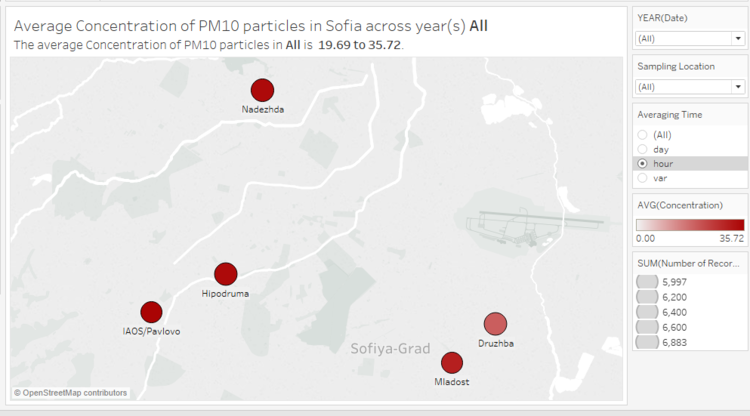
As hourly data for the Orlov-Most region does not exist, this visualization above only carries the PM10 concentration for the other 5 regions in this dataset. The average concentration is coloured on a scale of white to red, with white representing no pollution (no PM10 concentration) and red being the most heavily polluted. The size of the circle represents the number of observations taken in a particular region during this period.
Data Exploration
Before going into the details, we need to first look at the data that we have available. Looking at the "Averaging Time" column, we note that there are, in effect, three different types of data in this dataset - the first is data that was collected and averaged over an hourly period (e.g. 0200-0300hrs on a certain day), the second is data collected over 24 hours, and the third is a varied mix.
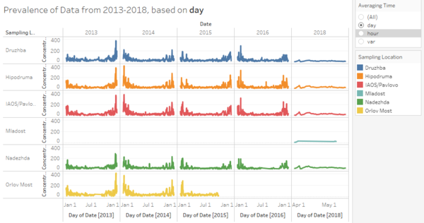
In effect, the following graphs display the data that was discovered:
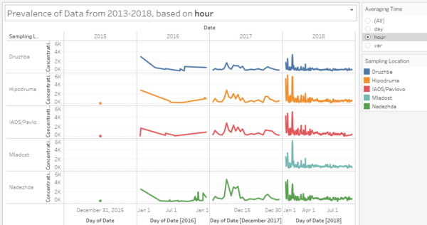
The varied mix is not considered as it is a very small fraction of the available dataset and it will not be easy to draw trends using that.
We can see that daily data is generally available from 2013 up to 2016, and from April 2018 onwards. However, there was no daily data collected in 2017 and the first quarter of 2018. On the other hand, hourly data is available only sporadically up until December of 2017, upon which it is collected regularly. We can also see that data collection in Orlov Most has ceased from Q4 2015 onwards, while data was only collected in Mladost from the start of 2018. Therefore, this will have to be taken into account when moving forwards with the analysis.
Possible Trends
Using the graphs created above, we can clearly see that spikes in pollution appear to occur in the December to January period, with PM10 concentration exceeding 200μg per cubic metre in nearly every year and every location recorded. In fact, this is characteristic of all cities represented in the dataset, and in comparison, the rest of the year has very low pollution levels.
To confirm this, we can look at a heatmap of the average pollution on a particular day of the year, using only the daily data as there are several days on which there is no data available, though we should keep in mind that the daily data does not include readings from much of 2017 and Q1 2018:
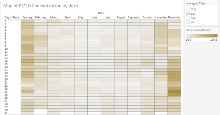
Clearly, most of the pollution on average happens in the months of December and January, supporting our initial observation.
Causes of Identified Trend
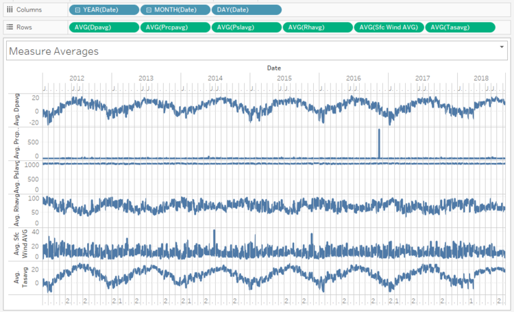
To look into why this is the case, we can bring in meteorological data from the same period:
The measures used here are as follows:
| Measure | Definition | Units |
|---|---|---|
| DPAVG | Daily average dew point temperature | degrees C |
| PRCPAVG | Daily average precipitation amount | mm |
| PSLAVG | Daily average surface pressure | hpa |
| RHAVG | Daily average relative humidity | % |
| sfcWindAVG | Daily average wind speed | km/h |
| TASAVG | Daily average temperature | degrees C |
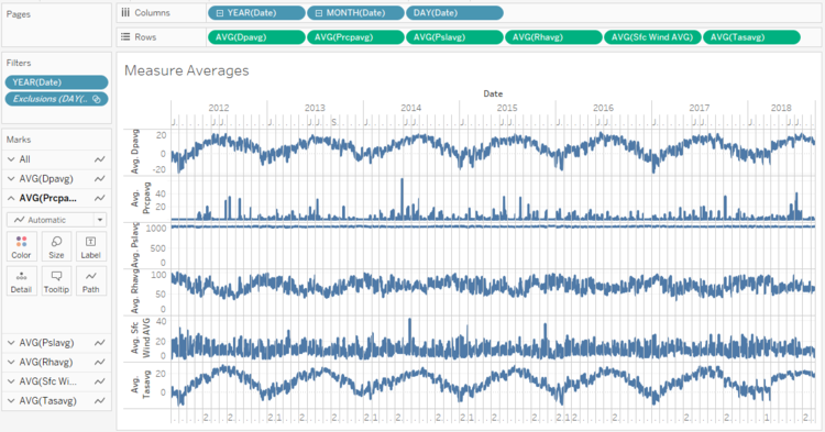
Note that there is an extreme outlier in November of 2016 for daily average precipitation amount. The value for the day in question is 9.03 metres (of rainfall), which does not make sense (there are no news reports of extraordinarily heavy rainfall or natural disasters on said date). On further investigation, this is also not reflected in the maximum precipitation (PRCPMAX) observation in the same dataset, and hence this data point will be excluded. The date with the next highest rainfall saw 0.62m of rain, which seems more likely. The dataset now looks as follows:
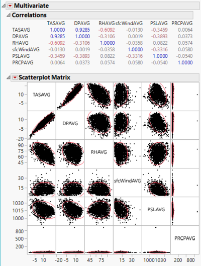
We run a correlation analysis on the 6 measure averages in jmp and get the following plot:
