ISSS608 2018-19 T1 Assign HyderAli Task 2 Insights
|
|
|
|
|
The Citizen Science Air Quality dataset was utilized for the study of the measurement data by the citizens for both years 2017 and 2018. The dataset is historical P1/P2 data obtained from the citizens which include P1 and P2 together with observation data such as temperature, humidity and pressure. Upon consolidation of the Citizen Science Air Quality data, we proceed to decode the geohashes into latitude/longitude pairs resulting in 3,610,146 measurements.
Characterize the sensors' coverage, performance and operation. Are they well distributed over the entire city? Are they all working properly all the times? Can you detect any unexpected behaviours of the sensors through analyzing the readings they capture? Limit your response to no more than 4 images and 600 words.
Contents
- 1 Are the Air Quality sensors well-distributed over the entire city?
- 2 Do these sensors all work properly all the times? Is there any unexpected behaviors of the sensors through analyzing the readings they capture?
- 3 Now turn your attention to the air pollution measurements themselves. Which part of the city shows relatively higher readings than others? Are these differences dependent?
- 4 Data Visualization Design
Are the Air Quality sensors well-distributed over the entire city?
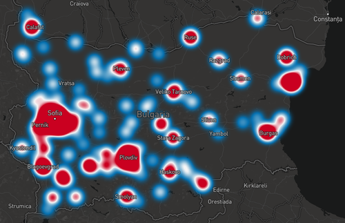
Emergence of small-scale air quality sensors has led to a significant shift in the approach to measuring air quality beyond those affected by traditional methods that use large, stationary and expensive analyzers. As these sensors are usually small and portable, it provides data in near real-time at relatively lower costs and thus allowing air quality to be measured with unprecedented temporal and spatial resolution. Heat map density plot of citizen science measurements across Bulgaria shows that most of the measurements lie around the major cities/towns such as Sofia, Pernik, Blagoevgrad and Plovdiv between 2017 to 2018 with the highest concentration at Sofia city.
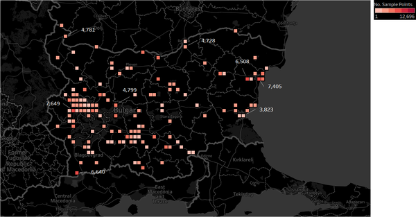
As we proceed to aggregate the spatial point data into square regions of an approximate binning size of 11.1 km, it then becomes clear that the citizen measurements are unevenly distributed.This is because most measurements are densely packed and saturated at particular locations of Sofia city. As these locations are highly populated areas relative to the other non-densely packed regions, thus there is high possibility of higher number of citizen measurements at these regions.
Do these sensors all work properly all the times? Is there any unexpected behaviors of the sensors through analyzing the readings they capture?
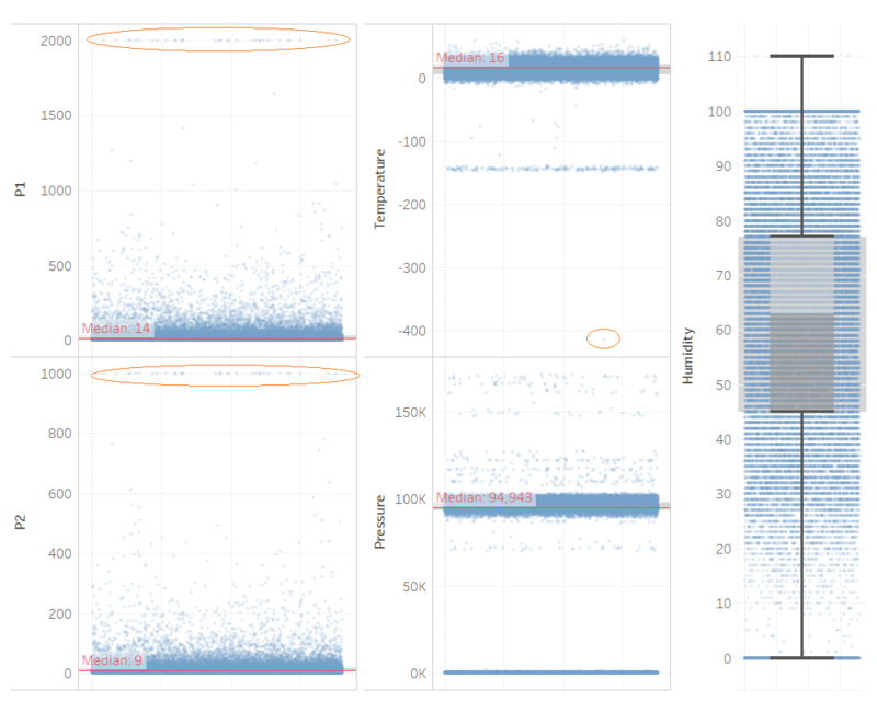
The citizen measurements were most likely recorded by local citizens/groups with their own testing kits, hence there lies high possibility that these measurements may not be accurate and could even paint a very inaccurate picture of Air Pollution in Sofia. As the dataset is very large, we proceed to sample 1% of the dataset comprising some 300K rows. Quick analysis of distribution plot shows that there is a significant number of outliers (denoted by the red circles) in P1, P2 and Temperature data: P1 readings ~ 2000, P2 readings ~ 1000 and Temperature < -400K. This indicates that the sensors are not working properly at all times due to some proportion of inaccurate measurements and thus should be excluded from the analysis to ensure consistency in the findings.
Now turn your attention to the air pollution measurements themselves. Which part of the city shows relatively higher readings than others? Are these differences dependent?
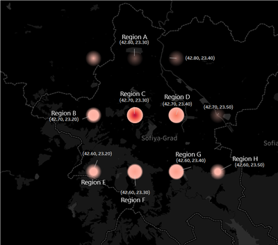
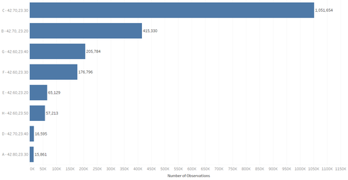
Firstly, we proceed to aggregate the spatial point data into 8 dense regions of an approximate binning size of 111.1 km; A (42.80, 23.30), B (42.70, 23.20), C (42.70, 23.30), D (42.70, 23.40), E (42.60, 23.20), F (42.60, 23.30), G (42.60, 23.40) and H (42.60, 23.50). Both the density and bar chart show most citizen measurements were recorded in Regions C (1.05M), B (0.42M) and G (0.21M) respectively. In contrast, regions A and D recorded the lowest number of measurements: 15.9K and 16.6K respectively. Region C corresponds to Sofia’s city center which is a popular and frequent visiting resident to most citizens and thus accounting for the highest count of measurements in this area. Likewise, regions A, E, F, G and H are further away from the city center and thus usually less frequently visiting compared to the other regions.
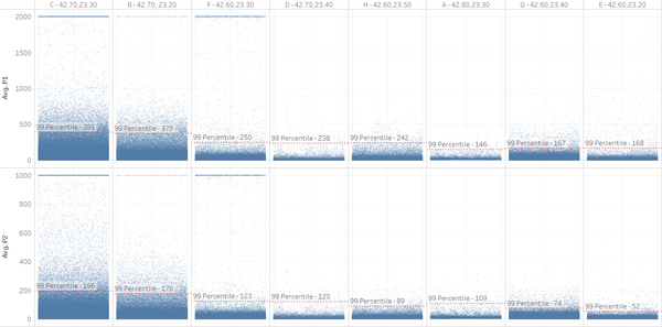
Jitter plot of P1/P2 readings revealed that there are certain portions of the city with higher relative P1/P2 readings compared to others. Regions C and B recorded the highest P1/P2 readings whilst regions G and E recorded the lowest P1/P2 readings: 167/74 and 168/52 respectively.
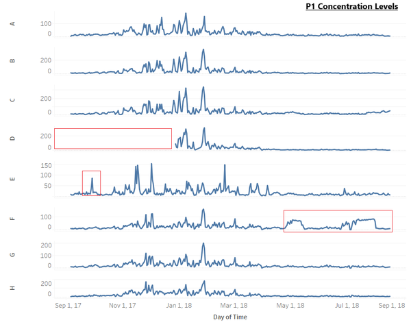
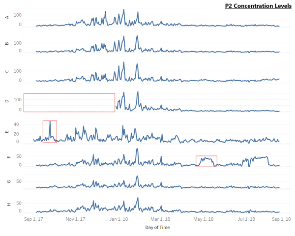
Next, we proceed to investigate the time differences among in P1/P2 readings across the 8 regions. A quick look at P1 and P2 concentration levels show that most readings follow similar pattern, except for few abnormalities which are circled in red. Firstly, there is no recorded readings in year 2017 at region D. An abnormal peak in P1 concentration levels in region E in Oct-17 coincides with with the abnormal peak in P2 concentration levels. There are also some fluctuations in P1 and P2 concentration levels in region F from May-18 onward, which are not observed across the other regions. Similar pattern between P1 and P2 concentration levels indicates that P1 and P2 may be emitted by the same sources, or one may be emitted by the transformation of another through some type of chemical mechanism.The unique abnormalities in the P1/P2 concentration level patterns further calls for an investigation of the human activities during this period by Sofia.
