ISSS608 2018-19 T1 Assign Debbie Siah Mei Ping Task 2
Sofia City - Air Quality Analysis
|
|
|
|
|
|
|
Contents
Task 2: Spatio-temporal Analysis of Citizen Science Air Quality Measurements
Using appropriate data visualisation, you are required will be asked to answer the following types of questions:
- Characterize the sensors’ coverage, performance and operation. Are they well distributed over the entire city? Are they all working properly at all times? Can you detect any unexpected behaviors of the sensors through analyzing the readings they capture?
- Now turn your attention to the air pollution measurements themselves. Which part of the city shows relatively higher readings than others? Are these differences time dependent?
Click here to access the Tableau Dashboard for Task 2.
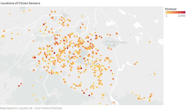
Coverage of Sensors
Sofia City is well covered with citizen sensors.
Performance & Operation of Sensors
Although the coverage of the citizen sensors is much better than the official air quality stations, however, it will be necessary to show the robustness of the performance and operation of the sensors before the data collected can be trusted.
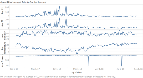
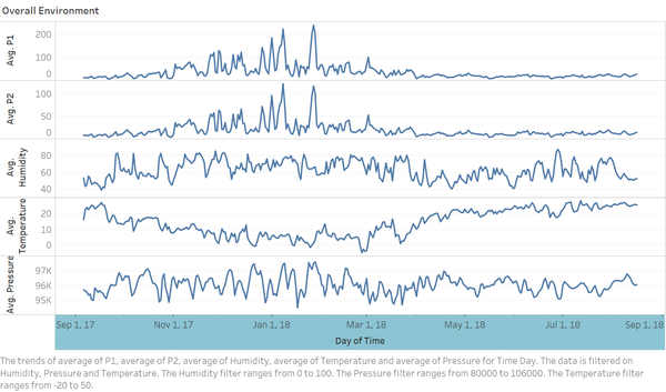
Based on the overall time series trend of the 2 major pollutant and 3 major atmospheric measurements, it can be seen that there are 2 dips in the pressure readings that went to 0. This is illogical and may be a sign of failure at the receiving end of the station as it is not statistically possible for all the transmitting sensors to be faulty at the same time, resulting in 0. This will be further examined below in the Pressure section.
Pressure
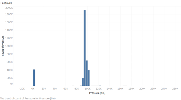
The initial plotting of the pressure readings collected by the citizen sensors shows that the readings range from -20k to 260k. This is illogical and may be an indication of faulty sensors or receivers.
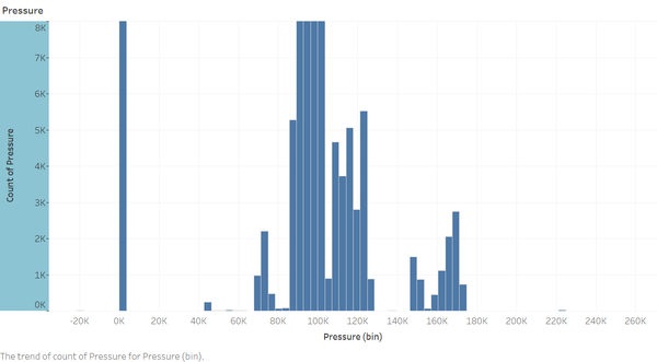
Upon closer examination, it is found that there is a large number of readings (more than 400,000) that equate to 0. This is a sign that enforces the hypothesis made earlier on about a fault in the receiving end for pressure related readings. Besides these, there are also various outliers which should be removed as they are out of the logical range.
Humidity
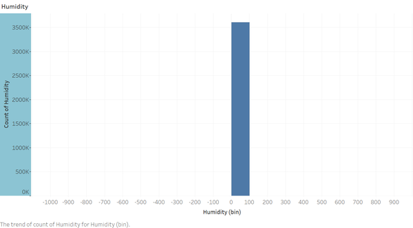
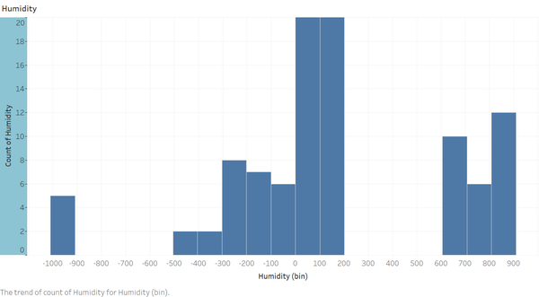
The initial plotting of the humidity readings collected by the citizen sensors shows that the readings range from -1000 to 1000. This is illogical and may be an indication of faulty sensors or receivers.
Upon closer examination, it is found that there are a small number of readings beyond the logical range of 0 - 100 for humidity. These outliers should be removed prior to any analysis.
Temperature
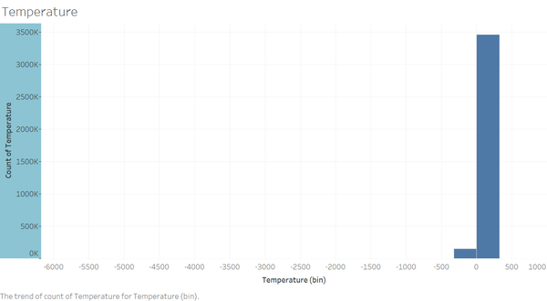
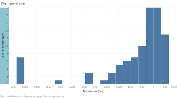
The initial plotting of the temperature readings collected by the citizen sensors shows that the readings range from -6000 to 1000. This is illogical and may be an indication of faulty sensors or receivers.
Upon closer examination, it is found that there are a small number of readings beyond the logical range of -20 to 50 for general temperature on Earth. These outliers should be removed prior to any analysis.
Air Pollutants as Detected by Citizen Sensors
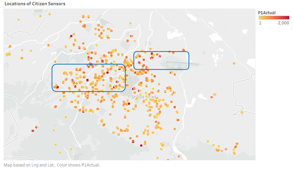
It is noted that there are 2 particular areas where the P1 readings are much higher than usual. They are boxed out in the map below. The highest polluted areas appear to be near the airport, as well as the stretch along roads.
It appears that the pollutants are the highest during the colder months of the year.
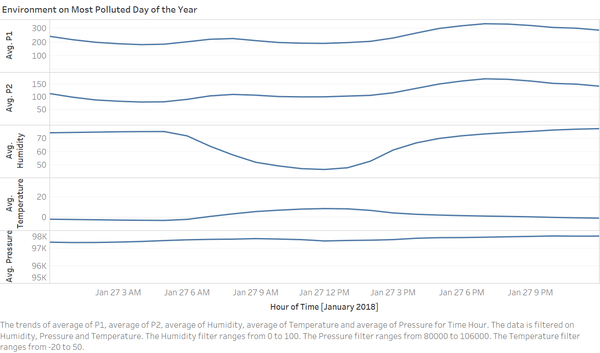
The maximumm P1 reading in the year occured on 27th January. Upon closer examination, the pollutant level is higher during the night where temperature is the lowest and humidity is the highest (indicative that it could be raining or snowing).
