ISSS608 2018-19 T1 Assign Chen Jinchuan Brian
Contents
- 1 Context
- 2 Project Datasets
- 3 EEA Dataset
- 4 Topology Data
- 5 EEA Metadata
- 6 Meteorological dataset
- 7 Task 1: Spatio-temporal Analysis of Official Air Quality
- 8 Task 3 for EEA dataset
- 9 Task 2: Spatio-temporal Analysis of Citizen Science Air Quality Measurements
- 10 Citizen Dataset
- 11 Task 3 for Citizen dataset
- 12 Conclusion
Context
Sofia is the capital of the Balkan nation of Bulgaria. It’s in the west of the country, below Vitosha Mountain. The city’s landmarks reflect more than 2,000 years of history, including Greek, Roman, Ottoman and Soviet occupation.
Bulgaria had the highest PM2.5 concentrations of all EU-28 member states in urban areas over a three-year average. Bulgaria is also leading on the top polluted countries with 77 μg/m3on the daily mean concentration.
According to WHO website [1] on air quality and health, guideline values for PMI are as follows:
|
PMI 2.5 |
10
μg/m3 annual mean |
|
PMI 10 |
20
μg/m3 annual mean |
We seek to visualize the air pollution measurements in this city collected across the years.
Project Datasets
|
Description |
Folder |
|
Official air quality measurements (5 stations in the city) |
EEA Data |
|
Citizen science air quality measurements |
Air Tube |
|
Meteorological measurements (1 station) |
METEO-data |
|
Topography data |
TOPO-DATA |
EEA Dataset
We start by exploring the EEA data with JMP. We notice 2 types of data, mainly the PMI concentration readings, and metadata relating to the 5 air quality stations. For the PMI readings, we observe the below data patterns. This awareness will affect and guide the rationale for how we analyse the data later for visualization.
EEA 9421-BG0052A
2013 - all daily 357 pts
2014 - all daily 364 pts
2015 - all daily 356 pts
2016 - mix of day (353) and hourly (110)
2017 - var and hourly, only Nov Dec data
2018 - mix of day (45) and hourly (5919)
EEA 9484-BG0054A
2013 - all daily 313 pts
2014 - all daily 341 pts
2015 - all daily, last 3 month missing (263)
EEA 9572-BG0050A
2013 - all daily 364 pts
2014 - all daily 344 pts
2015 - all daily 346 pts
2016 - mix of day (354) and hourly (98)
2017 - var and hourly, only Nov and Dec data
2018 - day (45) and hourly (6051) Oct/Nov/Dec missing
EEA 9616-BG0073A
2013 - all daily 343 pts
2014 - all daily 362 pts
2015 - all daily, 1 hourly. 351 pts
2016 - day (355), hourly (109)
2017 - var (633) var (142) - only Nov Dec data
2018 - day (45), hourly (5403) - Oct/Nov/Dec missing
EEA 9642-BG0040A
2013 - all daily 363 pts
2014 - all daily 359 pts
2015 - all daily 1 hourly. 357 pts
2016 - hourly (266) and day (247), missing month
2017 - hour (611), var (140), only Nov and Dec
2018 - day (45) hourly (6005) - Oct/Nov/Dec missing
EEA 60881-BG0079A
2018 - day (7), hourly (5997), Oct/Nov/Dec missing
As this is time series data, we seek to interpret and determine what data would be available for visualization in the level of time granularity required. Numbers eg 60881 refer to the file names corresponding with each station.
|
Year |
Remarks |
Granularity |
|
2013 |
We will be able to visualize for all stations except 60881 |
Daily |
|
2014 |
We will be able to visualize for all stations except 60881 |
Daily |
|
2015 |
Visualize all stations except 9484 with some months missing and without 60881 |
Daily |
|
2016 |
Station 9484/60881 missing. Mix of daily and hourly. |
Daily and hourly |
|
2017 |
Station 9484/60881 missing. Only Nov and Dec data. |
Hourly |
|
2018 |
Station 9484 missing. Oct/Nov/Dec missing in most stations. But most number of hourly readings. |
Daily and hourly |
Topology Data
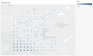
We also seek to look at the topology data to visualize the level of elevation in Sofia city. We observe that elevation is higher in the bottom left corner as compared to other parts of the city. This makes sense as in google maps with terrain overlay, south-west is where the mountain ranges are. (Click on the images to view them online)
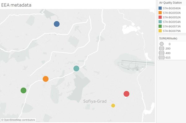
EEA Metadata
Next, we take a look at the EEA metadata to look for interesting observations regarding the air quality stations.
In terms of elevation, we observe they are all about similar in 500 to 600 m range. The 2 shades of green dots are the station type of traffic, while the rest belong to background. We could suspect that stations at traffic would measure more pollutant contribution from traffic, We also observe that BG0079A has elevation of 0, which seems erroneous if you compare the relative location to the topology data with about 500 elevation. (Click on the images to view them online)
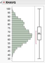
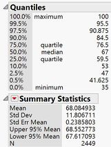
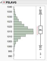
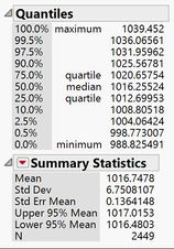
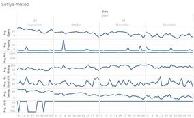
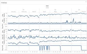
Meteorological dataset
This data spans the years 2012-2018 collected from measurements at Sofia airport.
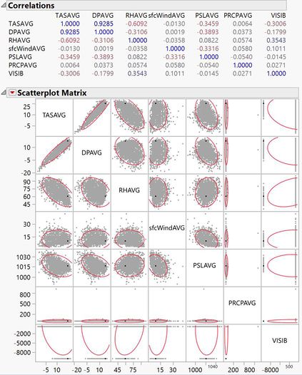
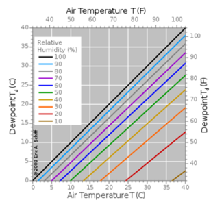
We perform a multivariate correlation analysis to check for correlated variables. We will just be comparing against average value variables for simplicity. We observe that dewpoint and temperature readings are highly correlated, nothing surprising here. There is some negative correlation between humidity and temperature. This may be trivial to readers in the industry but may need further understanding for casual readers with regards to this relationship. (see below)
|
From Wikipedia on Dew point [2], the higher the temperature the more water vapour it can contain, thus higher humidity. And at higher elevations, this yields a curve under this current curve, meaning less humidity for the same temperature value.
Relative humidity is a function of both how much moisture the air contains and the temperature. Therefore, if you raise the temperature while keeping moisture content constant, the relative humidity decreases. |
|
|
Dewpoints’ relationship to normal temperature readings is in the amount of relative humidity. The higher the relative humidity, the closer the dewpoint temperature is to air temperature. Otherwise dewpoint tends to be lower. |
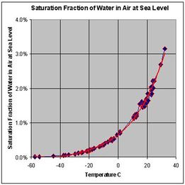
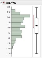
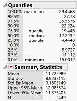
We also visualize the distribution of the various measurements. Taking this as official valid data from meteorological station at Sofia airport, this will help guide us regarding the citizen dataset later.
|
Daily average temperature range between -15 to 30 degrees Celsius. |
|
|
Daily average relative humidity range between 0 to 100%. |
|
|
Daily average surface pressure between 900-1040 Hpa. |
|
In order to visualize the data in tableau, we prepare the date column by combining the year, month, day into a date column via JMP formula Date MDY(:Month, :day, :year)
We output to csv file for loading into tableau.
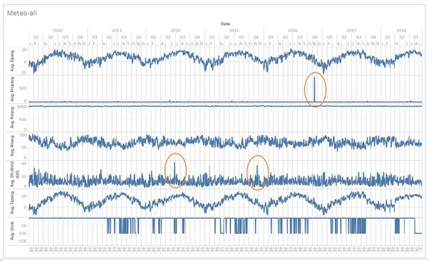
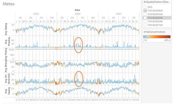
We observe cyclic rise in average temperatures in the summer follow by drops in the winter. There is drops in average visibility in all years except for 2012. We observe some unusual peaks circled in red for average precipitation and average wind speed. (Click on the images to view them online)
Task 1: Spatio-temporal Analysis of Official Air Quality
We setup the data with combination of EEA and the metadata, joined with air quality station code. We first visualize the 2013-2016 data due to their granularity at daily level and completeness. We union these years from the various files. (Click on the images to view them online)
Characterize the past and most recent situation with respect to air quality measures in Sofia City.
|
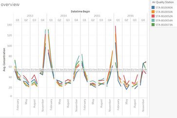
1. We see that over the years, average PMI 10 concentration have higher peaks in the winter of 2013 and 2016. Winters (lower temperature) also tend to have higher readings than summers (higher temperatures). Stations 54A and 73B of type road have higher readings relative to the others. (note reference line at 50 is for daily limit, while graph is in quarters)
(average over all quality stations)
Years 2017 and 2018 has to be seen separately due to the disjoint timeframes and differing set of stations. |
|
|
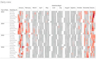
2. Days in red are those “stay home” days. Where either you should wear a mask or avoid outdoor activities, as levels have surpassed 50 average daily limit.
|
What does a typical day look like for Sofia city?
|
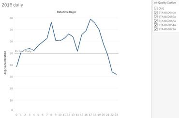
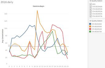
3. We use 2016 data only to visualize this
because it has one of the more complete hourly data for a year. We observe peaks in the morning 8am and evening 5pm before dropping off at night.
But depending on station location, there are differing daily experiences for citizens. |
|
|
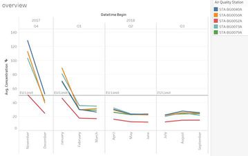
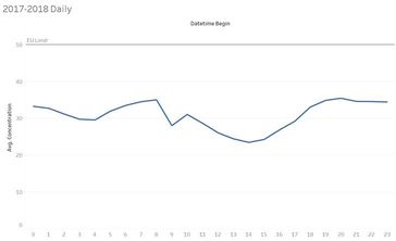
4. 2017 and 2018 data shows another story where concentrations are in fact below the 50 unit limit. We are not sure if this is caused by 2018 last quarter missing data. |
Do you see any trends of possible interest in this investigation?
We observe that station 73A seems to be lower in 2016 as compared to earlier years 2013 and 2014 relative to the other stations (table line 1 and 3). If measurements there are due to road vehicles, did traffic volume drop in later years?
What anomalies do you find in the official air quality dataset?
1. Zero altitude for station BG0079A is strange.
2. Missing data and frequency granularity inconsistency in data collected.
How do these affect your analysis of potential problems to the environment?
These data inconsistencies and irregularities make it hard to view a complete picture and see patterns in the data. This is so that better questions can be formed for further investigation.
Task 3 for EEA dataset
Reveal the relationships between the various pollution sources and environmental factors and the air quality measure detected. (Click on the images to view them online)
|
1. We combine EEA 2013-2015 data to meteorological data to observe for any interesting points. We see some points for station 40A that exceed 50 unit limit outside the typical winter season, in terms of precipitation and wind speed. But we are unable to establish a relationship based on current information set. Station 40A is also not located near the airport where the meteorological data is from. |
|
|
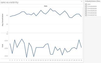
2. We try to observe if concentration has an effect on visibility. There is no obvious pattern. We note that stations 52A and 54A are located closer to Sofia airport than the rest. |
|
|
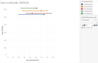
3. We try to play with the PMI concentration and altitude factors. We don’t see a regular relationship across time. |
|
|
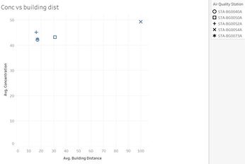
4. PMI Concentration versus building distance seems to have some clusters on the left. But more context has to be understood before knowing if this observation is actually useful. |
Task 2: Spatio-temporal Analysis of Citizen Science Air Quality Measurements
Citizen Dataset
The citizen dataset consists of last quarter of 2017 and first 3 quarters of 2018. The data needs some pre-processing before analysis. Firstly, we convert the geohash column into latitude and longitude via geohash from R cran library.
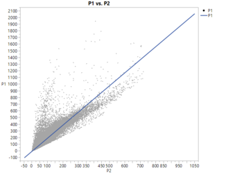
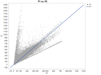
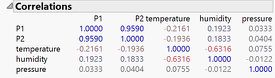
We observe the data in JMP. We see a mostly linear relationship between P1 and P2. It is not defined what they are but they could be PMI2.5 and PMI10 readings. We may want to assume P1 as PMI10 since it has a higher reading than PMI2.5
P1 and P2 have high correlation, and temperature has some correlation to humidity.
|
2017 |
2018 |
|
|
|
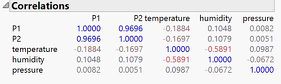
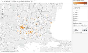
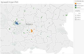
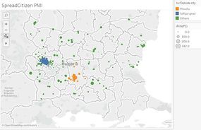
Characterize the sensors’ coverage, performance and operation. Are they well distributed over the entire city?
Measurement locations are well distributed over Bulgaria, with concentration in Sofiya-grad. Also, there is a growth in number of measurement locations over time. (Click on the images to view them online)
|
2017 |
2018 |

Are they all working properly at all times?
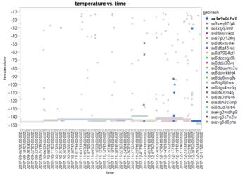
There is huge variation in sensor readings. This does not seem logical as some are beyond possible ranges. Eg -140 temperature does not make sense. We want to remove the temperature, humidity and pressure outliers. We reference meteorological dataset from Sofia airport which is supposed to be accurate in order to pick out a meaningful range. Humidity sensors seem be suffering from a different abnormality in 2017 vs 2018.
2017 distribution: Before
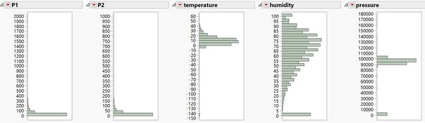
2017 distribution: After
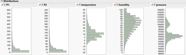
2018 distribution: Before
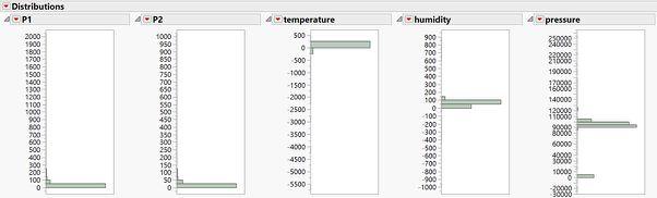
2018 distribution: After
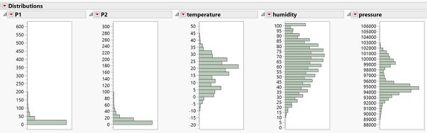
Filters that we apply to both 2017/2018 dataset are as follows:
Filters:
Temperature: -20 to 50
Humidity: remove 0 (1 to 100)
Pressure: only keep 880 to 1060 HPa
P1: 0-600
P2: 0-300
Can you detect any unexpected behaviors of the sensors through analyzing the readings they capture?
In 2017 data for example, we look at the bottom quartiles of readings from temperature sensors across time. We observe that for individual sensors (in this case highlighted in blue), readings span a wide range in volatility even in similar time period. This erratic behaviour may point to faulty sensors.
Now turn your attention to the air pollution measurements themselves. Which part of the city shows relatively higher readings than others?
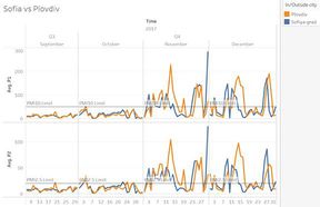
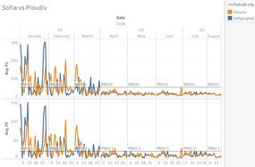
We can choose to visualize both P1 and P2 together by summing them, since their relationship is rather linear, to establish the total amount for the year. In both years, we observe some very high P1 and P2 readings in the mid of 2018 both in Sofiya-grad and Plovdiv. (Click on the images to view them online)
|
2017 |
2018 |
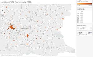
We zoom into Sofiya-grad and playback across time for 2018, to determine is it a growth in sensor points, or actually an increase in PMI levels. We observe it is indeed an increase in PMI.
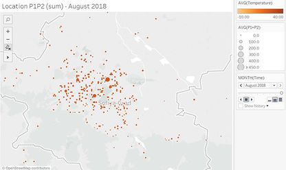
Are these differences time dependent?
Yes. The 2 clusters in Sofiya-grad and Plovdiv tend to get much higher and increase faster
in terms of PMI levels in certain months as compared to other areas. (End 2017 and mid
2018).
Task 3 for Citizen dataset
Reveal the relationships between the various pollution sources and environmental factors and the air quality measure detected.
Since the citizen dataset is spread throughout Bulgaria, it will not make sense to compare it directly against the meteorological dataset (from one station at Sofia airport), nor directly with EEA dataset which only contains data from Sofia area.
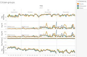
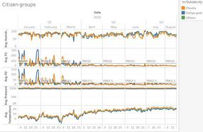
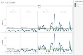
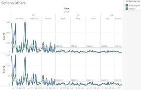
Therefore for comparison sake, we need to group the citizen dataset geographically. Inspired from the findings earlier, we group into 3 namely: Sofiya-grad area, Plovdiv area, and others. (Click on the images to view them online)
|
2017 |
2018 |
|
We notice 2 main clusters in Sofiya-grad and Plovdiv area. There are other isolated areas where average P1 PMI levels are high, but have lower participation rate. |
In 2018, we see that the average levels of P1 are even higher than previous year’s. |
|
We see observe a slight downtrend in average temperatures towards the end of year. Some peaks appear for average precipitation. Average visibility is strange as only September has variability. |
In 2018, there is an upward trend in temperatures from Jan to Aug. Some peaks in average precipitation in July, and sudden variability in average visibility during April. |
|
We observe that Plovdiv and Sofiya-grad have higher average P1/P2 readings, consistent with our visualizations earlier. Average temperatures in Sofiya-grad is lower than the rest, which is strange since normally Cities have higher temperatures than outskirts. Average temperature on donwntrend. |
We observe the same with regards to P1/P2 levels, just that this time variability is dropping off through the year. Average temperatures on the uptrend. |
|
Looking closer at just Plovdiv and Sofiya-grad, we observe that variability is quite similar in pattern. However there is a large surge in P1/P2 levels for Sofiya-grad in end Nov. Unhealthy levels begin to appear in Nov and Dec. |
Consistently, P1/P2 heights level off through after the first quarter. Sofiya-grad peaks are much higher, almost a third higher than Plovdiv. |
|
Sofiya-grad observes much higher peaks than “others” in the group. However, off-season timings (2nd and 3rd Quarter) are rather similar. |
Same pattern appearing in 2018. |
Conclusion
The overview of Citizen, EEA, and Meteorological data from Bulgaria gives us a better understanding and insight towards air pollution in and around the country. Although exact causes of pollution cannot be determined, we managed to display insights at the aggregate level, and spot abnormalities in our findings. Whether to help individuals make better decisions such as taking long year-end holidays abroad to stay away from Bulgaria (or at least stay off Sofiya-grad/Plovdiv), to the policy maker trying to address warnings over air quality from the EU, we hope these findings will turn out to be useful.