Group 3 Report
|
|
|
|
|
Tourism Investigator
Contents
Abstract
Where previous generations see travel as luxury, the current generation these days view travelling as an essential. This is prevalent among the millennials, who perceive travelling as a fulfilling experience that enhances their standard of living as well as an avenue to be exposed to various cultures. Not be to the left behind, the trend of silver generation travelling has been increasing. This is largely due to the affordability, as compared to travelling as a luxury item during their younger years. Apart from widening their horizon and experiences, travel also allows senior citizens to spend more quality time with their children whilst on holiday.
Apart from tourists, another group that make up a sizeable portion is the business travellers. Globalisation has resulted in many global corporations setting various regional headquarters to be closer to the respective marketplaces. Executives are at times, required to travel to meet up to discuss on the business strategies and directions. The availability of tele-conferencing negates the need to travel for minor meetings, but critical political and economic decisions are still conducted on a face to face setup.
Tourism Landscape in Singapore
Over the years, Singapore’s recognition in the global stage as been compelling. The Crown Jewel of the Formula One Race Circuit, backdrop of the successful Hollywood Film “Crazy Rich Asian” and the honourable host of the Memorable North Korea-United States Summit, Singapore’s ability to position herself as a neutral yet vibrant destination has led to hordes of visitors setting foot onto her sunny shores. It is no surprise that the tourism sector has been developing into a growth engine for Singapore’s economy. For 2017, Singapore’s tourism sectors attained records highs in both tourists’ arrivals and spending. According to the data released by Singapore Tourism Board, the number of arrivals increased by 6.2 per cent to $17.4 million, while tourism receipts increased by 3.9 per cent to $26.8 million. The increasing affordability of travel, with the prevalence of low-cost carriers globally, as contribute to the opportunistic trend.
Beyond tourism, Singapore is also an ideal venue for the conduit of businesses. Singapore has constantly been ranked as the top few, if not the top, amongst Asian cities for hosting Meetings, Inventive Travel, Conventions & Exhibitions (MICE) events. Its premium geographical location and stable political climates have been the two main reasons for being the prime destination for international MICE events. In 2017, a total of 935 international meetings took place in Singapore.
Objective and Motivations
During our exploratory analysis on the data comprising of the tourism arrival into Singapore, we noticed that the arrival patterns of tourists and business travellers from respective countries at heterogenous. The analysis obtained from The World Bank and Singapore Tourism Board provides a macro-view on the overall tourism activity. As much our team aims to address the gap but shifting the analysis to country-specific. A keen understanding of the unique travel behaviours can reveal their travel preference which is essential for local businesses to devise plans to attract more tourism receipts boosting their business revenue. The ability of the analysts to grapple the data and transform the insights into actionable business decision will see their businesses flourishes. In addition, beyond analysis, we aim to provide a forecast on the visitor's future travel and expenditure pattern. This will allow the local businesses to be better prepared to capture the tourism dollars in the next few years.
Dataset and Data Preparation
The CEIC contains many related tourism data information with regards to Singapore. However, to investigate our premise, we must narrow our search and work with datasets that illustrate each countries’ tourist behaviour pattern. As such, we narrowed our relevant dataset to tourists’ arrival numbers, the mode of arrival and expenditure level. The datasets were further whittled down and only countries with consistent yearly data points were selected. In summary, forty-seven countries with mainly arrival data and twenty countries with annual expenditure data were chosen based on consistency between the period from 2007 to 2017. Twenty countries have appropriate data on both arrival and expenditure.
Data Preparation
After the aforementioned datasets where chosen, we have to carry out a series of transformation to ensure the dataset will be able to portray the story that we want to tell. The first step was to melt the datasets and separate the id=Data into three different columns, Date, Country and Arrival respectively, using the bind_rows() function. Next, we add in a new columns to illustrate the type of arrival using the rep() function to differentiate the arrivals between Total, Sea, Air and Land. Lastly, we add a column named “Year” to the table to better plot the datasets on an annual basis. The tourists’ expenditure data are treated in the same manner to ensure consistency and for quick manipulation at the later stages.
Design Framework and Visualisation Methodologies
Dashboard Overview
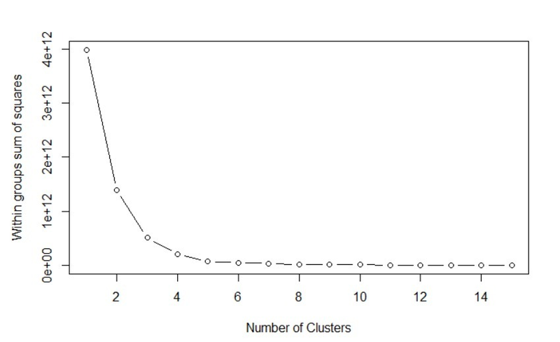
As the first point of contact with users, the dashboard provides a quick snap shot of the Singapore tourists’ arrival against the selected country. The top left-hand side illustrates the tourist total expenditure per capital (SGD) and total arrivals (person) whereas the top right-hand side shows similar data but with respect to the selected country. In addition, the highest and lowest month for tourist’s arrival for the selected year will be reflected as well. At the bottom of the page, the countries that exhibits similar tourists’ arrival and expenditure pattern for the selected year will be listed. This is carried out via K-mean clustering and the number of clusters to sort out the twenty countries with both arrival and expenditure has been fixed at six for consistency. We utilised the R cluster package to derive the most optimal number of clusters given our dataset and its attributes. As most our users may not be a technically verse in understanding the mechanism behind clustering, we selected six based on the results shown above. Adding more clusters thereafter does not give much better modelling of the data.
Expenditure and Transportation
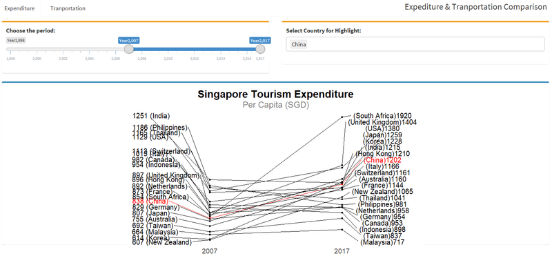
The slope-graph compares the change in expenditure of twenty countries at any two points from 2007 onwards. Users can select the two desired year on the slide bar and select the interested country to highlight to compare the absolute and relative change in expenditure levels over the two-time period. To create the slope-graph, we utilise the ggplot() and ggrepel() to prevent the overlapping of country labels to ensure results are legible. We have to melt the table from the initial top, to as shown in the bottom in figure 4. Thereafter we have to include the 3 columns “label_first”, “label_last” and “highlight” to bring out the results when users select them.
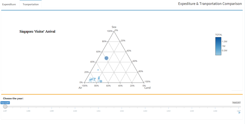
Ternary plot is selected as it is one of the most suitable charts to display data of 3 axis. Here we want to let users compare between the tourists’ arrival via land, air or sea. Users can hover their courser over the individual circles to show the selected country tourists’ arrival mode in percentage. Given Singapore’s geographical location, it is no surprise majority of the tourists land on the sunny island via air mode. An analysis of the travel pattern by these tourists may allow tour agencies to re-package their offers to attract the take up rate. European tourists that arrive via land or sea are likely to be regional tourists and agencies may adopt new methods to capture them.
Seasonality
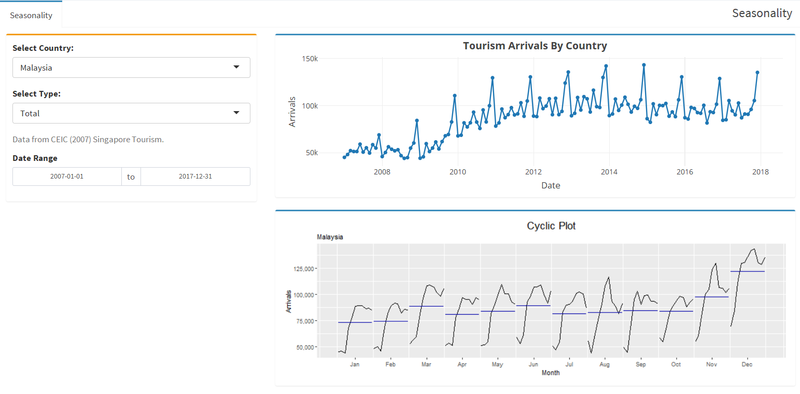
From the time series data, users can understand period cyclicity and seasonality in the travellers arrival rate. While the Dashboard does show the highest and lowest month of arrival, the seasonality provides a comprehensive view across all years. Users can also adjust the desired time frame to take a better look at the intended time frame. Furthermore, they can discern the dataset based on the mode of arrival should they notice any peculiarity or interesting patterns from the ternary plot diagrams. The time series line chart was constructed using plotly() and ggsubseriesplot().
Forecasting
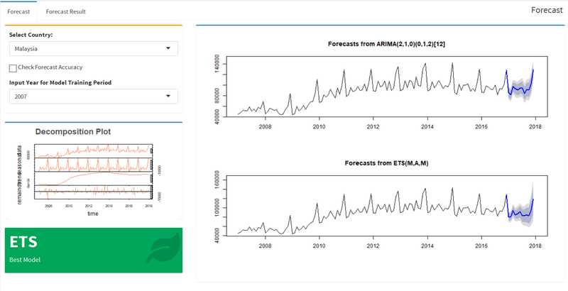
Our final interface aims to help users to look into the expected number of tourists’ arrivals in future so that they can develop strategies and measure to maximise the future tourism revenue generated. Having looked through a series of forecasting methodologies, we have narrowed down to Error, Trend, Seasonality (ETS) and Autoregressive Integrated Moving Average (ARIMA) as both methods factor seasonality.
ETS models are used for modelling how a single variable will change over time by identifying its underlying trends and not regarding any other variables. ETS models differ from a simple moving average by weighting the influence of previous points based on time interval between the two points. Over a longer time period, the greater the likelihood that some unmeasured condition has changed thus resulting in different behaviour of the variable that has been measured. As the tourism dataset has both trend and seasonality attributes, it is suitable to use ETS.
ARIMA is commonly used to utilized for fitting time series data and forecasting. It is a generalized version of ARMA (autoregressive moving average) process, where the ARMA process is applied for a differenced version of the data rather than original. Three constraints, p, d and q respectively, specify ARIMA model in the order of (p,d,q). The three constrains measure; p = order of autoregressive model, d = degree of differencing, counting the number of times data having past values subtracted and q, moving average models. With the arrival data in monthly format, we fixed the lag period to 12 to ensure analysis are carried out with an annual outlook.
To obtain best fit forecasts parameter from ETS and ARIMA models, we use the forecast package which contains ets() and auto.arima() functions to help us to selected the best parameters when applying these two kinds of models. Then we will take look at the statistical results of mean absolute scaled error (MASE) for Model Training and Testing procedure. In short, MASE is the comparison result between the mean absolute error between forecasted model against the naïve forecast (straight line projection).
Users can select the duration to be taken into account for forecasting from 2007 onwards to 2016. Actual 2017 results are retained separately for testing to see which forecast method is preferred depending on MASE results. Should users have a strong statistical background knowledge, they could select the Check Forecast Accuracy box to have the full model comparison statistics shown. We believe the odds of general users not having prior knowledge on forecasting techniques is higher. Thus, at the bottom left corner we have indicate the recommended forecasting method to use in the results tab.
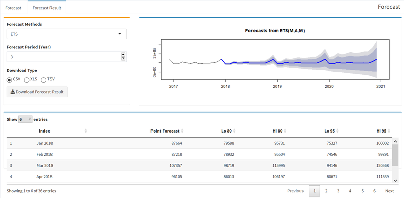
Having chosen the preferred forecast method as show in figure 7, user can now input the desired forecast period. The results can eventually be download onto excel so that user can utilise it to make further analysis, such as incorporating it with other relevant data and indicators such as gross domestic product.
Summary and Future Work
Our application allows users to have a detail explanatory, analysis and forecasting of the tourists’ expenditure and arrival data in Singapore. However, more insights could have been generated if we are able to obtain other relevant datasets such as breakdown of the various age groups, duration of stay, purpose of stay, type of expenditure and type of accommodation on a respective country. Currently these data are available on the aggregated level, i.e collectively of the entire visitors into Singapore. Should much data be made available, we can create an in-depth profiling on the various groups of visitors into Singapore and businesses will be able to conduct targeted marketing and offers to better incentivise tourists and travellers to spend more.
Acknowledgements
We would like to sincerely thank Professor Kam Tin Seong for his unwavering support and clear guidance to improve our application. The relevant changes would not have been possible if not for his recommendations and advice.
References
[1] Gabriel Martos. Cluster Analysis with R. Retrieved from https://rpubs.com/gabrielmartos/ Cluster Analysis
[2] Dr. Kam Tin Seong. Hands-on Exercise 4: Creating Ternary Plot with R. Retrieved from https://elearn.smu.edu.sg/d2l/le/content/219098/viewContent/1217926/View
[3] MPA 635: Data visualization. Retrieved from https://datavizf17.classes.andrewheiss.com/class/05-class/
[4] Ternary Plots in R with Plotly. Retrieved from https://xang1234.github.io/ternary/
[5 ]Rob J Hyndman and George Athanasopoulos. Monash University Australia. Forecasting: Principles and Practice. Retrieved from https://otexts.org/fpp2/
[6] Analysing Time Series Data. Retrieved from https://ourcodingclub.github.io/2017/04/26/time.html
[7] Riaz Khan, MS (Statistics) student, South Dakota State University. ARIMA model for forecasting– Example in R. Retrieved from https://rpubs.com/riazakhan94/arima_with_example
[8] Carson Sievert. plotly for R. Retrieved from https://plotly-book.cpsievert.me/index.html
[9] DataCamp. Data Visualization with ggplot2 (Part 3). Retrieved from https://www.datacamp.com/courses/data-visualization-with-ggplot2-part-3
[10] More Examples on Styling Cells, Rows, and Tables. Retrieved from https://rstudio.github.io/DT/010-style.html


