Difference between revisions of "NO.G.A.D.A"

From Visual Analytics for Business Intelligence
Jump to navigation Jump to search
m
Line 315: Line 315:
 
|-
 
|-
 
|
 
|
* Unfamiliarity of Visualization Technologies such as Tableau, D3.js etc.
+
* Unfamiliarity of Visualization Technologies such as Tableau, R etc.
 
||  
 
||  
  
* Attending Workshop on D3.js
+
* Attending Workshop on R
 
* Hands on Practice with different technologies.
 
* Hands on Practice with different technologies.
 
* Peer Learning.
 
* Peer Learning.

Revision as of 18:43, 14 October 2018


Team


Proposal


Poster


Application


Research Paper


PROBLEM


KTO.png

Over the years, the tourism sector has been an essential part of South Korea’s growth, with over 17 million of foreign tourists having reached Korea in 2016. Under the Ministry of Culture and Tourism of South Korea, the Korea Tourism Organisation (KTO) currently oversees and promotes Korea as a vibrant and popular tourism destination through various strategic assignments. By 2022, some of the goals that KTO aims to reach is to receive earnings of USD$ 25 billion to boost its national economy, attract over 350 thousands of tourism industry employees, and become the best public enterprise.

With in this mind, KTO is currently working to improve the quality of tourism experience of international visitors and maximize the economic contribution in the long term.


MOTIVATION


Our main motivation in this research is to address the lack of a convenient and comprehensive platform to study the correlations and trends amidst South Korea’s rapidly growing and developing tourism industry.

Currently, Korea Tourism Organization (KTO) provides market reports and basic info-graphics to analyze large amounts of complex data through the website and annual reports. Having mentioned KTO’s goals before, it is essential to further identify areas that need attention and further investment and clarify seasonal patterns of international visitors.

OBJECTIVES


Out of the many insights we can drive from the data set, we decided to focus on 3 main objectives. The objectives we hope to address through this project are as follows:

  1. Gain overall insight on the monthly visitor arrivals and seasonal trend to South Korea over the last 10 years.
  2. Identify popular tourism destinations in different regions of Korea and the yearly trend of the tourism destinations.
  3. Gain insights on the purpose of visit and other demographic information of the international visitors.


By taking a look at these three information about the tourism, we would be able to understand the influx of visitors, why they come along with the places they visit when they come. This would allow us and the users of the application to know what season is the most popular, what tourist attraction is popular in each province etc.

SELECTED DATASET


The Data Sets we will be using for our analysis and for our application is listed below:

Dataset/Source Data Attributes Rationale Of Usage
Visitor Arrivals Statistics

(2007 January - 2018 September)


(https://kto.visitkorea.or.kr/eng/tourismStatics/keyFacts/KoreaMonthlyStatistics.kto )


  • Month
  • Year
  • Country
  • Number of Visitor Arrivals


This dataset will be used to understand the number of visitors to South Korea from 2007 January to 2018 June. This will allow us to understand the inflow of visitors and see the trend (seasonal trend) of when the visitors come in.
International Visitor Survey

(2007 - 2018 )


(https://kto.visitkorea.or.kr/kor/notice/data/statis/tstatus.kto)
  • City
  • Tourist Attraction
  • Local/Foreigner
  • Date
  • No. of Visitors
  • Latitude
  • Longitude
This dataset will be used to understand the most popular tourist attraction in the different major cities in Korea. We will also be able to gain insights on the Number of visitors to each attraction and also if they are local and foreigner visitors which will allow us to see the difference between locals and foreigners.
Entry by nationality by age

(2007 - 2018)


(Click to View Data)
  • City
  • Age Range
  • Date
This data set will be used to understand the general demographic of international visitors coming to Korea from 2007 - 2018. We will be able to gain descriptive insights on the visitor demographics by Age Range.
Entry by nationality by Sex

(2007 - 2018)


(Click to View Data)
  • City
  • Sex
  • Date
This data set will be used to understand the general demographic of international visitors coming to Korea from 2007 - 2018. We will be able to gain descriptive insights on the visitor demographics by Gender.
Entry by nationality by Purpose

(2007 - 2018)


(Click to View Data)
  • City
  • Purpose of Visit
  • Date
This data set will be used to understand the general demographic of international visitors coming to Korea from 2007 - 2018. We will be able to gain descriptive insights on the visitor demographics by Purpose of Visit.

BACKGROUND SURVEY

Before we embarked on this project, we did some basic background research on this topic to see if there were any visualizations or dashboards we could drive inspirations from or make it better. Below are a few visuals we found:

Reference of Other Interactive Visualization Learning Point

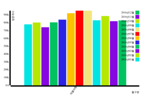
Title: Monthly Number of Individual Travelling Visitors (2016)

Example1.png

Source:https://www.data.go.kr/visual/content/577

  • Us

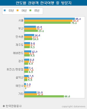
Title: Foreign tourists visiting Korea by 2015

Nogada.png

Source:http://m.datanews.co.kr/m/m_article.html?no=2995

  • City
  • Tourist Attraction
  • Local/Foreigner
  • Date
  • No. of Visitors
  • Latitude
  • Longitude

CONSIDERATION & VISUAL SELECTION

Below are a few visualizations and charts we considered making for our projects.

Visual Considerations Insights / Comments

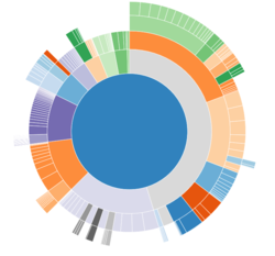
Title: Sunburst Diagram

Sunburst.png

Source:https://bl.ocks.org/mbostock/4348373

  • Pros:
    • Aims to show various sub-components of a particular category
    • Can drill down to multiple divisions to observe the distribution by percentages
    • May be useful to analyze tourism receipts by components and country
  • Cons:
    • Difficult to break down the huge number of markets
    • Does not provide a comprehensive time-series comparison

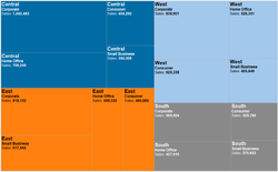
Title: Treemap

Treemap.png

Source:https://www.theinformationlab.co.uk/2015/02/10/show-treemaps/

  • Pros:
    • Effective visualisation to organise multivariate data by hierarchy
    • Able to analyse two measures on one chart (by colour and size), which makes it easier to see the correlation of two measures


  • Cons:
    • Requires ( can’t really provide THAT much information by itself)

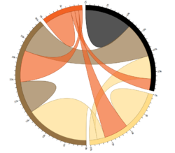
Title: Chord Diagram

Chord.png

Source:https://beta.observablehq.com/@mbostock/d3-chord-diagram

  • Pros:
    • Effective visualisation to organise multivariate data by hierarchy
    • Able to analyse two measures on one chart (by colour and size), which makes it easier to see the correlation of two measures


  • Cons:
    • Requires ( can’t really provide THAT much information by itself)

PROPOSED STORYBOARD

Below is the proposed story board for our project:

Storyboard Insights / Comments

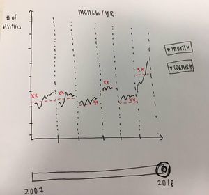
Title: Storyboard 1 - Seasonal Trend

Storyboard1Nogada.jpg
  • Aims to show the seasonal trend of yearly visitor arrivals by country and month.
  • There is a slider to select the year range and two dropdowns to analyse specific months and countries.

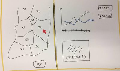
Title: Storyboard 2 - Tourist Attractions

Storyboard2Nogada.jpg
  • Aims to show the yearly / monthly trend in popular tourism destinations, filtered by year and month.
  • After selecting a region, the map will zoom in and display various tourism attractions within that region.
  • When the user hovers over a specific destination, there will be a time series graph of the local / foreigner arrivals as well as a picture of the destination.

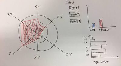
Title: Storyboard 3 - Demographic information

Storyboard3Nogada.jpg
  • Aims to provide demographic information and the purpose of arrival through a radar chart and bar charts.
  • Users can select the year/month and country from the dropdown list.

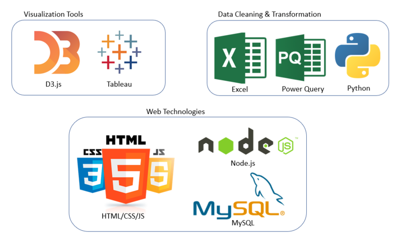
TECHNOLOGIES

The technologies we will be using for this Project is as below:

NogadaTech.png

CHALLENGES

Challenges Mitigation Plan
  • Unfamiliarity of Visualization Technologies such as Tableau, R etc.
  • Attending Workshop on R
  • Hands on Practice with different technologies.
  • Peer Learning.
  • Data Cleaning & Transformation from messy data.
  • Organize Meeting Sessions to meet and do data cleaning and transformation together.
  • Split the work between team members.
  • Python Scripting to find Top 10, Sort data and translate.
  • Integrating Relevant Data from Multiple Sources Proposed Solution.
  • Working together to decide on what data to extract or eliminate.
  • Trial and test for one set of data together before splitting the work.