Difference between revisions of "IS428 AY2018-19T1 Lau Zi Quan"
| (36 intermediate revisions by the same user not shown) | |||
| Line 2: | Line 2: | ||
<br/> | <br/> | ||
<!--PROBLEM AND MOTIVATION START--> | <!--PROBLEM AND MOTIVATION START--> | ||
| − | == Overview== | + | == <br/><div style="background: #2B547E; padding: 15px; font-weight: bold; line-height: 0.3em; text-indent: 15px;letter-spacing:-0.08em;font-size:20px"><font color=#fbfcfd face="Century Gothic">Overview</font></div> == |
Air pollution is an important risk factor for health in Europe and worldwide. A recent review of the global burden of disease showed that it is one of the top ten risk factors for health globally. Worldwide an estimated 7 million people died prematurely because of pollution; in the European Union (EU) 400,000 people suffer a premature death. The Organisation for Economic Cooperation and Development (OECD) predicts that in 2050 outdoor air pollution will be the top cause of environmentally related deaths worldwide. In addition, air pollution has also been classified as the leading environmental cause of cancer. | Air pollution is an important risk factor for health in Europe and worldwide. A recent review of the global burden of disease showed that it is one of the top ten risk factors for health globally. Worldwide an estimated 7 million people died prematurely because of pollution; in the European Union (EU) 400,000 people suffer a premature death. The Organisation for Economic Cooperation and Development (OECD) predicts that in 2050 outdoor air pollution will be the top cause of environmentally related deaths worldwide. In addition, air pollution has also been classified as the leading environmental cause of cancer. | ||
| Line 11: | Line 11: | ||
According to the WHO, 60 percent of the urban population in Bulgaria is exposed to dangerous (unhealthy) levels of particulate matter (PM10). | According to the WHO, 60 percent of the urban population in Bulgaria is exposed to dangerous (unhealthy) levels of particulate matter (PM10). | ||
| − | == Dataset Analysis & Transformation Process == | + | == <br/><div style="background: #2B547E; padding: 15px; font-weight: bold; line-height: 0.3em; text-indent: 15px;letter-spacing:-0.08em;font-size:20px"><font color=#fbfcfd face="Century Gothic">Dataset Analysis & Transformation Process</font></div> == |
<!--DATASET START--> | <!--DATASET START--> | ||
| − | |||
Four major data sets in zipped file format are provided. They can be download by click on this [https://storage.cloud.google.com/global-datathon-2018/sofia-air/air-sofia.zip link]. | Four major data sets in zipped file format are provided. They can be download by click on this [https://storage.cloud.google.com/global-datathon-2018/sofia-air/air-sofia.zip link]. | ||
* Official air quality measurements (5 stations in the city)(EEA Data.zip) – as per EU guidelines on air quality monitoring see the data description [https://drive.google.com/file/d/1v5yCL-LdriDwa65qXPbFL7b0tydylDlb/view HERE…] | * Official air quality measurements (5 stations in the city)(EEA Data.zip) – as per EU guidelines on air quality monitoring see the data description [https://drive.google.com/file/d/1v5yCL-LdriDwa65qXPbFL7b0tydylDlb/view HERE…] | ||
| − | * Citizen science air quality measurements (Air Tube.zip) , incl. temperature, humidity and pressure (many stations) and topography (gridded data). | + | * Citizen science air quality measurements (Air Tube.zip), incl. temperature, humidity and pressure (many stations) and topography (gridded data). |
* Meteorological measurements (1 station)(METEO-data.zip): Temperature; Humidity; Wind speed; Pressure; Rainfall; Visibility | * Meteorological measurements (1 station)(METEO-data.zip): Temperature; Humidity; Wind speed; Pressure; Rainfall; Visibility | ||
* Topography data (TOPO-DATA) | * Topography data (TOPO-DATA) | ||
| Line 49: | Line 48: | ||
# These sensors are deployed all over Bulgaria across the year 2017 to 2018. | # These sensors are deployed all over Bulgaria across the year 2017 to 2018. | ||
# Data from AirTube are expected to be noisy and requires cleaning and verification. | # Data from AirTube are expected to be noisy and requires cleaning and verification. | ||
| + | # P1 data is PM10 and P2 data is PM2.5 | ||
|- | |- | ||
| <center>METEO-data.zip</center> | | <center>METEO-data.zip</center> | ||
| Line 61: | Line 61: | ||
|} | |} | ||
<!--DATASET END--> | <!--DATASET END--> | ||
| + | <!--Transformation Process START--> | ||
| + | ==<br/><div style="background: #2B547E; padding: 15px; font-weight: bold; line-height: 0.3em; text-indent: 15px;letter-spacing:-0.08em;font-size:20px"><font color=#fbfcfd face="Century Gothic">Transformation Process</font></div>== | ||
| + | ''' Issue 1 : Merging of Data Set ''' | ||
| + | <br> | ||
| + | For EEA Data, there is a total of 28 csv file from different stations location in sofia across different years. In addition there a xlsx metadata which consists imporatant information like CommonName (Station Name) and Latitude and Longtitude of the station. In order to proceed with analysis, we need to merge all the data set together. | ||
| + | <br> | ||
| + | ''' Solution ''':<br> | ||
| + | ''' Method 1: Using Python Pandas''': <br> | ||
| + | I made use of python pandas read_csv function to load the data into dataframe in order to concatenate the data. After we concat the data, we can merge the data based on the StationEoICode to get more information on the stations. | ||
| + | [[File:MergeEEAPython.PNG|500px|center]]<br> | ||
| − | + | I used the same method to merged Air Tube Data for the year 2017 and 2018. | |
| + | By using this method, I can export the csv into a single file and load it into different analytics tool for visualization. Therefore I used this method over the next method, however eventually did not manage to use other visualisation tool <br> | ||
| + | ''' Method 2: Using Tableau Union Function''': <br> | ||
| + | Similarly, Tableau can merge the data together using the union features. Subsequently, we can inner join the data based on the StationEoICode. | ||
| + | [[File:TabMergeEEA2.PNG|500px|center]] | ||
| + | ''' Issue 2 : Geohashing for Airtube Data ''' | ||
| + | <br> | ||
| + | ''' Solution ''' : | ||
| + | I used python to convert the geohash to coordinates. I reference to python geohash2 library [https://github.com/DBarthe/geohash link]. | ||
| + | [[File:GeoHashDecoder.PNG|500px|center]]<br> | ||
| + | After I decode the geohash, I discover that there are noises in the process. There is a particular geohash "m-2105171" which is unable to be decode. I used this [http://geohash.co/ converter] to decode the geohash to obtain the latitude and longtitude. There are also a total of null values in the geohash data. In this case, I would probably be remove these 5 records as the geolocation is not located in Sofia or even near Bulgaria. | ||
| + | [[File:GeoHashError.png|500px|center]]<br> | ||
| − | + | ''' Issue 3 : Outlier/Noise in Airtube Dataset''' <br> | |
| + | During the Exploratory Data Analysis Process, I discovered extreme values in the dataset for certain measures. However, for Task 2, exploring outlier for Airtube Data is required. Thus this clean dataset is used after and before Task 2 to compare the results. | ||
| + | # Temperature: The lowest temperature in Bulgaria is -38.3 degrees Celsius and the highest is 45.2 degrees Celsius. In the Airtube Data, there are values as low as -400 and high as 70 degrees. Thus, these records could have erroneous data and need to be treated. | ||
| + | # Pressure: Pressure at sea level is 100 kpa,(100,000 Pa) and the higher the elevation, then the lower the pressure. Therefore it would be interesting if the pressure falls below 0 or higher that 200kpa. Pressure reduce by 1.2kpa for every 100 meters elevation. | ||
| + | # Humidity: Humidity is often measured in a relative scale from 0 to 100. Thus values like 1000 and -1000 could be type or noises. | ||
| − | + | ''' Solution ''': <br> | |
| + | # Temperature : I removed values for Temperatures that are > 50 degrees Celsius and < -50 degrees Celsius. That is about 25,068 records removed. | ||
| + | # Pressure: Remove > 50kpa and < 150 kpa | ||
| + | # Humidity: Remove the > 1000 and -1000 | ||
| − | + | ''' Issue 4 : Transforming Meteo Dataset''' <br> | |
| + | Meteo Data is collected from Sofia Airport. It contains data like wind speed, humidity, temperature and etc. The missing value is replaced with -9999. | ||
| + | However, in order for tableau to read the data, we need to transform the 3 columns of Year, Month and Day into one. | ||
| + | ''' Solution ''': <br> | ||
| + | I used python to concatenate the columns and export it. | ||
| + | <!--Transformation Process END--> | ||
| − | == | + | == <br/><div style="background: #2B547E; padding: 15px; font-weight: bold; line-height: 0.3em; text-indent: 15px;letter-spacing:-0.08em;font-size:20px"><font color=#fbfcfd face="Century Gothic">Task 1: Spatio-temporal Analysis of Official Air Quality</font></div> == |
| − | == Feedbacks == | + | Firstly, we are looking at only EEA Data from 2013 to 2018. By looking at the data as a whole, we identified that all stations have missing values from the period of 1 Jan 2017 to 28 November 2017. |
| + | <br> | ||
| + | [[File:OverallControlChart.PNG|center|500px]] | ||
| + | <br> | ||
| + | From this simple plot, we are able to identify that there is a pattern in the increase of the concentration of PM10. This means that there could be an interesting reason for the cause. Thus I decided to explore what is the current standards for PM10 to be considered unhealthy. Sofia City is located in Bulgaria, which is part of EU, thus I referenced to their standards of air quality from this [http://ec.europa.eu/environment/air/quality/standards.htm link]. From [https://en.wikipedia.org/wiki/Air_quality_index#Europe this link] we can further categorize the PM Air quality into different categories by on EU Air Quality Standards. Firstly 50μg/m3 measured daily is the limit for Bulgaria with a 35 exceedences each year. Thus we need to generate a graph that can clearly pinpoint on which day the concentration exceeds and when are the days where people in Sofia city can enjoy breathing healthy air. | ||
| + | |||
| + | [[File:ColorGroup.PNG|center|400px]] | ||
| + | |||
| + | I used the above categorization as my Color Scaling to visualize how a typical day in Sofia City looks like. | ||
| + | |||
| + | [[File:Heatmap PM10 Concentration.PNG|center|800px]] | ||
| + | |||
| + | By categorizing the concentration, we can identify that actually, Sofia City is facing a high level of concentration of PM10. Surprisingly, other than the spikes in January and December, Sofia City is also facing a high concentration of pollutant across the years except for June. | ||
| + | |||
| + | [[File:ControlChart.PNG|center|800px]] | ||
| + | |||
| + | Although Heatmap can highlight the seriousness of pollution Sofia is facing, but using Control Plot, we can use it to identify the underlying pattern and interesting insight from this graph. You can notice that every year during 24th December and between 18th to 24th January, there is a significant rise in the concentration of PM10 in Sofia. Could this be a coincidence or a reason behind this? I look up the [http://www.parliament.bg/en/24 national holidays] of Bulgaria and try to identify to see other Festive Seasons also have a significant rise other than Christmas Season, but in this case, there isn't. | ||
| + | |||
| + | I found out that this is due to their culture and custom. This is [https://www.novinite.com/articles/135151/Bulgaria+Celebrates+with+Christmas+Eve+Traditions article], people in Bulgaria celebrate Christmas Eve by following their tradition. Strict tradition demanded that a fire is built in the hearth, with enough wood to burn all night and into Christmas Day, to help with the new birth of the sun. Thus, we can actually see that the air pollutant rises over the night during those periods. It is kind of similar to how the Chinese celebrate the lunar festival by burning incense. | ||
| + | |||
| + | <center> ''' Putting the charts together ''' </center> | ||
| + | [[File:Task 1 Dashboard.png|center|800px]] | ||
| + | After building all the individual charts, I put together those charts which I deem that can tell the most story from and gather insights to build a dashboard. We can further split and identify the trend of each Official Station. | ||
| + | |||
| + | == <br/><div style="background: #2B547E; padding: 15px; font-weight: bold; line-height: 0.3em; text-indent: 15px;letter-spacing:-0.08em;font-size:20px"><font color=#fbfcfd face="Century Gothic">Task 2: Spatio-temporal Analysis of Citizen Science Air Quality Measurements</font></div> == | ||
| + | |||
| + | ''' Part 1 : ''' <hr> | ||
| + | ''' Sensor Coverage :''' <br> | ||
| + | In order to identify sensor coverage, we need to use a map to look at the location of each sensor and how many sensors are located in which area. This can be answered by looking at the distribution across Sofia map. | ||
| + | ''' Sensor Performace:'''<br> Sensor Performance can be identified by looking at the number of records collected at every hour. we will roughly identify the number of sensors we have and if there is no records or drop in the number of records, that would mean that it has unusual performance. | ||
| + | |||
| + | <center> '''2017 '''</center> | ||
| + | [[File:SensorDistribution2017.PNG|center|500px]] | ||
| + | <center> '''2018''' </center> | ||
| + | [[File:SensorDistribution2018.PNG|center|500px]] | ||
| + | <br> | ||
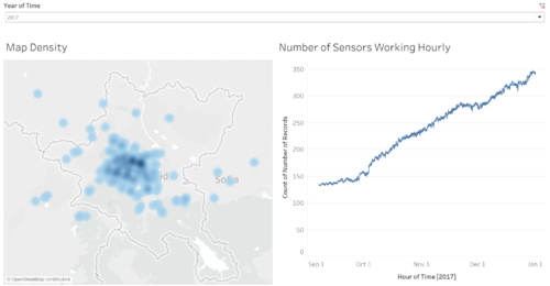
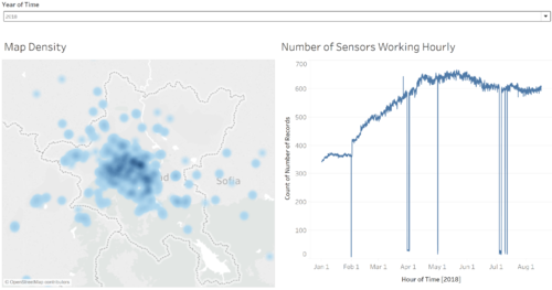
| + | We zoom in to the map of Sofia City to look at the distribution as AirTube sensor data is spread across from the whole Bulgaria. 2017 could be the start of the project, where sensors are deployed and crowdsource to gather the information. We see a steady growth in 2017 and more clustered in Sofia city and some of its outskirts. 2018 data points increases but we identified that there are some days where the sensors collected drastically drop to as low as only 6 readings. | ||
| + | |||
| + | |||
| + | ''' Sensor Operations : Unusual Behaviour (Detecting Outlier) '''<br> | ||
| + | Next detecting the unusual behaviour of the data collected. Sensors are collected on a voluntary basis so it is expected the data to be dirty and consist outliers. | ||
| + | Air Tube data consists of Humidity, Pressure, Temperature and Concentration (PM10 and PM2.5). Even the Geohash consist outlier, but we have cleared it earlier. | ||
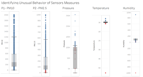
| + | The best way to calculate outlier and look at the distribution for numerical data is with a box plot. An outlier can be calculated based on 1.5 times of IQR higher than Q3 or lower than Q1. But in this case, the data are scientific data. This means that we first have to understand the nature of the measures like what does Pressures means and how much pressure on Earth is an acceptable value. For example, Pressure is acceptable for 100kpa at sea level. So if we have like 0kpa means the person is at very high altitude, would probably be located at the Stratosphere, 10km above sea level. I also look at the weather forcast to look at the normal temperature range in Bulgaria and Sofia City. We can give a high threshold as it might increase or degrees due global warmining, but in this case, our objective is to identify the outlier first. | ||
| + | |||
| + | <center> '''Min and Max Outlier Box Plot''' </center> | ||
| + | [[File:IdentifySensorUnusualBehaviour.PNG|center|500px]] | ||
| + | <br> | ||
| + | From this data, the blue data points are the maximum values recorded at each location, and red represent the minimum values recorded. For each measure we can determine the outliers clearly. | ||
| + | Firstly, the concentration of PM 10 and 2.5 is as high as 2000, that is way above the unhealthy and dangerous range of 300. | ||
| + | Secondly, pressure has extreme values of 0 to 300kpa. Next, humidity is way outside the 0-100 scale. Values of 5000 and -5000 could be missing values placeholder. | ||
| + | Lastly, Temperature collected is way below and above the highest temperature range of Bulgaria. | ||
| + | |||
| + | Therefore, I felt that there is a need to clean the data first before we proceed to use and visualise the data. | ||
| + | |||
| + | <center> '''Min and Max Outlier Box Plot (After) '''</center> | ||
| + | [[File:Cleaned Outlier.PNG|center|500px]] | ||
| + | |||
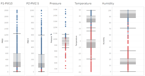
| + | From this, we can see that the values are more acceptable and at a realistic range. | ||
| + | |||
| + | ''' Part 2 : ''' <hr> | ||
| + | <center> '''Exploring Air Pollutant Concentrations and Spread'''</center> | ||
| + | |||
| + | Firstly, we use a Density Map to visualize the concentration of sensors and the readings. Next, we used a Quadrant Analysis for P1 and P2 which is the PM 10 and PM 2.5 pollutant average concentration to identify which are the location are always highly polluted. | ||
| + | |||
| + | <center> '''Montly Quadrant Analysis'''</center> | ||
| + | [[File:YearlyQuardrant.PNG|center|500px]] | ||
| + | <br> | ||
| + | From this chart, we can identify the areas that are always high polluted and follow the shift over the years. We also can identify areas that are highly concentrated on PM10 but not for PM 2.5 | ||
| + | |||
| + | <center> '''Montly Quadrant Analysis'''</center> | ||
| + | [[File:DecemberQuardrant NoFilter.PNG|center|500px]] | ||
| + | From the previous task, we identified that January and December have relative high pollutant, as such I choose to look further into data on December. | ||
| + | Although in this case, we only have 2017 December data, which also have lesser sensor data, we still can explore more on an hourly basis. | ||
| + | |||
| + | <center> '''December Quadrant Analysis'''</center> | ||
| + | [[File:DecemberQuardrant.PNG|center|500px]] | ||
| + | I filter and look at the city of Sofia and only the points in Sofia City. We can see that in the Quadrant Analysis, the data points are majority dark red, means it is highly polluted as a whole. | ||
| + | |||
| + | <center> '''Hourly Quadrant Analysis'''</center> | ||
| + | [[File:HourlyQuardrant.PNG|center|500px]] | ||
| + | Hourly data gives us an idea of how the concentration changes over time in a day. As we plot the hourly Quadrant Analysis and look at how different points moves I discover an interesting pattern, the points expand and contracts and shifts. Thus, I pick 2 different Time of the day and compare them side by side | ||
| + | |||
| + | <center> '''Compare Hourly Quadrant Analysis'''</center> | ||
| + | [[File:CompareHourly.png|center|500px]] | ||
| + | I take a data point of 10am in the morning and 6pm at night and compare them. You can see that the 10am one is less polluted than in 6pm. People can say that it maybe due to before work and after work. But this plot is not idea to visualize such pattern. As such, I made a change and used Cycle Plot to identify such pattern. | ||
| + | |||
| + | <center> '''Hourly Cycle Plot'''</center> | ||
| + | [[File:HourlyCyclePlot.PNG|center|500px]] | ||
| + | |||
| + | From this chart, you can clearly see that the Concentration of PM10 moves at as S shape pattern of Down Up Down Up Down Patter throughout the day for every month. The only difference you see is the increase across the different month, but still the pattern did not. Therefore there is something very interesting that is related to the increase of pollutant and its decrease. | ||
| + | |||
| + | == <br/><div style="background: #2B547E; padding: 15px; font-weight: bold; line-height: 0.3em; text-indent: 15px;letter-spacing:-0.08em;font-size:20px"><font color=#fbfcfd face="Century Gothic">Task 3: Air Quality Measure Analysis </font></div> == | ||
| + | Urban air pollution is a complex issue. There are many factors affecting the air quality of a city. Some of the possible causes are: | ||
| + | # Local energy sources. For example, according to Unmask My City, a global initiative by doctors, nurses, public health practitioners, and allied health professionals dedicated to improving air quality and reducing emissions in our cities, Bulgaria’s main sources of PM10, and fine particle pollution PM2.5 (particles 2.5 microns or smaller) are household burning of fossil fuels or biomass, and transport. | ||
| + | # Local meteorology such as temperature, pressure, rainfall, humidity, wind etc | ||
| + | # Local topography | ||
| + | # Complex interactions between local topography and meteorological characteristics. | ||
| + | # Transboundary pollution for example the haze that intruded into Singapore from our neighbours. | ||
| + | |||
| + | |||
| + | Therefore what I have explored earlier was the National Holiday and Culture of Bulgarians. | ||
| + | But there could be more underlying factor that may result or even aid in having a higher concentration of air pollutant. Therefore I used the Air Tube data to plot a correlation metrics for the measures against the pollutant measures. | ||
| + | |||
| + | <center> ''' Air Tube Correlation Metrics ''' </center> | ||
| + | [[File:CorrelationMetrix.PNG | center | 700px]] | ||
| + | |||
| + | Firstly, we are only concern on what makes Sofia City air unhealthy, so the color are group based on the air quality standards defined earlier. I created a trend like so that we can early identify if it is a positive or negative correlation or there is no correlation. | ||
| + | |||
| + | In this case, we look at the Red Trend Lines that the one we are interested in. | ||
| + | Humidity: This shows us that the higher the humidity, the lower the concentration because most of the healthy ranges values are clustered at the high humidity cluster. | ||
| + | Pressure: This shows us that there is no correlation. Generally, Pressure should be about the same, only changes where the altitude changes and moves, if the sensor remains at where is it or taken at sea level, then pressure could not affect anything. Tentatively, I am still unsure about this measures. | ||
| + | Temperature. When looking at the trend line of P1 and P2 in temperature, we do not get a strong correlation here, but only one trend line shows that the higher the temperature, then the higher the pollutant concentration. However, we know that correlation does not means causation. Whether is the pollutant causing the high temperature or the other way round, we do not know for sure. Therefore I used another chart to explore the relationship between the measures and the concentration. | ||
| + | |||
| + | <center> ''' Air Tube Tenary Chart ''' </center> | ||
| + | [[File:Tenary.PNG | center | 700px]] | ||
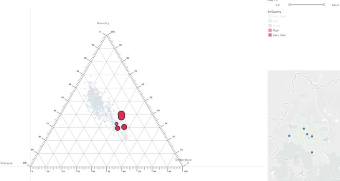
| + | Adopting what we learn in class, I decide to use a Tenary Plot to look at the relationship between Pressure, Humidity and Temperature. | ||
| + | From this, we know that all 3 measures are somehow important factor to have high pollutant concentration. | ||
| + | |||
| + | <center> ''' Air Tube Tenary Chart ''' </center> | ||
| + | [[File:FilterTenary.PNG | center | 700px]] | ||
| + | We can even select and highlight the points that are of High Concentration to look at the Geohash and Geolocation of what is the area that has the worst air quality. However, some of the points are clustered around in the city and also near to the airport. | ||
| + | |||
| + | <center> ''' Meteo Data Correlation Chart ''' </center> | ||
| + | [[File:MeteoDataCorrMetrix.PNG | center | 700px]] | ||
| + | Lastly, I decide to look at the Meteo data. The Meteo Data is collected in Sofia Airport according to the readme file. It contains data from 2013 to 2018 and what I did is that I aggregate the values in Air Tube Data and Merge it with the data of Meteo. I use the Average Value as my choice instead of Min and Max as I have to have a relative value to look at all the data as a whole. Average is sensitive to Outlier as compare to using Median. Min and Max is too risky to be used in this case as I do not what to include outlier which I did not manage to detect in my data. | ||
| + | |||
| + | Now let's interpret the metrics in Meteo data. Similarly to the previous Air Tube correlation metrics, I used the same Color Grouping for identifying Air Quality. | ||
| + | |||
| + | - DPAVG Daily average dew point temperature <br> | ||
| + | - PRCPAVG Daily average precipitation amount <br> | ||
| + | - RHAVG Daily average relative humidity <br> | ||
| + | - sfcWindAVG Daily average wind speed <br> | ||
| + | - TASAVG Daily average temperature <br> | ||
| + | |||
| + | We look at these data average on a daily basis because the Air Quality Standards are measured and compared daily. | ||
| + | Dew point temperature and temperature are highly correlated. | ||
| + | Temperature and Humidity are negatively correlated. This is means the hotter the weather the less humid it gets. | ||
| + | Wind Speed have no correlation with other values, but it is highly correlated to Humidity. Meaning that wind speed increase when humidity increase. This is highly due to weather. | ||
| + | |||
| + | == <br/><div style="background: #2B547E; padding: 15px; font-weight: bold; line-height: 0.3em; text-indent: 15px;letter-spacing:-0.08em;font-size:20px"><font color=#fbfcfd face="Century Gothic">Visualization Storyboard </font></div> == | ||
| + | |||
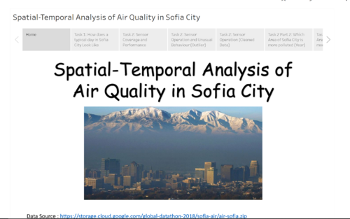
| + | https://public.tableau.com/views/Final_StoryBoard/Spatial-TemporalAnalysisofAirQualityinSofiaCity?:embed=y&:display_count=yes&publish=yes | ||
| + | |||
| + | [[File:StoryBoard.PNG | center | 500px]] | ||
| + | |||
| + | |||
| + | == <br/><div style="background: #2B547E; padding: 15px; font-weight: bold; line-height: 0.3em; text-indent: 15px;letter-spacing:-0.08em;font-size:20px"><font color=#fbfcfd face="Century Gothic">Conclusion </font></div> == | ||
| + | |||
| + | In conclusion, this dataset is very challenging and interesting. Firstly, we have to understand and have geographical knowledge. In order to make sense and understand the data, we need to read up and explore the domain or air pollutant and understand the different factors causing it. Next, we need to look up or have the data in order to use it to help us with the visualization. Without these, by looking at the data, it would be difficult to understand anything insightful from the visualization. | ||
| + | |||
| + | When tackling this challenge, I try to apply the knowledge taught in class and try to apply the concept to tackle this problem. I tried looking at many other different graphs and have different thought every time I build a graph. Some of the graph it looks very presentable, but there is no value I extract from the visualization, thus I scrape the ideas. Next, I have in mind is that if the graph telling the truth or hiding the truth from me? For example, Task 1 heatmap, when I first started to plot the map, it shows me that Sofia City has a low concentration on an average day. This contradicts with what we read online that Sofia is one of the most Polluted City in EU. This comes to my mind that I need to explore on the International Standards of measurements on air pollutant and how they measure the data. | ||
| + | |||
| + | Lastly, working on this assignment in a short time did not allow me to explore other tools. Given another opportunity, I would want to explore other Visualization Tools. | ||
| + | |||
| + | == <br/><div style="background: #2B547E; padding: 15px; font-weight: bold; line-height: 0.3em; text-indent: 15px;letter-spacing:-0.08em;font-size:20px"><font color=#fbfcfd face="Century Gothic">Reference</font></div> == | ||
| + | # IS428 2016-17 Term1 Assign3 Gwendoline Tan Wan Xin [https://wiki.smu.edu.sg/1617t1IS428g1/IS428_2016-17_Term1_Assign3_Gwendoline_Tan_Wan_Xin link] | ||
| + | # IS428 2016-17 Term1 Assign3 Tan Kee Hock [https://wiki.smu.edu.sg/1617t1IS428g1/IS428_2016-17_Term1_Assign3_Tan_Kee_Hock link] | ||
| + | # Datasciencesociety Monthly Challenge Sofia City By Jeremy [https://www.datasciencesociety.net/monthly-challenge-sofia-air-solution-jeremy-desir-weber/ link] | ||
| + | # Datasciencesociety Monthly Challenge Sofia City By MARTINPETROV [https://www.datasciencesociety.net/sofia-air-quality-eda-exploratory-data-analysis/ link] | ||
| + | # Neelesh Kamkolkar Tableau - Sofia Pollution Data Exploration [https://public.tableau.com/profile/neelesh.kamkolkar#!/vizhome/shared/6KHYBP228 link] | ||
| + | # Neelesh Kamkolkar Tableau - Sofia Official Pollution Data Story [https://public.tableau.com/profile/neelesh.kamkolkar#!/vizhome/shared/RSFXGYTFM link] | ||
| + | # Bulgaria Celebrates with Christmas Eve Traditions - [https://www.novinite.com/articles/135151/Bulgaria+Celebrates+with+Christmas+Eve+Traditions link] | ||
| + | # BULGARIAN OFFICIAL HOLIDAYS - [http://www.parliament.bg/en/24 link] | ||
| + | # EU Air Quality - [http://ec.europa.eu/environment/air/quality/standards.htm link] | ||
| + | # Air Quality Index - [https://en.wikipedia.org/wiki/Air_quality_index#Europe link] | ||
| + | |||
| + | == <br/><div style="background: #2B547E; padding: 15px; font-weight: bold; line-height: 0.3em; text-indent: 15px;letter-spacing:-0.08em;font-size:20px"><font color=#fbfcfd face="Century Gothic">Feedbacks </font></div> == | ||
| + | Please feel free to provide your feedback. Thank you. | ||
Latest revision as of 04:05, 12 November 2018
To be a Visual Detective
Contents
- 1 Overview
- 2 Dataset Analysis & Transformation Process
- 3 Transformation Process
- 4 Task 1: Spatio-temporal Analysis of Official Air Quality
- 5 Task 2: Spatio-temporal Analysis of Citizen Science Air Quality Measurements
- 6 Task 3: Air Quality Measure Analysis
- 7 Visualization Storyboard
- 8 Conclusion
- 9 Reference
- 10 Feedbacks
Overview
Air pollution is an important risk factor for health in Europe and worldwide. A recent review of the global burden of disease showed that it is one of the top ten risk factors for health globally. Worldwide an estimated 7 million people died prematurely because of pollution; in the European Union (EU) 400,000 people suffer a premature death. The Organisation for Economic Cooperation and Development (OECD) predicts that in 2050 outdoor air pollution will be the top cause of environmentally related deaths worldwide. In addition, air pollution has also been classified as the leading environmental cause of cancer.
Air quality in Bulgaria is a big concern: measurements show that citizens all over the country breathe in air that is considered harmful to health. For example, concentrations of PM2.5 and PM10 are much higher than what the EU and the World Health Organization (WHO) have set to protect health.
Bulgaria had the highest PM2.5 concentrations of all EU-28 member states in urban areas over a three-year average. For PM10, Bulgaria is also leading on the top polluted countries with 77 μg/m3on the daily mean concentration (EU limit value is 50 μg/m3).
According to the WHO, 60 percent of the urban population in Bulgaria is exposed to dangerous (unhealthy) levels of particulate matter (PM10).
Dataset Analysis & Transformation Process
Four major data sets in zipped file format are provided. They can be download by click on this link.
- Official air quality measurements (5 stations in the city)(EEA Data.zip) – as per EU guidelines on air quality monitoring see the data description HERE…
- Citizen science air quality measurements (Air Tube.zip), incl. temperature, humidity and pressure (many stations) and topography (gridded data).
- Meteorological measurements (1 station)(METEO-data.zip): Temperature; Humidity; Wind speed; Pressure; Rainfall; Visibility
- Topography data (TOPO-DATA)
| Dataset | Data Attributes | Rationale Of Usage |
|---|---|---|
| ||
| ||
|
Transformation Process
Issue 1 : Merging of Data Set
For EEA Data, there is a total of 28 csv file from different stations location in sofia across different years. In addition there a xlsx metadata which consists imporatant information like CommonName (Station Name) and Latitude and Longtitude of the station. In order to proceed with analysis, we need to merge all the data set together.
Solution :
Method 1: Using Python Pandas:
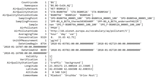
I made use of python pandas read_csv function to load the data into dataframe in order to concatenate the data. After we concat the data, we can merge the data based on the StationEoICode to get more information on the stations.
I used the same method to merged Air Tube Data for the year 2017 and 2018.
By using this method, I can export the csv into a single file and load it into different analytics tool for visualization. Therefore I used this method over the next method, however eventually did not manage to use other visualisation tool
Method 2: Using Tableau Union Function:
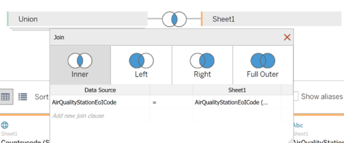
Similarly, Tableau can merge the data together using the union features. Subsequently, we can inner join the data based on the StationEoICode.
Issue 2 : Geohashing for Airtube Data
Solution :
I used python to convert the geohash to coordinates. I reference to python geohash2 library link.
After I decode the geohash, I discover that there are noises in the process. There is a particular geohash "m-2105171" which is unable to be decode. I used this converter to decode the geohash to obtain the latitude and longtitude. There are also a total of null values in the geohash data. In this case, I would probably be remove these 5 records as the geolocation is not located in Sofia or even near Bulgaria.
Issue 3 : Outlier/Noise in Airtube Dataset
During the Exploratory Data Analysis Process, I discovered extreme values in the dataset for certain measures. However, for Task 2, exploring outlier for Airtube Data is required. Thus this clean dataset is used after and before Task 2 to compare the results.
- Temperature: The lowest temperature in Bulgaria is -38.3 degrees Celsius and the highest is 45.2 degrees Celsius. In the Airtube Data, there are values as low as -400 and high as 70 degrees. Thus, these records could have erroneous data and need to be treated.
- Pressure: Pressure at sea level is 100 kpa,(100,000 Pa) and the higher the elevation, then the lower the pressure. Therefore it would be interesting if the pressure falls below 0 or higher that 200kpa. Pressure reduce by 1.2kpa for every 100 meters elevation.
- Humidity: Humidity is often measured in a relative scale from 0 to 100. Thus values like 1000 and -1000 could be type or noises.
Solution :
- Temperature : I removed values for Temperatures that are > 50 degrees Celsius and < -50 degrees Celsius. That is about 25,068 records removed.
- Pressure: Remove > 50kpa and < 150 kpa
- Humidity: Remove the > 1000 and -1000
Issue 4 : Transforming Meteo Dataset
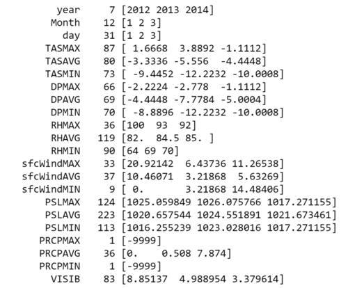
Meteo Data is collected from Sofia Airport. It contains data like wind speed, humidity, temperature and etc. The missing value is replaced with -9999.
However, in order for tableau to read the data, we need to transform the 3 columns of Year, Month and Day into one.
Solution :
I used python to concatenate the columns and export it.
Task 1: Spatio-temporal Analysis of Official Air Quality
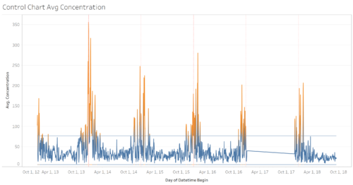
Firstly, we are looking at only EEA Data from 2013 to 2018. By looking at the data as a whole, we identified that all stations have missing values from the period of 1 Jan 2017 to 28 November 2017.
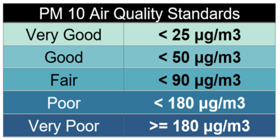
From this simple plot, we are able to identify that there is a pattern in the increase of the concentration of PM10. This means that there could be an interesting reason for the cause. Thus I decided to explore what is the current standards for PM10 to be considered unhealthy. Sofia City is located in Bulgaria, which is part of EU, thus I referenced to their standards of air quality from this link. From this link we can further categorize the PM Air quality into different categories by on EU Air Quality Standards. Firstly 50μg/m3 measured daily is the limit for Bulgaria with a 35 exceedences each year. Thus we need to generate a graph that can clearly pinpoint on which day the concentration exceeds and when are the days where people in Sofia city can enjoy breathing healthy air.
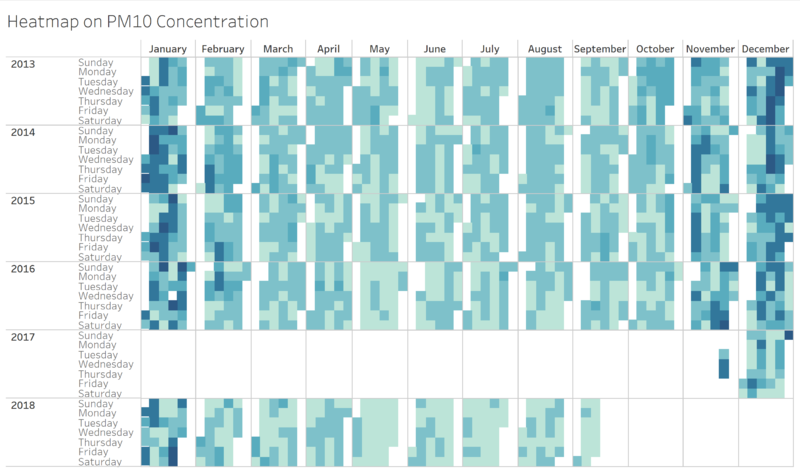
I used the above categorization as my Color Scaling to visualize how a typical day in Sofia City looks like.
By categorizing the concentration, we can identify that actually, Sofia City is facing a high level of concentration of PM10. Surprisingly, other than the spikes in January and December, Sofia City is also facing a high concentration of pollutant across the years except for June.
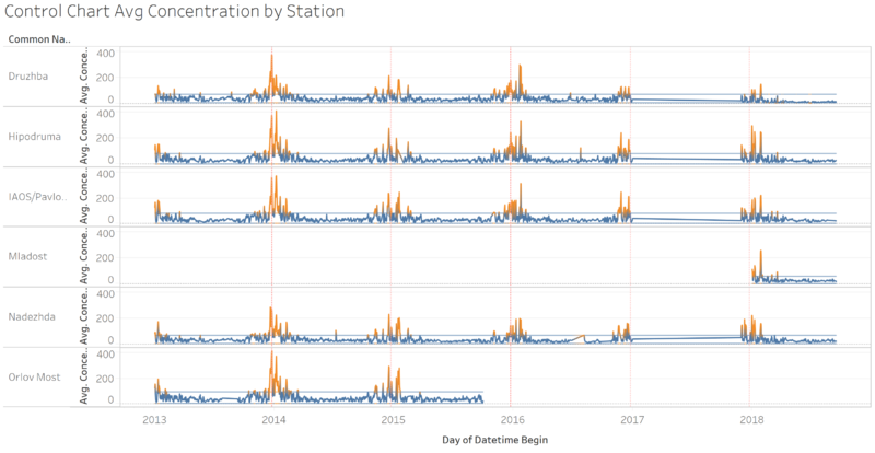
Although Heatmap can highlight the seriousness of pollution Sofia is facing, but using Control Plot, we can use it to identify the underlying pattern and interesting insight from this graph. You can notice that every year during 24th December and between 18th to 24th January, there is a significant rise in the concentration of PM10 in Sofia. Could this be a coincidence or a reason behind this? I look up the national holidays of Bulgaria and try to identify to see other Festive Seasons also have a significant rise other than Christmas Season, but in this case, there isn't.
I found out that this is due to their culture and custom. This is article, people in Bulgaria celebrate Christmas Eve by following their tradition. Strict tradition demanded that a fire is built in the hearth, with enough wood to burn all night and into Christmas Day, to help with the new birth of the sun. Thus, we can actually see that the air pollutant rises over the night during those periods. It is kind of similar to how the Chinese celebrate the lunar festival by burning incense.
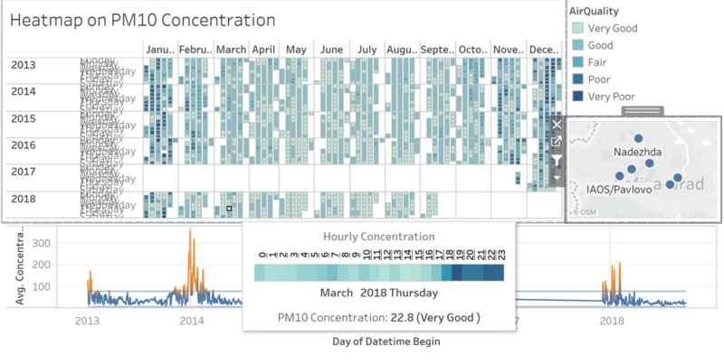
After building all the individual charts, I put together those charts which I deem that can tell the most story from and gather insights to build a dashboard. We can further split and identify the trend of each Official Station.
Task 2: Spatio-temporal Analysis of Citizen Science Air Quality Measurements
Part 1 :
Sensor Coverage :
In order to identify sensor coverage, we need to use a map to look at the location of each sensor and how many sensors are located in which area. This can be answered by looking at the distribution across Sofia map.
Sensor Performace:
Sensor Performance can be identified by looking at the number of records collected at every hour. we will roughly identify the number of sensors we have and if there is no records or drop in the number of records, that would mean that it has unusual performance.
We zoom in to the map of Sofia City to look at the distribution as AirTube sensor data is spread across from the whole Bulgaria. 2017 could be the start of the project, where sensors are deployed and crowdsource to gather the information. We see a steady growth in 2017 and more clustered in Sofia city and some of its outskirts. 2018 data points increases but we identified that there are some days where the sensors collected drastically drop to as low as only 6 readings.
Sensor Operations : Unusual Behaviour (Detecting Outlier)
Next detecting the unusual behaviour of the data collected. Sensors are collected on a voluntary basis so it is expected the data to be dirty and consist outliers.
Air Tube data consists of Humidity, Pressure, Temperature and Concentration (PM10 and PM2.5). Even the Geohash consist outlier, but we have cleared it earlier.
The best way to calculate outlier and look at the distribution for numerical data is with a box plot. An outlier can be calculated based on 1.5 times of IQR higher than Q3 or lower than Q1. But in this case, the data are scientific data. This means that we first have to understand the nature of the measures like what does Pressures means and how much pressure on Earth is an acceptable value. For example, Pressure is acceptable for 100kpa at sea level. So if we have like 0kpa means the person is at very high altitude, would probably be located at the Stratosphere, 10km above sea level. I also look at the weather forcast to look at the normal temperature range in Bulgaria and Sofia City. We can give a high threshold as it might increase or degrees due global warmining, but in this case, our objective is to identify the outlier first.
From this data, the blue data points are the maximum values recorded at each location, and red represent the minimum values recorded. For each measure we can determine the outliers clearly.
Firstly, the concentration of PM 10 and 2.5 is as high as 2000, that is way above the unhealthy and dangerous range of 300.
Secondly, pressure has extreme values of 0 to 300kpa. Next, humidity is way outside the 0-100 scale. Values of 5000 and -5000 could be missing values placeholder.
Lastly, Temperature collected is way below and above the highest temperature range of Bulgaria.
Therefore, I felt that there is a need to clean the data first before we proceed to use and visualise the data.
From this, we can see that the values are more acceptable and at a realistic range.
Part 2 :
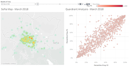
Firstly, we use a Density Map to visualize the concentration of sensors and the readings. Next, we used a Quadrant Analysis for P1 and P2 which is the PM 10 and PM 2.5 pollutant average concentration to identify which are the location are always highly polluted.
From this chart, we can identify the areas that are always high polluted and follow the shift over the years. We also can identify areas that are highly concentrated on PM10 but not for PM 2.5
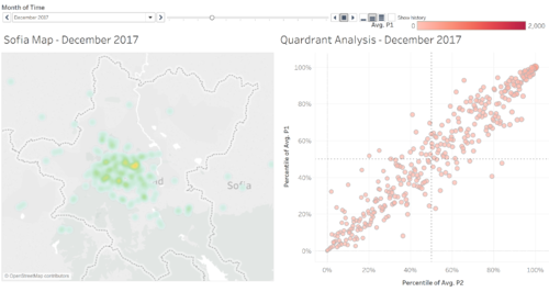
From the previous task, we identified that January and December have relative high pollutant, as such I choose to look further into data on December. Although in this case, we only have 2017 December data, which also have lesser sensor data, we still can explore more on an hourly basis.
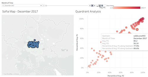
I filter and look at the city of Sofia and only the points in Sofia City. We can see that in the Quadrant Analysis, the data points are majority dark red, means it is highly polluted as a whole.
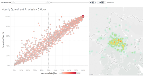
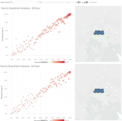
Hourly data gives us an idea of how the concentration changes over time in a day. As we plot the hourly Quadrant Analysis and look at how different points moves I discover an interesting pattern, the points expand and contracts and shifts. Thus, I pick 2 different Time of the day and compare them side by side
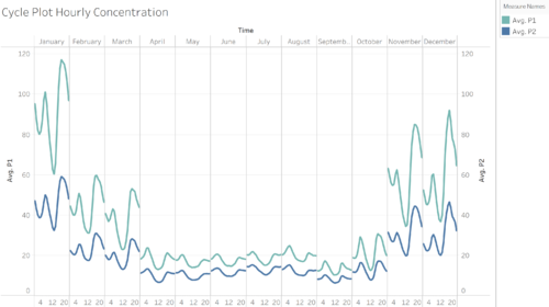
I take a data point of 10am in the morning and 6pm at night and compare them. You can see that the 10am one is less polluted than in 6pm. People can say that it maybe due to before work and after work. But this plot is not idea to visualize such pattern. As such, I made a change and used Cycle Plot to identify such pattern.
From this chart, you can clearly see that the Concentration of PM10 moves at as S shape pattern of Down Up Down Up Down Patter throughout the day for every month. The only difference you see is the increase across the different month, but still the pattern did not. Therefore there is something very interesting that is related to the increase of pollutant and its decrease.
Task 3: Air Quality Measure Analysis
Urban air pollution is a complex issue. There are many factors affecting the air quality of a city. Some of the possible causes are:
- Local energy sources. For example, according to Unmask My City, a global initiative by doctors, nurses, public health practitioners, and allied health professionals dedicated to improving air quality and reducing emissions in our cities, Bulgaria’s main sources of PM10, and fine particle pollution PM2.5 (particles 2.5 microns or smaller) are household burning of fossil fuels or biomass, and transport.
- Local meteorology such as temperature, pressure, rainfall, humidity, wind etc
- Local topography
- Complex interactions between local topography and meteorological characteristics.
- Transboundary pollution for example the haze that intruded into Singapore from our neighbours.
Therefore what I have explored earlier was the National Holiday and Culture of Bulgarians.
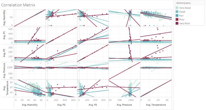
But there could be more underlying factor that may result or even aid in having a higher concentration of air pollutant. Therefore I used the Air Tube data to plot a correlation metrics for the measures against the pollutant measures.
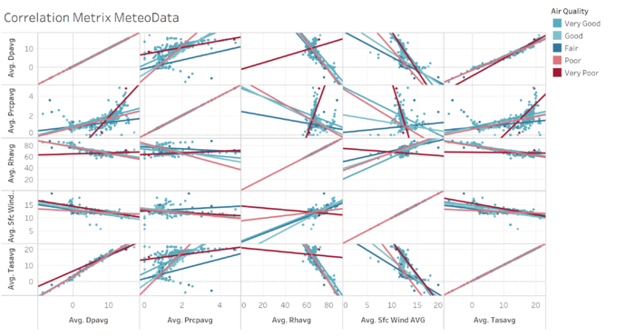
Firstly, we are only concern on what makes Sofia City air unhealthy, so the color are group based on the air quality standards defined earlier. I created a trend like so that we can early identify if it is a positive or negative correlation or there is no correlation.
In this case, we look at the Red Trend Lines that the one we are interested in. Humidity: This shows us that the higher the humidity, the lower the concentration because most of the healthy ranges values are clustered at the high humidity cluster. Pressure: This shows us that there is no correlation. Generally, Pressure should be about the same, only changes where the altitude changes and moves, if the sensor remains at where is it or taken at sea level, then pressure could not affect anything. Tentatively, I am still unsure about this measures. Temperature. When looking at the trend line of P1 and P2 in temperature, we do not get a strong correlation here, but only one trend line shows that the higher the temperature, then the higher the pollutant concentration. However, we know that correlation does not means causation. Whether is the pollutant causing the high temperature or the other way round, we do not know for sure. Therefore I used another chart to explore the relationship between the measures and the concentration.
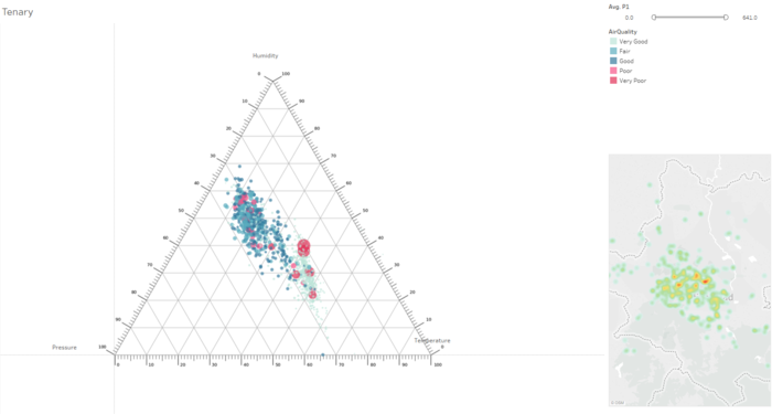
Adopting what we learn in class, I decide to use a Tenary Plot to look at the relationship between Pressure, Humidity and Temperature. From this, we know that all 3 measures are somehow important factor to have high pollutant concentration.
We can even select and highlight the points that are of High Concentration to look at the Geohash and Geolocation of what is the area that has the worst air quality. However, some of the points are clustered around in the city and also near to the airport.
Lastly, I decide to look at the Meteo data. The Meteo Data is collected in Sofia Airport according to the readme file. It contains data from 2013 to 2018 and what I did is that I aggregate the values in Air Tube Data and Merge it with the data of Meteo. I use the Average Value as my choice instead of Min and Max as I have to have a relative value to look at all the data as a whole. Average is sensitive to Outlier as compare to using Median. Min and Max is too risky to be used in this case as I do not what to include outlier which I did not manage to detect in my data.
Now let's interpret the metrics in Meteo data. Similarly to the previous Air Tube correlation metrics, I used the same Color Grouping for identifying Air Quality.
- DPAVG Daily average dew point temperature
- PRCPAVG Daily average precipitation amount
- RHAVG Daily average relative humidity
- sfcWindAVG Daily average wind speed
- TASAVG Daily average temperature
We look at these data average on a daily basis because the Air Quality Standards are measured and compared daily. Dew point temperature and temperature are highly correlated. Temperature and Humidity are negatively correlated. This is means the hotter the weather the less humid it gets. Wind Speed have no correlation with other values, but it is highly correlated to Humidity. Meaning that wind speed increase when humidity increase. This is highly due to weather.
Visualization Storyboard
Conclusion
In conclusion, this dataset is very challenging and interesting. Firstly, we have to understand and have geographical knowledge. In order to make sense and understand the data, we need to read up and explore the domain or air pollutant and understand the different factors causing it. Next, we need to look up or have the data in order to use it to help us with the visualization. Without these, by looking at the data, it would be difficult to understand anything insightful from the visualization.
When tackling this challenge, I try to apply the knowledge taught in class and try to apply the concept to tackle this problem. I tried looking at many other different graphs and have different thought every time I build a graph. Some of the graph it looks very presentable, but there is no value I extract from the visualization, thus I scrape the ideas. Next, I have in mind is that if the graph telling the truth or hiding the truth from me? For example, Task 1 heatmap, when I first started to plot the map, it shows me that Sofia City has a low concentration on an average day. This contradicts with what we read online that Sofia is one of the most Polluted City in EU. This comes to my mind that I need to explore on the International Standards of measurements on air pollutant and how they measure the data.
Lastly, working on this assignment in a short time did not allow me to explore other tools. Given another opportunity, I would want to explore other Visualization Tools.
Reference
- IS428 2016-17 Term1 Assign3 Gwendoline Tan Wan Xin link
- IS428 2016-17 Term1 Assign3 Tan Kee Hock link
- Datasciencesociety Monthly Challenge Sofia City By Jeremy link
- Datasciencesociety Monthly Challenge Sofia City By MARTINPETROV link
- Neelesh Kamkolkar Tableau - Sofia Pollution Data Exploration link
- Neelesh Kamkolkar Tableau - Sofia Official Pollution Data Story link
- Bulgaria Celebrates with Christmas Eve Traditions - link
- BULGARIAN OFFICIAL HOLIDAYS - link
- EU Air Quality - link
- Air Quality Index - link
Feedbacks
Please feel free to provide your feedback. Thank you.
