Difference between revisions of "IS428 AY2018-19T1 Lim Li Xuan"
| Line 9: | Line 9: | ||
==Data Cleaning (Step-By-Step)== | ==Data Cleaning (Step-By-Step)== | ||
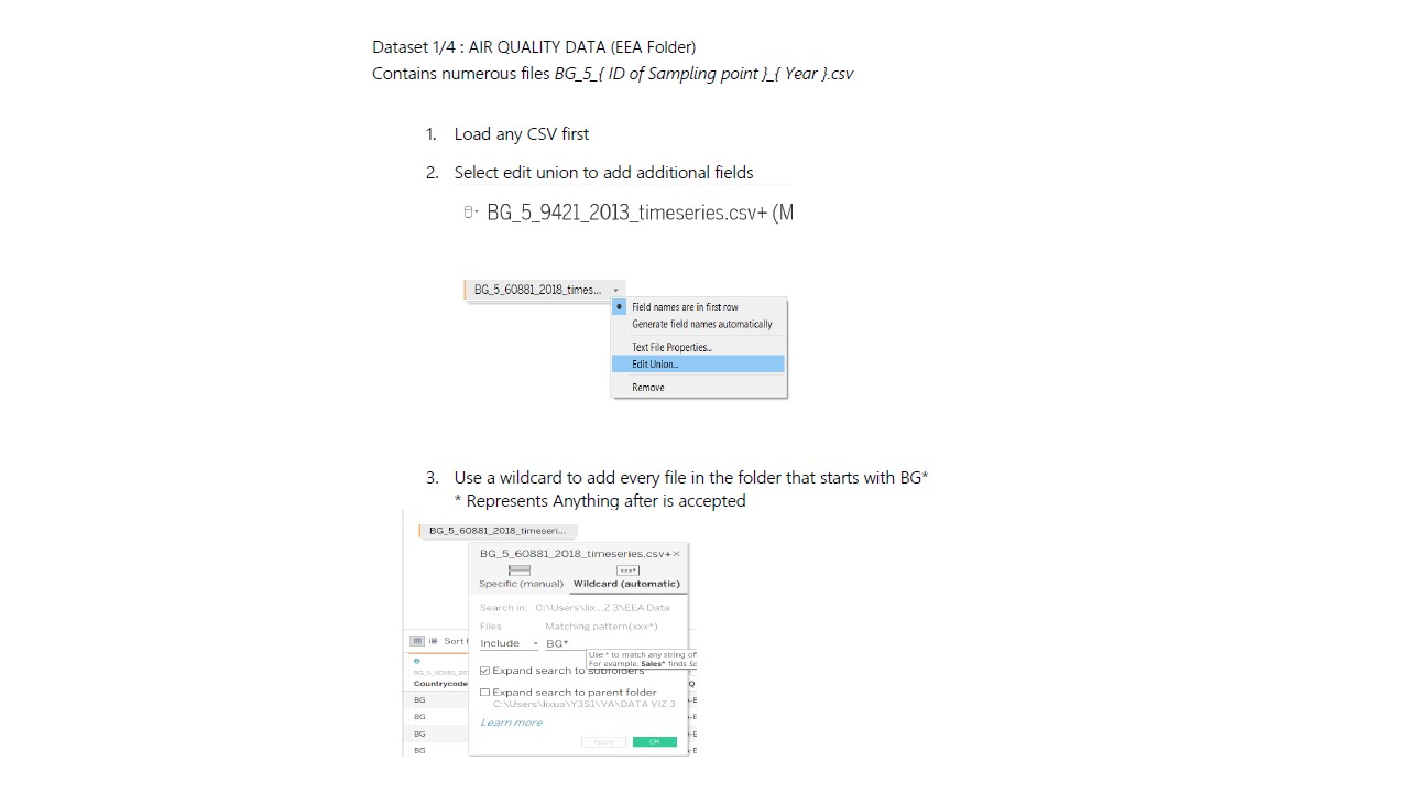
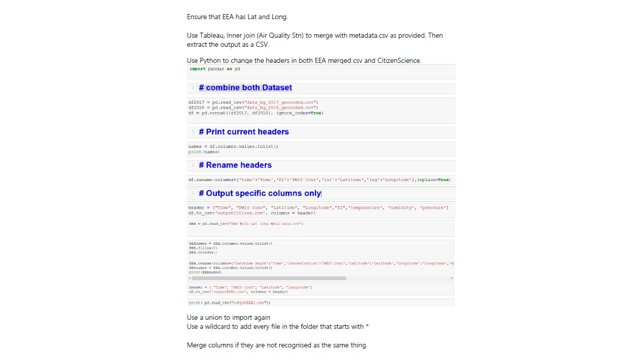
===Union EEA DataSets=== | ===Union EEA DataSets=== | ||
| − | [[File:Slide4.jpg|center | + | [[File:Slide4.jpg|center]] |
| − | [[File:Slide5.jpg|center | + | [[File:Slide5.jpg|center]] |
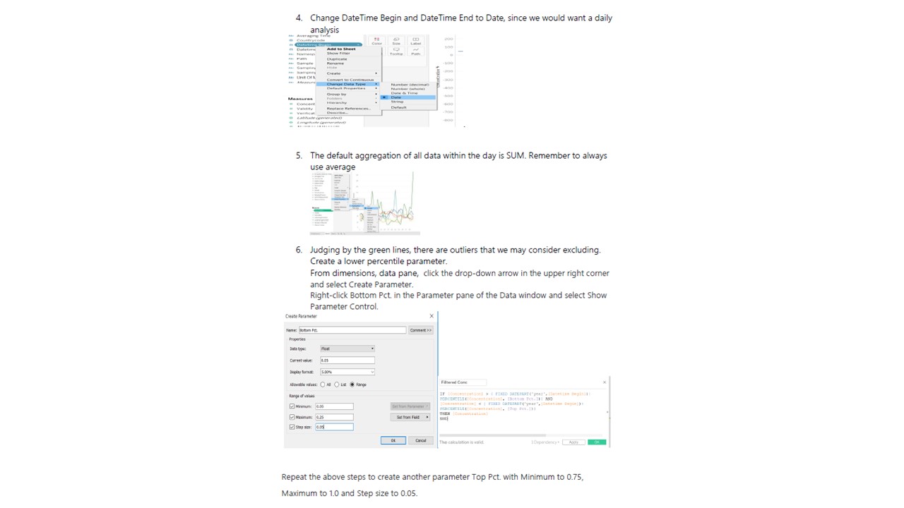
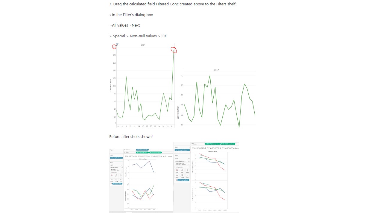
===Filter=== | ===Filter=== | ||
| − | [[File:Slide6.jpg|center | + | [[File:Slide6.jpg|center]] |
===Combining data with different headers=== | ===Combining data with different headers=== | ||
| − | [[File:Slide6r.jpg|center | + | [[File:Slide6r.jpg|center]] |
| − | [[File:Slide73.jpg|center | + | [[File:Slide73.jpg|center]] |
==Data Analysis== | ==Data Analysis== | ||
| Line 44: | Line 44: | ||
Overview of the PM10 Concentrations collected from the respective Air Quality Stations over the Months between 2013-2018. Once a point is clicked, it expands to 1A to show distribution over days. Then we can take a closer look into which parts of the month caused the overall surge. | Overview of the PM10 Concentrations collected from the respective Air Quality Stations over the Months between 2013-2018. Once a point is clicked, it expands to 1A to show distribution over days. Then we can take a closer look into which parts of the month caused the overall surge. | ||
| − | [[File:112mine.png|center | + | [[File:112mine.png|center]] |
===Highlight Table=== | ===Highlight Table=== | ||
1A. Highlight table shows the intensity for each station for the entire month. Using this table, we can tell which are the regions that are more polluted than the other, or if it as a common phenomenon across the city. | 1A. Highlight table shows the intensity for each station for the entire month. Using this table, we can tell which are the regions that are more polluted than the other, or if it as a common phenomenon across the city. | ||
| − | [[File:2sdfesf.png|center | + | [[File:2sdfesf.png|center]] |
==StoryBoard 2== | ==StoryBoard 2== | ||
| Line 58: | Line 58: | ||
* Min Max Average for the day | * Min Max Average for the day | ||
| − | [[File:332323.png|center | + | [[File:332323.png|center]] |
Hover over to see the readings across stations in a boxplot to represent variance. | Hover over to see the readings across stations in a boxplot to represent variance. | ||
==StoryBoard 3== | ==StoryBoard 3== | ||
===Dynamic comparison of Meteorology Data against Concentration using a Time Series=== | ===Dynamic comparison of Meteorology Data against Concentration using a Time Series=== | ||
| − | With our next DataSet, We can now look at Meteorological data. Does the PM10 Conc. | + | With our next DataSet, We can now look at Meteorological data. Does the PM10 Conc. Do patterns correlate with Meteorological Patterns? Could the environment be a cause of accumulation of PM10 particles, which results in high PM10 Conc. ? |
| − | [[File:4eweweq.png|center | + | [[File:4eweweq.png|center]] |
| − | [[File:5qwewqeqwe.png|center | + | [[File:5qwewqeqwe.png|center]] |
==StoryBoard 4== | ==StoryBoard 4== | ||
===Terrain Map & Density=== | ===Terrain Map & Density=== | ||
How can we better visualize the patterns of PM10 Conc Levels? Through research, considering that Sofia is largely bound by high valleys and that likely a contributing factor to its pollution. There is, therefore, a need for us to picture it on a terrain map to indicate elevated areas. On top of this, we can also use this pages function to run through months of PM10 Conc. on a density map so that we can quickly identify the PM10 Levels. Clicking on each point will bring you to the worksheet. | How can we better visualize the patterns of PM10 Conc Levels? Through research, considering that Sofia is largely bound by high valleys and that likely a contributing factor to its pollution. There is, therefore, a need for us to picture it on a terrain map to indicate elevated areas. On top of this, we can also use this pages function to run through months of PM10 Conc. on a density map so that we can quickly identify the PM10 Levels. Clicking on each point will bring you to the worksheet. | ||
| − | [[File:6eadw.png|center | + | [[File:6eadw.png|center]] |
This worksheet wraps up the 6 maps shown above as it shows the concentration patterns over months, regardless of year. This is useful to confirm the months that have the worst air quality. | This worksheet wraps up the 6 maps shown above as it shows the concentration patterns over months, regardless of year. This is useful to confirm the months that have the worst air quality. | ||
| − | [[File:Dewddew.png|center | + | [[File:Dewddew.png|center]] |
==Step By Step (After Cleaning)== | ==Step By Step (After Cleaning)== | ||
| Line 91: | Line 91: | ||
===StoryBoard 2A (Circular Chart for hourly data)=== | ===StoryBoard 2A (Circular Chart for hourly data)=== | ||
*Filter Year, Month, Day ( From EEA) Apply to worksheets 1B | *Filter Year, Month, Day ( From EEA) Apply to worksheets 1B | ||
| − | *In order to limit to 2 years only : If you only want 2017/2018: Duplicate EEA > Extract only 2017,2018 as database > Set Additional filter on worksheet > save | + | *In order to limit to 2 years only: If you only want 2017/2018: Duplicate EEA > Extract only 2017,2018 as database > Set an Additional filter on worksheet > save |
| − | [[File:LOL1ferf.png | + | [[File:LOL1ferf.png]] |
*Put them together in a dashboard | *Put them together in a dashboard | ||
| − | [[File:LOL2erferf.png | + | [[File:LOL2erferf.png]] |
*Marks Concentration | *Marks Concentration | ||
*Columns Year Month | *Columns Year Month | ||
| Line 127: | Line 127: | ||
===StoryBoard 4A=== | ===StoryBoard 4A=== | ||
*https://www.mapbox.com | *https://www.mapbox.com | ||
| − | [[File:LOL3SDC.png | + | [[File:LOL3SDC.png]] |
===StoryBoard 4B: Create Map with Pages + Density=== | ===StoryBoard 4B: Create Map with Pages + Density=== | ||
| Line 134: | Line 134: | ||
*Columns Lat | *Columns Lat | ||
*Rows Long | *Rows Long | ||
| − | *Place each map into the dashboard. > Show page controls > Synchronized. So that the selection of months in the year can be | + | *Place each map into the dashboard. > Show page controls > Synchronized. So that the selection of months in the year can be synchronized with one play button. |
https://kb.tableau.com/articles/howto/synchronize-sheets-on-a-dashboard-with-a-single-page-control | https://kb.tableau.com/articles/howto/synchronize-sheets-on-a-dashboard-with-a-single-page-control | ||
| Line 149: | Line 149: | ||
| − | == | + | ==Answering the Questions / Coming with Insights== |
| − | [[File: | + | =Task 1= |
| + | ===1A. Characterize the past and most recent situation with respect to air quality measures in Sofia City.=== | ||
| + | With Respect to PM10 Concentrations taken, the average of each year is as shown StoryBoard 1 | ||
| + | {| class="wikitable" | ||
| + | |- | ||
| + | ! 2013 (Daily)!! 2014 (Daily)!! 2015 (Daily)!! 2016 (Hourly)!! 2017 | ||
| + | (Hourly) !! 2018 (Hourly) | ||
| + | |- | ||
| + | | 44.42|| 46.19|| 41.07|| 41.09|| Omitted because of missing data for Months Jan to Oct. ||29.20 | ||
| + | |||
| + | |} | ||
| + | Comparing the PM10 Concentration of 2013 and 2018, there is a general decrease in PM10Concentration over the years. | ||
| + | |||
| + | The concentration of PM10 usually peaks at the start and ends of the year, during January, November, and December. This still holds true from 2013-2018, as shown in Story Board 1. | ||
| + | [[File:Pop1sdc.png]] | ||
| + | |||
| + | ===1B. What does a typical day look like for Sofia city? Do you see any trends of possible interest in this investigation?=== | ||
| + | |||
| + | Based on the hourly data [Storyboard 2], | ||
| + | On a typical day, concentration is of an average of about 40 across 2013-2018. The readings are never consistent throughout the day, with obvious peaks over the days | ||
| + | [[File:Poop12.png]] | ||
| + | On a typical day, hourly readings are pretty consistent such that the maximum point is not a suspected anomaly, but is also accompanied by several other points. One possible point for investigation would be | ||
| + | at the end of January 2018, where the readings are | ||
| + | [[File:Olololdsfsf.png]] | ||
| + | An interest of investigation would be what caused the rise in levels from 26 Jan and what happened after 10 AM ON 28 January to have caused the rapid decrease in concentration back to safe levels. However, the daily meteorological information is unable to provide further information on this. | ||
| + | |||
| + | ===1C. What anomalies do you find in the official air quality dataset?=== | ||
| + | *There were extreme values that were beyond the concentration of 300 in 2017, which was questionable, given the average was only around 40. After taking a closer look, multiple different stations took turns to hold the most extreme scores (beyond 300), on the 24 of January 2018. Between 12AM to 1AM. Hence, a variable Percentile filter is created to filter anomaly based on research to decide on the threshold we want to use for future predictions. | ||
| + | [[File:Pop1sdc.png|thumb]] | ||
| + | *Missing data in 2017 : excluded from [Visual 1: Analysis across years] to prevent additional bias to the dataset | ||
| + | *Air Quality STA-BG0079A and STA-BG0054A Had a lot of blanks. After researching, some of the Air Quality Stations closed down between 2013-2018. Removed to reduce inconsistencies and bias. For the rest of the stations, on some years and months, ===How do these affect your analysis of potential problems to the environment?=== | ||
| + | *Unable to plot a trend line spanning from 2016-2018 using hourly data. | ||
| + | *By not having full data of stations, I resorted to finding the average of each time bin. However, there may be inaccuracies in the averaged-data as some only had 1 data point. | ||
| + | =Task 2= | ||
| + | ===2A. Characterize the sensors’ coverage, performance and operation. Are they well distributed over the entire city? Are they all working properly at all times? Can you detect any unexpected behaviors of the sensors through analyzing the readings they capture? == | ||
| + | *Station Orlov Most has erratic readings that does not follow the norms. It may have been faulty. It eventually stopped service halfway thorugh 2015. Its geographis location is also such that it is being surrounded by other sensors, hence it does not make sense why it can have such different readings at times. | ||
| + | [[File:SDFSFWR.png]] | ||
| + | |||
| + | ===2B. Now turn your attention to the air pollution measurements themselves. Which part of the city shows relatively higher readings than others? Are these differences time dependent? Limit your response to no more than 6 images and 800 words.=== | ||
| + | *The temperatures might be Month Dependent / Temperature Dependent | ||
| + | Monthly Averaged readings ( From 2013-2018, Aggregated by average) | ||
| + | [[File:HEYO.png]] | ||
| + | Judging by this, the trend of concentration could be month dependent | ||
| + | [[File:HEYOR.png]] | ||
| + | Following the investigation into these months, the high concentration of pollution conincides with the periods when temperature is low. | ||
| + | [[File:HEYORR.png]] | ||
| + | |||
| + | ==Comments== | ||
| + | PHEW ! Please provide me your feedback. Thank you! | ||
Revision as of 00:44, 12 November 2018
IS428_2018-19_T1_Lim_Li_Xuan
Contents
- 1 Topic
- 2 Problem and Motivation
- 3 Data Cleaning (Step-By-Step)
- 4 Data Analysis
- 5 StoryBoard 1
- 6 StoryBoard 2
- 7 StoryBoard 3
- 8 StoryBoard 4
- 9 Step By Step (After Cleaning)
- 9.1 StoryBoard 1A (Time Series)
- 9.2 StoryBoard 1B (Highlight Table)
- 9.3 StoryBoard 2A (Circular Chart for hourly data)
- 9.4 StoryBoard 1B (BoxPlot)
- 9.5 StoryBoard 3A
- 9.6 StoryBoard 3B: All-Time Series
- 9.7 StoryBoard 3C: Cheat to select different views
- 9.8 StoryBoard 4A
- 9.9 StoryBoard 4B: Create Map with Pages + Density
- 9.10 StoryBoard 4C: Jan-Dec Analysis + Density
- 10 Answering the Questions / Coming with Insights
- 11 Task 1
- 11.1 1A. Characterize the past and most recent situation with respect to air quality measures in Sofia City.
- 11.2 1B. What does a typical day look like for Sofia city? Do you see any trends of possible interest in this investigation?
- 11.3 1C. What anomalies do you find in the official air quality dataset?
- 12 Task 2
Topic
Problem and Motivation
Data Cleaning (Step-By-Step)
Union EEA DataSets
Filter
Combining data with different headers
Data Analysis
EEAData
- Had hourly readings from 2017 onwards but daily from 2013-2016
- Had missing values from Jan – Nov 2017
- Station readings also had time gaps without data
- Latitude and Longitude can be created once joined with given metadata: Inner join on station name.
- Useful Fields: PM10, Lat, Long, Time, Stations
Airtube
- Only 2 years worth of data
- Possible Abnormalities due to citizen sensors and over the top readings
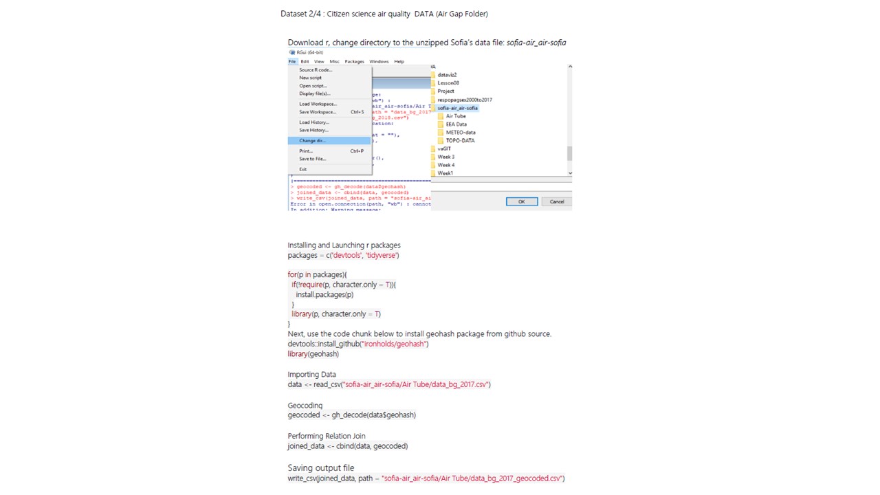
- Need to convert geohash to Lat Long
- Readings are not only within Sofia City but Bulgaria
METEO-DATA
- 1 Point in the country: Airport
- Useful Fields: Lat, Long, Time, Meteorological data [Dew Point Temperature, Precipitation Amount, Wind Speed, Humidity, Surface Pressure, Temperature, and Visibility]
- Elevation in meters
- Useful fields: Lat, Long, Elevation
- Can use Density Map
StoryBoard 1
Time Series
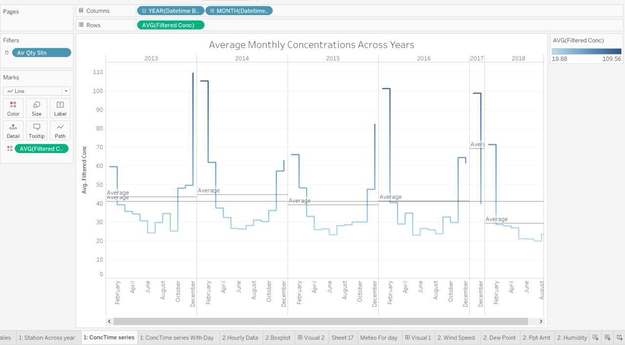
Overview of the PM10 Concentrations collected from the respective Air Quality Stations over the Months between 2013-2018. Once a point is clicked, it expands to 1A to show distribution over days. Then we can take a closer look into which parts of the month caused the overall surge.
Highlight Table
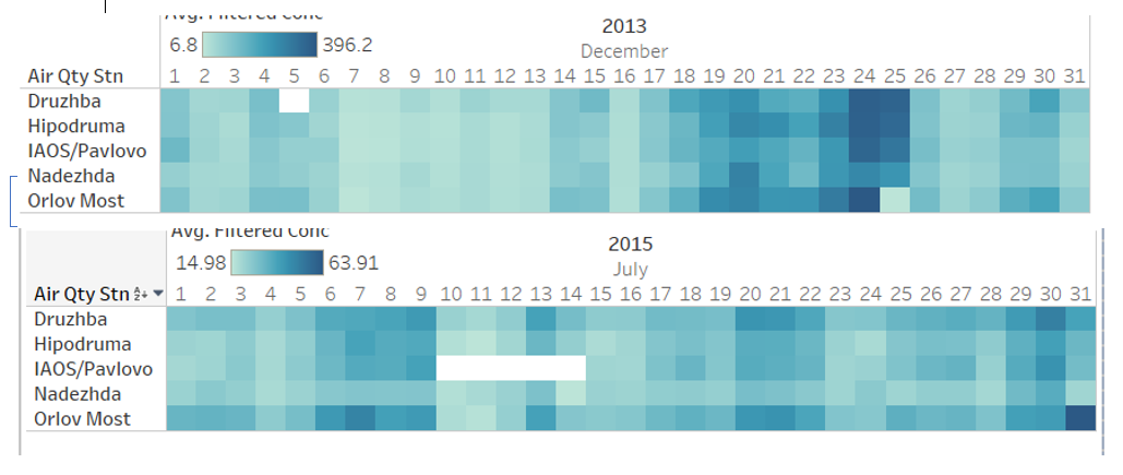
1A. Highlight table shows the intensity for each station for the entire month. Using this table, we can tell which are the regions that are more polluted than the other, or if it as a common phenomenon across the city.
StoryBoard 2
Time Series & Boxplot & Meteorology Data
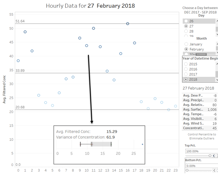
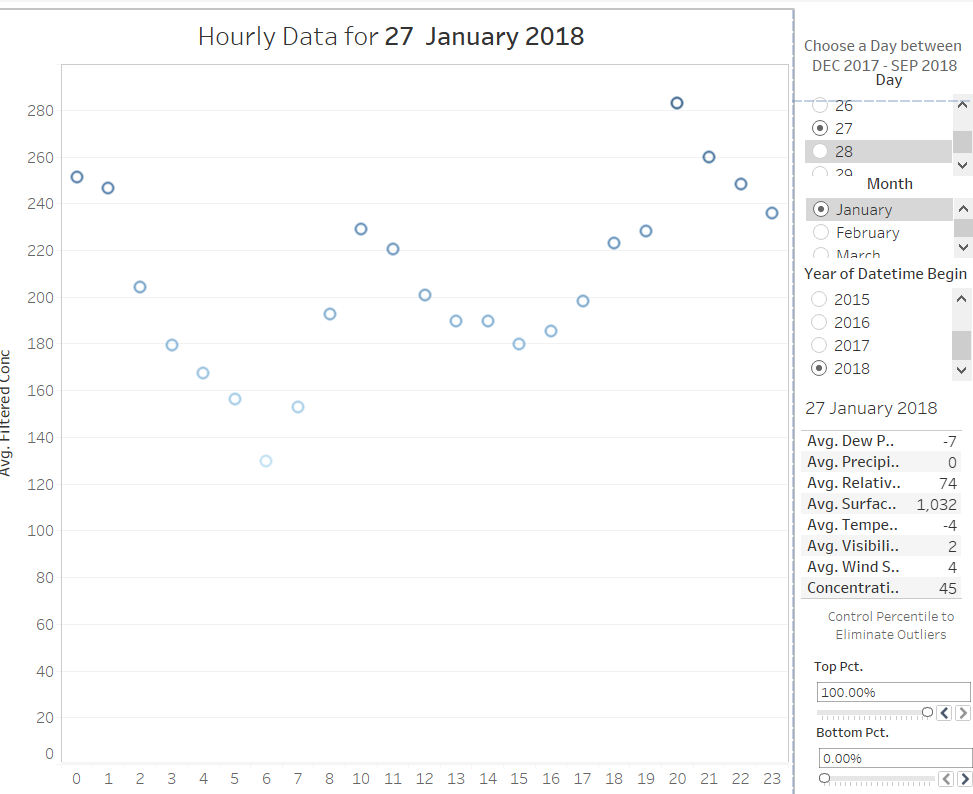
The second storyboard is separate from the first because it only has 1 year worth of data. After analyzing the trends across the years, months and days. We can now study the pattern across one day in Sofia City. On selecting a day, we can see the
- Boxplot of readings from each station with its variance.
- Meteo Data for the day
- Hourly readings
- Min Max Average for the day
Hover over to see the readings across stations in a boxplot to represent variance.
StoryBoard 3
Dynamic comparison of Meteorology Data against Concentration using a Time Series
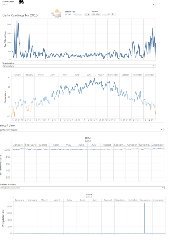
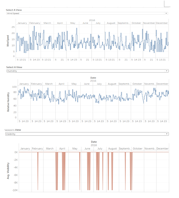
With our next DataSet, We can now look at Meteorological data. Does the PM10 Conc. Do patterns correlate with Meteorological Patterns? Could the environment be a cause of accumulation of PM10 particles, which results in high PM10 Conc. ?
StoryBoard 4
Terrain Map & Density
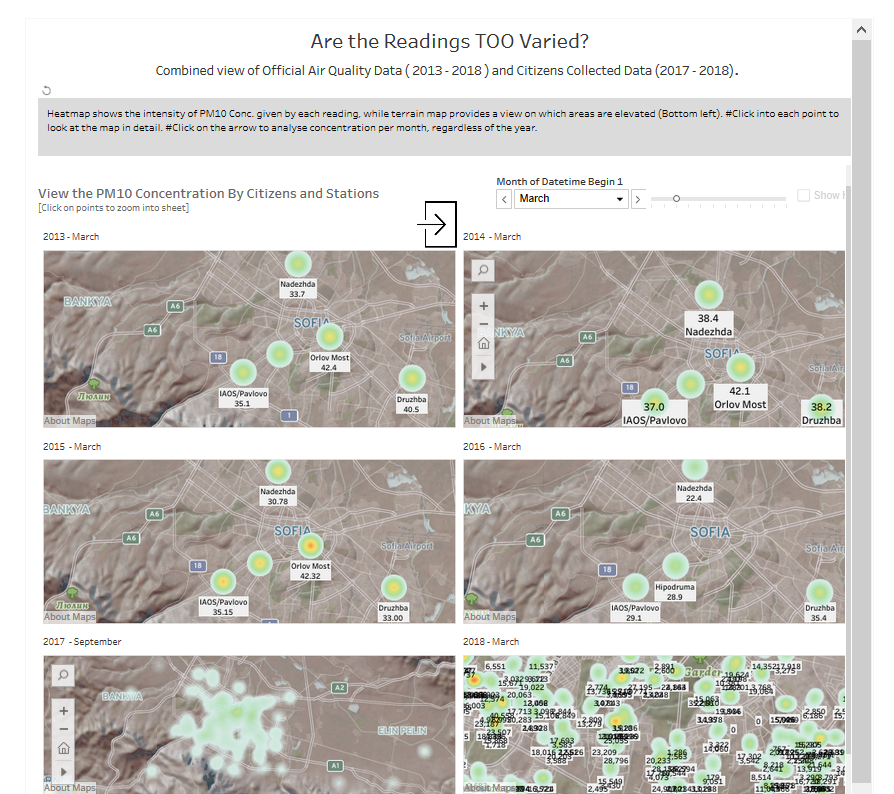
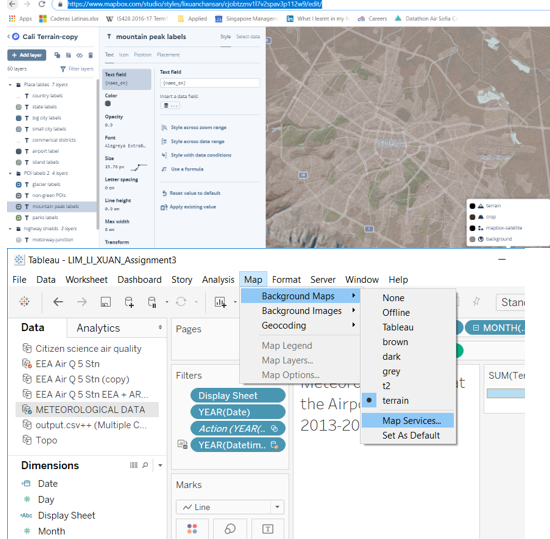
How can we better visualize the patterns of PM10 Conc Levels? Through research, considering that Sofia is largely bound by high valleys and that likely a contributing factor to its pollution. There is, therefore, a need for us to picture it on a terrain map to indicate elevated areas. On top of this, we can also use this pages function to run through months of PM10 Conc. on a density map so that we can quickly identify the PM10 Levels. Clicking on each point will bring you to the worksheet.
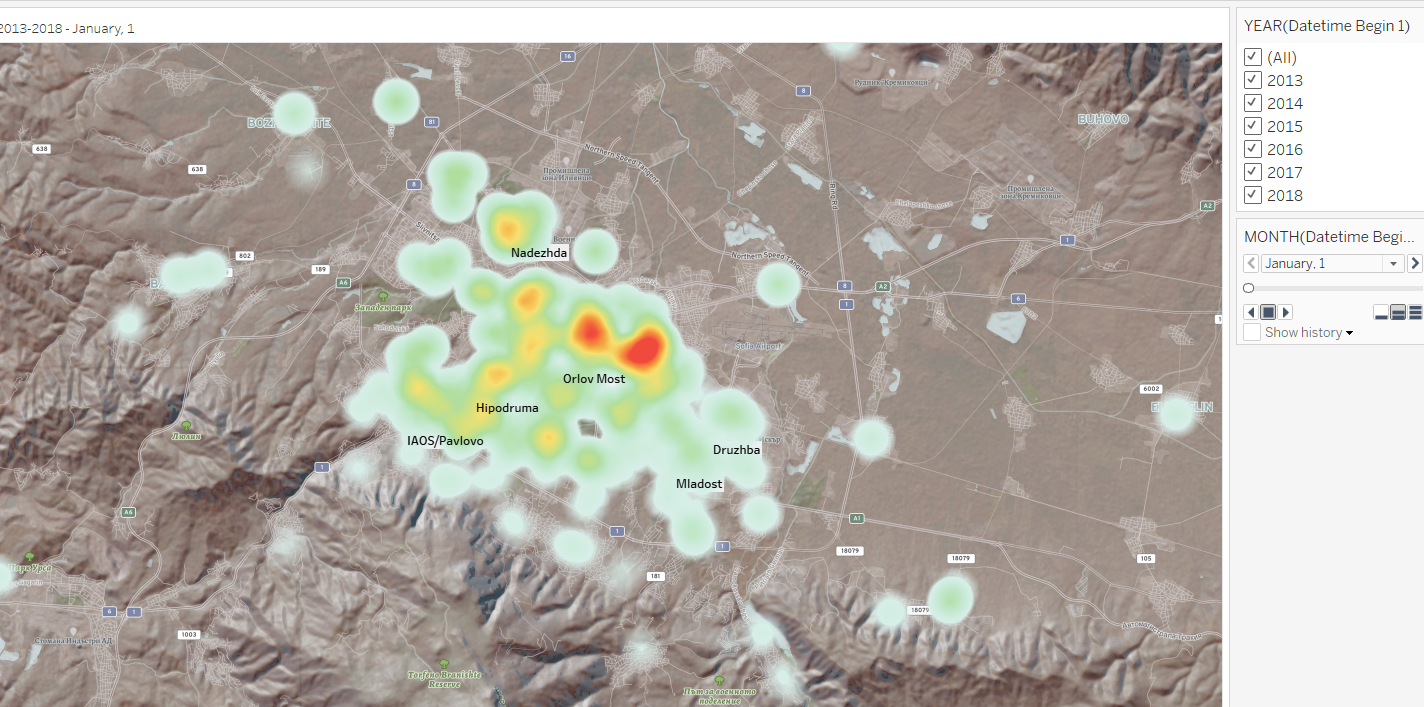
This worksheet wraps up the 6 maps shown above as it shows the concentration patterns over months, regardless of year. This is useful to confirm the months that have the worst air quality.
Step By Step (After Cleaning)
StoryBoard 1A (Time Series)
- Filter Year, Month,Day
- Marks Concentration
- Columns Year Month
- Rows Concentration
- Action On Select, All fields ( year, month, day) to target sheet IB
StoryBoard 1B (Highlight Table)
- Filter Year, Month, Day
- Marks Concentration
- Columns Year Month Day,
- Rows Air Qty Stn
StoryBoard 2A (Circular Chart for hourly data)
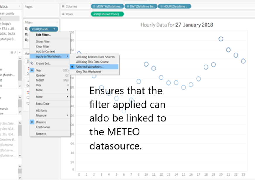
- Filter Year, Month, Day ( From EEA) Apply to worksheets 1B
- In order to limit to 2 years only: If you only want 2017/2018: Duplicate EEA > Extract only 2017,2018 as database > Set an Additional filter on worksheet > save
- Put them together in a dashboard
- Marks Concentration
- Columns Year Month
- Rows Concentration
- Action On Select, All fields ( year, month, day) to target sheet 2B
StoryBoard 1B (BoxPlot)
- Filter Year, Month, Day Automatically filtered
- Marks Air Quality Station
- Columns Concentration
- Rows Year
StoryBoard 3A
- Duplicate 1A's worksheet
- Filter Year, Month, Day
Affect Worksheets using the selected data source
- Marks Concentration
- Columns Year Month, Day
- Rows Concentration
- Action On Hover, filter Worksheets using Meteorological data by “Year” Field.
StoryBoard 3B: All-Time Series
- Filter Year, Month, Day
- Columns Year Month Day,
- Rows measure
StoryBoard 3C: Cheat to select different views
https://onlinehelp.tableau.com/current/pro/desktop/en-us/dashboards_sheet_selector.htm
- Create a parameter, then a dimension, custom add values and position all views overlapping each other in the dashboard. Eventually, the view will be filtered.
StoryBoard 4A
StoryBoard 4B: Create Map with Pages + Density
- Filter Pages, year, Month
- Set filter conc max to 700.
- Columns Lat
- Rows Long
- Place each map into the dashboard. > Show page controls > Synchronized. So that the selection of months in the year can be synchronized with one play button.
https://kb.tableau.com/articles/howto/synchronize-sheets-on-a-dashboard-with-a-single-page-control
StoryBoard 4C: Jan-Dec Analysis + Density
- Filter
- Pages All years
- Month
- Columns Lat
- Rows Long
Answering the Questions / Coming with Insights
Task 1
1A. Characterize the past and most recent situation with respect to air quality measures in Sofia City.
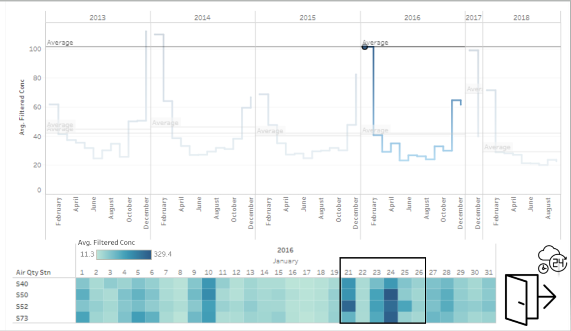
With Respect to PM10 Concentrations taken, the average of each year is as shown StoryBoard 1
| 2013 (Daily) | 2014 (Daily) | 2015 (Daily) | 2016 (Hourly) | 2017
(Hourly) !! 2018 (Hourly) | |
|---|---|---|---|---|---|
| 44.42 | 46.19 | 41.07 | 41.09 | Omitted because of missing data for Months Jan to Oct. | 29.20 |
Comparing the PM10 Concentration of 2013 and 2018, there is a general decrease in PM10Concentration over the years.
The concentration of PM10 usually peaks at the start and ends of the year, during January, November, and December. This still holds true from 2013-2018, as shown in Story Board 1.
1B. What does a typical day look like for Sofia city? Do you see any trends of possible interest in this investigation?
Based on the hourly data [Storyboard 2],
On a typical day, concentration is of an average of about 40 across 2013-2018. The readings are never consistent throughout the day, with obvious peaks over the days
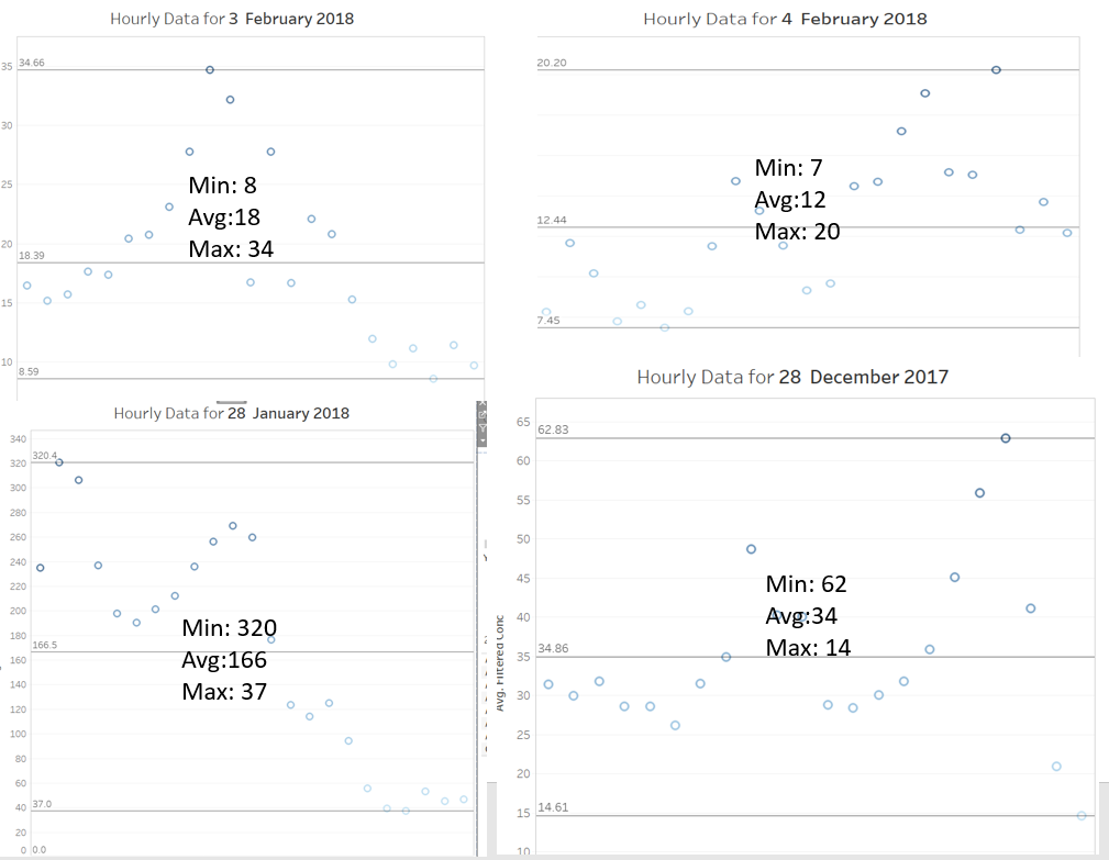 On a typical day, hourly readings are pretty consistent such that the maximum point is not a suspected anomaly, but is also accompanied by several other points. One possible point for investigation would be
at the end of January 2018, where the readings are
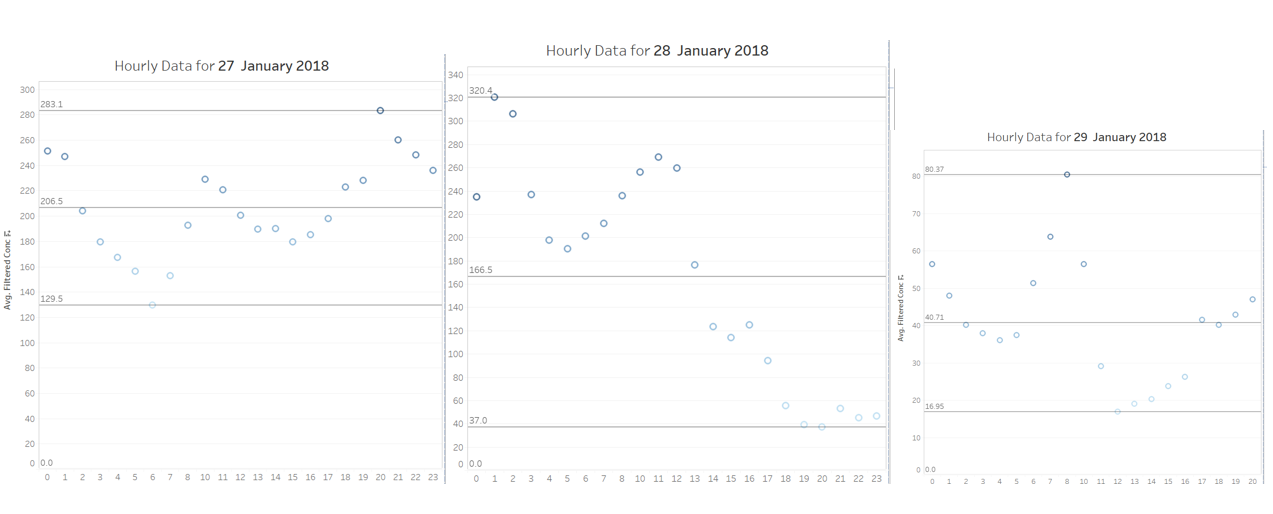 An interest of investigation would be what caused the rise in levels from 26 Jan and what happened after 10 AM ON 28 January to have caused the rapid decrease in concentration back to safe levels. However, the daily meteorological information is unable to provide further information on this.
1C. What anomalies do you find in the official air quality dataset?
- There were extreme values that were beyond the concentration of 300 in 2017, which was questionable, given the average was only around 40. After taking a closer look, multiple different stations took turns to hold the most extreme scores (beyond 300), on the 24 of January 2018. Between 12AM to 1AM. Hence, a variable Percentile filter is created to filter anomaly based on research to decide on the threshold we want to use for future predictions.
- Missing data in 2017 : excluded from [Visual 1: Analysis across years] to prevent additional bias to the dataset
- Air Quality STA-BG0079A and STA-BG0054A Had a lot of blanks. After researching, some of the Air Quality Stations closed down between 2013-2018. Removed to reduce inconsistencies and bias. For the rest of the stations, on some years and months, ===How do these affect your analysis of potential problems to the environment?===
- Unable to plot a trend line spanning from 2016-2018 using hourly data.
- By not having full data of stations, I resorted to finding the average of each time bin. However, there may be inaccuracies in the averaged-data as some only had 1 data point.
Task 2
=2A. Characterize the sensors’ coverage, performance and operation. Are they well distributed over the entire city? Are they all working properly at all times? Can you detect any unexpected behaviors of the sensors through analyzing the readings they capture?
- Station Orlov Most has erratic readings that does not follow the norms. It may have been faulty. It eventually stopped service halfway thorugh 2015. Its geographis location is also such that it is being surrounded by other sensors, hence it does not make sense why it can have such different readings at times.
2B. Now turn your attention to the air pollution measurements themselves. Which part of the city shows relatively higher readings than others? Are these differences time dependent? Limit your response to no more than 6 images and 800 words.
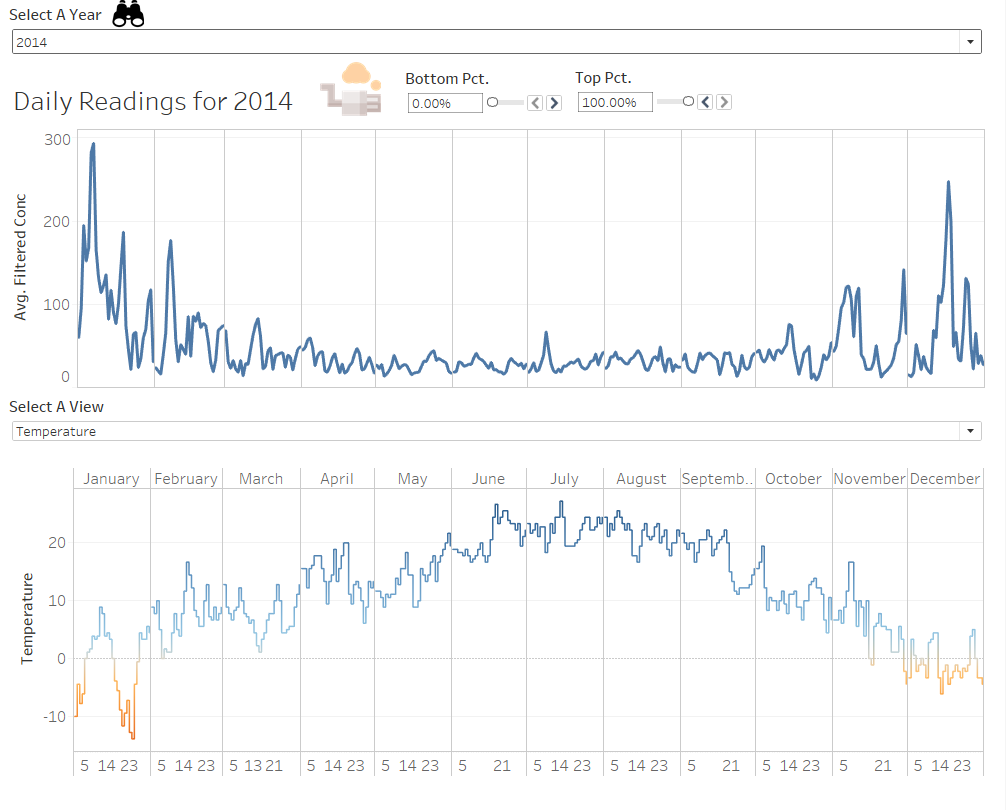
- The temperatures might be Month Dependent / Temperature Dependent
Monthly Averaged readings ( From 2013-2018, Aggregated by average)
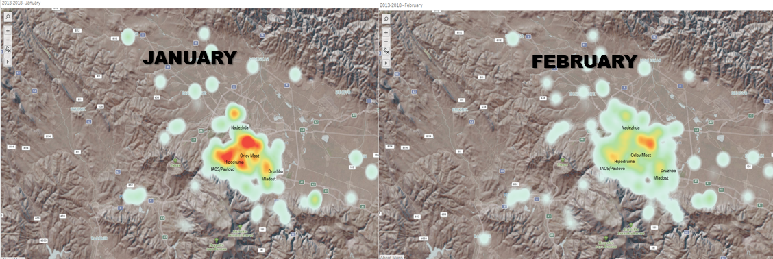 Judging by this, the trend of concentration could be month dependent
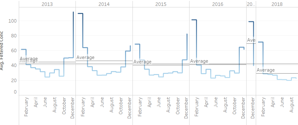 Following the investigation into these months, the high concentration of pollution conincides with the periods when temperature is low.
Comments
PHEW ! Please provide me your feedback. Thank you!


