User:Lixuan.lim.2016
IS428_2018-19_T1_Lim_Li_Xuan
Contents
Topic
Problem and Motivation
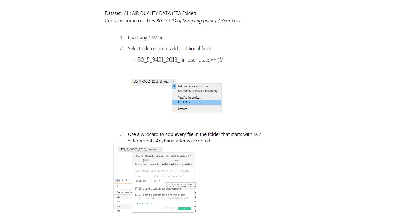
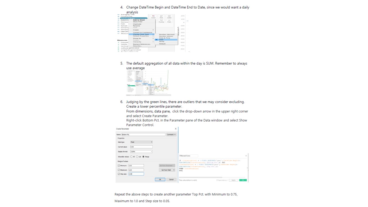
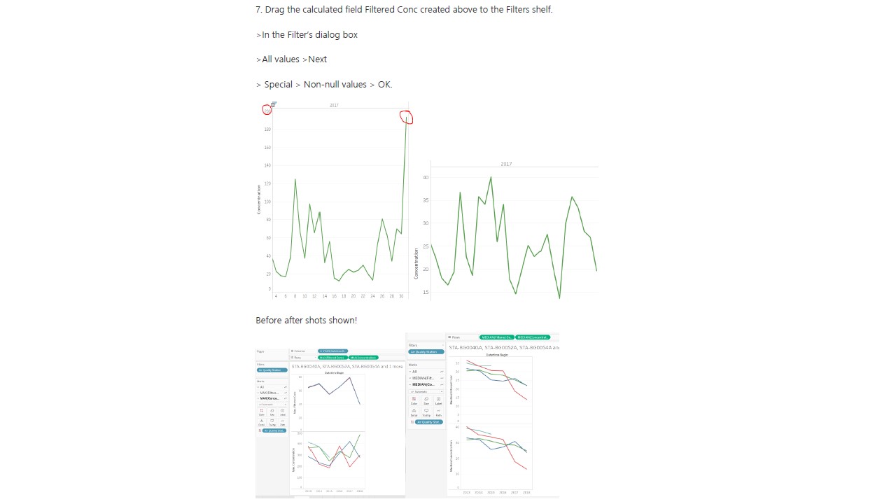
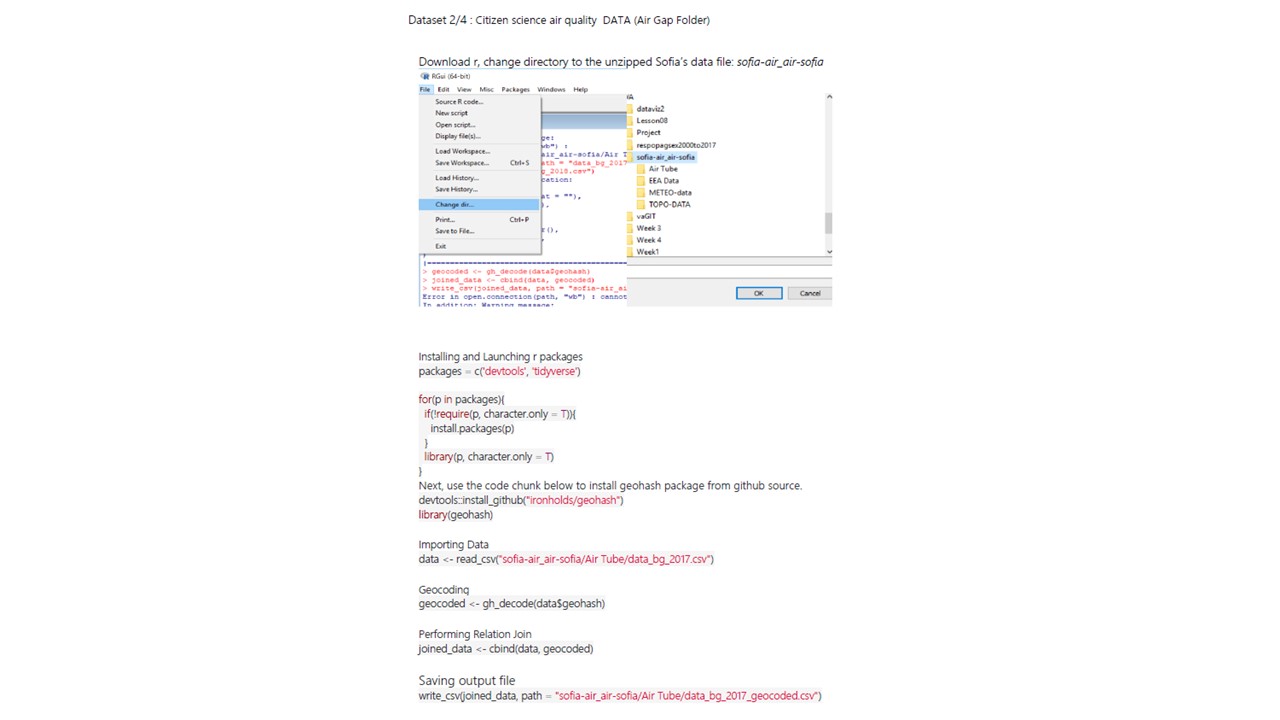
Data Cleaning (Step-By-Step)
Data Analysis
1. EEAData
- Had hourly readings from 2017 onwards but daily from 2013-2016
- Had missing values from Jan – Nov 2017
- Station readings also had time gaps without data
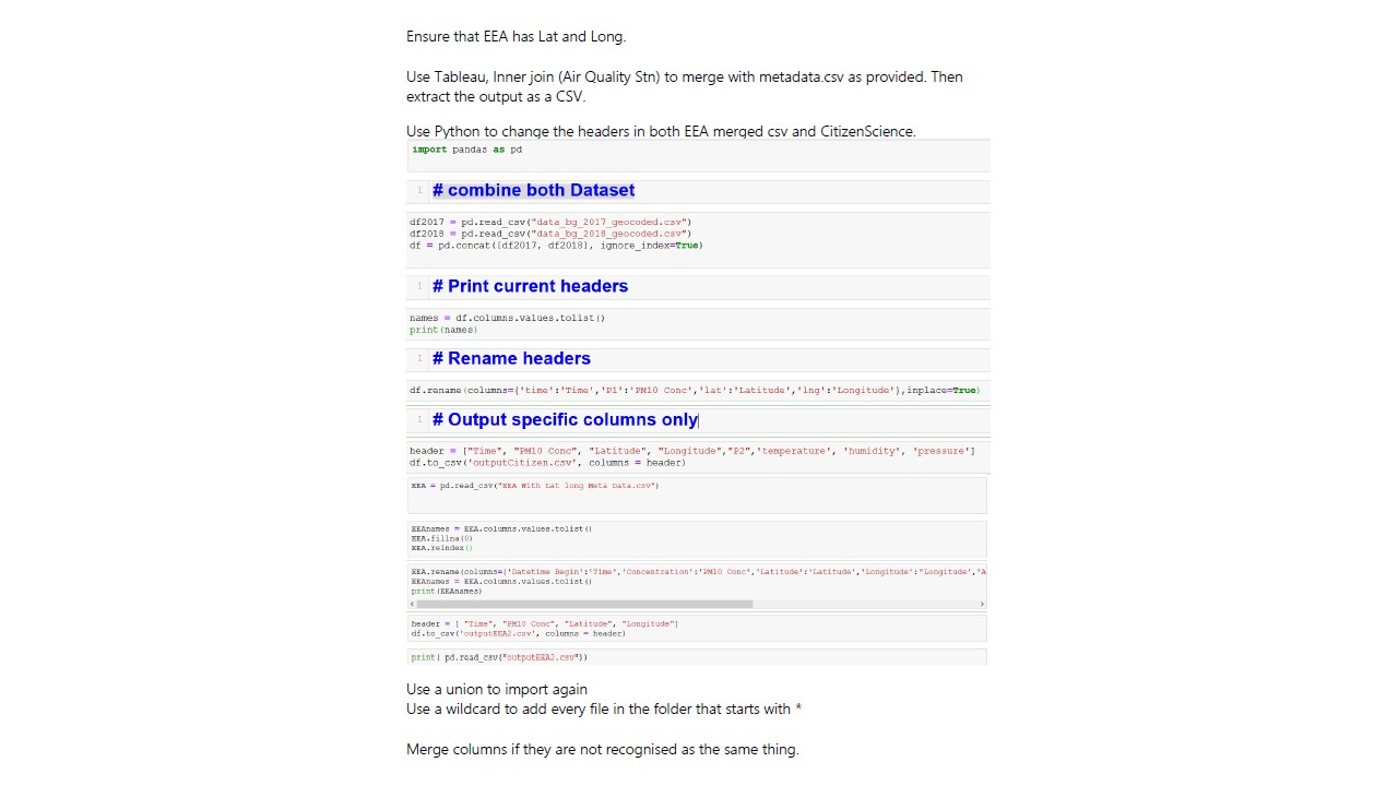
- Latitude and Longitude can be created once joined with given metadata: Inner join on station name.
- Useful Fields: PM10, Lat, Long, Time, Stations
2. Airtube
- Only 2 years worth of data
- Possible Abnormalities due to citizen sensors and over the top readings
- Need to convert geohash to Lat Long
- Readings are not only within Sofia City but Bulgaria
3. METEO-DATA
- 1 Point in the country: Airport
- Useful Fields: Lat, Long, Time, Meteorological data [Dew Point Temperature, Precipitation Amount, Wind Speed, Humidity, Surface Pressure, Temperature, and Visibility]
- Elevation in meters
- Useful fields: Lat, Long, Elevation
- Can use Density Map
StoryBoard 1
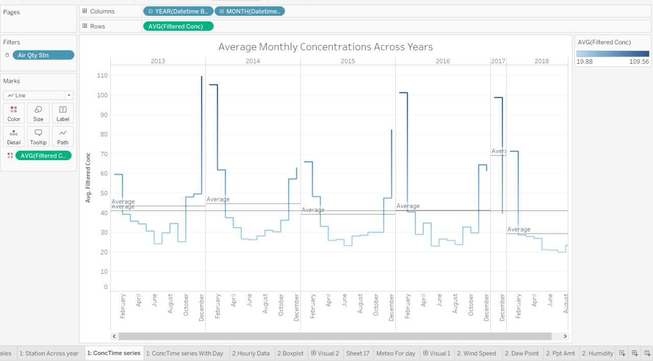
Overview of the PM10 Concentrations collected from the respective Air Quality Stations over the Months between 2013-2018. Once a point is clicked, it expands to 1A to show distribution over days. Then we can take a closer look into which parts of the month caused the overall surge.
1A. Highlight table shows the intensity for each station for the entire month. Using this table, we can tell which are the regions that are more polluted than the other, or if it as a common phenomenon across the city.
StoryBoard 2
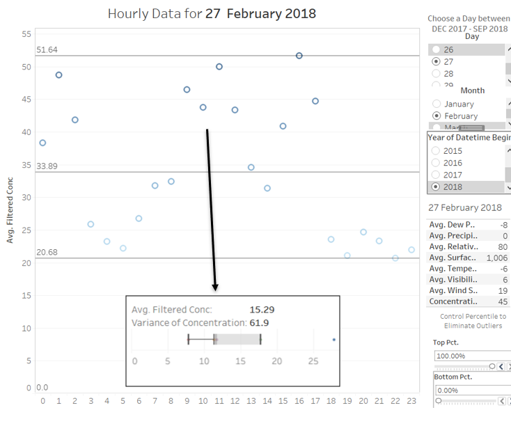
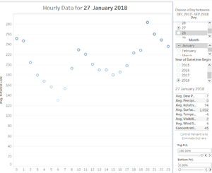
The second storyboard is separate from the first because it only has 1 year worth of data. After analyzing the trends across the years, months and days. We can now study the pattern across one day in Sofia City. On selecting a day, we can see the
- Boxplot of readings from each station with its variance.
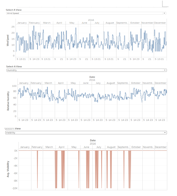
- Meteo Data for the day
- Hourly readings
- Min Max Average for the day
Hover over to see the readings across stations in a boxplot to represent variance.
StoryBoard 3
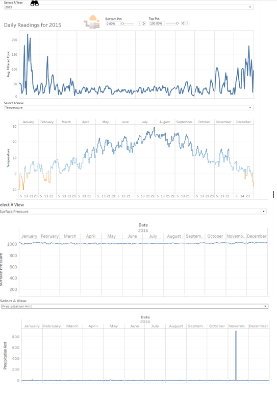
With our next DataSet, We can now look at Meteorological data. Does the PM10 Conc. Does patterns correlate with Meteorological Patterns? Could the environment be a cause of accumulation of PM10 particles, which results in high PM10 Conc. ?
StoryBoard 4
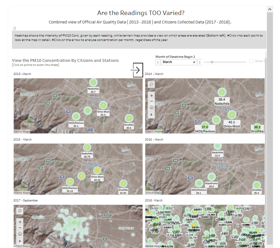
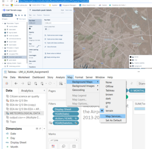
How can we better visualize the patterns of PM10 Conc Levels? Through research, considering that Sofia is largely bound by high valleys and that likely a contributing factor to its pollution. There is, therefore, a need for us to picture it on a terrain map to indicate elevated areas. On top of this, we can also use this pages function to run through months of PM10 Conc. on a density map so that we can quickly identify the PM10 Levels. Clicking on each point will bring you to the worksheet.
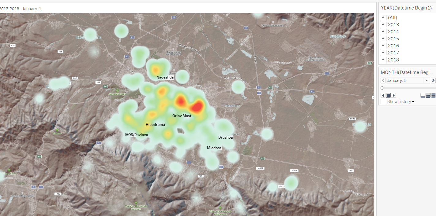
This worksheet wraps up the 6 maps shown above as it shows the concentration patterns over months, regardless of year. This is useful to confirm the months that have the worst air quality.
Step By Step (After Cleaning)
Step by step guide StoryBoard 1A (Time Series)
- Filter Year, Month,Day
- Marks Concentration
- Columns Year Month
- Rows Concentration
- Action On Select, All fields ( year, month, day) to target sheet IB
StoryBoard 1B (Highlight Table)
- Filter Year, Month, Day
- Marks Concentration
- Columns Year Month Day,
- Rows Air Qty Stn
StoryBoard 2A (Circular Chart for hourly data)
- Filter Year, Month, Day ( From EEA) Apply to worksheets 1B
- In order to limit to 2 years only : If you only want 2017/2018: Duplicate EEA > Extract only 2017,2018 as database > Set Additional filter on worksheet > save
- Put them together in a dashboard
- Marks Concentration
- Columns Year Month
- Rows Concentration
- Action On Select, All fields ( year, month, day) to target sheet 2B
StoryBoard 1B (BoxPlot)
- Filter Year, Month, Day Automatically filtered
- Marks Air Quality Station
- Columns Concentration
- Rows Year
StoryBoard 3A:
- Duplicate 1A's worksheet
- Filter Year, Month, Day
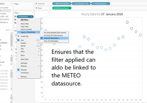
Affect Worksheets using the selected data source
- Marks Concentration
- Columns Year Month, Day
- Rows Concentration
- Action On Hover, filter Worksheets using Meteorological data by “Year” Field.
StoryBoard 3B: All-Time Series
- Filter Year, Month, Day
- Columns Year Month Day,
- Rows measure
StoryBoard 3C: Cheat to select different views https://onlinehelp.tableau.com/current/pro/desktop/en-us/dashboards_sheet_selector.htm
- Create a parameter, then a dimension, custom add values and position all views overlapping each other in the dashboard. Eventually, the view will be filtered.
StoryBoard 4A:
StoryBoard 4B: Create Map with Pages + Density
- Filter Pages, year, Month
- Set filter conc max to 700.
- Columns Lat
- Rows Long
- Place each map into the dashboard. > Show page controls > Synchronized. So that the selection of months in the year can be synchronised with one play button.
https://kb.tableau.com/articles/howto/synchronize-sheets-on-a-dashboard-with-a-single-page-control
StoryBoard 4C: Jan-Dec Analysis + Density
- Filter
- Pages All years
- Month
- Columns Lat
- Rows Long


