Difference between revisions of "IS428 AY2018-19T1 Ji Xinyi"
| Line 125: | Line 125: | ||
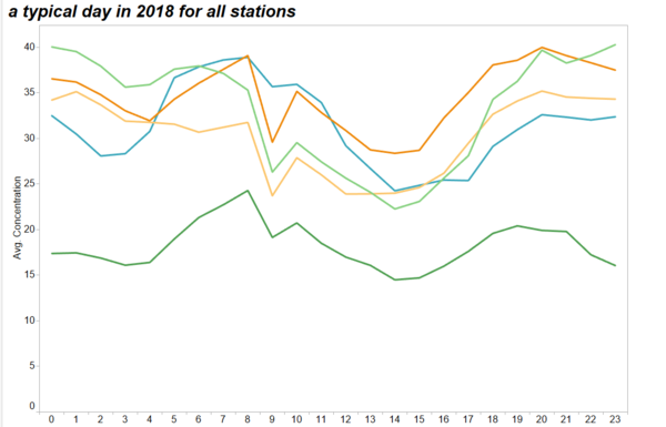
| − | This graph shows the hourly trend in one day of PM10 concentration in the year of 2018, since the hour data is more completed in 2018. | + | This graph shows the hourly trend in one day of PM10 concentration in the year of 2018, since the hour data is more completed in 2018.</br> |
| − | As we can see, the trend of PM10 seems to be similar across the 5 air quality stations. At 0:00AM, the PM10 starts out with a higher value and as the morning comes, the fluctuates up and down. Then we see a sudden dip in the concentration | + | As we can see, the trend of PM10 seems to be similar across the 5 air quality stations. At 0:00AM, the PM10 starts out with a higher value and as the morning comes, the fluctuates up and down. Then we see a sudden dip in the concentration around 8AM for the stations. After the dip, the concentration increases at 10AM until starts decreasing again from 11AM to 16PM. Then onwards the concentration level seems to increase again until the next morning. |
|} | |} | ||
Revision as of 22:45, 11 November 2018
Contents
Problem & Motivation
Air pollution is an important risk factor for health in Europe and worldwide. A recent review of the global burden of disease showed that it is one of the top ten risk factors for health globally. Worldwide an estimated 7 million people died prematurely because of pollution; in the European Union (EU) 400,000 people suffer a premature death. The Organisation for Economic Cooperation and Development (OECD) predicts that in 2050 outdoor air pollution will be the top cause of environmentally related deaths worldwide. In addition, air pollution has also been classified as the leading environmental cause of cancer.
Air quality in Bulgaria is a big concern: measurements show that citizens all over the country breathe in air that is considered harmful to health. For example, concentrations of PM2.5 and PM10 are much higher than what the EU and the World Health Organization (WHO) have set to protect health.
Bulgaria had the highest PM2.5 concentrations of all EU-28 member states in urban areas over a three-year average. For PM10, Bulgaria is also leading on the top polluted countries with 77 μg/m3on the daily mean concentration (EU limit value is 50 μg/m3).
According to the WHO, 60 percent of the urban population in Bulgaria is exposed to dangerous (unhealthy) levels of particulate matter (PM10).
Dataset Analysis & Transformation Process
This section will elaborate on the exploratory data analysis and transformation process for each dataset to prepare the data for analysis. There are 4 different Zip Files that were provided to us in the assignment. The files provided to us are Air Tube, EEA Data, METEO-data and TOPO-DATA.
In this section, I examine the quality of the data provided by exploring for bad data, gaps in data and informing next steps.
Data Cleaning Procedure
| Problem #1 | Location is needed for final result to be shown as map and is a learning feature for NN |
|---|---|
| Issue | Bring lat/long/elev data into EEA Data metropolitan data from the metadata.xls file |
| Solution | Left merge EEA_Data with metadata.xls. |
| Problem #2 | Need consistent aggregation across all data for accuracy. |
|---|---|
| Issue | BG_5_60881_2018_timeseries.csv has ‘AveragingTime’ as hour |
| Solution |
| Problem #3 | Goehash cannot be parsed directly by tableau |
|---|---|
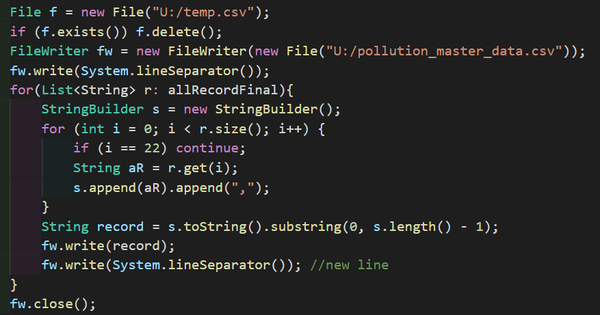
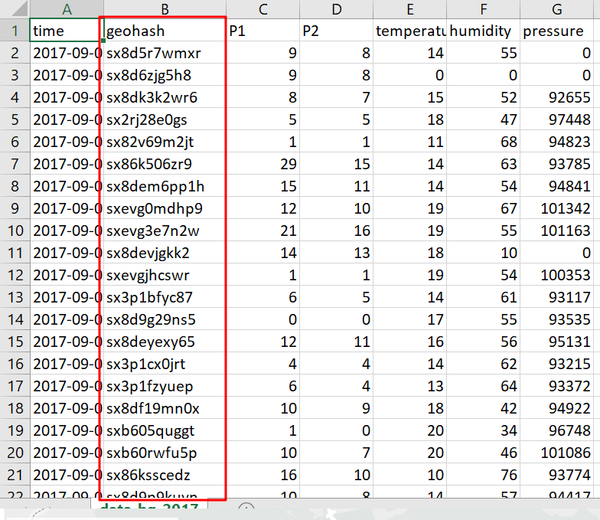
| Issue | Geohash is a convenient way of expressing a location (anywhere in the world) using a short alphanumeric string, with greater precision obtained with longer strings, geohash. One geohash value is corresponding to one set of longitude and latitude values. The tableau software needs to use the longitude and latitude values instead of geohash. The data transformation needs to be done. |
| Solution |
Use coding method to decode all the geohash to long/lat. Notice that the geohash field is still reserved since it is the unique identifier for the different sensors. |
| Problem #4 | Difficulty to identify the data points in the city. |
|---|---|
| Issue |
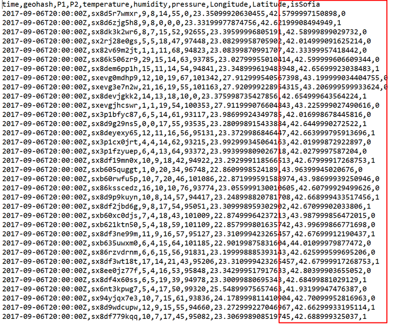
In the citizen dataset, the sensor data is across the whole country, while the assignment is mainly focusing on the Sofia city. Data cleaning is required to remove or mark the unrelated data. |
| Solution |
|
Final Data Files
- pollution_master_data This data-set contains the aggragated data of original EEA dataset.
- citizen This data-set contains Citizen science air quality measurements with decoded longitude and latitude.
Interactive Visualization
Task 1: Spatio-temporal Analysis of Official Air Quality
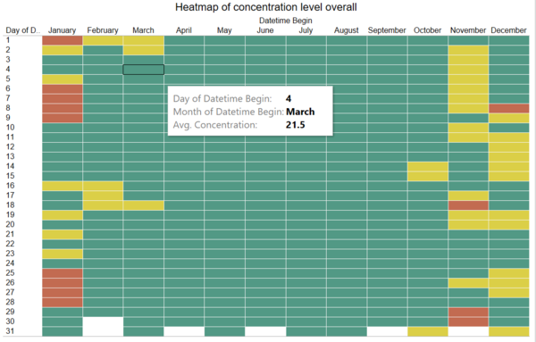
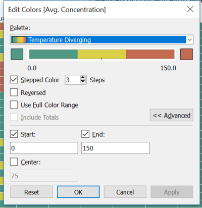
Characterize the past and most recent situation with respect to air quality measures in Sofia City. What does a typical day look like for Sofia city? Do you see any trends of possible interest in this investigation? What anomalies do you find in the official air quality dataset? How do these affect your analysis of potential problems to the environment?
| Characterize the past and most recent situation with respect to air quality measures in Sofia City. |
|---|
|
|
| PM10 Concentration over the timeline with shade |
|---|
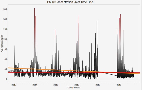
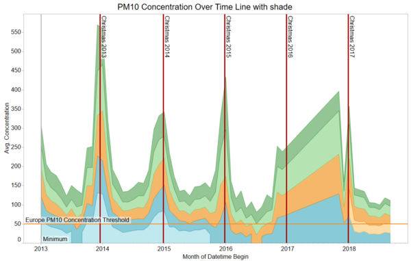
| Purpose / Description This diagram shows the average concentration of the PM10 recorded from the five stations by month across years.
|
Interactive Technique
|
| Analysis A monthly aggregated view shows all stations having highest peaks during holiday/Christmas times.
The missing data from 2017 to 2018 leads to an inaccurate visualisation. According to the previous years, the air pollution level should be lower than what is displayed.
The changes of the pollution level from the given stations are relative the same. In other words, the concentrations of PM10 from the five stations increase and decrease simultaneously.
|
| What does a typical day look like for Sofia city? |
|---|
|
|
Task 2: Spatio-temporal Analysis of Citizen Science Air Quality Measurements
Using appropriate data visualisation, you are required will be asked to answer the following types of questions:
Characterize the sensors’ coverage, performance and operation. Are they well distributed over the entire city? Are they all working properly at all times? Can you detect any unexpected behaviors of the sensors through analyzing the readings they capture? Limit your response to no more than 4 images and 600 words. Now turn your attention to the air pollution measurements themselves. Which part of the city shows relatively higher readings than others? Are these differences time dependent?
Task 3
Urban air pollution is a complex issue. There are many factors affecting the air quality of a city. Some of the possible causes are:
- Local energy sources. For example, according to Unmask My City, a global initiative by doctors, nurses, public health practitioners, and allied health professionals dedicated to improving air quality and reducing emissions in our cities, Bulgaria’s main sources of PM10, and fine particle pollution PM2.5
(particles 2.5 microns or smaller) are household burning of fossil fuels or biomass, and transport.
- Local meteorology such as temperature, pressure, rainfall, humidity, wind etc.
- Local topography
- Complex interactions between local topography and meteorological characteristics.
- Transboundary pollution for example the haze that intruded into Singapore from our neighbours.
