IS428 AY2018-19T1 Ji Xinyi
Contents
Problem & Motivation
Air pollution is an important risk factor for health in Europe and worldwide. A recent review of the global burden of disease showed that it is one of the top ten risk factors for health globally. Worldwide an estimated 7 million people died prematurely because of pollution; in the European Union (EU) 400,000 people suffer a premature death. The Organisation for Economic Cooperation and Development (OECD) predicts that in 2050 outdoor air pollution will be the top cause of environmentally related deaths worldwide. In addition, air pollution has also been classified as the leading environmental cause of cancer.
Air quality in Bulgaria is a big concern: measurements show that citizens all over the country breathe in air that is considered harmful to health. For example, concentrations of PM2.5 and PM10 are much higher than what the EU and the World Health Organization (WHO) have set to protect health.
Bulgaria had the highest PM2.5 concentrations of all EU-28 member states in urban areas over a three-year average. For PM10, Bulgaria is also leading on the top polluted countries with 77 μg/m3on the daily mean concentration (EU limit value is 50 μg/m3).
According to the WHO, 60 percent of the urban population in Bulgaria is exposed to dangerous (unhealthy) levels of particulate matter (PM10).
Dataset Analysis & Transformation Process
This section will elaborate on the exploratory data analysis and transformation process for each dataset to prepare the data for analysis. There are 4 different Zip Files that were provided to us in the assignment. The files provided to us are Air Tube, EEA Data, METEO-data and TOPO-DATA.
In this section, I examine the quality of the data provided by exploring for bad data, gaps in data and informing next steps.
| Problem #1 | Location is needed for final result to be shown as map and is a learning feature for NN |
|---|---|
| Issue | Bring lat/long/elev data into EEA Data metropolitan data from the metadata.xls file |
| Solution | Left merge EEA_Data with metadata.xls. |
| Problem #2 | Need consistent aggregation across all data for accuracy. |
|---|---|
| Issue | BG_5_60881_2018_timeseries.csv has ‘AveragingTime’ as hour |
| Solution |
| Problem #3 | Goehash cannot be parsed directly by tableau |
|---|---|
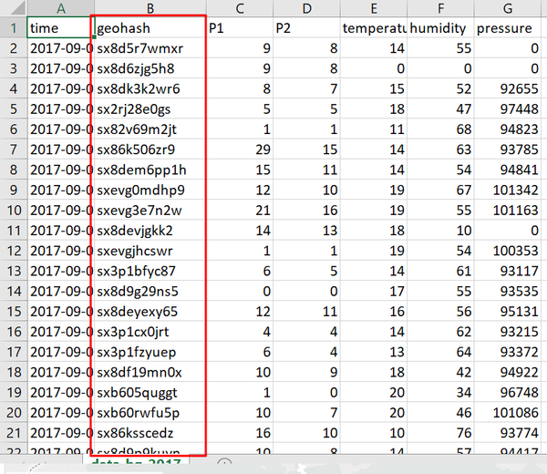
| Issue | Geohash is a convenient way of expressing a location (anywhere in the world) using a short alphanumeric string, with greater precision obtained with longer strings, geohash. One geohash value is corresponding to one set of longitude and latitude values. The tableau software needs to use the longitude and latitude values instead of geohash. The data transformation needs to be done. |
| Solution |
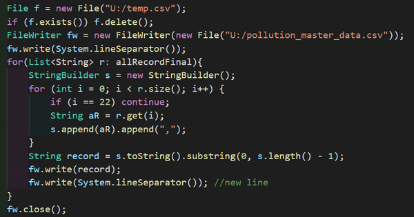
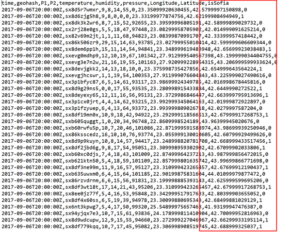
Use coding method to decode all the geohash to long/lat. Notice that the geohash field is still reserved since it is the unique identifier for the different sensors. |
| Problem #4 | Difficulty to identify the data points in the city. |
|---|---|
| Issue |
In the citizen dataset, the sensor data is across the whole country, while the assignment is mainly focusing on the Sofia city. Data cleaning is required to remove or mark the unrelated data. |
| Solution |
|
Final Data Files
- pollution_master_data This data-set contains the aggragated data of original EEA dataset.
- citizen This data-set contains Citizen science air quality measurements with decoded longitude and latitude.
- meteo-concentration The aggragated data from the meteo and timeseries data.
Interactive Visualization
The interactive visualisation can be assessed from this link: https://public.tableau.com/profile/ji.xinyi#!/vizhome/SofiaMetroPollutionDataExploration/Story1
Task 1: Spatio-temporal Analysis of Official Air Quality
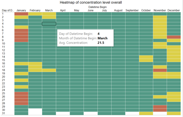
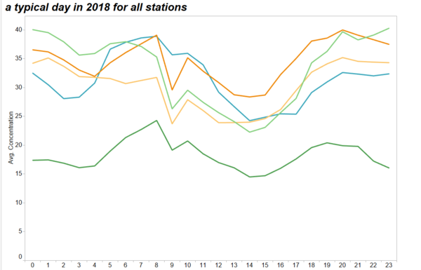
Characterize the past and most recent situation with respect to air quality measures in Sofia City. What does a typical day look like for Sofia city? Do you see any trends of possible interest in this investigation? What anomalies do you find in the official air quality dataset? How do these affect your analysis of potential problems to the environment?
| Characterize the past and most recent situation with respect to air quality measures in Sofia City. |
|---|
|
|
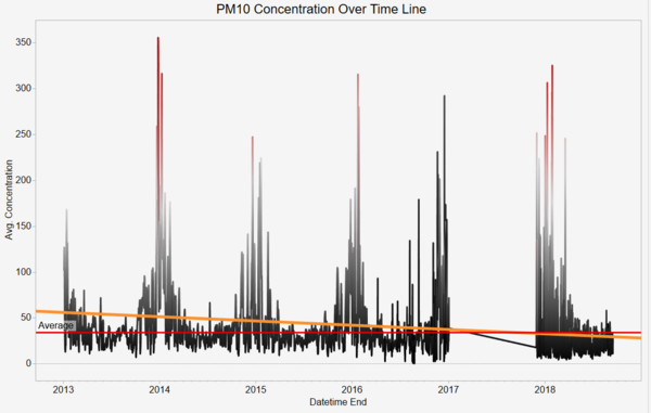
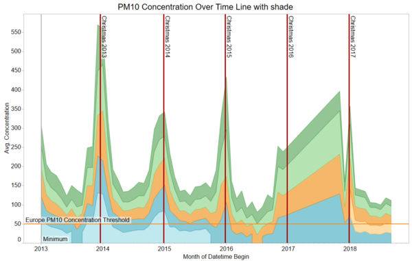
| PM10 Concentration over the timeline with shade |
|---|
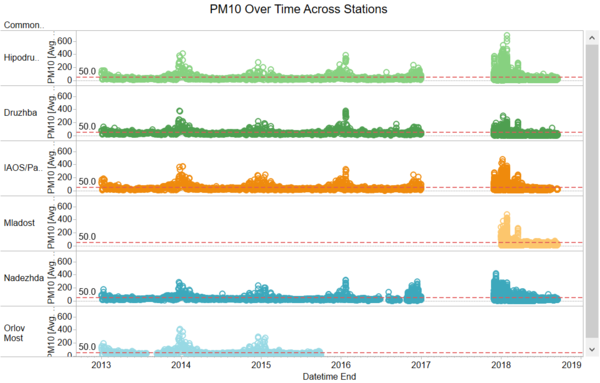
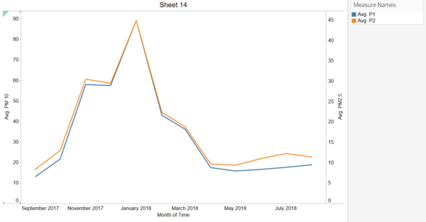
| Purpose / Description This diagram shows the average concentration of the PM10 recorded from the five stations by month across years.
|
| What does a typical day look like for Sofia city? |
|---|
|
|
| Do you see any trends of possible interest in this investigation? |
|---|
|
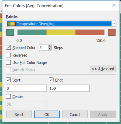
As we can see from the graphs above, I find some interested things: |
| What anomalies do you find in the official air quality dataset? |
|---|
|
|
Task 2: Spatio-temporal Analysis of Citizen Science Air Quality Measurements
Using appropriate data visualisation, you are required will be asked to answer the following types of questions:
- Characterize the sensors’ coverage, performance and operation. Are they well distributed over the entire city? Are they all working properly at all times? Can you detect any unexpected behaviors of the sensors through analyzing the readings they capture? Limit your response to no more than 4 images and 600 words.
- Now turn your attention to the air pollution measurements themselves. Which part of the city shows relatively higher readings than others? Are these differences time dependent?
| Characterize the sensors’ coverage, performance and operation. Are they well distributed over the entire city? Are they all working properly at all times? |
|---|
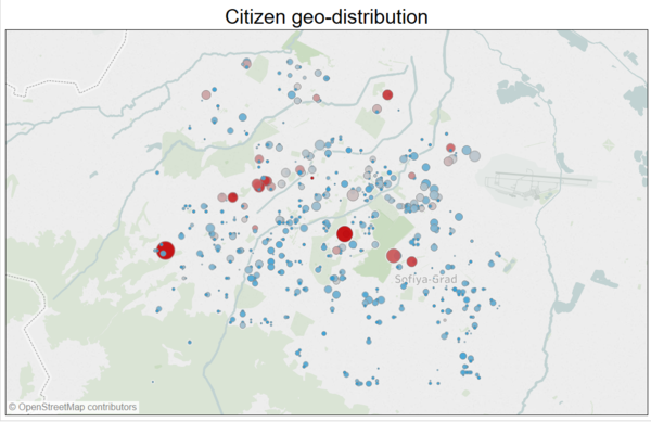
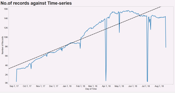
| Coverage and Distribution This diagram aims to show the geospatial coverage of sensors across the whole country. This is essential since the spatial coverage of the citizen data reflects the confidence and completeness of the whole dataset. This dataset is obtained from citizen database, it is essential to justify the coverage before looking at the pollution level it reflects, if there is some large area is not tracked, the overall result might not be trustworthy. Only the data points within the city area are displayed, the irrelevant data is hidden. The way to distinguish the data points is described in the previous data cleaning procedures. From the visualization above, the citizen data fairly reflects the overall situation of the country. There is no obvious empty region on the map. However, the North part and the South-East part of the map have a relatively low sensor concentration than the central area. Hence, the pollution records in the central area are more credible. The colour code is responsible for the highest concentration record reported from the sensor at that location. It can be observed that the points with the deepest colour appear at the centre area indicating that the centre area is the most polluted area. The time series above shows the number of measurements over time and displays an obvious increase in the number of citizen science sensors from September 2017 to August 2018. There are certain days where measurements are missing, as seen by the massive downward spikes. These sudden drop in measurements seem to occur at the end and start of the month.(These can results from system down or regular maintenance)
|
| Can you detect any unexpected behaviors of the sensors through analyzing the readings they capture? |
|---|
|
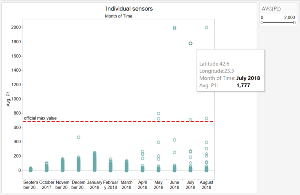
The instruments used by citizen scientists are not professional measuring devices. Thus, errors are expected to occur. The captured readings for citizen science range between 0 to 2000, which is much larger than the official air quality measurements of 0 to 690. Therefore, it can be deduced that the citizen science instruments are very inaccurate in comparison to the official air quality stations.The graph shows some random fluctuation due to some anomalies(e.g. PM10=2000), a filter should be implemented to filter out the extreme data./br>
|
Task 3
Urban air pollution is a complex issue. There are many factors affecting the air quality of a city
| Relationship between concentration and factors |
|---|
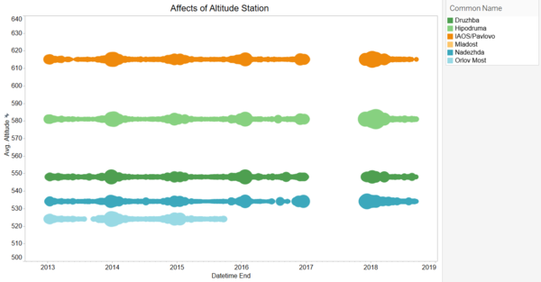
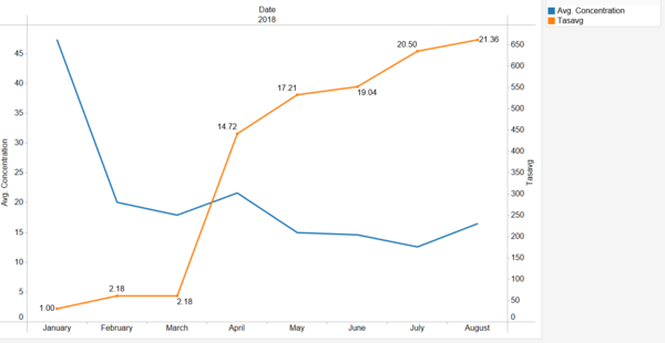
| This diagram shows the relationship between concentration and altitude This visualization aims to investigate the relationship between the altitude and the concentration of pollutants with official data. The five stations located at different altitudes. Among them, the Pavlovo station has the highest altitude while the station Hipodruma is the most polluted station. Hence, there is not a clear relationship between the polltion level and the altitude.
This diagram shows the relationship between concentration and temperature
|
References
- https://www.datasciencesociety.net/sofia-air-quality-eda-exploratory-data-analysis/
- https://www.datasciencesociety.net/monthly-challenge-sofia-air-solution-kung-fu-panda/
Comments
Do provide me your feedback!:)
