Data Preparation1
| Data Preparation | Visualization Design | Answer | Application | Assignments | |
Data Preparation
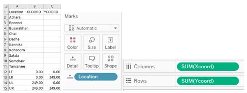
1.Prepare the location data, first create the table below then import the table into tableau, drag the Xcoord into Column, Ycoord into Rows and Location into Detail to create the scatter plot.
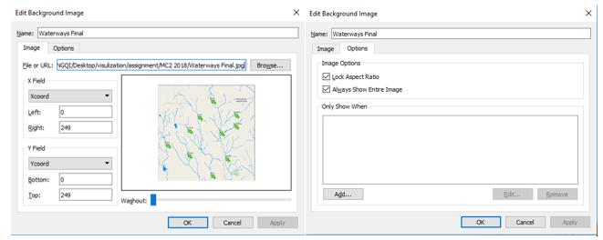
2.Click Map>Background Image>data on the menu, then click Add Image on the pop-up window, set the each value as below.
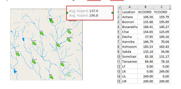
3.Right click on the scatter plot then click Annotate>Point to create the annotation, then drag the point to each arrow of location to get the Xcoord and Ycoord of each location and fill the table.
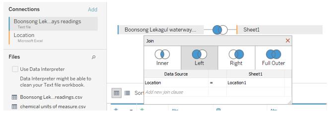
4.Import the dataset Boonsong Lekagul waterways readings.csv and location.xlsx and select Left join, set the join clause to Location=Loaction1.
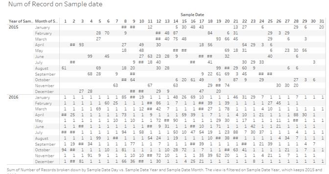
5.Create a new worksheet and drag the Sample Date to Column and set the Day then drag another Sample Date to Rows and set to year and drag the third Sample Date to Rows and set to Month and drag the Number of Records to Text. Drag the Sample date to Filter and select only 2015 and 2016 to see the data roughly. From this table, I find the many missing data on Sample Date, so it is better for me to visualize the data by month/year.
6.Because different chemicals have different value scale, I use percentile chart to visualize the data. Drag the Measure and Value into Rows, click the triangle on value and click Measure>Average and Quick Table Calculation>Percentile. Drag the Sample Date to Column, click triangle on Sample Date and click the second Month. From the chart below, I find there are many missing values, so I need to figure out which chemical I should focus on based on the completeness.
When adding the location into the percentile chart, I find Achara, Decha and Taneness only have the data from 2009, but I find there is no explicit difference during 2008-2009.
7.To filter the data, I create a calculation field named Num of Year to get how many year of sample date each chemical contains.
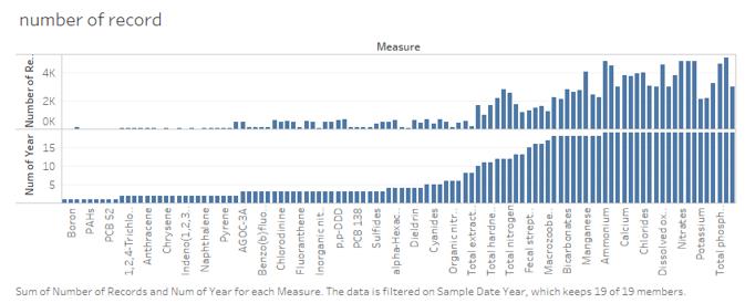
8.I create a histogram chart to visualize the data. First Drag the measure into columns and drag Number of Record and Num of Year to Rows. Click the sort on the Num of year to sort the chart. I only select the chemicals with 19 years, which means the chemical I select have the data from 1998 to 2016.
9.After filtering the data, I get 10 chemicals and I use the percentile chart again. Only a few month data are missing but it won’t influence the analysis much.

