Visualization Design1
Vast Chanllenge 2018 MC2
Like a duck to water
| Data Preparation | Visualization Design | Answer | Application | Assignments | |
Visualization Design
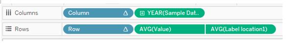
1.Trellis plot by year

This plot is for the Question 1 to see the trend of different chemicals.
(1) To create this plot, I use 4 calculation fields. The Column and Row are used to put every 5 chemicals into one row. The Label and Label text are used to show the label for each chemical.

(2) After creating the calculation field, drag the Column, Sample Date into Columns and Row, Value and Label location1 into Rows. Then drag the measure into Detail, and click the triangle on Column/Row, then click Computing Using > measure and click Discrete to change the type. Click the triangle on Value/Lable location1 and click Measure>Average.

(3) Right click the Y-axis of AVG(Value) and click Edit Axis> Independent axis ranges for each row or column. Then Right click the Y-axis of AVG(Value)> Add Reference Line and set as below to get the Average line for each chemical. I find there is no need to add 3*standard deviation line in this plot because it doesn’t help much in this plot.

(4) Right click the triangle of AVG(Value)/Column/Row and uncheck the Show Header, then the plot only has the header of Year(Sample Date).
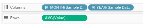
2.Trellis plot for Month/Day
These plots are for Question 2 to visualize the data in detail, so I can find the anomalies.
(1) Drag the Sample Date into Columns and drag the Measure and Value into rows.
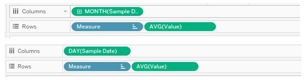

(2) Click the triangle of Sample Date then click the second Month/Day. Click the triangle of Value and click Measure>Average.
(3) Right click the Y-axis of AVG(Value) and click Edit Axis> Independent axis ranges for each row or column. Then Right click the Y-axis of AVG(Value)> Add Reference Line and set as below to get the Average line for each chemical.
3.Cycle plot
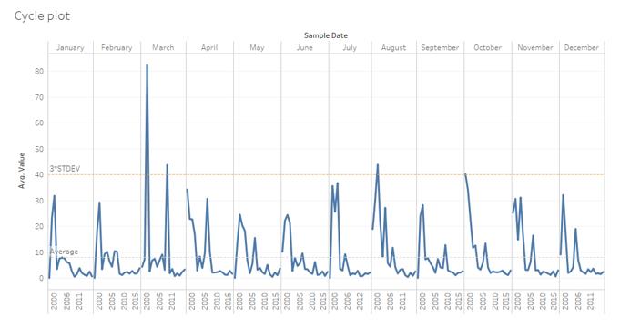

This plot is used to look at the cycle pattern of different chemical.

Drag the 2 Sample date to Columns, click the triangle of each Sample Date and click the First Month and year. Then drag the Value to rows. Add average reference line and 3*standard deviation line for whole table and add Measure & location into Filter.
4.Trellis plot for location

This plot is used to quickly find the anomalies for each location. The step of this plot is similar to trellis plot for chemicals. And add average reference line and 3*standard deviation line for whole table.

5. Map plot

This plot will be used to show data of each location interactively.
(1) Drag the Xcoord into Column, Ycoord into Rows and Location into Detail to create the scatter plot. Then click the triangle of Xcoord and Ycoord, then click >Measure>Average. Changing to average is because there are many duplicate Xcoord and Ycoord for each location when the the Location file is joined with the dateset. And click the triangle of Xcoord and Ycoord, uncheck the Show Header of Xcoord and Ycoord.
(2) Click Map>Background Image>data on the menu, then click Add Image on the pop-up window, set the each value as below.

6.Interaction Dashboard For the Question 2 and 3, the chemical data need to combine with location data to see whether the locations at upper stream or down stream have different pattern.
(1) Drag the Map plot and other trellis plots into the dashboard.
(2) Click Dashboard>Action>Add Action>Highlight on menu and set as below.
