ISS608 2017-18 T3 G2 Assign ChenYanchong Visualization
The final visualisation story board is available through Chen Yanchong's Tableau Public
The task of the visualisation is to answer the following 3 questions.
Question 1
Characterize the past and most recent situation with respect to chemical contamination in the Boonsong Lekagul waterways. Do you see any trends of possible interest in this investigation?
If the overall tendency (all showing upward or all showing downward trend) is the same across the 10 locations, we can assume that the changes along with years are caused by natural effect instead of human intervention.
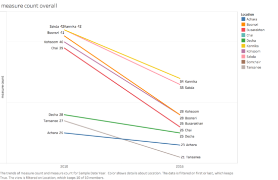
Slope chart is a good practice to show the difference between the start point and the end point.

From above slope chart, the water taken from the 10 locations seems cleaner in the year 2016 than it in the year 2010. Compared to the obvious decrease, Decha and Tansanee decrease slower than the rest of the locations.
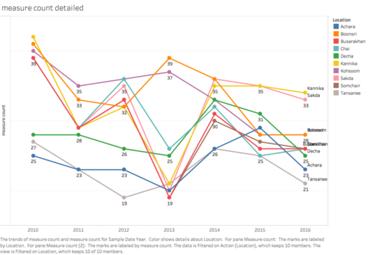
Does the water composition decrease year by year? Taking a closer look at how the water composition changes year by year.

Above line chart reveals that in year 2013, the number of compositions decrease till the lowest point in 7 of the 10 locations, but not in Kohsoom, Boonsri and Tansanee. After year 2013, the trend reversed a bit, the composition of water chemicals in the other 8 places start to increase whilst Kohsoom and Boonsri show contrast trend.
Is it because these three places are polluted by human intervention? From the background information, the furniture company Kasios was established in year 2013, furthermore, from the map of the preserve, Kohsoom and Boonsri are the two locations which are the nearest ones to the suspicious waste dumping point, however, Tasanee is further away from the approximate waste dumping point.
Point source[1]might be helpful to clarify the mystery.

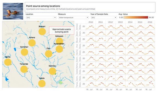
The purpose of the point source is to compare the differences of one certain measures among the locations during the same period of time. To perform the point source, multiple locations and years are allowed to select at a time, however, only one measure can be picked out at the same time.
Above picture shows how the water temperature changes in the past 6 years among the 10 positions. Obviously, water temperature shows the same trends across the 10 locations, it shows a bell curve and always reaches its highest in July. There are some empty area in the graph, indicates that water temperature is not taken.
Question 2
What anomalies do you find in the waterway samples dataset? How do these affect your analysis of potential problems to the environment? Is the Hydrology Department collecting sufficient data to understand the comprehensive situation across the Preserve? What changes would you propose to make in the sampling approach to best understand the situation?
Question 3
After reviewing the data, do any of your findings cause particular concern for the Pipit or other wildlife? Would you suggest any changes in the sampling strategy to better understand the waterways situation in the Preserve?
