ISSS608 2017-18 T3 Assign Liu Yuanjing Visualisations
The Path Analysis
Note: The path only has one sampling site that we would not cover in path analysis part.
| Patterns | Visualization |
|---|---|
| 1. Paths--3+4:
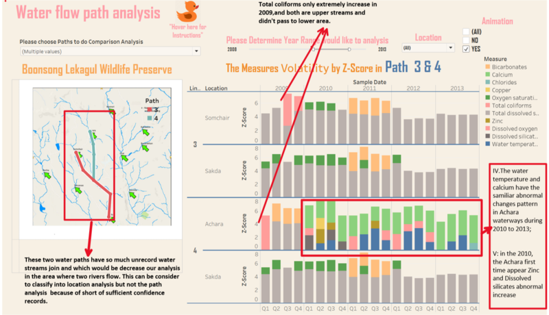
The path 3 water flow: Sochair to Sakda. The path 4 water flow: Achara to Sakda
In the recent years, the Total dissolved salts is only abnormal volatility during the past three years in the upper streams. Although the lower streams also have oxygen saturation and Bicarbonates, we can clearly notice that these two measure have greatly possibility come from Achars area (path 4). The mentioned two measures have greatly volatility in the Achars sampling sites at the same time period.
|
|
| 2-1.Paths:5+6+7 in past period
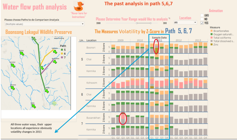
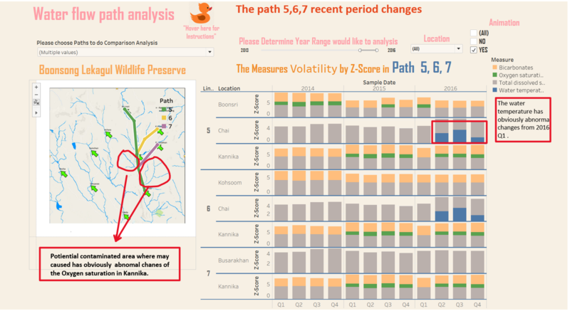
he lower samping point Kannika which is end point of three sampling water path. But in the Kannika, the Oxygen saturation has increase in 2015 and 2016. And we also can exlude the reason that the measures come from Boonsri, because if measure suddently increase in Boonsri, it's next point Chai should be increase at the almost similar time, but in fact, the chai even never measure out the Oxygen saturation during that time. Therefore, we highlight the other potiential contaminated area. |
|
| 2-2.Paths:5+6+7 in recent period
|
Location Analysis
Note: The null measures in data set has been excluded s to avoid misunderstandings.
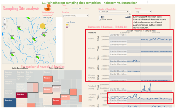
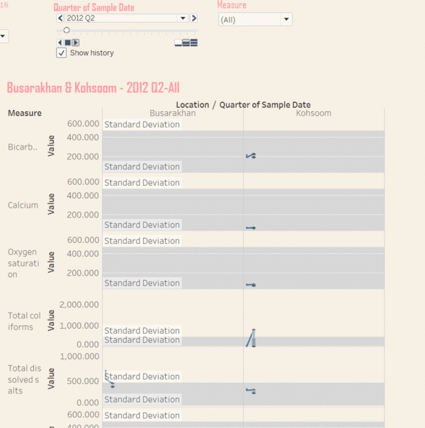
In Fig 5.2 we could see the motion track between two locations.
| Patterns | Visualization | |
|---|---|---|
| 1.Single Location Analysis
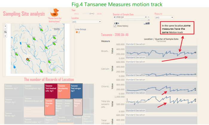
Fig 4 provides the information about the measure in Tansanee. the below treemap has show the measures that increase or decrease relative higher than others and color highlight the number of record of the measures. The whole picture has tell us that in the same location, some measures has similar motion tracks. |
||
| 2. Pair Comparative Analysis
| ||
