ISSS608 2017-18 T3 Assign Vaishnavi Praveen Agarwal Visual
|
|
|
|
|
|
|
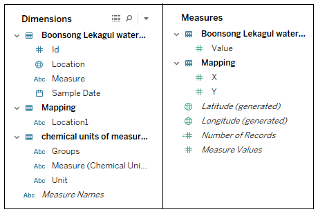
Dimensions and Measures
The finals dataset contains various columns and the columns are divided into Dimensions and Measures in Tableau based on their properties. Before starting with the Visualization, lets get familiar with the available Dimensions and Measures.
Measure by Location
The data has a total of 106 chemicals (12 groups) and 10 places. I want to analyze the trend of each measure at all the places for years 1998 - 2016. This visualization will help to compare the average values and select the place that has the highest reading of a measure.
|
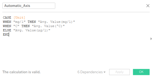
Create a Calculated Field The measures have three different units: mg/l, µg/l, and °C. The unit for average value should change according to the measure, therefore we will use this calculated field to automate the y-axis label.
|
|
|
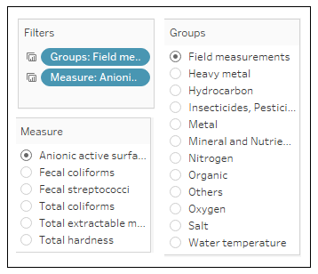
Add Filters The user should be able to visualize the measure of their choice, therefore the graph should filter the data according to the selected measure.
|


