ISSS608 2017-18 T3 Chan En Ying Grace Which song belongs to thee
|
|
|
|
|
|
Contents
- 1 Audio Visualisation: "Which song belongs to thee, Rose Pipit?"
- 2 Concluding Hypothesis
- 3 Next Steps to be Taken
Audio Visualisation: "Which song belongs to thee, Rose Pipit?"
1. Location Matters
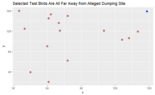
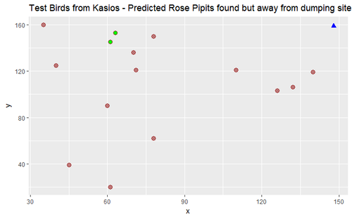
Firstly, it is important to note that the 15 testing data are nowhere near the alleged dumping site, except for the four birds. It is unclear whether these 4 birds belong to Rose Pipits, as they could also belong to the Ordinary Snapes or Lesse Birchbeere clusters, which was earlier proven that their home range also exist near the dumping site.
2. Data Preparation
Next, we convert all the MP3 files into .wav format. Wav format is preferred for many of the R packages that deal with audio files. We’ll select and work with the left channel of each file, then convert our sound array to floating point values ranging from -1 to 1.
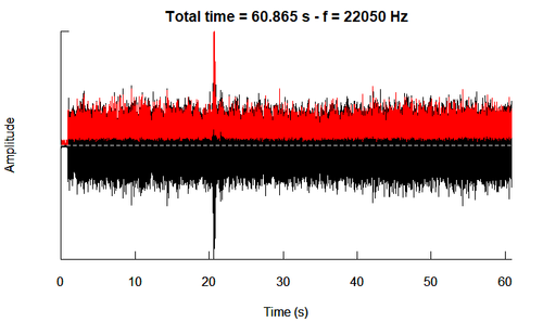
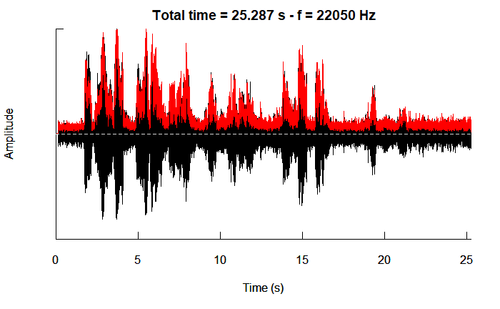
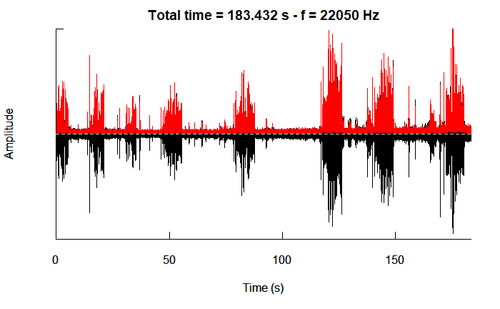
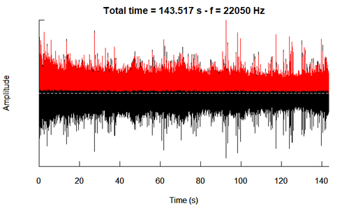
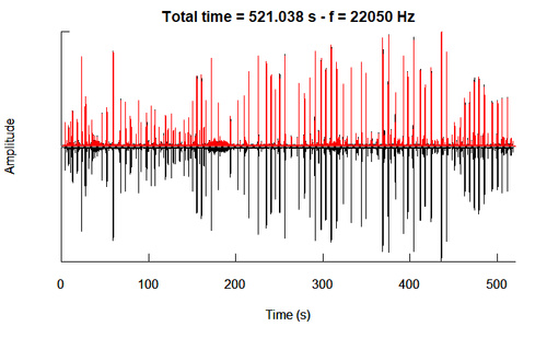
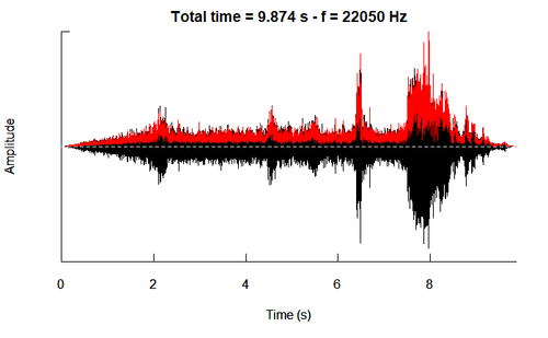
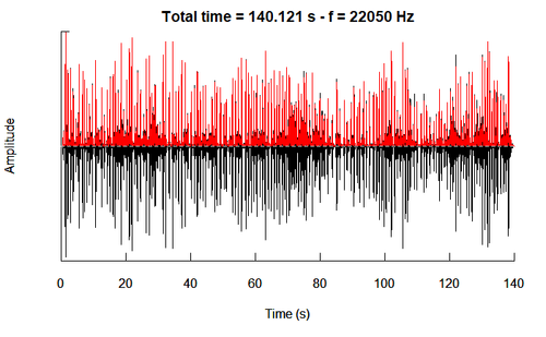
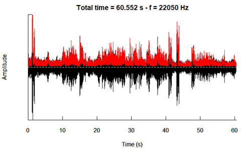
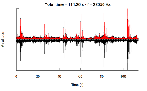
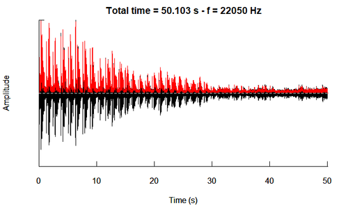
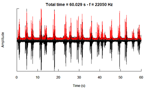
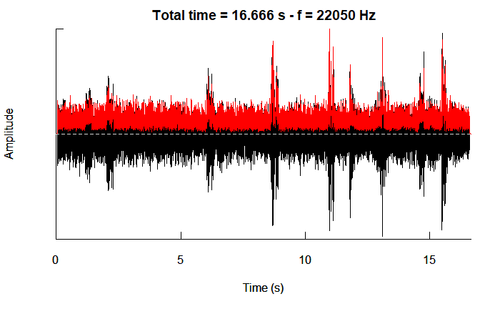
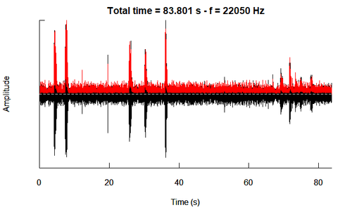
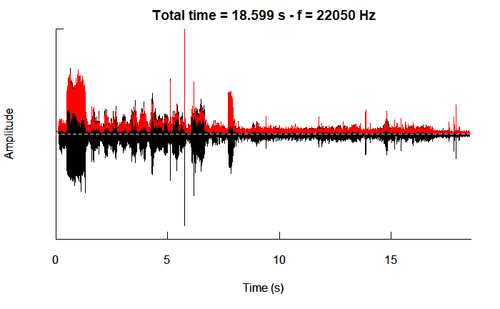
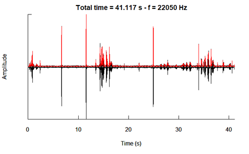
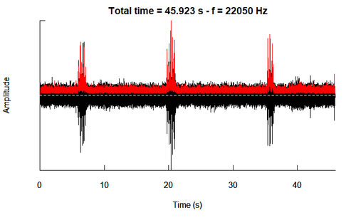
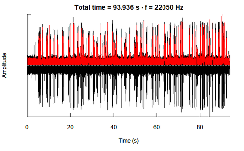
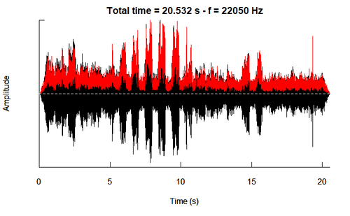
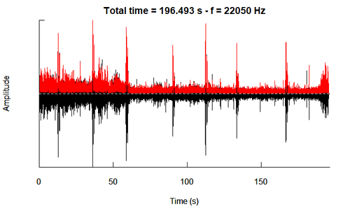
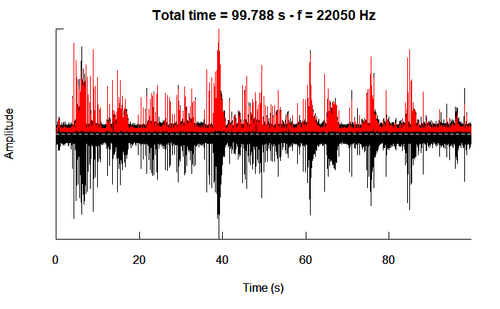
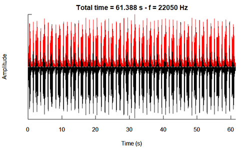
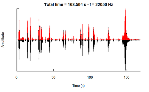
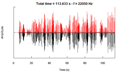
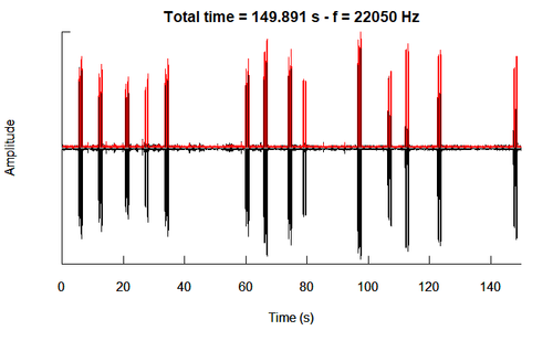
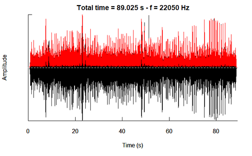
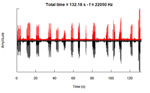
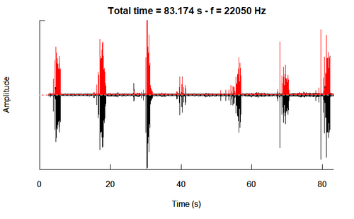
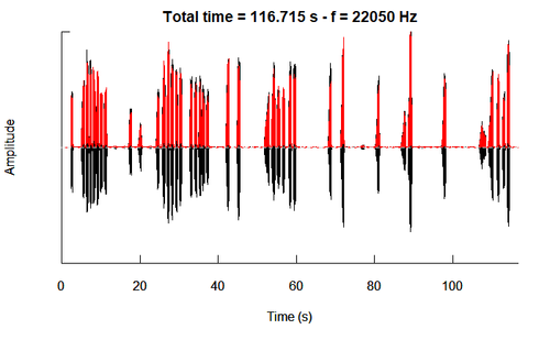
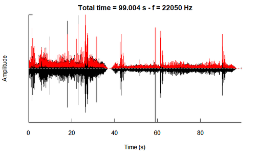
Now, we are ready to plot the oscillogram to visualize the relationship between Amplitude and Time (seconds), for each bird species. We will colour the envelope in red, for easier visualization.
Using the training dataset (2081 birds), we will pick 5 birds per species and then obtain a representative one by choosing the pattern that is most common for that species. We will do this in 3 steps.
Approach
First, we will plot the envelope of each sound wave of the bird species, for a quick visualization across each of the 19 bird species. Second, we plot the osciilogram outlined by the envelope to view the amplitude pattern in greater detail, for each of the 19 species. Thirdly, we will use ggplot to obtain a trellis plot of the distribution of each parameter of the audio file (e.g. amplitude, HNR, entropy, spectrogram slope, pitch frequency) for each species to obtain the mean.
With these 3 techniques, we will then do the same for the 15 testing birds, and compare using the three visualisations against the 19 species of the training data. This will help us identify the bird species of the 15 testing birds of Kasios.
3. Envelope Plot
Amplitude envelope refers to the changes in the amplitude of a sound over time. It is an important property of sound, because it is what allows us to effortlessly identify sounds, and uniquely distinguish them from other sounds. We will thus use envelope plot to distinguish bird calls/songs.
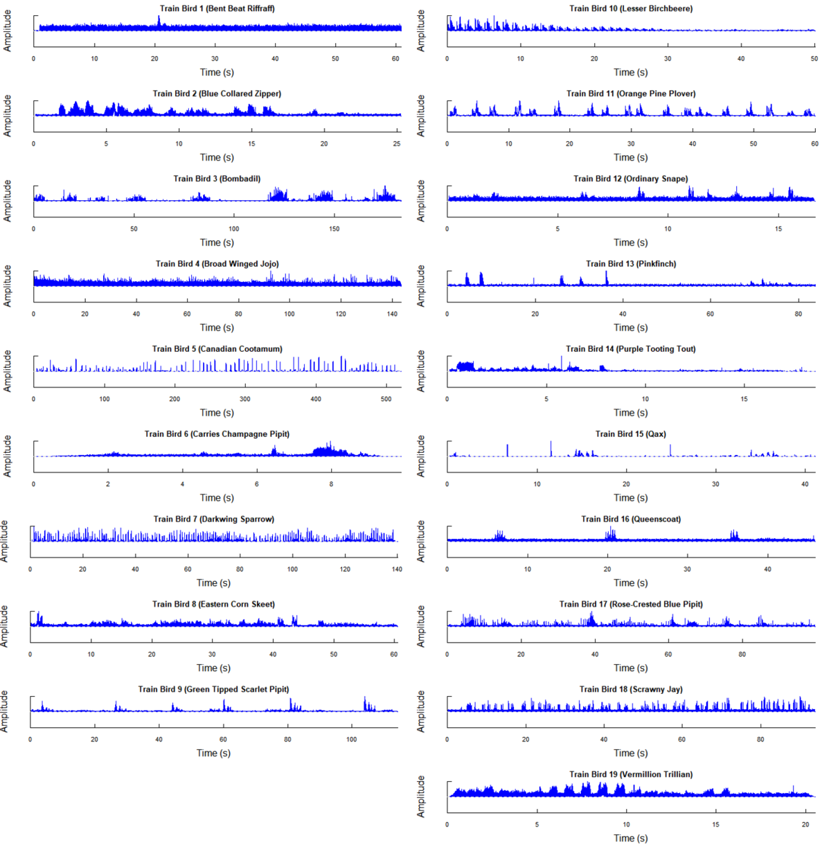
Training Birds (19 Species)
First, we will plot the envelope of each sound wave of the bird species, for a quick visualization across each of the 19 bird species.
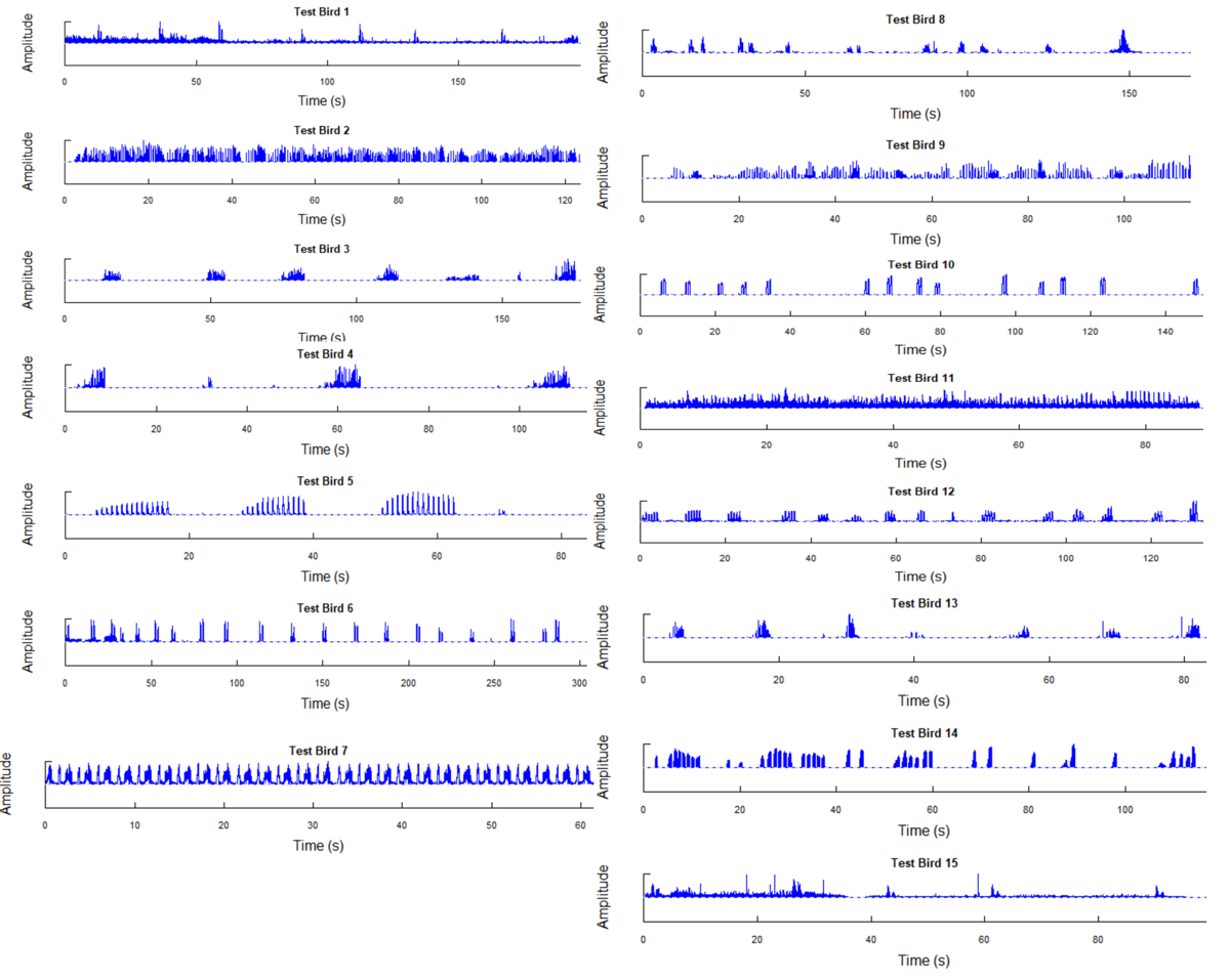
Testing Birds (15 Birds Identified By Kasios)
Next, we will plot the envelope of each sound wave for the 15 test birds.
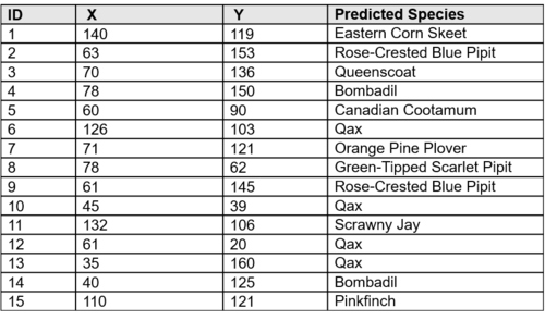
Predicted Results, Based on Visualisation
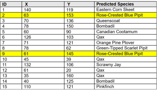
By visualizing the envelope of the amplitude waves of both the training and testing data, the last column shows the predicted species for each of the 15 test birds.
4. Oscillogram Comparison
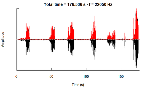
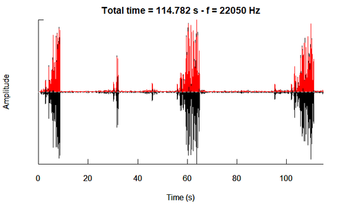
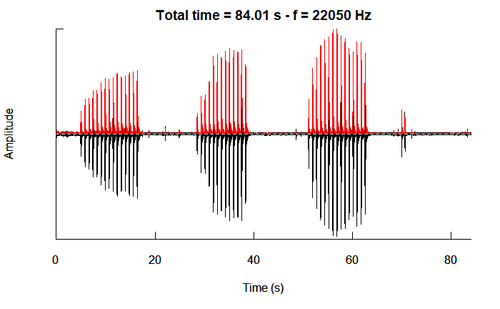
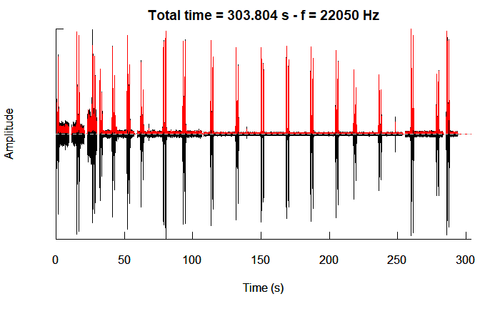
For confirmation, let us also look at the oscillogram which gives us not only the envelope but also the waves. Oscillogram is the plot of relative amplitude vs. time in seconds (while a Spectrogram is the plot of frequency in kHz vs. time in seconds).
Training Birds
The oscillograms of each of the 19 species of the training birds are as follows:
|
No. |
Species Name |
Oscillogram |
|
1. |
Bent Beat Riffraff |
|
|
2. |
Blue Collared Zipper |
|
|
3. |
Bombadil |
|
|
4. |
Broad Winged Jojo |
|
|
5. |
Canadian Cootamum |
|
|
6. |
Carries Champagne Pipit |
|
|
7. |
Darkwing Sparrow |
|
|
8. |
Eastern Corn Skeet |
|
|
9. |
Green Tipped Scarlet Pipit |
|
|
10. |
Lesser Birchbeere |
|
|
11. |
Orange Pine Plover |
|
|
12. |
Ordinary Snape |
|
|
13. |
Pinkfinch |
|
|
14. |
Purple Tooting Tout |
|
|
15. |
Qax |
|
|
16. |
Queenscoat |
|
|
17. |
Rose-Crested Blue Pipit |
|
|
18. |
Scrawny Jay |
|
|
19. |
Vermillion Trillian |
Testing Birds
The oscillograms of each of the 15 test birds are as follows, including the predicted species by visualising the similarity of the amplitude plots.
|
ID |
Oscillogram |
Predicted Species |
Same as earlier predicted by envelope? |
|
1 |
Eastern Corn Skeet |
Yes. Though, this is quite close to the Rose-Crested Pipit. However, the Pipit produces more ‘chirps’ per 100 sec, as compared to the Skeet. | |
|
2 |
Rose-Crested Pipit |
Yes. | |
|
3 |
Queenscoat |
Yes. | |
|
4 |
Bombadil |
Yes. | |
|
5 |
Canadian Cootamum |
Yes. | |
|
6 |
Qax |
Yes. | |
|
7 |
Canadian Cootamum |
Yes. | |
|
8 |
Green-Tipped Scarlet Pipit |
Yes. | |
|
9 |
Rose-Crested Blue Pipit |
Yes. | |
|
10 |
Qax |
Yes. | |
|
11 |
Scrawny Jay |
Yes. | |
|
12 |
Qax |
Yes. | |
|
13 |
Qax |
Yes.
| |
|
14 |
Bombadil |
Yes.
| |
|
15 |
Pinkfinch |
Yes. |
5. Trellis Plot (Distribution Analysis)
A caveat to the above is that we did not make use of all the training birds in the visualisation. Rather, we pick about 5 birds per species and then selected 1 to represent the entire species.
To make the analysis more rigorous, we will use analyzeFolder() to obtain the distribution analysis of the parameters of the audiofile. There is a total of 15 parameters, out of which, 7 are chosen as these 7 parameters have greater distinction between the species.
The 7 parameters are: dom_median, HNR_median,mean, Freq_median, peakFreq_median, pitch_median, pitchAutocor_median, pitchSpec_median.
The trellis plot of the 7 parameters of the training birds, is as follows:
<!!!insert Trellis of Training>
Next, we will plot each of the 15 testing birds from Kasios onto this plot. We will then select the closest species for each parameter. The species with the most parameters selected will be assigned as the predicted species.
Given that Test Bird 2 and Test Bird 9 were predicted to be Rose-Crested Blue Pipits, we will focus on these two birds for visualisation.
<!!!insert TB2>
<!!!insert TB9>
Results
From the above plots, based on the most number of parameters closest to the species’ mean, Test Bird 2 seems like a Qax while Test Bird 9 seems like a Vermillion Trillon. Unfortunately, this does not match our earlier predictions by visualizing the amplitude plot. We conclude that this method may not be ideal as it is a numerical representation, while the amplitude plots are more likely to be more reflective (though less representative of the entire training population).
Let’s analyse the coordinates to understand whether these 2 predicted birds are found near the Rose Pipit clusters. In fact, these two birds (represented in green below) are not found in the two clusters near the dumping site (represented in blue). But they did appear together, which makes sense since birds of the same species tend to fly together.
Moreover, only 2 out of the 15 birds have resemblance to the Rose Pipits. It is likely that the Rose Pipits were indeed affected by the dumping of Kasios.
Concluding Hypothesis
The Pipits are surviving, but not thriving across the Boonsong Preserve. There is likely to be dumping given that 2015 was the year of change across many variables.
However, since the Control Groups were not affected, one hypothesis is that the dumping only affected the Rose Pipits due to the biological made-up of the Rose Pipits. An alternative hypothesis is that it was the dumping but, another event that affected the Rose Pipits only.
Next Steps to be Taken
To test our hypothesis to determine whether it is the dumping that caused it, we can conduct a Randomised Control Trial. Introduce the dumping substance and put a Rose Pipit and an Ordinary Snape together. Make all other variables constant. If only the Rose Pipit dies, while the Ordinary Snape survives, then our hypothesis is correct.

