ISSS608 2017-18 T3 Assign Weijie Jay Zheng Dataset Visulisation
Link to go back to MITB class assignment page (Group 1)
VAST Challenge 2018: Suspense at the Wildlife Preserve
|
|
|
|
|
Hypothesis
The assignment looks for below
- Chemical readings
- Trend over time
- # of samples
- Chemical specific
- Location specific
A visualisation chart will need to incorporate above factors.
Parameters
Given chemical readings is the centre of argument, it is important to breakdown and understand the characteristics of the readings. There are 2 apparent constraints of the data
- Sample data is not available every year making YoY comparison not possible for some chemicals
- the range of chemical readings is just too wide, e.g. from as small as 0.005 to 100+. This practically means that the scales need to flexible/different for different parameters
To observe and compare the trend of multiple parameters with various readings scales, one practical approach is to convert the absolute numbers into YoY % change, e.g. making 2010 reading as a benchmark 100. This option is however constrained because there is not a single year where all chemicals had readings…. Thus unable to run uniform benchmarking, but selective benchmarking could still be possible on the important/meaningful ones the next step is to show how we can pick out the important parameters.
Overview for Data Visulisation
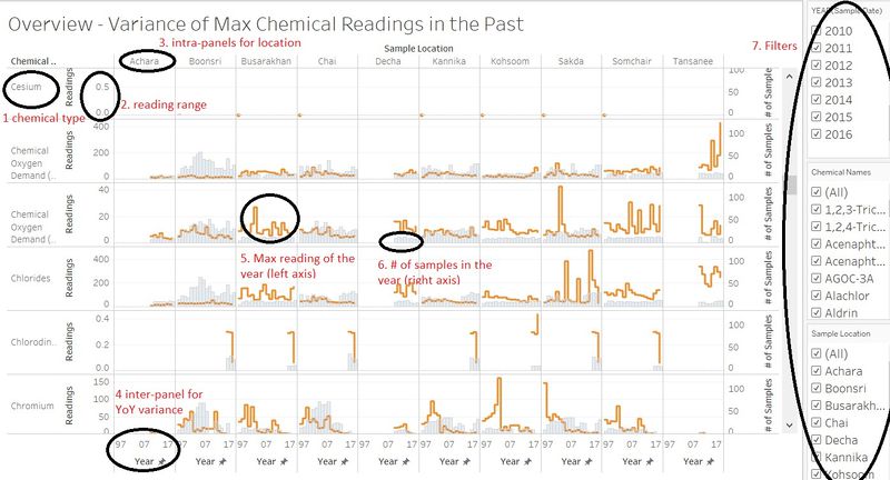
Tableau is used to provide a visualisation overview of the dataset, with key components clarified as below
- Name of chemicals – this is listed in alphabetic order for ease of following
- Chemical readings – note the range is different for different chemicals. Although the range may not be ideal, remember that we are interested in trends rather than absolute numbers
- Location – use panels to divide the panels for location-to-location benchmarking.
- Year of sampling – use 1997-2027 to show the historical trend. Although no all samples were taken back in 1997, it was decided to keep 20-year ranges for all to address the completeness of the data. And it fullfill the purpose of the overview
- Max readings of all samples in any given year. Note that interest is to see if there any significant change in chemical level – so it is sound to look at max value (and median value if needed)
- The bars show the number of samples taken for any given year. This would address the question if the sample scheme was sufficient to make any conclusions. The bars are made with a degree of transparency so that it becomes secondary information from the chart
- Filters are provided to allow user to chose parameters of specific interest.
Tableau link for below visualisation overview[1]
