ISSS608 2017-18 T3 Assign Weijie Jay Zheng Data Analysis Proceeding
Link to go back to MITB class assignment page (Group 1)
VAST Challenge 2018: Suspense at the Wildlife Preserve
|
|
|
|
|
Contents
- 1 Data Analysis Principle - Focus on the Objectives
- 1.1 Data Analysis Step 1 - Eliminate chemicals with insufficient data
- 1.2 Data Analysis Step 2 - Eliminate data that are irrelevant to the purpose
- 1.3 Data Analysis Step 3 - Only investigate chemicals with minimum 5 samples in the given year
- 1.4 Data Analysis Step 4 - To interpret the "normality" by bench-marking
- 1.5 Data Analysis Step 5 - Interpret the data for the remaining chemicals
- 1.6 Data Analysis Step 6 - Finalize visualization summary
- 1.7 Step 7 - Identification of Potential Contamination
Data Analysis Principle - Focus on the Objectives
It is a large visualization files with noisy files, and we do not present the charts for the purpose of visualizing data - it means nothing to anyone!
For data analysis to be meaningful, we need to keep reverting back to the purpose that we are looking for potential evidence that the waterway has been polluted. That is, we do not need to present the whole dataset, but it is okay or essential to trim down the data to find out the critical but relevant data.
It is apparent that there are just too many redundant chemical names with no sample taken over the year. in order to narrow down on what matters, we should only look at chemicals which have readings in the last 5 years, e.g. 2012-2016
- What’s the point of raising questions on chemical data if nothing to compare for the last 5 years?
The next step is to have quick browsing of the charts, and assess whether or not to keep any chemical. The hypothesis is that the visualisation is able to eliminate noisy/useless information quickly. Not necessarily scientific, but common sense should be applied.
- This step can be done via the filter function of "exclude values"
Data Analysis Step 1 - Eliminate chemicals with insufficient data
Tableau workbook reference for this step[1]
For this particular step, we want to eliminate chemicals with nil or limited data in the last 5 years. Example of such chemicals is "Dissolved Silicates", where the last points observed were in 2013, and no evidence for any trend.
Data Analysis Step 2 - Eliminate data that are irrelevant to the purpose
Tableau workbook reference for this step[2]
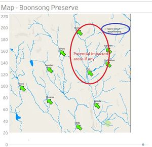
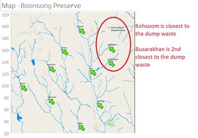
By observing the map of Boonsong Preserve, it is fair to assume the waste dumping is more likely to impact on nearby waterways rather than those further way. Since our objective is to find the evidence of pollution impact, we will narrow down the analysis focus to 4 locations: Boonsri, Koonsoom, Busarakhan, and Chai.
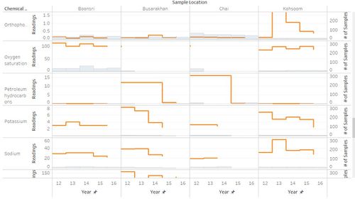
The visulisation is then much simplified as below.
Further data cleaning is done based on visual compariosn
- similar levels and consistent trends for these 4 locations, e.g. "Dissolved Oxygen"
- Limited data for these 4 locations, e.g. "Macrozoobenthos"
Data Analysis Step 3 - Only investigate chemicals with minimum 5 samples in the given year
Tableau workbook reference for this step[3]
Since we are looking for evidence to prove any potential contamination, one would require the evidence to be statistically valid. For this purpose, we will eliminate any chemicals with <5 readings in the given year. Similar data cleaning process (as step 1 and 2) is then applied to further trim down the dataset.
Data Analysis Step 4 - To interpret the "normality" by bench-marking
Tableau workbook reference for this step [4]
Given the data scientist does not have the expertise to tell what is “normal” chemical level, a practical way to solve this issue is via benchmarking.
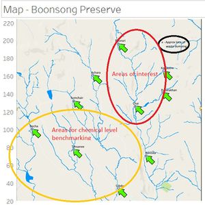
In previous stage, we chose 4 locations of interests; this time we will benchmark against 3 locations (Decha, Sakda, Tansanee)furthest away from the waste dumping area. That is, those 3 areas are very unlikely to be affected by the waste dumping, and note that these 3 locations are in different water streams!
Similar data cleaning process (as step 1 and 2) is then applied to further trim down the dataset.
Data Analysis Step 5 - Interpret the data for the remaining chemicals
Tableau workbook for this step is [5]
After eliminating a number of chemicals post benchmarking other sampling locations, we are back to observe the trends/levels for the 4 potentially contaminated locations.
Similar exercise, with 4 chemicals eliminated in this step, e.g. Chemical Oxygen Demand (Mn) is eliminated because of similar levels for the 4 locations with no evidence suggesting any trend.
Data Analysis Step 6 - Finalize visualization summary
Tableau workbook reference for this step is [6]
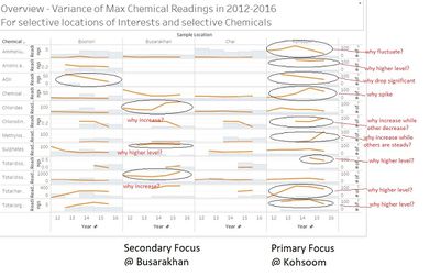
With 12 chemicals left, it is now much feasible to investigate in details. As per the charts show below
- Kohsoom show very abnormal readings for a number of chemicals. Primary focus for further investigation
- Busarakhan show abnormal readings for some chemicals. Secondary focus for further investigation
Noting that Kohsoom is the closest to the waste dump, and Busarakhan is the 2nd closest to the waste dump. It seems the results are implying some coorelations
Step 7 - Identification of Potential Contamination
Tableau workbook reference for this step is[7]
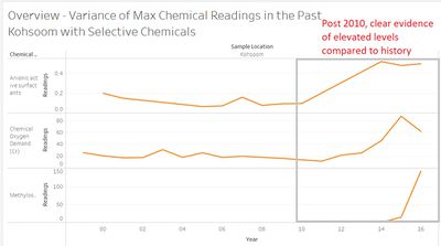
By narrow down the focus to Kohsoom with a handful of chemical left, we can then extent the timeframe to the full scope, and explore any potential trend/abnormals
- it becomes clear that 3 chemicals, Anionic active surfactants, Chemical Oxygen Demand (Cr) & Mythylosmoline, are trending upwards.

