ISSS608 2017-18 T3 Assign Liu Yuanjing Methodology
Tools
|
Methodology
|
Methodology |
Description |
|
|
Standardization method: |
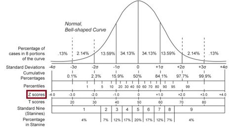
Because we want to go through all measures in different waterways or locations but measures have different units and if we want see the volatility changes in different paths or location and then identify potential chemical contamination. Therefore, we decided to use Z-Score to modify the data bias. Z-score represents the distance of the original data from the mean, and the standard of the distance measure is the standard deviation.
If the amount of statistical data is sufficient, the Z-score data distribution is satisfied, 68% of the data is distributed between "-1" and "1", and 95% of the data is distributed between "-2" and "2", 99%. The data is distributed between "-3" and "3". You can use this to verify your data. See the Z-score data distribution below: and then we edit the formula in tableau and add one measure variable, called “Z-Score”, the formula as below:
| |
|
Animation analysis by Z-scores |
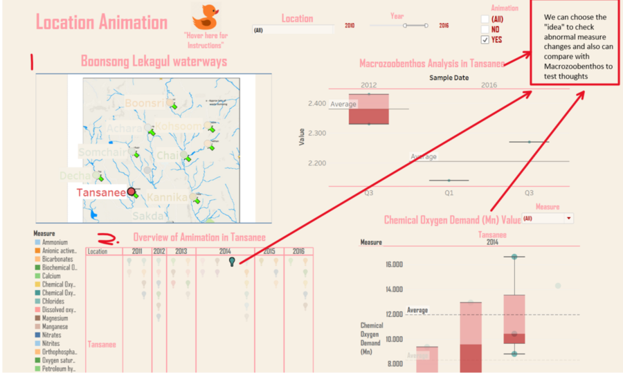
In the dataset, there are more than 100 measures in different locations. Then when user to explore measures, it would kill lots of time to identify one by one. Therefore, Z-score could be utilized in making a preliminary screening among so many measures. In the data set, if measures z-score (based on its value) more than 1 or less than -1 would be classify “YES”, and if between [-1.1], would be labeled “NO”. The formula in tableau as below:
| |
|
Path Analysis |
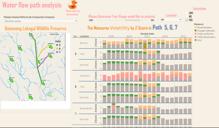
Some of sampling sites are in the same water ways and part of them in the upper course, some in the middle course, and also have two sampling sites at lower course. And same waterflow (Path) could tell us the whole picture about chemical measures changes. Because the water would flow down along the path and the chemical contaminant also would flow down but a vital importance point needed to be consider is that the consist of chemical measures is always changing and many chemical substances would be diluted, as more tributaries along the path flow into the main stream. Therefore, it’s truly necessary for us to analysis from water path angle to digest the whole picture.
| |
|
Location & Measures Analysis |
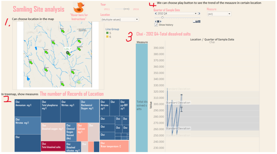
Based on principle of prudence, we also need focus on every measures and invest it one by one to find the more accurately animation pattern. Because different chemical measures increase or decrease have uncertain positive or negative effects to water environment, so we cannot simply assume that the measures increase would cause negative effect to water environment. In this way, we analysis from location with detail value changes by every measure through the select functions.
|
APPROACH TAKEN
|
Step |
Approach |
Description |
|
1. |
Data Understanding |
i. Basic Infromation
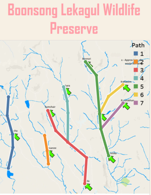
ii. Map The location of the potential contamination site identified in last year's VAST Challenge. After on-site inspection, Mistford College investigators have most recently found no indication of contamination at that site. And in the map only high the location but didn’t give water flow ways and other information;
The source of the river is where the magic begins. It all starts when rain falls on a mountain top, or when a snowy peak starts to melts. It might simply begin where water springs up through the ground, from the rock beneath. As we know , the beginning of a river, when it flows quickly with lots of energy, is called a young river. The river here is smaller and usually has a rapid, tumbling flow that cuts a narrow channel through rocky hills or mountains. And in the map, the above side has many thin water flow and then coverage in southeast direction. Therefore, we can conclude that the waterflow direction from northeast to southeast, where also can determine that the terrain is high in the northwest and low in the southeast. |
|
2. |
Data Cleaning |
i.Import two CSV Files: Boonsong Lekagul waterways readings.csv ;Chemical measure character.csv ii.Join the two csv files by measures ii.Exclude “NILL” variables
|
|
3. |
Geospatial Visualisation |
i.Generate coordinate for location in the map
|
|
|
prepare tableau analysis sheets |
Sheets LIST
|
Dashboard Design
View the interactive Tableau design here: [1]
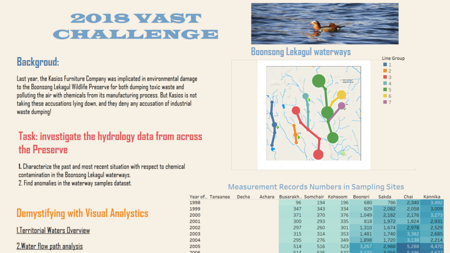
1.Introduction -- Provide basic information about the story and show the major measure water paths and locations, and also provide number of measure records in past 19 years.
Design Dashboard
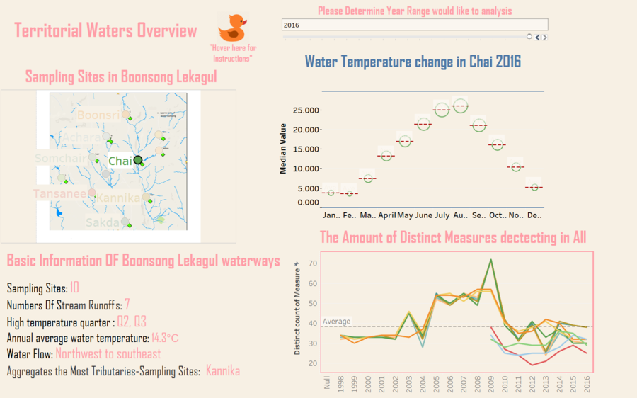
2.Territorial Water Overview --To visualize water temperature change and discount chemical measures by different locations
3.Path Analysis -- To visualize the most volatility measures in different paths
4.Location Analysis --To visualize the most volatility measures in different locations
to check the measure changes trend in certain location
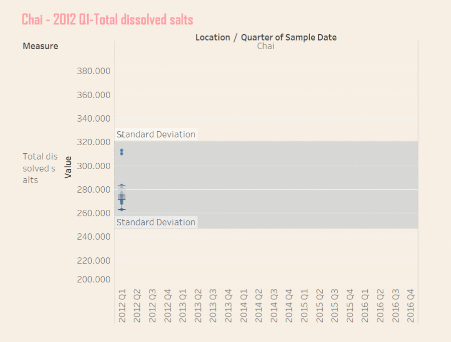
5. Location Animation Analysis --To discover unusual change in location.
v.Location Animation Analysis
To discover unusual change in location.
