ISSS608 2017-18 T3 Chan En Ying Grace Which song belongs to thee
|
|
|
|
|
|
Audio Visualisation: "Which song belongs to thee, Rose Pipit?"
1. Location Matters
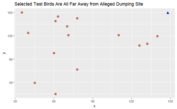
Firstly, it is important to note that the 15 testing data are nowhere near the alleged dumping site. Assuming that the samples were obtained in 2018, the 4 birds that are circles below could possibly belong to the cluster of Ordinary Snape/Lesse Birchbeere. Let’s test it out.
2. File Conversion
Next, we convert all the MP3 files into .wav format. Wav format is preferred for many of the R packages that deal with audio files. We’ll select and work with the left channel of each file, then convert our sound array to floating point values ranging from -1 to 1.
Now, we are ready to plot the oscillogram to visualize the relationship between Amplitude and Time (seconds), for each bird species. We will colour the envelope in red, for easier visualization.
Using the training dataset (2081 birds), we will pick 5 birds per species and then obtain a representative one by choosing the pattern that is most common for that species. We will do this in 3 steps.
Approach
First, we will plot the envelope of each sound wave of the bird species, for a quick visualization across each of the 19 bird species. Second, we plot the osciilogram outlined by the envelope to view the amplitude pattern in greater detail, for each of the 19 species. Thirdly, we will use ggplot to obtain a trellis plot of the distribution of each parameter of the audio file (e.g. amplitude, HNR, entropy, spectrogram slope, pitch frequency) for each species to obtain the mean.
With these 3 techniques, we will then do the same for the 15 testing birds, and compare using the three visualisations against the 19 species of the training data. This will help us identify the bird species of the 15 testing birds of Kasios.
3. Envelope Plot
Amplitude envelope refers to the changes in the amplitude of a sound over time. It is an important property of sound, because it is what allows us to effortlessly identify sounds, and uniquely distinguish them from other sounds. We will thus use envelope plot to distinguish bird calls/songs.
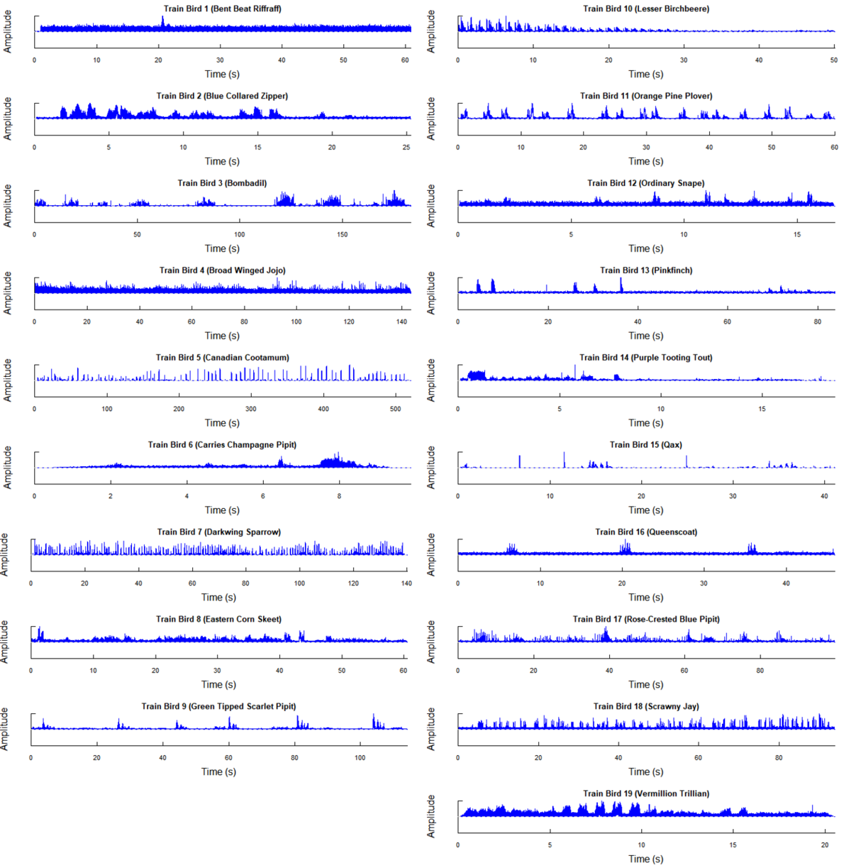
Training Birds (19 Species)
First, we will plot the envelope of each sound wave of the bird species, for a quick visualization across each of the 19 bird species.
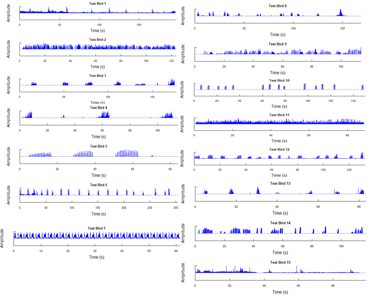
Testing Birds (15 Birds Identified By Kasios)
Next, we will plot the envelope of each sound wave for the 15 test birds.
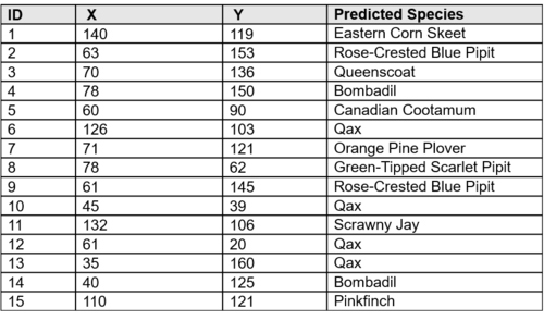
Predicted Results, Based on Visualisation
By visualizing the envelope of the amplitude waves of both the training and testing data, the last column shows the predicted species for each of the 15 test birds.
4. Oscillogram Comparison
For confirmation, let us also look at the oscillogram which gives us not only the envelope but also the waves.
Oscillogram is the plot of relative amplitude vs. time in seconds (while a Spectrogram is the plot of frequency in kHz vs. time in seconds).


