Difference between revisions of "ISS608 2017-18 T3 G2 Assign ChenYanchong Visualization"
Ycchen.2017 (talk | contribs) |
Ycchen.2017 (talk | contribs) |
||
| Line 30: | Line 30: | ||
=Preparation of worksheets= | =Preparation of worksheets= | ||
There are total 11 worksheets are used. | There are total 11 worksheets are used. | ||
| − | ==1 map== | + | ==1. map== |
Purpose of this worksheet: making use of the map and using the location information properly<br/> | Purpose of this worksheet: making use of the map and using the location information properly<br/> | ||
[[Image:Cyc_wh_1.png|350px]] <br/> | [[Image:Cyc_wh_1.png|350px]] <br/> | ||
| Line 40: | Line 40: | ||
[[Image:Cyc_wh_prep_1.jpg|400px]] | [[Image:Cyc_wh_prep_1.jpg|400px]] | ||
| − | ==2 measure count overall== | + | ==2. measure count overall== |
Purpose of this worksheet: to should the tendency from the start to the end<br/> | Purpose of this worksheet: to should the tendency from the start to the end<br/> | ||
[[Image:Cyc_wh_2.png|550px]]<br/> | [[Image:Cyc_wh_2.png|550px]]<br/> | ||
| Line 47: | Line 47: | ||
# Create a calculated field ''' first or last ''', using formula: '''FIRST() == 0 OR LAST() == 0''' | # Create a calculated field ''' first or last ''', using formula: '''FIRST() == 0 OR LAST() == 0''' | ||
# Drag '''sample date''' to the column shelf, and '''measure count ''' to row shelf | # Drag '''sample date''' to the column shelf, and '''measure count ''' to row shelf | ||
| − | # '''first or last ''' and '''location''' as filter | + | # '''first or last ''' and '''location''' as filter, and choose '''True''' only |
# '''measure count''' on row shelf again, and choose '''dual axis''' | # '''measure count''' on row shelf again, and choose '''dual axis''' | ||
# '''location''' on color card, '''measure count''' and '''location''' on label card | # '''location''' on color card, '''measure count''' and '''location''' on label card | ||
| − | ==3 measure count detailed== | + | ==3. measure count detailed== |
| − | Purpose of this worksheet: | + | Purpose of this worksheet: showing more detailed measure count than the slope chart above<br/> |
| − | [[Image: | + | [[Image:Cyc_wh_3.png|550px]]<br/> |
| − | Steps to take: | + | Steps to take:<br/> |
| − | # | + | # Duplicate the slope chart |
| − | + | # Remove '''first or last''' from filter | |
| − | |||
| − | # | ||
| − | |||
==4 measure value per loc== | ==4 measure value per loc== | ||
Revision as of 22:13, 8 July 2018
The final visualisation story board is available through Chen Yanchong's Tableau Public
This page will give a brief introduction of how the story board was prepared
Preparation of worksheets
There are total 11 worksheets are used.
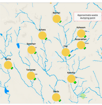
1. map
Purpose of this worksheet: making use of the map and using the location information properly

Steps to take:
- Creating a excel worksheet named location with three columns inside it, location, Xcoord and Ycoord
- Adding a background map in Tableau
- Using annotation to get the coordinate of each location on the map
- Using the prepared data table to left join the location table by the column "location"
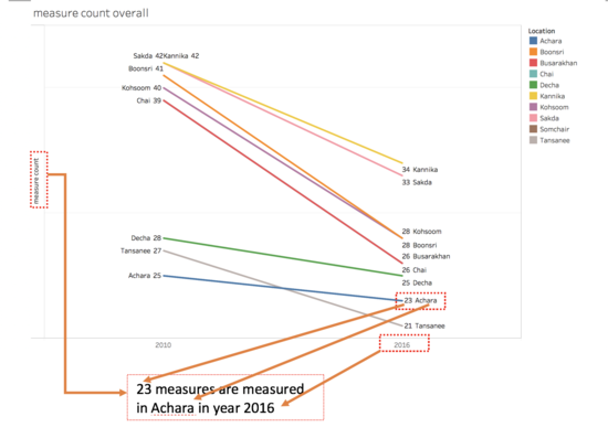
2. measure count overall
Purpose of this worksheet: to should the tendency from the start to the end

Steps to take:
- Create a calculated field measure count , using formula : COUNTD([Measure])
- Create a calculated field first or last , using formula: FIRST() == 0 OR LAST() == 0
- Drag sample date to the column shelf, and measure count to row shelf
- first or last and location as filter, and choose True only
- measure count on row shelf again, and choose dual axis
- location on color card, measure count and location on label card
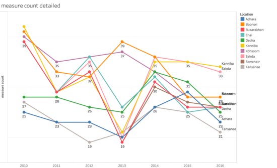
3. measure count detailed
Purpose of this worksheet: showing more detailed measure count than the slope chart above

Steps to take:
- Duplicate the slope chart
- Remove first or last from filter
4 measure value per loc
Purpose of this worksheet: making use of the map and using the location information properly
550px
Steps to take:
- Creating a excel worksheet named location with three columns inside it, location, Xcoord and Ycoord
- Adding a background map in Tableau
- Using annotation to get the coordinate of each location on the map
- Using the prepared data table to left join the location table by the column "location"
5 measure value
Purpose of this worksheet: making use of the map and using the location information properly
550px
Steps to take:
- Creating a excel worksheet named location with three columns inside it, location, Xcoord and Ycoord
- Adding a background map in Tableau
- Using annotation to get the coordinate of each location on the map
- Using the prepared data table to left join the location table by the column "location"
6 measure value trend by year
Purpose of this worksheet: making use of the map and using the location information properly
550px
Steps to take:
- Creating a excel worksheet named location with three columns inside it, location, Xcoord and Ycoord
- Adding a background map in Tableau
- Using annotation to get the coordinate of each location on the map
- Using the prepared data table to left join the location table by the column "location"
7 heat map
Purpose of this worksheet: making use of the map and using the location information properly
550px
Steps to take:
- Creating a excel worksheet named location with three columns inside it, location, Xcoord and Ycoord
- Adding a background map in Tableau
- Using annotation to get the coordinate of each location on the map
- Using the prepared data table to left join the location table by the column "location"
8 seasonality trend
Purpose of this worksheet: making use of the map and using the location information properly
550px
Steps to take:
- Creating a excel worksheet named location with three columns inside it, location, Xcoord and Ycoord
- Adding a background map in Tableau
- Using annotation to get the coordinate of each location on the map
- Using the prepared data table to left join the location table by the column "location"
9 percentage diff
Purpose of this worksheet: making use of the map and using the location information properly
550px
Steps to take:
- Creating a excel worksheet named location with three columns inside it, location, Xcoord and Ycoord
- Adding a background map in Tableau
- Using annotation to get the coordinate of each location on the map
- Using the prepared data table to left join the location table by the column "location"
10 0.3 principle
Purpose of this worksheet: making use of the map and using the location information properly
550px
Steps to take:
- Creating a excel worksheet named location with three columns inside it, location, Xcoord and Ycoord
- Adding a background map in Tableau
- Using annotation to get the coordinate of each location on the map
- Using the prepared data table to left join the location table by the column "location"
11 intuitive line graph
Purpose of this worksheet: making use of the map and using the location information properly
550px
Steps to take:
- Creating a excel worksheet named location with three columns inside it, location, Xcoord and Ycoord
- Adding a background map in Tableau
- Using annotation to get the coordinate of each location on the map
- Using the prepared data table to left join the location table by the column "location"


