Difference between revisions of "ISSS608 2017-18 T3 Assign Li Hongxin Answers"
| Line 73: | Line 73: | ||
===Discussion=== | ===Discussion=== | ||
| + | |||
| + | [[File:Test Birds Location.png|500px]] | ||
Revision as of 16:05, 7 July 2018
|
|
|
|
|
Contents
Question 1: Are Pipits actually thriving across the Preserve?
Geographical Distribution Overview
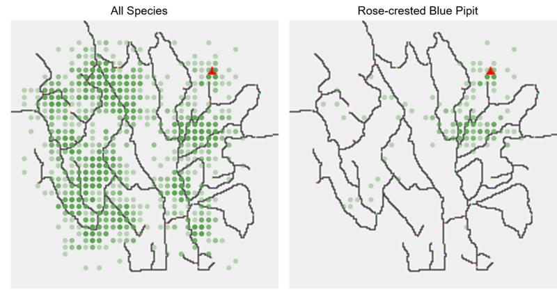
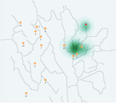
Birds were found throughout the preserve as shown in the left figure. The darker, the more birds were found around the area. Figure in the right indicates the geographical distribution of Rose-crested Blue Pipit. That is, at the northeast of the Preserve, and near to the Dumping Site(shown as red triangle).
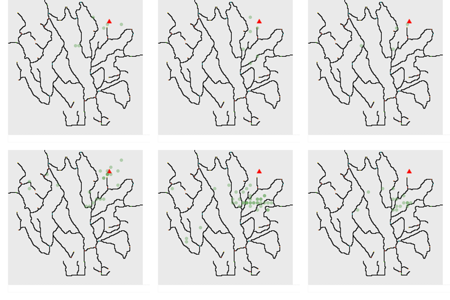
From the dynamic graph, we can find that the gathering place of Rose-crested Blue Pipit moved around the northeast corner of the Preserve from 2007 to 2017. And the path of the moving went to the red triangle direction, where the dumping site located in the recent years, and then to the opposite direction. This may provide an evidence that the dumping site has some effect on the Rose-crested Blue Pipit.
Growth Pattern
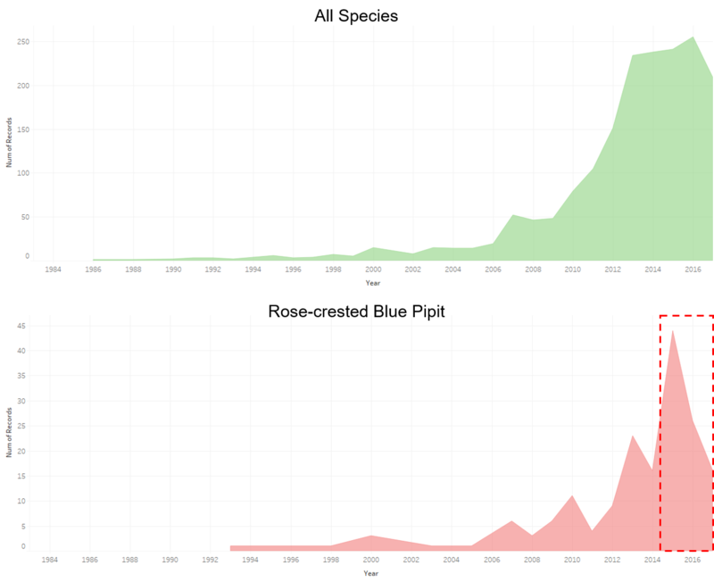
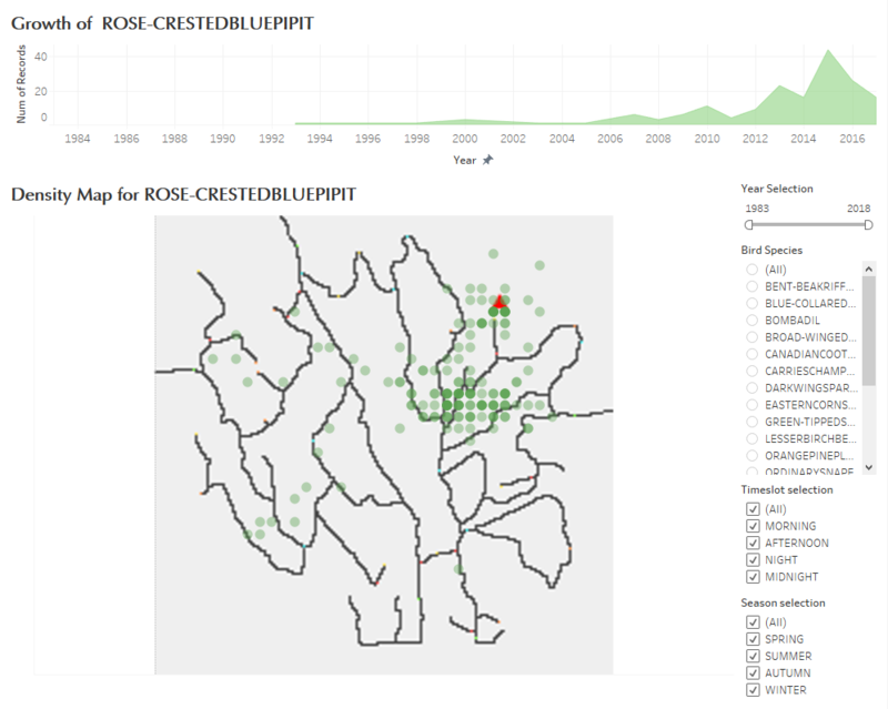
Area plot is a straightforward way of indicating the growth trend. From the figures below, we can conclude that the number of birds around this Preserve has a large growth from 1983 to 2017, so does the Rose-crested Blue Pipit. However, the number of Rose-crested Blue Pipit has a sharp decrease from 2016. This might be another evidence to show that Rose-crested Blue Pipit was influenced by the dumping site. But we still need further proof because the total number of 19 species decreased as well at the same time.
Kernel Density Plot
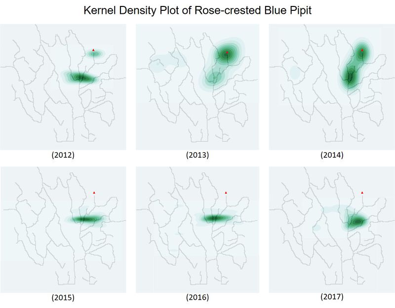
Kernel density plot was used to visualize the geographical distribution more clearly. Figure below shows that during 1983-2018, there were two centers with high density distribution of Rose-crested Blue Pipits.
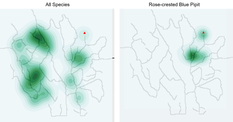
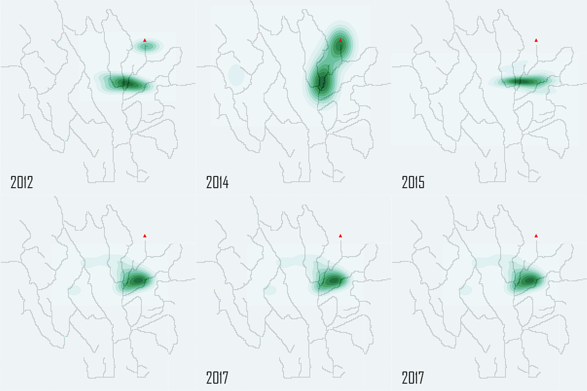
If we take look at the kernel density plot over the recent years(from 2012 to 2017), it is obvious that there were 2 centers at the beginning, and then the center near the location where dumping site was built later gathered more Pipits. But eventually, the density of this center kept decreasing from 2015 and now only one center exists for the Pipits.
You may refer to the dynamic graph to have an intuitive feelings. If the dumping site was built around 2014 or 2015, it is more likely that the Rose-crested Blue Pipit was influenced by the dumping site.
Interactive Dashboard
Interactive dashboard is created for users to find out some interesting patterns of bird species by themselves.
The upper side of the dashboard is an area plot, which shows the growth trend of one bird species or all birds in the Preserve. The bottom of the dashboard is a scatter density plot, where we change the grid from 1x1 to 5x5 to show the density of birds around the Preserve.
The controller in at the right side allow users to select Year/Bird Species/Season/Timeslot.
