Difference between revisions of "ISSS608 2017-18 T3 Chan En Ying Grace Which song belongs to thee"
| Line 34: | Line 34: | ||
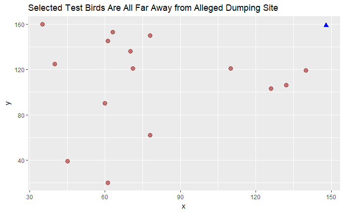
Firstly, it is important to note that the 15 testing data are nowhere near the alleged dumping site. Assuming that the samples were obtained in 2018, the 4 birds that are circles below could possibly belong to the cluster of OS/LB. Let’s test it out. | Firstly, it is important to note that the 15 testing data are nowhere near the alleged dumping site. Assuming that the samples were obtained in 2018, the 4 birds that are circles below could possibly belong to the cluster of OS/LB. Let’s test it out. | ||
| − | [[File: | + | [[File:Pic2_1.png|800px]] |
<hr/> | <hr/> | ||
Revision as of 00:20, 23 June 2018
|
|
|
|
|
|
Contents
Audio Visualisation: "Which song belongs to thee, Rose Pipit?"
1. Location Matters
Firstly, it is important to note that the 15 testing data are nowhere near the alleged dumping site. Assuming that the samples were obtained in 2018, the 4 birds that are circles below could possibly belong to the cluster of OS/LB. Let’s test it out.
2. Amplitude Plot
Next, we convert all the MP3 files into .wav format. Wav format is preferred for many of the R packages that deal with audio files. We’ll select and work with the left channel of each file, then convert our sound array to floating point values ranging from -1 to 1.
Now, we are ready to plot the oscillogram to visualize the relationship between Amplitude and Time (seconds), for each bird species. We will colour the envelope in red, for easier visualization.
Using the training dataset (2081 birds), we will pick 5 birds per species and then obtain a representative one by choosing the pattern that is most common for that species. We will do this in 3 steps.
Approach
First, we will plot the envelope of each sound wave of the bird species, for a quick visualization across each of the 19 bird species. Second, we plot the osciilogram outlined by the envelope to view the amplitude pattern in greater detail, for each of the 19 species. Thirdly, we will use ggplot to obtain a trellis plot of the distribution of each parameter of the audio file (e.g. amplitude, HNR, entropy, spectrogram slope, pitch frequency) for each species to obtain the mean.
With these 3 techniques, we will then do the same for the 15 testing birds, and compare using the three visualisations against the 19 species of the training data. This will help us identify the bird species of the 15 testing birds of Kasios.

