Difference between revisions of "ISSS608 2017-18 T3 Assign Lim Yee Cheng Insights"
Yc.lim.2016 (talk | contribs) (added insights) |
Yc.lim.2016 (talk | contribs) |
||
| Line 30: | Line 30: | ||
|} | |} | ||
<br> | <br> | ||
| − | Link to Interactive Visualisation on Tableau Public: https://public.tableau.com/ | + | Link to Interactive Visualisation on Tableau Public: https://public.tableau.com/views/ISSS608_201718-T3_AssignmentMC2_LimYeeCheng/AvgValueofContaminantbyLocation?:embed=y&:display_count=yes&publish=yes |
<div style=" text-align:left"> | <div style=" text-align:left"> | ||
<font size = 3; color="#000000"><span style="font-family:Segoe UI; font-weight:bold;"><h2>Characterizing the past and most recent situation with respect to chemical contamination in the Boonsong Lekagul waterways</h2></span></font> | <font size = 3; color="#000000"><span style="font-family:Segoe UI; font-weight:bold;"><h2>Characterizing the past and most recent situation with respect to chemical contamination in the Boonsong Lekagul waterways</h2></span></font> | ||
Latest revision as of 23:53, 8 July 2018
|
|
|
|
|
Link to Interactive Visualisation on Tableau Public: https://public.tableau.com/views/ISSS608_201718-T3_AssignmentMC2_LimYeeCheng/AvgValueofContaminantbyLocation?:embed=y&:display_count=yes&publish=yes
Characterizing the past and most recent situation with respect to chemical contamination in the Boonsong Lekagul waterways
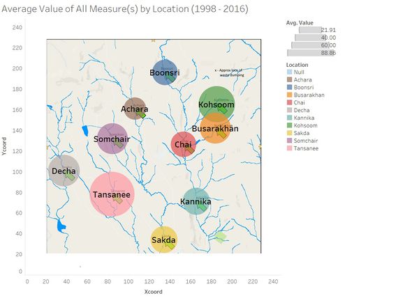
Let us first get a high-level overview of the situation, by looking at the average value of all measures across all locations and over all time, before going into trends over time. To that end, I plotted the necessary data on the interactive map that was created in the data preparation phase. The size of the bubble at each location corresponds positively to the measure value, i.e. the higher the measure value, the bigger the size. The visualisation below shows the average values of all retained measures for each location, and there seems to be no significant variation:
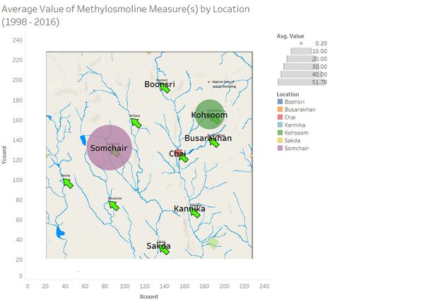
However, if we zoom into one of the contaminants named in the question, i.e. Methylosmoline, we get a very different picture. Kohsoom, which is the sampling location closest to the suspected dumping site, is highly exposed to the chemical. That is no surprise if there truly was dumping at the suspected site. However, over at Somchair, which is part of a different river system, more Methylosmoline had been detected than Somchair. This discovery, at the very least, casts some doubts over the veracity of the suspected site.
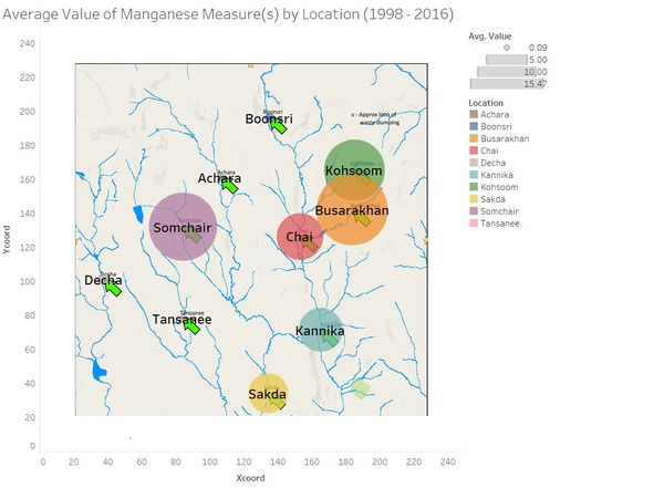
Zooming into another contaminant, Manganese, paints yet another picture. While Kohsoom and Somchair remain highly exposed, Busarakhan is now the location that suffers most from the contaminant. Chai and Kannika, which are downstream of Busarakhan, unsurprisingly show higher levels of Manganese. In this case, the fact that the entire Boonsri river system contains more Manganese provides stronger evidence that the suspected site is real, as compared to the visualisation above with Methylosmoline.
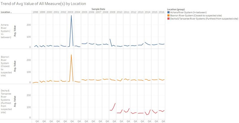
Let us now increase the visualisation resolution by looking at trends of annual averaged values for all retained contaminants. We start with trends of all contaminants for each river system, across all years of the data i.e. 1998 to 2016 with each year further broken down into four quarters. From this visualisation, there appears to be a slight upwards trend in the amount of contaminants of the Boonsri River System between 1998 and 2016. It is hard to discern evidence of any singular event (such as a dumping site) that would have created a spike in the trend. Furthermore, a similar trajectory is observed for the neighbouring Achara River System. Finally, we see that there are basically no data before 2009 for Decha and Tansanee. A plausible explanation is that sensors were not installed in those locations prior to 2009. However, the amount of contaminants in those locations are significantly higher than the Boonsri and Achara River Systems, which may justify further investigation.
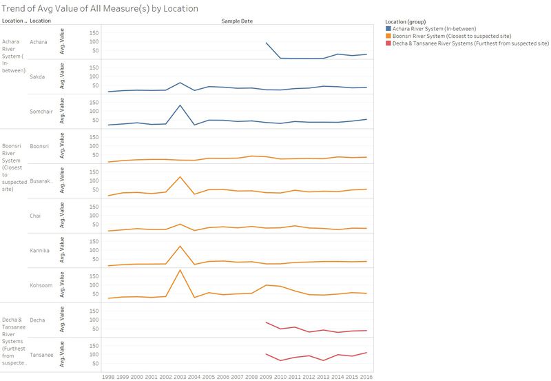
The drilling capabilities of Tableau allow for different slices of data to be visualised in one graph. From the previous visualisation, we can drill down into each of the specific locations and drill up from the quarters of the years to the years themselves, as below. In this new view, we discover that like Decha and Tansanee, there were no data for Achara before 2009 as well. Interestingly, the data for Achara started off very high before tapering off to lower levels in subsequent years. This may be due to a catastrophic event in 2009 that prompted the hydrologists to start collecting data from that area. Although what happened in 2009 pales in comparison to that in 2003, which produced gigantic peaks for Kohsoom, Kannika, Busarakhan and Somchair. Furthermore, we see that in general, there are no significant variations in the trends between the different locations.
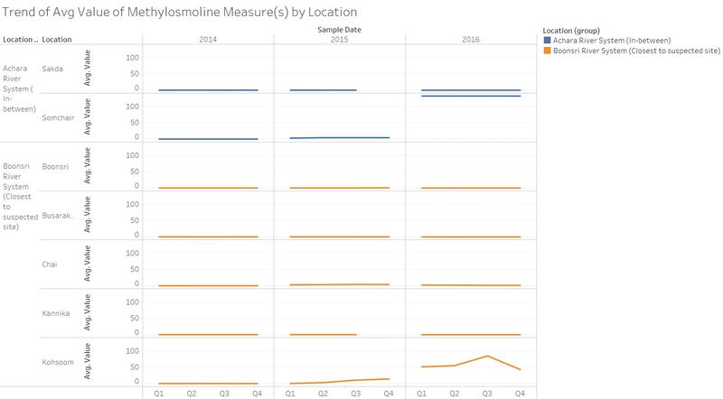
Next, let us turn to Methylosmoline which we investigated earlier, at an aggregated level in the interactive map. By looking at the trends for each location (drilled down from the location groups), we can make a few interesting discoveries. First, Methylosmoline is not present in Decha and Tansanee, which are furthest away from the suspected site. Second, the contaminant only became a problem for Somchair and Kohsoom in 2016. The trends in 2014 and 2015 were generally low and stable for both locations. Further, the escalation in 2016 is more pronounced for Somchair, which would be puzzling if the dumping site was real.
The other contaminant we investigated earlier is Manganese. The trends for each location reveal that in fact, no data were collected in 2016, with 2015 being the last year with data. This is understandable given that manganese levels were essentially close to zero for all locations after 2004. The lack of danger of exposure might have prompted the hydrologists to divert resources to more problematic chemicals. Even if the dumping site was real, it was unlikely to have included Manganese as one of the dumped toxics.

An illuminating lesson from the contrast in trends between Methylosmoline and Manganese is that dumping is a complex event that could involve endless permutations of different chemicals. Hence, visual analysis is an appropriate methodology to investigate dumping as it allows us to literally look at the problem from multiple angles.
What anomalies do you find in the waterway samples dataset? How do these affect your analysis of potential problems to the environment? Is the Hydrology Department collecting sufficient data to understand the comprehensive situation across the Preserve?
As highlighted in the Data Exploration section on the previous page, there are many measures with relatively few values, which resulted in 71 out of 106 measures being filtered out before the visualisation. Let us now explore this problem deeper with Tableau.
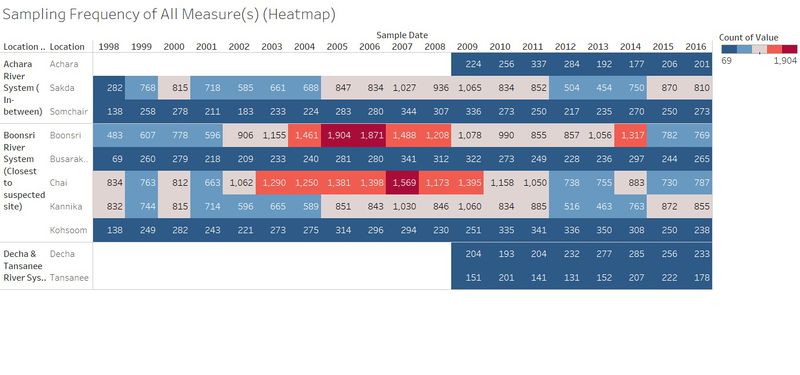
First, we shall investigate along the dimension of time. The heatmap below plots the sampling frequency of all measures for all locations. By contrasting high and low frequencies with different colours, it is apparent that frequency is consistent across time for Achara, Busarakhan, Decha, Somchair and Tansanee. However, there is no such consistency for the other five locations. In fact, we see a cluster of high frequencies for both Boonsri (2004 – 2008) and Chai (2003 – 2009). While we can only speculate as to the reason for the inconsistencies, there is no doubt that the hydrologists should strive to harmonise the frequencies across time for all locations, so that comparison between different sites would be more accurate.
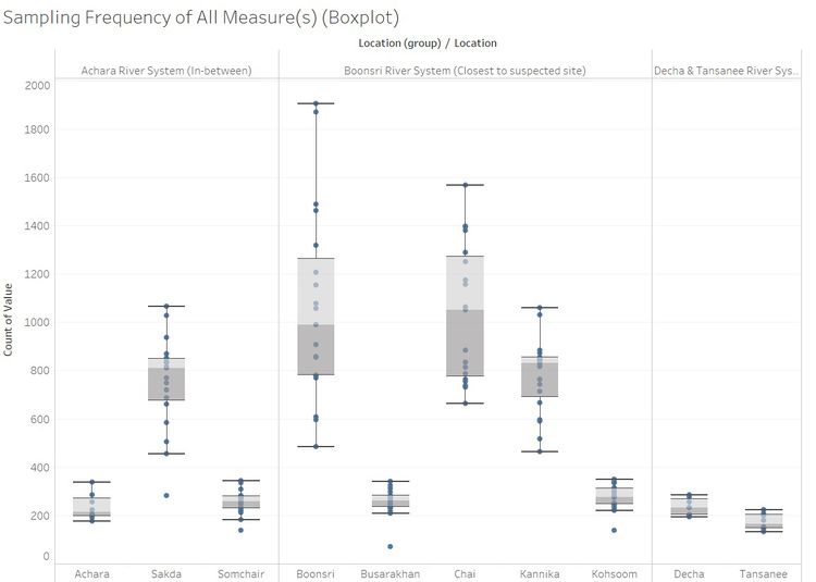
Next, we shall investigate along the dimension of locality. Boxplots are used here as they would be clearer than a heatmap and they have the added benefit of showing the distribution across years. We can clearly see that Boonsri, Chai, Kannika and Sakda have enjoyed more samples being taken from them as compared to the other 6 locations. The wider spread of values for Boonsri and Chai mirrors what we found in the previous heatmap, i.e. the clusters of abnormally high sampling frequencies at those locations in certain years.
Do any of your findings cause particular concern for the Pipit or other wildlife? Would you suggest any changes in the sampling strategy to better understand the waterways situation in the Preserve?
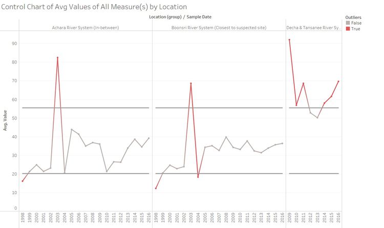
For findings to cause “particular concern”, they would need to be statistically different from what has happened in the past. This requirement can be fulfilled with a control chart, which is essentially about identifying data points that are one or more standard deviation(s) away from normal. In this case, a control chart can be built on the upper and lower bounds of the average values of the measures. The actual range between the bounds would be determined by the number of standard deviations. Data points above or below the bounds would naturally be flagged out as worthy of heightened concern.
In the first control chart below, we get a high-level overview of the situation across the three location groups (Boonsri River System, Achara River System and Decha & Tansanee River Systems) and across all years of available data. The number of standard deviations has been set as 1 but users can interact with the parameter control to select either 2 or 3 to allow for more fluctuations in the average values. One key observation is that while Decha & Tansanee River Systems have had less years of data, the data they had produced are almost all above the upper bound. Hence these river systems are in dire need of further monitoring and investigation.
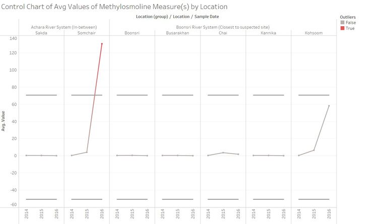
Looking specifically at Methylosmoline, we get a slightly different picture than with previous visualisations. Thus far, it has seemed like the amount of this chemical has risen significantly in both Kohsoom and Somchair and hence, both locations would warrant further monitoring and/or action to tackle this problem. However, the control chart for Methylosmoline only suggests that perhaps only Somchair would require additional attention. When setting the number of standard deviations to two, the increase in Methylosmoline in 2016 at Kohsoom is within the normal bounds.
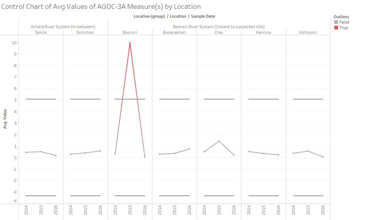
Let us turn our attention to a chemical we have not seen thus far, AGOC-3A, for a different flavour of the control chart. In this case, AGOC-3A has clearly not been a problem in general, except for Boonsri in 2015. Perhaps the surrounding area of Boonsri should be investigated for activities that produce AGOC-3A.
