Difference between revisions of "ISSS608 2017-18 T3 Assign Li Hongxin Answers"
Jump to navigation
Jump to search
| Line 33: | Line 33: | ||
<br>The <b>controller</b> in at the right side allow users to select Year/Bird Species/Season/Timeslot. | <br>The <b>controller</b> in at the right side allow users to select Year/Bird Species/Season/Timeslot. | ||
| − | [[File: | + | [[File:Jianloude_dashboard.png|800px]] |
==Question 2== | ==Question 2== | ||
b | b | ||
Revision as of 13:54, 7 July 2018
|
|
|
|
|
Contents
Question 1: Are Pipits actually thriving across the Preserve?
Overview
Growth Pattern
Kernel Density Plot
Interactive Dashboard
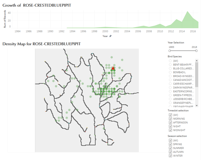
Interactive dashboard is created for users to find out some interesting patterns of bird species by themselves.
The upper side of the dashboard is an area plot, which shows the growth trend of one bird species or all birds in the Preserve. The bottom of the dashboard is a scatter density plot, where we change the grid from 1x1 to 5x5 to show the density of birds around the Preserve.
The controller in at the right side allow users to select Year/Bird Species/Season/Timeslot.
Question 2
b

