Difference between revisions of "ISSS608 2017-18 T3 Assign Chan En Ying Grace Did Rose Pipit kick the bucket"
| Line 129: | Line 129: | ||
<br><div align="center">[[File:Mid1.png|800px]]</div> | <br><div align="center">[[File:Mid1.png|800px]]</div> | ||
| + | |||
| + | <hr/> | ||
<hr/> | <hr/> | ||
| Line 135: | Line 137: | ||
Rose Pipits could either have left the Preserve as a flight mechanism, or that they were defeated and simply died and dwindled in population due to the chemical. | Rose Pipits could either have left the Preserve as a flight mechanism, or that they were defeated and simply died and dwindled in population due to the chemical. | ||
| − | I don’t think it had left, but rather, I think it dwindled. Because if it left, we should see a trend of them flying away from the Dumping Site and moving towards an edge of the Preserve to migrate to another island, for example. It was unlikely for the flight to take place immediately and we should see a staggered flight pattern across the months as birds migrate elsewhere. | + | I don’t think it had left, but rather, I think it dwindled. Because if it left, we should see a trend of them flying away from the Dumping Site and moving towards an edge of the Preserve to migrate to another island, for example. It was unlikely for the flight to take place immediately and we should see a staggered flight pattern across the months as birds migrate elsewhere. |
===Facet Grid Plot=== | ===Facet Grid Plot=== | ||
Revision as of 23:48, 22 June 2018
|
|
|
|
|
|
Contents
- 1 Cluster Visualisation: "Did Rose Pipit actually kicketh the bucket?"
- 1.1 1. Data Overview
- 1.2 2. Clustering by Species
- 1.3 3. Assignment of Treatment & Control Groups
- 1.4 4. Rose Pipits Only – Across the 4 Seasons
- 1.5 5. Rose Pipits Across Time
- 1.6 6. Kernel Density Plot to visualize clusters (All Birds & Rose Pipit)
- 1.7 7. Kernel Density Plot of Rose Pipits Across Time (2012-2017)
- 1.8 8. Spatial Point Pattern Analysis (Across Time)
- 1.9 9. Did Rose Pipits die from the dumping chemical? If not, where did they flock to?
- 1.10 Facet Grid Plot
- 1.11 Kernel Density Plot – by Quarter
Cluster Visualisation: "Did Rose Pipit actually kicketh the bucket?"
1. Data Overview
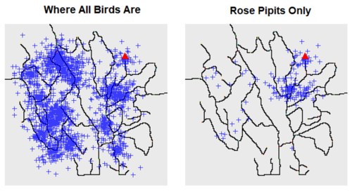
Different bird species were found throughout the preserve, but Pipits were found typically in the northeastern side of the preserve – that is, closest to the alleged Dumping Site marked by the triangle below.
We can also see a visible Pipit cluster near/at the Dumping Site. This is likely why the alleged dumping by Kasios was “accused” to cause the death of the Pipits since the Pipits were found at that location.
2. Clustering by Species
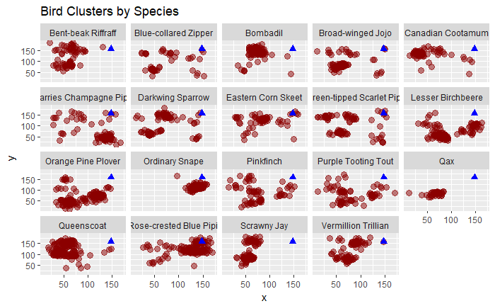
To characterize the pattern relative to the alleged dumping site (blue triangle), the following facet plot shows the clustering patterns by Bird Species, independent of time.
From the cluster locations, we can see that the Rose-Crested Blue Pipits are clustered around the alleged dumping site, explaining why the 15 test birds provided are claimed to be Rose-Crested Blue Pipits to prove the allegation wrong. We can use this facet plot to have a good overview of other bird species’ cluster locations, such as the Ordinary Snape and Lesser Birchbeere being also clustered near to the Dumping Site.
3. Assignment of Treatment & Control Groups
If the dumping indeed took place, one would expect that other birds in this dumping area would also decrease in population as they would migrate elsewhere or die from the dumping substance, not just affecting the Rose Pipits.
Other species that are dominantly clustered around the dumping site include the Ordinary Snape and Lesser Birchbeere. These populations should also be affected by the dumping, if dumping indeed happened. We will thus use Ordinary Snape (OS) and Lesser Birchbeere (LB) as our Control Group, and Rose-Crested Blue Pipits (Rose Pipit) as our Treatment Group.
4. Rose Pipits Only – Across the 4 Seasons
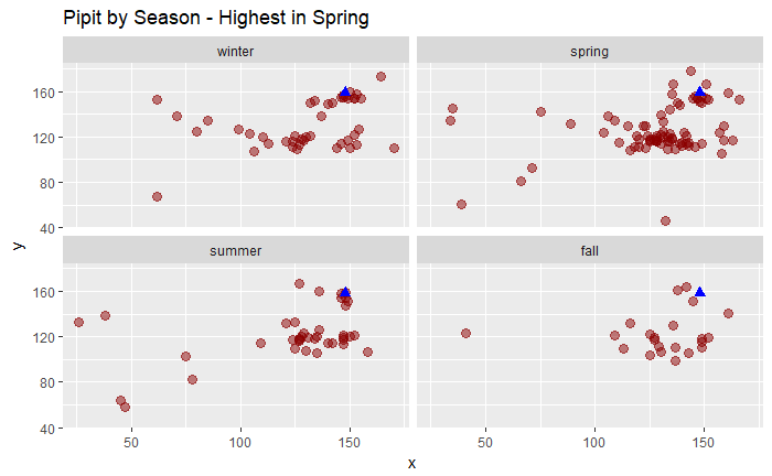
Just like other bird species, Rose Pipits population peaked in the Spring. When we analyse its population across time, we should bear in mind that seasonal or monthly population changes would not help us determine the true population patterns accurately as change in population is likely due to seasonal migration, than dumping. Thus, we will track its population changes across Year, than across month or season.
5. Rose Pipits Across Time
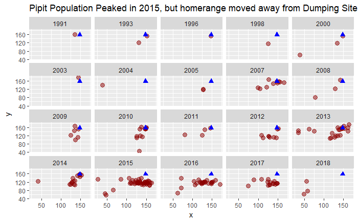
There are two observations here.
a. First, the Pipit population increased in 2013 to 2017.
In 2013, the cluster appeared right at the alleged dumping site. We call this the Pipit home range, where the Pipits tended to live and thrive. Population soared in 2015 and then declined gradually till 2017.
However, it is important to note that this is a short 5-year period and prior to 2013, Pipits were few and far between. One possible interpretation could be that Pipits only found the Boonseng Preserve as their home in 2013, and lived elsewhere prior to this.
Another possible interpretation could be due to data quality issue. Although it is mentioned that the data is well represented, an overview of the data showed signs of data quality, especially in the earlier years (80s, 90s) where birds across all species were reported to be very few. Due to the incompleteness of data, we will focus on years 2013-2017 for a more reliable study.
b. Second, the home range moved away from the dumping site, from 2015 onwards even though that was the year of peak.
This could be signs of dumping. It could be that the dumping caused Pipits to fly slightly further away, but the long-run effect was that the birds population dwindled as they struggled to survive given the decline in population size (as the cluster got smaller). It could be that only those that flew away from the site survived.
But given that the Kasios company provided some Pipit bird calls, we should also analyse to see if it really belongs to Pipits, and whether these calls were obtained around the dumping site or far away from it. If far away, then it could support the dumping claim. If near, then more work needs to be put in to analyse this.
6. Kernel Density Plot to visualize clusters (All Birds & Rose Pipit)
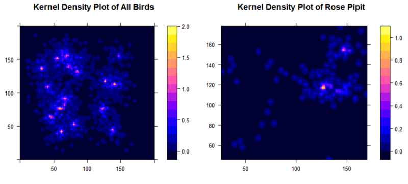
To visualize the above clusters more clearly, we plot the Kernel Density to visualize the size and intensity.
If we look at Rose Pipits (right), the Kernel Density plot gives us clearer visualization that there were 2 (not 1!) clusters formed. This could possibly indicate some sort of migration from one to the other. As the bottom cluster (away from dumping site) looks bigger than the top cluster (at dumping site), it could also be a sign of dumping, as dumping chemicals could cause the population to be smaller and give rise to the Pipits' migration from its original homerange to a new homerange.
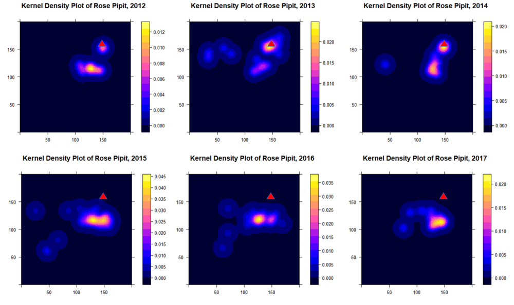
To verify this, let us do a Kernel Density plot for Pipits across time for a six-year period from 2012-2017.
7. Kernel Density Plot of Rose Pipits Across Time (2012-2017)
Interestingly, when we plot the the Kernel Density across time, we can see that there were two clusters in 2012 – one at the dumping site, and one slightly away from the dumping site. The cluster at the dumping site grew in size until 2014, while the cluster away from the dumping site took over and started to grow in 2014.
More importantly, the cluster at the dumping site vanished totally from 2015 onwards, leaving only the cluster away from the dumping site, which grew in size. This could indicate a movement of birds from the dumping site cluster towards the cluster away from the dumping site, possibly indicating a trend of dumping.
8. Spatial Point Pattern Analysis (Across Time)
To more objectively determine the strength and significance of the clusters, we apply distance-based measures to test for cluster statistical significance, that could shed light towards the dumping allegation – the Quadrat Test, K-Nearest Neighbour as well as the K-Function.
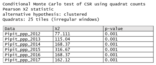
a. Quadrat Analysis (Across 2012-2017)
Rose Pipit clusters were statistically significant at the 1% level of significance across 2012 to 2017, when a quadrat analysis was applied with the alternative hypothesis set as clustered. However, the Pearson X2 statistic peaked at 2015 and reduced after that, showing signs of reduction in cluster (though still statistically significant)
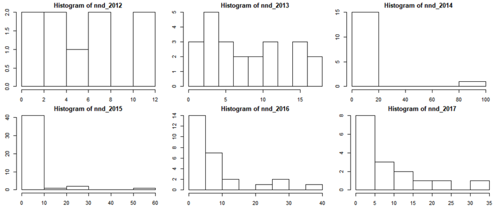
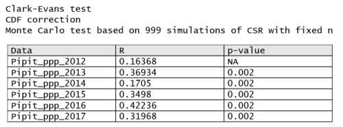
b. K-Nearest Neighbour, followed by Clarke-Evans Test (Across 2012-2017)
Clusters were most compact in 2015, where majority of each Pipit’s neighbours were within 10units distance away. From 2016 however, the neighbouring distance expanded to beyond 10 towards 40. Though clusters were statistically significant from 2012 to 2017 (applying the Clark-Evans test), the clusters started to disperse after 2015 which was the suspected year of dumping.
c. K-Function (Across 2012-2017)
Likewise, when a K-Function was applied, the size/strength of clusters reduced overtime after year 2015 as the grey shaded range increased.
Eventually in 2017, the cluster lost its significance when radius was below 5. Clusters were significant only when the radius was 5 or greater. In other words, the cluster became less compact after 2015.
That said, we note that in year 2013 and 2014, the clusters were likely not that strongly significant. Ceteris paribus, this is because there were two clusters if we refer to the earlier Kernel Density plot, rather than a decline in Pipit population, so this is not a cause for concern.
9. Did Rose Pipits die from the dumping chemical? If not, where did they flock to?
Rose Pipits could either have left the Preserve as a flight mechanism, or that they were defeated and simply died and dwindled in population due to the chemical.
I don’t think it had left, but rather, I think it dwindled. Because if it left, we should see a trend of them flying away from the Dumping Site and moving towards an edge of the Preserve to migrate to another island, for example. It was unlikely for the flight to take place immediately and we should see a staggered flight pattern across the months as birds migrate elsewhere.
Facet Grid Plot
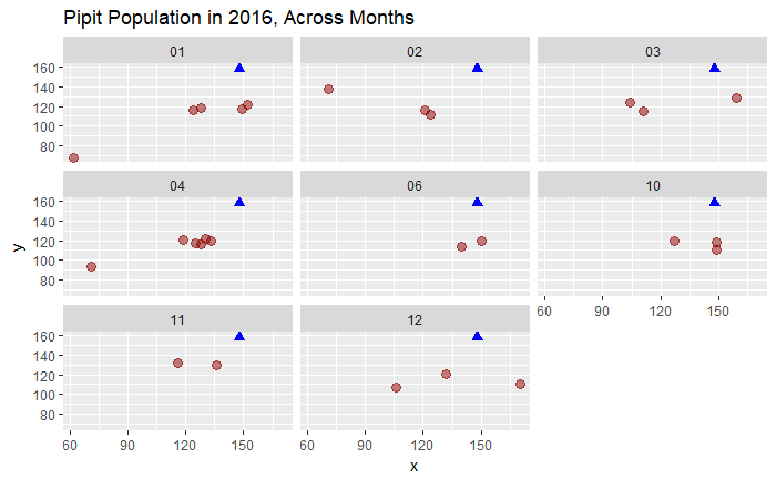
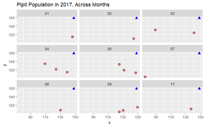
To test my hypothesis, let’s do a KD plot by month for 2016 and 2017 only. Unfortunately, KD plot is not possible for small data points (as some months only have 1-2 birds). So let’s start off with a Facet Grid Plot to see if there’s a trend where the birds are migrating.
The pattern is not so clear in 2016. Birds moved away from the dumping site but dwindled at that location.
But in 2017, this pattern is clearer. The remaining birds were flocking to the South East of Kasios Island, even in Spring (April). This could be because their alternate homerange is in another region of the country, southeast of Kasios.
Kernel Density Plot – by Quarter
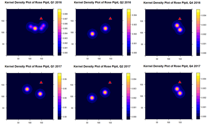
However, this is not that convincing. Let’s attempt to run a Kernel Density Plot - instead of by month (which we lack data of some months especially in the 2nd half of the year), we plot the kernel density for each quarter in 2016 and 2017.
Note that Q3 2016 and 2017 data is too few for a Kernel Density plot, so we have no choice but to omit them from our analysis.
Interestingly, the birds actually flew back closer to the dumping site every end of the year (winter).
Could it be that the dumping was not once-off, but during certain parts of the year e.g. in dumping took place in Q3, explaining the absence of birds? Or is the absence of birds due to seasonal changes?
Well, when we look at the Pipit distribution by season in the earlier graph, we can see that Summer should be the 2nd highest peak season of Pipit population. There is no reason why it should be 0 in population. Possibly, this could be signs of dumping takes place every year in Spring/Summer from 2015 onwards.
However, I must note that the data points are too few to analyse the birds in 2016 and 2017 even by quarter and make such concusions. Even by visualizing the facet plot, it is clear that the KD plot can be not representative because of the few data points.
Instead, let us focus on our Control Groups to shed greater light into the fate of our Rose Pipits.

