Difference between revisions of "ISSS608 2017 T3 Assign BI HE Question"
He.bi.2017 (talk | contribs) |
He.bi.2017 (talk | contribs) |
||
| Line 23: | Line 23: | ||
'''''Dissolved oxygen''''' | '''''Dissolved oxygen''''' | ||
| − | [[File:Bihe 1.png| | + | <span style=text-align:center;">[[File:Bihe 1.png|300px|thumb|left|Dissolved Oxygen in Achara]]</span> |
| + | |||
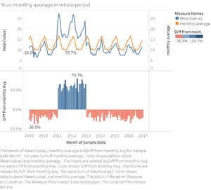
Above is data from 2009-2017 for dissolved oxygen in Achara, the value of dissolved oxygen is higher than other years between 2011-2012, which may be effect of human activities. | Above is data from 2009-2017 for dissolved oxygen in Achara, the value of dissolved oxygen is higher than other years between 2011-2012, which may be effect of human activities. | ||
Revision as of 16:32, 9 July 2018
Q1 Characterize the past and most recent situation with respect to chemical contamination in the Boonsong Lekagul waterways. Do you see any trends of possible interest in this investigation?
Method
Month-to-Month comparision
The line graph is used to display the trend of each indicator. Set up the axis as dual axis for real time waterway data and monthly average data. And synchronize the axis for two lines.
For the second part of the graph, the bar chart can be used to show the change of difference from monthly average. The setting for columns and rows is as below.
The filter for measure and location provides user to observe the trend for each indicator in each location.
Location comparison
tree map is also useful in this case. Filters and marks setting are below
Insight
For each of the indicator, the change ratio can be observed from the graph below.
•From all 106 indicators, it can be observed that many of the them have changed sharply according to the time series. And some of the chemistry indicators have significant change in a continuous period in some places.
Dissolved oxygen
Above is data from 2009-2017 for dissolved oxygen in Achara, the value of dissolved oxygen is higher than other years between 2011-2012, which may be effect of human activities.
Above are the graphs for Busarakhan(left) and Somchair(right). They shared similar pattern for data trend. They got spike in same period of time and similar value with the percentage of difference from monthly average (189.5% and 188.4% respectively). Based on the observation of map, they are not from the same river. So, we can make an assumption that in Busarakhan and Somchair are affected by similar human activities between 2012-2017.
The tree map of dissolved oxygen shows the difference from the location average for all location in all period of time. It is obvious that the data from Chai is higher than location average in most of time, Busarakhan,Somchair,Boonsri and Achara are also detected to have higher than average dissolved oxygen rate in a specific of period.
After signed up all the abnormal spots for dissolved oxygen, we can have an assumption that there are human activities along the river signed in green and near the red circles.
