Difference between revisions of "ISSS608 2017-18 T3 Assign VISHALI REDDY NALLA - Visualisations"
| (2 intermediate revisions by the same user not shown) | |||
| Line 7: | Line 7: | ||
{|style="background-color:#F7E7D4;" width="100%" cellspacing="0" cellpadding="0" valign="top" border="0" | | {|style="background-color:#F7E7D4;" width="100%" cellspacing="0" cellpadding="0" valign="top" border="0" | | ||
| − | | style="font-family:Georgia; font-size:100%; solid #343009; background:#F7E7D4; text-align:center;" width=" | + | | style="font-family:Georgia; font-size:100%; solid #343009; background:#F7E7D4; text-align:center;" width="16%" | |
; | ; | ||
[[ISSS608_2017-18_T3_Assign_Vishali_Reddy_Nalla| <font color="#343009"> Introduction</font>]] | [[ISSS608_2017-18_T3_Assign_Vishali_Reddy_Nalla| <font color="#343009"> Introduction</font>]] | ||
| − | | style="font-family:Georgia; font-size:100%; solid #343009; background:#F7E7D4; text-align:center;" width=" | + | | style="font-family:Georgia; font-size:100%; solid #343009; background:#F7E7D4; text-align:center;" width="16%" | |
; | ; | ||
[[ISSS608_2017-18_T3_Assign_VISHALI_REDDY_NALLA - Data Preparation| <font color="#343009">Data Preparation</font>]] | [[ISSS608_2017-18_T3_Assign_VISHALI_REDDY_NALLA - Data Preparation| <font color="#343009">Data Preparation</font>]] | ||
| − | | style="font-family:Georgia; font-size:100%; solid #343009; background:#F7E7D4; text-align:center;" width=" | + | | style="font-family:Georgia; font-size:100%; solid #343009; background:#F7E7D4; text-align:center;" width="16%" | |
; | ; | ||
[[ISSS608_2017-18_T3_Assign_VISHALI_REDDY_NALLA - Visualisations| <font color="#343009"> <big><big>Visualisations</big></big></font>]] | [[ISSS608_2017-18_T3_Assign_VISHALI_REDDY_NALLA - Visualisations| <font color="#343009"> <big><big>Visualisations</big></big></font>]] | ||
| − | | style="font-family:Georgia; font-size:100%; solid #343009; background:#F7E7D4; text-align:center;" width=" | + | | style="font-family:Georgia; font-size:100%; solid #343009; background:#F7E7D4; text-align:center;" width="16%" | |
; | ; | ||
[[ISSS608_2017-18_T3_Assign_VISHALI_REDDY_NALLA - Insights| <font color="#343009">Insights</font>]] | [[ISSS608_2017-18_T3_Assign_VISHALI_REDDY_NALLA - Insights| <font color="#343009">Insights</font>]] | ||
| Line 28: | Line 28: | ||
; | ; | ||
[[ISSS608_2017-18_T3_Assign_VISHALI_REDDY_NALLA - Conclusion| <font color="#343009"> Conclusion </font>]] | [[ISSS608_2017-18_T3_Assign_VISHALI_REDDY_NALLA - Conclusion| <font color="#343009"> Conclusion </font>]] | ||
| + | |||
| + | | style="font-family:Georgia; font-size:100%; solid #343009; background:#F7E7D4; text-align:center;" width="16%" | | ||
| + | ; | ||
| + | [[Assignment_Dropbox_G2| <font color="#343009"> Assignment Dropbox </font>]] | ||
| | | | ||
| Line 122: | Line 126: | ||
=Tableau Public = | =Tableau Public = | ||
| − | Have a look at my Visualisations and Dashboard at [https://public.tableau.com/profile/vishali.reddy#!/vizhome/VASTMC2Workbook/PrimaryInvestigation?publish=yes] | + | Have a look at my Visualisations and Dashboard at [https://public.tableau.com/profile/vishali.reddy#!/vizhome/VASTMC2Workbook/PrimaryInvestigation?publish=yes Tableau Public Vishali Nalla] |
---- | ---- | ||
Latest revision as of 23:18, 8 July 2018
|
|
|
|
|
|
|
Visualisations
I created the following visuals in Tableau to study the chemical contamination in Boongsong Lekagul Wildlife Preserve.
1) Groups
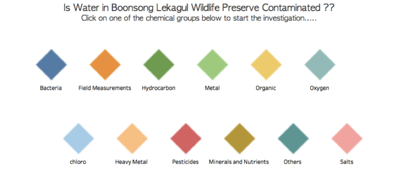
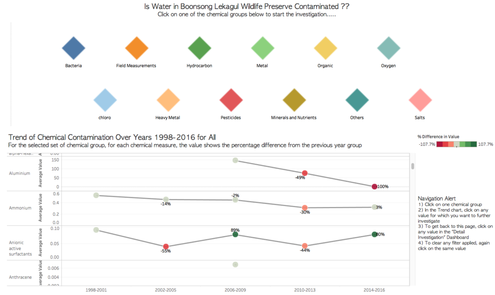
I created Chemical Groups Overview graph inspired from Tiles Chart that I used it as a filter to drill down to list of only those chemicals which belong to that group.To create the Tiles with Chemical groups, I manually assigned X & Y Coordinates to all the Chemical groups using the calculated fields Group_Xcoor & Group_Ycoor.
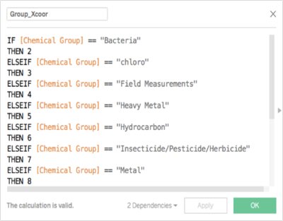
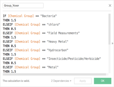
Then mapped the chemicals groups according to the coordinates assigned and colored using chemical groups.
2) Trend of Chemical Contamination Over Years
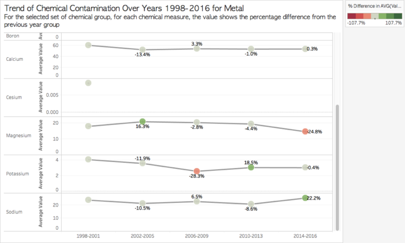
To analyze the trend of chemical measures from past to most recent, I grouped consecutive 4 years into single Year group from 1998-2016.
Then I plotted a line graph with percentage change of average value of measure readings from previous year group which shows if the chemical measures have increased or decreased or remained constant in recent times (2014-2016). This graph is to quickly analyze the chemicals of concern and ignore chemicals which have remained stable over years.
3) Drill Down for the details in Trend
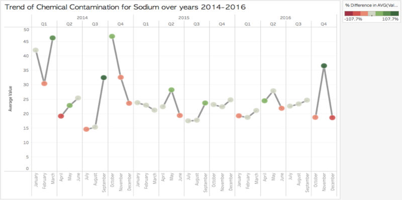
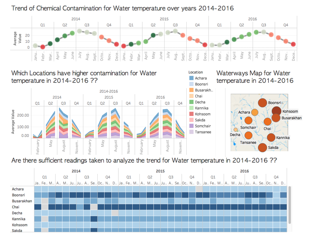
This is a replica of the “Trend of Chemical Contamination Over Years” which a few modifications. This chart has detail analysis on Year -> Quarter -> Month for the selected Chemical Measure and Year Group.
Challenges – Not all chemical measures have readings every month or every year, therefore for few chemical measures, we can see blank spaces which means no readings were taken in that time period.
4) Which Locations have higher contamination?
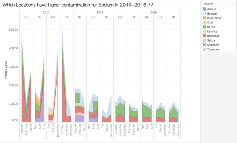
To see Areas which are more contaminated, I plotted the average value of the chemical measure with respect to the Locations as an Area Graph. In the Area Graph, each Location is colored separately so we can clearly analyze which Locations have higher values.
Challenges - For few locations which don’t have readings are not reflected in the graph.
5) Waterways Map
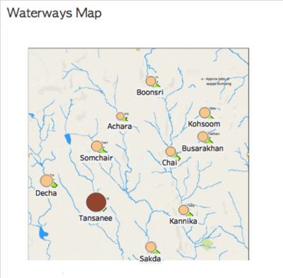
To see which waterways are most effected I plotted the average values over a specified time period for a chemical measure with the background image as Waterways Map against Xcoord and Ycoord derived in the data preparation. With this Map, we can also see the effect of a chemical measure for the surrounding locations. Additionally, we can see the proximity of location to the dumping site.
6) Are there sufficient readings taken to analyze the trend?
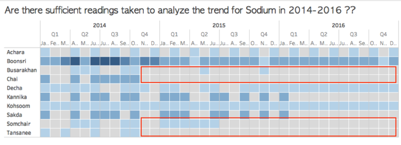
Now that we have seen the locations which are most effected by a chemical measure, now the question is to see if the recordings are sufficient enough to say that the location is actually effected by the chemical. To see the number of readings taken for a chemical over a time period, I plotted a heat map showing number of readings Location wise.
The tiles that are marked in grey are those which don't have any readings for the respective location and time period.
Interactive Dashboard
Primary Investigation Dashboard :
As we have 106 chemicals, it is very difficult to drill down on chemicals manually, so therefore I used “chemical group” as a filter to show list of only those chemicals belonging to that group. This is done by creating an action with filter as Chemical Group with source sheet as Groups and Target Sheet as Trend.
Navigation Alert
1) Click on one chemical group
2) In the Trend chart, click on any value for which you want to further investigate
3) To get back to this page, click on any value in the "Detail Investigation" Dashboard
4) To clear any filter applied, again click on the same value
Detailed Investigation Dashboard :
Now when we see increase in a chemical measure value in a particular year group, we would want to dig deep and look into the in-depth details. The second dashboard “Detailed Investigation “ is mainly created for study of in-depth details for a selected chemical.
Select a Chemical Measure from “Trend of Chemical Contaminations Over Years” sheet to best investigate the details in this dashboard. This would also select the Year Group for the value selected.
Below is the Detailed Investigation Dashboard.
Tableau Public
Have a look at my Visualisations and Dashboard at Tableau Public Vishali Nalla

