|
|
| (68 intermediate revisions by the same user not shown) |
| Line 1: |
Line 1: |
| | + | <div> |
| | + | [[Image:pic.jpg|550px]] |
| | + | <font size = 5; font color="#21618C"> VAST Challenge: Mini Challenge 2</font> |
| | + | </div> |
| | | | |
| | <!--MAIN HEADER --> | | <!--MAIN HEADER --> |
| | {|style="background-color:#0B5345;" width="100%" cellspacing="0" cellpadding="0" valign="top" border="0" | | | {|style="background-color:#0B5345;" width="100%" cellspacing="0" cellpadding="0" valign="top" border="0" | |
| − | | style="font-family:Century Gothic; font-size:100%; solid #1B338F; background:#0B5345; text-align:center;" width="20%" | | + | | style="font-family:Century Gothic; font-size:100%; solid #1B338F; background:#21618C; text-align:center;" width="17%" | |
| | ; | | ; |
| | [[ISSS608_2017-18_T3_Assign_Vaishnavi_Praveen_Agarwal| <font color="#FFFFFF">The Challenge</font>]] | | [[ISSS608_2017-18_T3_Assign_Vaishnavi_Praveen_Agarwal| <font color="#FFFFFF">The Challenge</font>]] |
| | | | |
| − | | style="font-family:Century Gothic; font-size:100%; solid #1B338F; background:#0B5345; text-align:center;" width="20%" | | + | | style="font-family:Century Gothic; font-size:100%; solid #1B338F; background:#21618C; text-align:center;" width="16%" | |
| | ; | | ; |
| | [[ISSS608_2017-18_T3_Assign_Vaishnavi_Praveen_Agarwal_DataPrep| <font color="#FFFFFF">Data Preparation</font>]] | | [[ISSS608_2017-18_T3_Assign_Vaishnavi_Praveen_Agarwal_DataPrep| <font color="#FFFFFF">Data Preparation</font>]] |
| | | | |
| − | | style="font-family:Century Gothic; font-size:100%; solid #1B338F; background:#7D6608; text-align:center;" width="20%" | | + | | style="font-family:Century Gothic; font-size:100%; solid #1B338F; background:#808B96; text-align:center;" width="16%" | |
| | ; | | ; |
| − | [[ISSS608_2017-18_T3_Assign_Vaishnavi_Praveen_Agarwal_Visual| <font color="#FFFFFF">Visualization Tools</font>]] | + | [[ISSS608_2017-18_T3_Assign_Vaishnavi_Praveen_Agarwal_Visual| <font color="#FFFFFF">Visualizations</font>]] |
| | | | |
| − | | style="font-family:Century Gothic; font-size:100%; solid #1B338F; background:#0B5345; text-align:center;" width="20%" | | + | | style="font-family:Century Gothic; font-size:100%; solid #1B338F; background:#21618C; text-align:center;" width="18%" | |
| | ; | | ; |
| − | [[ISSS608_2017-18_T3_Assign_Vaishnavi_Praveen_Agarwal_Vast| <font color="#FFFFFF">VAST Submissions</font>]] | + | [[ISSS608_2017-18_T3_Assign_Vaishnavi_Praveen_Agarwal_Vast| <font color="#FFFFFF">Insights and Conclusion</font>]] |
| | | | |
| − | | style="font-family:Century Gothic; font-size:100%; solid #1B338F; background:#0B5345; text-align:center;" width="20%" | | + | | style="font-family:Century Gothic; font-size:100%; solid #1B338F; background:#21618C; text-align:center;" width="19%" | |
| | ; | | ; |
| | [[ISSS608_2017-18_T3_Assign_Vaishnavi_Praveen_Agarwal_Feedback| <font color="#FFFFFF">Feedback and Comments</font>]] | | [[ISSS608_2017-18_T3_Assign_Vaishnavi_Praveen_Agarwal_Feedback| <font color="#FFFFFF">Feedback and Comments</font>]] |
| | + | |
| | + | | style="font-family:Century Gothic; font-size:100%; solid #1B338F; background:#21618C; text-align:center;" width="14%" | |
| | + | ; |
| | + | [[Assignment_Dropbox_G2| <font color="#FFFFFF">All Assignments</font>]] |
| | | | |
| | | | | | |
| − | |} | + | |} |
| − | | |
| − | | |
| − | <!--MAIN HEADER-->
| |
| − | | |
| − | <!--Sub Heading-->
| |
| − | | |
| − | | |
| − | | |
| − | <!--Sub Heading-->
| |
| − | <!--
| |
| − | <div style="float:right;display:block;text-align:right;font-family:'Century Gothic';font-size:20px;color:#016FEC;text-decoration:underline;">
| |
| − | [ Click here to explore the live dashboard]
| |
| − | </div>
| |
| − | | |
| − | | |
| − | | |
| − | | |
| − | The visualizations covered in this section are in order of creation and presentation on the live dashboard. The dashboard investigative journal is compartmentalized into 5 chapters. For each chapter, a brief description of each of the visualizations created is summarized below:
| |
| − | | |
| − | =Chapter 1=
| |
| − | <br/>
| |
| − | <span style="font-weight:bold;text-decoration:underline;font-size:17px;">1. Calendar Plot:</span>
| |
| − | | |
| − | [[|center|border]]
| |
| − | <center style="font-size:13px;"> <u>''Figure 1''</u> </center>
| |
| − | | |
| | | | |
| − | The calendar plot is a representation of a monthly calendar to show the number of observations captured by each Sensor for the months of April, August and December 2016.
| |
| | | | |
| − | To make the above plot, the fields added to Tableau rows and columns and the filters applied are shown below:
| + | <div style="float:center;display:block;text-align:center;font-family:'Century Gothic';font-size:30px;color:#016FEC;text-decoration:underline;"> |
| − | | + | [https://public.tableau.com/profile/vaishnavi.agarwal#!/vizhome/VAST2018-MiniChallenge2/YearwiseTrend?publish=yes Click here to explore the live dashboard] |
| − | | |
| − | <div style="float:left;;width:60%;"><br/><br/> | |
| − | [[|500px|center|border]]<br/>
| |
| − | <center style="font-size:13px;"> <u>''Figure 2''</u> </center>
| |
| | </div> | | </div> |
| − | <div style="float:left;;width:40%;>
| |
| − | [[|200px|center|border]]<br/>
| |
| − | <center style="font-size:13px;"> <u>''Figure 3''</u> </center>
| |
| − | </div>
| |
| − |
| |
| | | | |
| | + | =Dimensions and Measures= |
| | | | |
| − | Users are given the option to filter by Month (April, August and December), Monitor (Sensors 1 to 9) and the calculated field – Selected Chemical, which enforces the option to select any or all chemicals to view in the Calendar chart. Selected Chemical is a calculated field that leverages on the user selection of one or more chemicals using a user input Tableau Parameter called Q1_ChemicalList. The calculations for both are as follows:
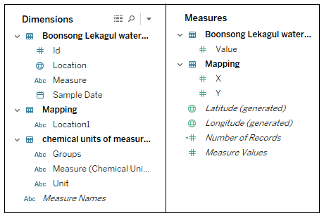
| + | The finals dataset contains various columns and the columns are divided into Dimensions and Measures in Tableau based on their properties. Before starting with the Visualization, lets get familiar with the available Dimensions and Measures. |
| | | | |
| | + | <span style=text-align:center;">[[Image:Vaishnavi_8.png|700px|thumb|left]]</span> |
| | + | <br> |
| | + | <br> |
| | + | <br> |
| | + | <br> |
| | + | <br> |
| | + | <br> |
| | + | <br> |
| | + | <br> |
| | + | <br> |
| | + | <br> |
| | + | <br> |
| | + | <br> |
| | + | <br> |
| | + | <br> |
| | + | <br> |
| | + | <br> |
| | + | <br> |
| | + | =Measure by Location= |
| | | | |
| − | <div style="float:left;;width:50%;"><br/><br/>
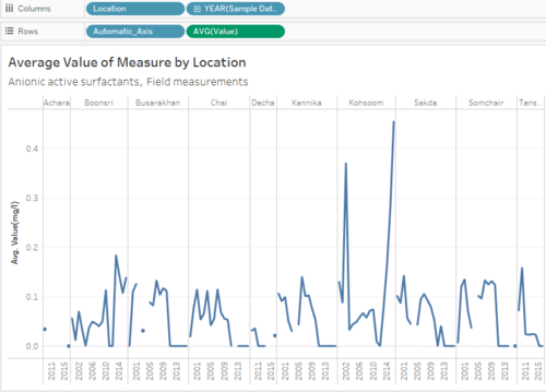
| + | The data has a total of 106 chemicals (12 groups) and 10 places. I want to analyze the trend of each measure at all the places for years 1998 - 2016. This visualization will help to compare the average values and select the place that has the highest reading of a measure. |
| − | [[|400px|center|border]]<br/>
| |
| − | <center style="font-size:13px;"> <u>''Figure 4''</u> </center><br/><br/><br/><br/>
| |
| − | </div>
| |
| − | <div style="float:left;;width:50%;>
| |
| − | [[|250px|center|border]]<br/>
| |
| − | <center style="font-size:13px;"> <u>''Figure 5''</u> </center>
| |
| − | </div>
| |
| | | | |
| | + | <div style="margin:0px; padding: 2px; font-family: Arial; border-radius: 1px; text-align:left"> |
| | + | {| class="wikitable" style="background-color:#FFFFFF;" width="100%" |
| | + | |- |
| | + | | |
| | + | <b>Create a Calculated Field</b> |
| | | | |
| − | As shown above, the DateTime field was modified to show the month, week and weekdays in the respective columns and rows.
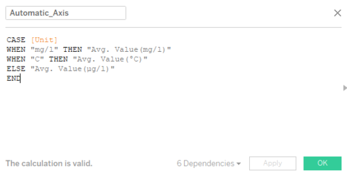
| + | The measures have three different units: <b>mg/l,</b> <b>µg/l,</b> and °C. The unit for average value should change according to the measure, therefore we will use this calculated field to automate the y-axis label. |
| − | The Marks card and Tooltip configuration in Tableau for this chart is shown below: | |
| | | | |
| − | <div style="float:left;;width:50%;">
| + | *Right click on Dimension and select Create Calculated Field |
| − | [[|250px|center|border]]<br/>
| + | *Name it as Automatic_Axis |
| − | <center style="font-size:13px;"> <u>''Figure 6''</u> </center>
| + | *The formula for the calculated field is as shown in the picture. |
| − | </div>
| |
| − | <div style="float:left;;width:50%;><br/><br/>
| |
| − | [[|350px|center|border]]<br/>
| |
| − | <center style="font-size:13px;"> <u>''Figure 7''</u> </center>
| |
| − | </div>
| |
| | | | |
| | + | || |
| | | | |
| | + | <span style=text-align:center;">[[Image:Vaishnavi_9.png|500px|thumb|center]]</span> |
| | | | |
| − | The SUM(Number of Records) are filled in this calendar plot. All the fields in the Marks card except for Monitor Color Bin are used to configure the tooltip which provides more detail on hovering through this chart.
| + | |- |
| | + | | |
| | + | <b>Add Filters</b> |
| | | | |
| − | The use of stepped colors allows the audience to differentiate between lesser than expected number of observation, expected number of observations and greater than expected number of observations on that day. | + | The user should be able to visualize the measure of their choice, therefore the graph should filter the data according to the selected measure. |
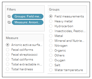
| | | | |
| − | The Monitor color bin calculated field helps in doing so. The calculation and usage of this field to color the calendar plot is shown below:
| + | *Create a hierarchy of Groups and Measures, this will allow the user to select a group and then select a measure of that group. |
| | + | *Drag and drop <b>Groups</b> and <b>Measures</b> to Filters. |
| | + | *Click on the fields in filters, select Show Filter and select the Filters to be Single Value (list). |
| | | | |
| − | <div style="float:left;;width:50%;"><br/><br/>
| + | || |
| − | [[|350px|center|border]]<br/>
| |
| − | <center style="font-size:13px;"> <u>''Figure 8''</u> </center><br/><br/>
| |
| − | </div>
| |
| − | <div style="float:left;;width:50%;>
| |
| − | [[|250px|center|border]]<br/>
| |
| − | <center style="font-size:13px;"> <u>''Figure 9''</u> </center>
| |
| − | </div>
| |
| | | | |
| | + | <span style=text-align:center;">[[Image:Vaishnavi_10.png|400px|thumb|center]]</span> |
| | | | |
| − | <br/>
| + | |- |
| − | <span style="font-weight:bold;text-decoration:underline;font-size:17px;">2. Hourly Heatmap of Chemical Readings:</span> | + | | |
| | + | <b>Plotting the Graph</b> |
| | | | |
| − | [[|800px|center|border]]
| + | *<b>Columns:</b> Location, YEAR(Sample Date) |
| − | <center style="font-size:13px;"> <u>''Figure 10''</u> </center> | + | *<b>Rows:</b> Automatic_Axis, AVG(Value) |
| | + | *<b>Details:</b> Measure, Groups, Location, YEAR(Sample Date) |
| | + | *<b>Tooltip:</b> Measure, Groups, Location, YEAR(Sample Date), AVG(Value) |
| | + | *<b>Title:</b> Measure, Groups |
| | | | |
| | | | |
| − | Similar to the Calendar chart described above, the Hourly heatmap data table chart uses the Monitor and Hours of the day fields in the respective Rows and Columns section as shown below.
| + | <span style="color:red"><b>NOTE*</b></span> The Measure for Value is selected as Average(AVG) because there are various readings taken every year, and to compare the readings across years I have plot the value of a measure in a year as the average of all the readings in that year. |
| | | | |
| − | The Marks section in Tableau for this chart is shown below. Labelling and coloring of this chart is configured by the field SUM(Number of Records) and the selected shape type is Square.
| + | || |
| | | | |
| | + | <span style=text-align:center;">[[Image:Vaishnavi_11.png|500px|thumb|center]]</span> |
| | | | |
| − | <div style="float:left;;width:60%;"><br/><br/>
| + | |} |
| − | [[|350px|center|border]]<br/>
| |
| − | <center style="font-size:13px;"> <u>''Figure 11''</u> </center><br/><br/><br/><br/>
| |
| − | </div>
| |
| − | <div style="float:left;;width:40%;>
| |
| − | [[|200px|center|border]]<br/>
| |
| − | <center style="font-size:13px;"> <u>''Figure 12''</u> </center>
| |
| | </div> | | </div> |
| | | | |
| | | | |
| − | [[|200px|right|border]]
| + | =Month-wise Readings= |
| − | | |
| − | | |
| − | This chart allows for filtering on all the fields shown below and also by a particular day. The reason for doing so is to interactively link this hourly readings heatmap with the Calendar chart described above to show the hourly readings of any selected day.
| |
| − | | |
| − | | |
| − | | |
| − | <br/>
| |
| − | <span style="font-weight:bold;text-decoration:underline;font-size:17px;">3. Deviation by Chemical: Line Chart:</span>
| |
| − | | |
| − | [[|400px|center|border]]
| |
| − | <center style="font-size:13px;"> <u>''Figure 13''</u> </center>
| |
| − | | |
| − | | |
| − | The purpose of this graph is to show deviation in the number of observational readings captured for each chemical on any day. The line graph shows hourly deviations, if any.
| |
| − | | |
| − | Hours of the day and the SUM(Number of records) have been plotted on the rows and columns. Instead of showing the absolute value of number of records, a table calculation to show the deviation in number of records has been made; as shown below:
| |
| | | | |
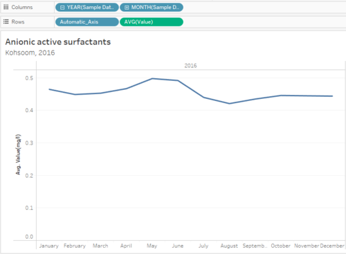
| | + | This graph will give the user month-wise readings of the selected measure, for the selected place and year. This can help the user get a detailed insight as for which month the readings are high, and is there any particular month where the reading are high. This graph will be a drill-dwon from <b>Measure by Value</b> graph. |
| | | | |
| − | <div style="float:left;;width:60%;"><br/><br/><br/><br/><br/><br/> | + | <div style="margin:0px; padding: 2px; font-family: Arial; border-radius: 1px; text-align:left"> |
| − | [[|350px|center|border]]<br/>
| + | {| class="wikitable" style="background-color:#FFFFFF;" width="100%" |
| − | <center style="font-size:13px;"> <u>''Figure 14''</u> </center><br/><br/><br/><br/>
| + | |- |
| − | </div>
| + | | |
| − | <div style="float:left;;width:40%;>
| + | <b>Plotting the Graph</b> |
| − | [[|200px|center|border]]<br/>
| |
| − | <center style="font-size:13px;"> <u>''Figure 15''</u> </center> | |
| − | </div> | |
| | | | |
| | + | *<b>Columns:</b> YEAR(Sample Date), MONTH(Sample Date) |
| | + | *<b>Rows:</b> Automatic_Axis, AVG(Value) |
| | + | *<b>Details:</b> Measure, Groups, Location, YEAR(Sample Date) |
| | + | *<b>Tooltip:</b> Measure, Groups, Location, YEAR(Sample Date), MONTH(Sample Date), AVG(Value), SUM(Number of Records) |
| | + | *<b>Title:</b> Measure, Location, YEAR(Sample Date) |
| | | | |
| − | The Marks section and tooltip configuration is shown below. The Chemical field has been for the detail and coloration of this chart.
| |
| − |
| |
| − |
| |
| − | <div style="float:left;;width:50%;">
| |
| − | [[|150px|center|border]]<br/>
| |
| − | <center style="font-size:13px;"> <u>''Figure 16''</u> </center><br/><br/>
| |
| − | </div>
| |
| − | <div style="float:left;;width:50%;>
| |
| − | [[|300px|center|border]]<br/>
| |
| − | <center style="font-size:13px;"> <u>''Figure 17''</u> </center>
| |
| − | </div>
| |
| | | | |
| | + | <span style="color:red"><b>NOTE*</b></span> The Measure for Value is selected as Average(AVG) because there are various readings taken in a month, and to compare the readings across months, I plot the value of a measure in a month as the average of all the readings in that month. |
| | | | |
| − | Similar to filters applied in the previous two graphs, this chart also filters on monitor, time-period and selected chemical. The additional filter added to SUM(Number of Records) is to remove null values if any.
| + | || |
| | | | |
| | + | <span style=text-align:center;">[[Image:Vaishnavi_12.png|500px|thumb|center]]</span> |
| | | | |
| − | <div style="float:left;;width:50%;">
| + | |} |
| − | [[|300px|center|border]]<br/>
| |
| − | <center style="font-size:13px;"> <u>''Figure 18''</u> </center><br/><br/>
| |
| − | </div>
| |
| − | <div style="float:left;;width:50%;>
| |
| − | [[|300px|center|border]]<br/>
| |
| − | <center style="font-size:13px;"> <u>''Figure 19''</u> </center>
| |
| | </div> | | </div> |
| | | | |
| | | | |
| | + | =No. of Records= |
| | | | |
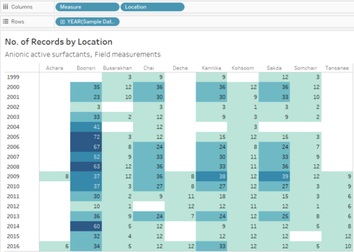
| | + | This graph will show how many reading where taken for the selected measure from 1998-2016. The heat-map makes it visually easy to spot the variation in the number of readings based on the color. |
| | | | |
| − | =Chapter 2=
| + | <div style="margin:0px; padding: 2px; font-family: Arial; border-radius: 1px; text-align:left"> |
| − | <br/> | + | {| class="wikitable" style="background-color:#FFFFFF;" width="100%" |
| − | <span style="font-weight:bold;text-decoration:underline;font-size:17px;">1. Dynamic Horizon Chart:</span>
| + | |- |
| − | | + | | |
| − | [[|800px|center|border]]
| + | <b>Add Filters</b> |
| − | <center style="font-size:13px;"> <u>''Figure 20''</u> </center>
| |
| | | | |
| | + | The user should be able to visualize the measure of their choice, therefore the graph should filter the data according to the selected measure. |
| | | | |
| − | The dynamic Horizon Chart is used to show the magnitude of chemical readings for monitors or chemicals and for any given time-period.
| + | *Create a hierarchy of Groups and Measures, this will allow the user to select a group and then select a measure of that group. |
| | + | *Drag and drop <b>Groups</b> and <b>Measures</b> to Filters. |
| | + | *Click on the fields in filters, select Show Filter and select the Filters to be Single Value (list). |
| | | | |
| − | Audiences are encouraged to choose their Y and X axis to decide whether they want to plot the Horizon chart by chemical or by sensor and either by hours of the day or days of the selected month.
| + | || |
| | | | |
| − | This is achieved by using the following two parameters.
| + | <span style=text-align:center;">[[Image:Vaishnavi_10.png|400px|thumb|center]]</span> |
| − | | |
| − | | |
| − | | |
| − | <div style="float:left;;width:50%;"> | |
| − | [[|300px|center|border]]<br/> | |
| − | <center style="font-size:13px;"> <u>''Figure 21''</u> </center>
| |
| − | </div>
| |
| − | <div style="float:left;;width:50%;>
| |
| − | [[|300px|center|border]]<br/>
| |
| − | <center style="font-size:13px;"> <u>''Figure 22''</u> </center>
| |
| − | </div> | |
| | | | |
| | + | |- |
| | + | | |
| | + | <b>Plotting the Graph</b> |
| | | | |
| | + | *<b>Columns:</b> Measure, Location |
| | + | *<b>Rows:</b> YEAR(Sample Date) |
| | + | *<b>Details:</b> Measure, Location, YEAR(Sample Date) |
| | + | *<b>Label:</b> SUM(Number of Records) |
| | + | *<b>Color:</b> SUM(Number of Records) |
| | + | *<b>Tooltip:</b> Measure, Location, YEAR(Sample Date), SUM(Number of Records) |
| | + | *<b>Title:</b> Measure, Groups |
| | | | |
| − | Two corresponding calculated fields have been created which leverage on the user input through the above parameters. The fields are:
| + | || |
| | | | |
| | + | <span style=text-align:center;">[[Image:Vaishnavi_13.png|500px|thumb|center]]</span> |
| | | | |
| − | <div style="float:left;;width:50%;">
| + | |} |
| − | [[|450px|center|border]]<br/>
| |
| − | <center style="font-size:13px;"> <u>''Figure 23''</u> </center>
| |
| − | </div>
| |
| − | <div style="float:left;;width:50%;>
| |
| − | [[|350px|center|border]]<br/>
| |
| − | <center style="font-size:13px;"> <u>''Figure 24''</u> </center>
| |
| | </div> | | </div> |
| | | | |
| | | | |
| − | Based on the above fields, the fields of X and Y axis can be dynamically selected. Thus, the rows and columns of this chart include the following fields:
| + | =Map= |
| | | | |
| − | [[|400px|center|border]]
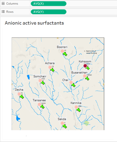
| + | Map will be used to show the location of the places where readings of the selected measures were taken and also the place that has the highest average value of the selected measure. |
| − | <center style="font-size:13px;"> <u>''Figure 25''</u> </center>
| |
| | | | |
| | + | <div style="margin:0px; padding: 2px; font-family: Arial; border-radius: 1px; text-align:left"> |
| | + | {| class="wikitable" style="background-color:#FFFFFF;" width="100%" |
| | + | |- |
| | + | | |
| | + | <b>Plotting the Graph</b> |
| | | | |
| − | As shown above, the Measure Values fields are a part of the rows of this chart. The Measure values have been carefully selected by creating new calculated fields which consist of binned values of Chemical Readings.
| + | *<b>Columns:</b> AVG(X) |
| | + | *<b>Rows:</b> AVG(Y) |
| | + | *<b>Filters:</b> Groups, Measures |
| | + | *<b>Details:</b> Measure, Location, Groups |
| | + | *<b>Color:</b> AVG(Value) |
| | + | *<b>Label</b> Location |
| | + | *<b>Tooltip:</b> Location |
| | + | *<b>Title:</b> Location |
| | | | |
| | + | <span style="color:red"><b>NOTE*</b></span> AVG(X) and AVG(Y) is taken because there are multiple rows of data for a single location, but the X and Y coordinates will be same for a particular location, therefore using the Average measure for X and Y gives the actual coordinates of the places. |
| | | | |
| − | For the purpose of this illustration, 4 bin fields have been created. Chemical readings have been binned based on the percentile and quantile values of ‘Chemical Readings’, based on the univariate analysis as covered in the Data Preparation section.
| + | || |
| | | | |
| | + | <span style=text-align:center;">[[Image:Vaishnavi_18.png|400px|thumb|center]]</span> |
| | | | |
| − | <div style="float:left;;width:50%;">
| + | |} |
| − | [[|300px|center|border]]<br/>
| |
| − | <center style="font-size:13px;"> <u>''Figure 26''</u> </center>
| |
| − | </div>
| |
| − | <div style="float:left;;width:50%;>
| |
| − | [[|350px|center|border]]<br/>
| |
| − | <center style="font-size:13px;"> <u>''Figure 27''</u> </center>
| |
| | </div> | | </div> |
| | | | |
| | + | =Interactive Dashboard= |
| | | | |
| − | Therefore, the border conditions of the 4 Reading Bin fields has been calculated as:
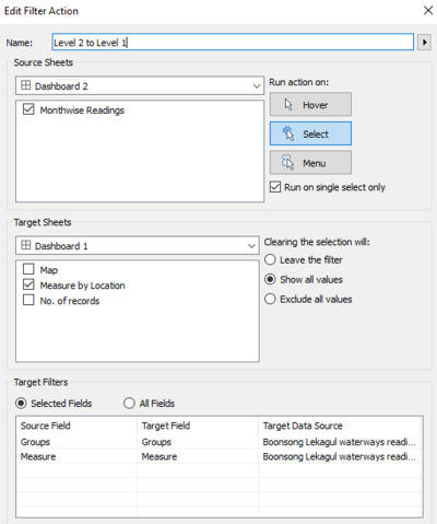
| + | The 4 graphs that I plotted are added to the dashboard, and following actions were added to the sheets to link them to each each, so that detailed analyses of the data can be done. |
| | | | |
| | + | <div style="margin:0px; padding: 2px; font-family: Arial; border-radius: 1px; text-align:left"> |
| | + | {| class="wikitable" style="background-color:#FFFFFF;" width="100%" |
| | + | |- |
| | + | | |
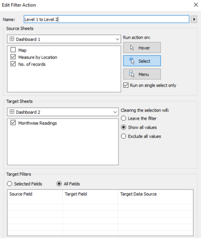
| | + | <b>Level 1 to Level 2</b> |
| | | | |
| − | [[|950px|center|border]]
| + | This action was added to the files: <b>Measure by Location and No. of Records</b>. |
| − | <center style="font-size:13px;"> <u>''Figure 28''</u> </center> | + | <br>This will help the user get detailed insights of a particular measure by just selecting the point on any of these two graphs. |
| | + | <br>When the user select any point on the graph, it will redirect to the other two graphs: <b>Month-wise Reading and Map</b> for extra details. |
| | | | |
| − | This chart is filtered by month and using only the above previously mentioned Measure Names.
| + | || |
| | | | |
| − | The Marks card contains the detail of SUM(Reading) which is then colored by the Measure Values which primarily consists of the 4 Reading bin values.
| + | <span style=text-align:center;">[[Image:Vaishnavi_19.png|400px|thumb|center]]</span> |
| | | | |
| − | <div style="float:left;;width:50%;"><br/><br/>
| + | |- |
| − | [[|250px|center|border]]<br/>
| + | | |
| − | <center style="font-size:13px;"> <u>''Figure 29''</u> </center><br/><br/>
| + | <b>Level 2 to Level 1</b> |
| − | </div>
| |
| − | <div style="float:left;;width:50%;>
| |
| − | [[|200px|center|border]]<br/>
| |
| − | <center style="font-size:13px;"> <u>''Figure 30''</u> </center> | |
| − | </div> | |
| | | | |
| | + | This action was added to the files: <b>Month-wise Readings and Map</b>. |
| | + | <br>This will help the user go back to the previous graph with the selection highlighted. |
| | + | <br>The target sheet is only <b>Measure by Location</b> because the filter is added only to that sheet and applied to No. of Records and Mao sheets in the Dashboard |
| | | | |
| − | Finally, the titles resultant color legend of the resultant Horizon chart thus created was renamed to make the legend descriptions more readable.
| + | || |
| | | | |
| − | [[|200px|center|border]]
| + | <span style=text-align:center;">[[Image:Vaishnavi_20.png|400px|thumb|center]]</span> |
| − | <center style="font-size:13px;"> <u>''Figure 31''</u> </center> | |
| | | | |
| − | | + | |} |
| − | | |
| − | =Chapter 3=
| |
| − | <br/>
| |
| − | <span style="font-weight:bold;text-decoration:underline;font-size:17px;">1. Marimekko Chart - Base:</span>
| |
| − | | |
| − | [[|600px|center|border]]
| |
| − | <center style="font-size:13px;"> <u>''Figure 32''</u> </center>
| |
| − | | |
| − | | |
| − | In order to create the base part Marimekko chart, two new calculated fields were created.
| |
| − | | |
| − | | |
| − | <div style="float:left;;width:50%;"><br/><br/>
| |
| − | [[|300px|center|border]]<br/>
| |
| − | <center style="font-size:13px;"> <u>''Figure 33''</u> </center><br/>
| |
| − | </div>
| |
| − | <div style="float:left;;width:50%;>
| |
| − | [[|350px|center|border]]<br/>
| |
| − | <center style="font-size:13px;"> <u>''Figure 34''</u> </center>
| |
| − | </div>
| |
| − | | |
| − | | |
| − | Based on the above 2 fields, the Number of Readings and SUM(Readings) fields were placed on columns and rows respectively.
| |
| − | | |
| − | | |
| − | [[|400px|center|border]]
| |
| − | <center style="font-size:13px;"> <u>''Figure 35''</u> </center>
| |
| − | | |
| − | | |
| − | However, table calculations were added for these fields in order to show the Readings as a percent of total readings and to ensure that the Number of Readings was calculated separately for each monitor.
| |
| − | | |
| − | | |
| − | <div style="float:left;;width:50%;"><br/><br/>
| |
| − | [[|250px|center|border]]<br/>
| |
| − | <center style="font-size:13px;"> <u>''Figure 36''</u> </center><br/>
| |
| − | </div>
| |
| − | <div style="float:left;;width:50%;>
| |
| − | [[|250px|center|border]]<br/>
| |
| − | <center style="font-size:13px;"> <u>''Figure 37''</u> </center>
| |
| | </div> | | </div> |
| | | | |
| − | | + | <div style="float:center;display:block;text-align:center;font-family:'Century Gothic';font-size:30px;color:#016FEC;text-decoration:underline;"> |
| − | The Marks card, as shown in the figure below, consisted of coloring by Chemical, labelling by percentage SUM(Reading) and size by Reading per column. All other fields in details were used for the tooltip configuration.
| + | [https://public.tableau.com/profile/vaishnavi.agarwal#!/vizhome/VAST2018-MiniChallenge2/YearwiseTrend?publish=yes Click here to explore the live dashboard] |
| − | | |
| − | | |
| − | <div style="float:left;;width:50%;"> | |
| − | [[|250px|center|border]]<br/>
| |
| − | <center style="font-size:13px;"> <u>''Figure 38''</u> </center><br/>
| |
| | </div> | | </div> |
| − | <div style="float:left;;width:50%;><br/>
| |
| − | [[|350px|center|border]]<br/>
| |
| − | <center style="font-size:13px;"> <u>''Figure 39''</u> </center>
| |
| − | </div>
| |
| − |
| |
| − |
| |
| − | Finally, this chart was filtered by months in order for the audience to see the distribution of chemical readings across monitors for each month.
| |
| − |
| |
| − | [[|200px|center|border]]
| |
| − | <center style="font-size:13px;"> <u>''Figure 40''</u> </center>
| |
| − |
| |
| − |
| |
| − | <br/>
| |
| − | <span style="font-weight:bold;text-decoration:underline;font-size:17px;">2. Marimekko Chart - Header:</span>
| |
| − |
| |
| − | [[|800px|center|border]]
| |
| − | <center style="font-size:13px;"> <u>''Figure 41''</u> </center>
| |
| − |
| |
| − |
| |
| − | The Marimekko header which consists of the Sensor names has to be placed on top of the Marimekko base with the exact width size of each sensor. In order to achieve this, the SUM(Readings) and a hardcoded title was plotted on Columns and Rows.
| |
| − |
| |
| − |
| |
| − | [[|300px|center|border]]
| |
| − | <center style="font-size:13px;"> <u>''Figure 42''</u> </center>
| |
| − |
| |
| − |
| |
| − | The following fields were added to the Marks section, with the corresponding tooltip configuration.
| |
| − |
| |
| − |
| |
| − | <div style="float:left;;width:50%;">
| |
| − | [[|250px|center|border]]<br/>
| |
| − | <center style="font-size:13px;"> <u>''Figure 43''</u> </center><br/>
| |
| − | </div>
| |
| − | <div style="float:left;;width:50%;>
| |
| − | [[|350px|center|border]]<br/>
| |
| − | <center style="font-size:13px;"> <u>''Figure 44''</u> </center>
| |
| − | </div>
| |
| − |
| |
| − |
| |
| − | Finally, this header too was filtered by Selected Month as the width of each sensor heading should change as per its monthly chemical readings.
| |
| − |
| |
| − | [[|250px|center|border]]
| |
| − | <center style="font-size:13px;"> <u>''Figure 45''</u> </center>
| |
| − |
| |
| − |
| |
| − | <br/>
| |
| − | <span style="font-weight:bold;text-decoration:underline;font-size:17px;">3. Dot Plot - Chemical Readings:</span>
| |
| − |
| |
| − | [[|800px|center|border]]
| |
| − | <center style="font-size:13px;"> <u>''Figure 46''</u> </center>
| |
| − |
| |
| − |
| |
| − | The dot plot chart shows the chemical readings across hours of the day or days of the month depending on user selection.
| |
| − |
| |
| − | Similar to the Horizon chart, the X axis is dynamic based on the Q2_TimeFilter parameter and calculated field.
| |
| − |
| |
| − | <div style="float:left;;width:50%;">
| |
| − | [[|400px|center|border]]<br/>
| |
| − | <center style="font-size:13px;"> <u>''Figure 47''</u> </center><br/>
| |
| − | </div>
| |
| − | <div style="float:left;;width:50%;><br/><br/><br/><br/><br/><br/>
| |
| − | [[|500px|center|border]]<br/>
| |
| − | <center style="font-size:13px;"> <u>''Figure 48''</u> </center><br/><br/><br/><br/><br/><br/>
| |
| − | </div>
| |
| − |
| |
| − |
| |
| − |
| |
| − | Therefore, the columns and rows for this chart are as follows:
| |
| − |
| |
| − | [[|300px|center|border]]
| |
| − | <center style="font-size:13px;"> <u>''Figure 49''</u> </center>
| |
| − |
| |
| − |
| |
| − | The Marks card configuration is shown below. The SUM(Readings) is used to configure the label and size of the circles in this chart. The plot is also colored by Chemical and the remaining fields in the details pane are used to configure the tooltip.
| |
| − |
| |
| − | <div style="float:left;;width:50%;">
| |
| − | [[|250px|center|border]]<br/>
| |
| − | <center style="font-size:13px;"> <u>''Figure 50''</u> </center>
| |
| − | </div>
| |
| − | <div style="float:left;;width:50%;>
| |
| − | [[|500px|center|border]]<br/>
| |
| − | <center style="font-size:13px;"> <u>''Figure 51''</u> </center>
| |
| − | </div>
| |
| − |
| |
| − |
| |
| − | Finally, this chart is filtered on months and actions have been defined to filter this plot based on selections made on the Marimekko chart.
| |
| − |
| |
| − | [[|200px|center|border]]
| |
| − | <center style="font-size:13px;"> <u>''Figure 52''</u> </center>
| |
| − |
| |
| − |
| |
| − |
| |
| − |
| |
| − | =Chapter 4=
| |
| − | <br/>
| |
| − | <span style="font-weight:bold;text-decoration:underline;font-size:17px;">1. Wind Rose Illustration:</span>
| |
| − |
| |
| − | [[|400px|center|border]]
| |
| − | <center style="font-size:13px;"> <u>''Figure 53''</u> </center>
| |
| − |
| |
| − |
| |
| − | The purpose of the visualization in this chapter is to show an appropriate chart that could use the meteorological dataset and the location coordinates of Sensors to highlight the area where the chemical readings could have been captured from. For the purpose of this analysis, we call this the ‘influence area’ of each sensor.
| |
| − |
| |
| − |
| |
| − | Based on the given wind speed and direction at any point in time, a triangular region (polygon) is to be visualized for each sensor. As an illustration, the visualization in this chapter shows the mapping of the influence area of Sensor 1.
| |
| − |
| |
| − |
| |
| − | To recreate this illustration, we need to determine the 3 required coordinates for the triangle covering the influence area at any particular time. Since the origin point (sensor location) is already known, we need to calculate the 2 other coordinates of the triangle (Destination 1 and Destination 2). The angle thus created to map a triangle is unknown and therefore can be determined from a user input parameter, as shown below:
| |
| − |
| |
| − |
| |
| − | [[|400px|center|border]]
| |
| − | <center style="font-size:13px;"> <u>''Figure 54''</u> </center>
| |
| − |
| |
| − |
| |
| − | Since the entered angle would be based on a 2-D map and the requirement of this analysis is to visualize the direction of north-facing wind; the input angle is recalculated by using the following formula:
| |
| − |
| |
| − | [[|300px|center|border]]
| |
| − | <center style="font-size:13px;"> <u>''Figure 55''</u> </center>
| |
| − |
| |
| − |
| |
| − | Based on the given angle of the triangle to be plotted, we need to calculate the two other triangular coordinates – Destination 1 and Destination 2. The calculated fields for the same are as follows.
| |
| − |
| |
| − |
| |
| − | <div style="float:left;;width:50%;">
| |
| − | [[|500px|center|border]]
| |
| − | <center style="font-size:13px;"> <u>''Figure 56''</u> </center><br/>
| |
| − | </div>
| |
| − | <div style="float:left;;width:50%;>
| |
| − | [[|500px|center|border]]
| |
| − | <center style="font-size:13px;"> <u>''Figure 57''</u> </center>
| |
| − | </div>
| |
| − |
| |
| − |
| |
| − | Based on the above calculated fields, the Recalculated X and Recalculated Y were then added as columns and rows. Moreover, the SUM(Reading) and Date fields were added as details in the Marks card with the selected shape as Polygon.
| |
| − |
| |
| − | <div style="float:left;;width:50%;"><br/><br/><br/><br/><br/>
| |
| − | [[|350px|center|border]]
| |
| − | <center style="font-size:13px;"> <u>''Figure 58''</u> </center><br/><br/><br/>
| |
| − | </div>
| |
| − | <div style="float:left;;width:50%;>
| |
| − | [[|200px|center|border]]
| |
| − | <center style="font-size:13px;"> <u>''Figure 59''</u> </center>
| |
| − | </div>
| |
| − |
| |
| − |
| |
| − | Additionally, filters were added for this illustration so that the readings for only Sensor 1 is shown and the audience can only look at one time frame at a time.
| |
| − |
| |
| − | [[|200px|center|border]]
| |
| − | <center style="font-size:13px;"> <u>''Figure 60''</u> </center>
| |
| − |
| |
| − |
| |
| − | After this, worksheet was formatted to remove all the axis labels and marks.
| |
| − |
| |
| − | Finally a background image of a compass was added with the following dimensions and axis points to map around the origin points of Sensor 1.
| |
| − |
| |
| − | [[|400px|center|border]]
| |
| − | <center style="font-size:13px;"> <u>''Figure 61''</u> </center>
| |
| − |
| |
| − |
| |
| − |
| |
| − |
| |
| − | =Chapter 5=
| |
| − | <br/>
| |
| − |
| |
| − | Based on the concepts covered in Chapter 4, the visualizations in Chapter 5 include a Coxcomb chart for all sensors overlayed by the geographical map of Mistford to highlight the wind direction during the time-frame of high chemical readings. The visualizations developed for this dashboard are described below:
| |
| − |
| |
| − |
| |
| − | <span style="font-weight:bold;text-decoration:underline;font-size:17px;">1. Top Chemical Readings table:</span>
| |
| − |
| |
| − | [[|250px|center|border]]
| |
| − | <center style="font-size:13px;"> <u>''Figure 62''</u> </center>
| |
| − |
| |
| − |
| |
| − | This data table ranks the instances of high chemical readings that were captured by any of the sensors. There is flexibility for the audience to see as many records at a time (upto top 100 records). This has been achieved by using a parameter field:
| |
| − |
| |
| − | [[|350px|center|border]]
| |
| − | <center style="font-size:13px;"> <u>''Figure 63''</u> </center>
| |
| − |
| |
| − |
| |
| − | To rank the observations with high chemical readings and dynamically display these records depending on how many observations the audience wants to see, the following calculated fields were created.
| |
| − |
| |
| − |
| |
| − | <div style="float:left;;width:50%;">
| |
| − | [[|300px|center|border]]
| |
| − | <center style="font-size:13px;"> <u>''Figure 64''</u> </center><br/>
| |
| − | </div>
| |
| − | <div style="float:left;;width:50%;>
| |
| − | [[|300px|center|border]]
| |
| − | <center style="font-size:13px;"> <u>''Figure 65''</u> </center>
| |
| − | </div>
| |
| − |
| |
| − |
| |
| − | After this, a data table with ranked chemical readings per sensor was created by adding the relevant fields to the Rows; and the details and label text section of the Marks card.
| |
| − |
| |
| − |
| |
| − | <div style="float:left;;width:50%;"><br/><br/><br/><br/>
| |
| − | [[|500px|center|border]]
| |
| − | <center style="font-size:13px;"> <u>''Figure 66''</u> </center><br/><br/><br/><br/>
| |
| − | </div>
| |
| − | <div style="float:left;;width:50%;>
| |
| − | [[|200px|center|border]]
| |
| − | <center style="font-size:13px;"> <u>''Figure 67''</u> </center>
| |
| − | </div>
| |
| − |
| |
| − |
| |
| − | Finally, since the users can filter this table for each chemical; the Filters card contained the following fields. A table calculation was added to the FilterRank field in order to rank the chemical readings across the entire table.
| |
| − |
| |
| − | <div style="float:left;;width:50%;"><br/><br/><br/><br/>
| |
| − | [[|250px|center|border]]
| |
| − | <center style="font-size:13px;"> <u>''Figure 68''</u> </center><br/><br/><br/><br/><br/><br/>
| |
| − | </div>
| |
| − | <div style="float:left;;width:50%;>
| |
| − | [[|200px|center|border]]
| |
| − | <center style="font-size:13px;"> <u>''Figure 69''</u> </center>
| |
| − | </div>
| |
| − |
| |
| − |
| |
| − | <br/>
| |
| − | <span style="font-weight:bold;text-decoration:underline;font-size:17px;">2. Coxcomb Chart:</span>
| |
| − |
| |
| − | [[|650px|center|border]]
| |
| − | <center style="font-size:13px;"> <u>''Figure 70''</u> </center>
| |
| − |
| |
| − |
| |
| − | The Coxcomb chart was constructed based on the fields created in the visualizations for Chapter 4. For this chart, a background image of the geolocation points of the city of Mistford was added.
| |
| − |
| |
| − | [[|500px|center|border]]
| |
| − | <center style="font-size:13px;"> <u>''Figure 71''</u> </center>
| |
| − |
| |
| − |
| |
| − | As explained in the visualization of Chapter 4, the fields – Recalculated X and Recalculated Y were used in Rows and Columns. Additionally the date field was added to show the exact date and time during periods of high chemical reading.
| |
| − |
| |
| − |
| |
| − | [[|400px|center|border]]
| |
| − | <center style="font-size:13px;"> <u>''Figure 72''</u> </center>
| |
| − |
| |
| − |
| |
| − | The date field was reformatted as follows:
| |
| − |
| |
| − |
| |
| − | [[|400px|center|border]]
| |
| − | <center style="font-size:13px;"> <u>''Figure 73''</u> </center>
| |
| − |
| |
| − |
| |
| − | The following fields were added to the Marks card and the shape was set to Polygon. The opacity of the Color was changed to 20% and a border was added.
| |
| − |
| |
| − | <div style="float:left;;width:50%;">
| |
| − | [[|150px|center|border]]
| |
| − | <center style="font-size:13px;"> <u>''Figure 74''</u> </center><br/>
| |
| − | </div>
| |
| − | <div style="float:left;;width:50%;>
| |
| − | [[|150px|center|border]]
| |
| − | <center style="font-size:13px;"> <u>''Figure 75''</u> </center>
| |
| − | </div>
| |
| − |
| |
| − |
| |
| − | In addition, the following fields were added to the Filters card:
| |
| − |
| |
| − |
| |
| − | [[|200px|center|border]]
| |
| − | <center style="font-size:13px;"> <u>''Figure 76''</u> </center>
| |
| − |
| |
| − |
| |
| − | As shown above, the Selected Chemical is filtered upon as the audience has the capability to dynamically change the selected chemical. The Date field has been added as a shared filter which is commonly applied also to the Sensor monitor worksheets (as explained in the next visualization). This is done so that all the worksheets in this dashboard display one reading at a time on a particular date.
| |
| − | Finally the Recalculated X field is filtered on non-null values as a precaution.
| |
| − |
| |
| − |
| |
| − | <br/>
| |
| − | <span style="font-weight:bold;text-decoration:underline;font-size:17px;">3. Sensor Monitors:</span>
| |
| − |
| |
| − | There are 9 sensor monitors displayed in the dashboard which are represented by 9 corresponding worksheets.
| |
| − |
| |
| − | Each of these worksheets contains readings for one sensor at a time and the worksheet has been overlayed on top of a Monitor image in the final dashboard.
| |
| − |
| |
| − | [[|300px|center|border]]
| |
| − | <center style="font-size:13px;"> <u>''Figure 77''</u> </center>
| |
| − |
| |
| − |
| |
| − | In order to make this data table, the Chemical field was added to Rows and the Attribute of the Reading field was added to label text in the Marks card. Additionally, the SUM(Reading) field was used to color the chemical readings using stepped colors, as shown below:
| |
| − |
| |
| − |
| |
| − | <div style="float:left;;width:50%;"><br/><br/><br/>
| |
| − | [[|300px|center|border]]
| |
| − | <center style="font-size:13px;"> <u>''Figure 78''</u> </center><br/><br/><br/>
| |
| − | </div>
| |
| − | <div style="float:left;;width:50%;>
| |
| − | [[|150px|center|border]]
| |
| − | <center style="font-size:13px;"> <u>''Figure 79''</u> </center>
| |
| − | </div>
| |
| − |
| |
| − | [[|250px|center|border]]
| |
| − | <center style="font-size:13px;"> <u>''Figure 80''</u> </center>
| |
| − |
| |
| − |
| |
| − | Other formatting/cosmetic changes in these sheets include:
| |
| − | *Changing the background color of the worksheet to Black
| |
| − | *Removing all borders
| |
| − | *Changing the font color of Chemicals to White.
| |
| − |
| |
| − |
| |
| − | Finally, the Filters card included fixing the worksheet for one Sensor, the shared date filter across all Sensor sheet and the Coxcomb chart and Selected Chemical to be true so that the audience can analyse one chemical at a time.
| |
| − |
| |
| − | [[|300px|center|border]]
| |
| − | <center style="font-size:13px;"> <u>''Figure 81''</u> </center>
| |
| − |
| |
| − | The worksheets for the other 8 monitors were constructed in a similar fashion all the remaining 8 sensors.
| |
| − | -->
| |

