Difference between revisions of "ISSS608 2017-18 T3 Assign Kaushik Jaganathan - Methodology and Design"
| (5 intermediate revisions by the same user not shown) | |||
| Line 27: | Line 27: | ||
| − | <font size=" | + | <font size="5"><font color="#42485D">'''Data description & preparation '''</font></font><br/> |
<div style="margin:0px; padding: 2px; font-family: Arial; border-radius: 1px; text-align:left"> | <div style="margin:0px; padding: 2px; font-family: Arial; border-radius: 1px; text-align:left"> | ||
| Line 67: | Line 67: | ||
The Waterways Final is a map image that shows the location of dumping site and the waterways. | The Waterways Final is a map image that shows the location of dumping site and the waterways. | ||
| − | <span style=text-align:center;">[[Image: | + | <span style=text-align:center;">[[Image:Waterways Final.jpg|200px|thumb|left]]</span> |
|} | |} | ||
| Line 106: | Line 106: | ||
|} | |} | ||
</div> | </div> | ||
| + | |||
| + | <font size="5"><font color="#42485D">'''Dashboard Design'''</font></font><br/> | ||
| + | View the interactive Tableau design here: [https://public.tableau.com/profile/kaushik.jaganathan#!/vizhome/VASTChallenge2018MiniChallenge2/MC2 Link to tableau dashboard] | ||
| + | |||
| + | |||
| + | <font size="4"><font color="#74b5b1">'''1.Chemical Trends'''</font></font><br/> | ||
| + | |||
| + | This dashboard is aimed to uncover the trends in chemical values across Boonsong Preserve Waterway.Sampling sites and time period are used as filters. | ||
| + | |||
| + | [[Image:DB1.png|700px]]<br/> | ||
| + | |||
| + | The map shows the average value of a chemical for a selected time period. Box plot gives the variation in values for the chemical and date range chosen. The trend plot takes the selected location from map,time and measure from the filter and shows the variation over time. | ||
| + | |||
| + | |||
| + | <font size="4"><font color="#74b5b1">'''2.Chemical Anomalies'''</font></font><br/> | ||
| + | |||
| + | This dashboard is aimed to uncover some of the recent mysterious chemical trend anomalies at the Preserve.The analysis goes into finding alarming trends which might threaten aquatic and wildlife. | ||
| + | |||
| + | [[Image:DB2.png|700px]]<br/> | ||
| + | |||
| + | |||
| + | <font size="4"><font color="#74b5b1">'''3.Sample Collection'''</font></font><br/> | ||
| + | |||
| + | This dashboard is to look at the number of samples collected across sampling sites. Sample collection is studied over years and further drilled down to months in filtered years for a particular chemical and site. | ||
| + | |||
| + | [[Image:DB3.png|700px]]<br/> | ||
| + | |||
| + | This dashboard uses a 3 level visualisation - Sample count vs year --> Sample count vs month in selected year --> Value of chemical over selected month. Chemical measure and location are used as filters. | ||
| + | |||
| + | |||
| + | <font size="4"><font color="#74b5b1">'''4.Sampling Frequency'''</font></font><br/> | ||
| + | |||
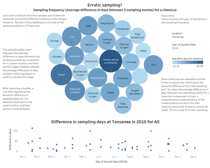
| + | This dashboard aims to look at when the samples were taken for chemicals across the different locations to discover the sampling patterns of chemicals. | ||
| + | |||
| + | [[Image:DB4.png|700px]]<br/> | ||
| + | |||
| + | The packed bubble chart indicates the average difference in days between two sampling events for a chemical. After selecting a bubble, a line chart is used to show the absolute difference in sampling days for the selected chemical. | ||
| + | |||
| + | |||
| + | <font size="4"><font color="#74b5b1">'''5.Sampling trends and anomalies'''</font></font><br/> | ||
| + | |||
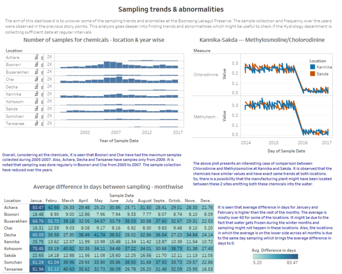
| + | The aim of this dashboard is to uncover some of the sampling trends and anomalies at the Preserve. This is useful to check if the Hydrology department is collecting sufficient data. | ||
| + | |||
| + | [[Image:DB5.png|700px]]<br/> | ||
| + | |||
| + | A bar chart shows the number of samples taken over the years for all the chemicals. A heatmap is used to indicate the month-wise average difference in sampling days. | ||
Latest revision as of 18:48, 8 July 2018
ISSS608 2017-18 Mini Challenge 2 - Kaushik Jaganathan
|
|
|
|
|
Data description & preparation
|
File Name |
Variables |
|
Boonsong Lekagul waterways readings (.csv file) |
The given data file has reading of 106 chemicals at 10 different locations from 1998 - 2016. i. id (numeric , unique)
|
|
chemical units of measure (.csv file) |
The given data file has the unit of each measure (106 measures) in which the readings were taken. i. measure (string, unique)
|
|
Waterways Final (.jpg file) |
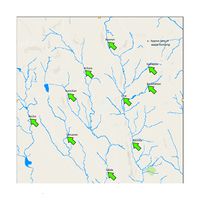
The Waterways Final is a map image that shows the location of dumping site and the waterways. |
|
Steps |
Image |
|
Adding Data and Background Image
|
|
|
Annote Point
|
|
Dashboard Design
View the interactive Tableau design here: Link to tableau dashboard
1.Chemical Trends
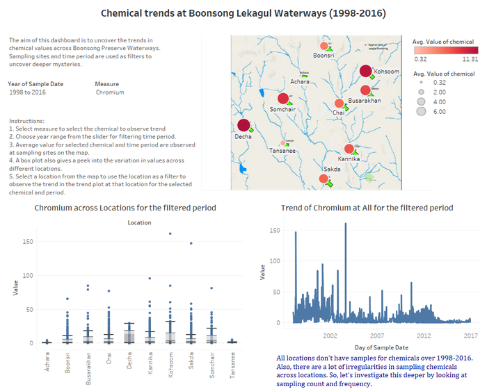
This dashboard is aimed to uncover the trends in chemical values across Boonsong Preserve Waterway.Sampling sites and time period are used as filters.
The map shows the average value of a chemical for a selected time period. Box plot gives the variation in values for the chemical and date range chosen. The trend plot takes the selected location from map,time and measure from the filter and shows the variation over time.
2.Chemical Anomalies
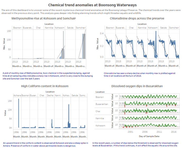
This dashboard is aimed to uncover some of the recent mysterious chemical trend anomalies at the Preserve.The analysis goes into finding alarming trends which might threaten aquatic and wildlife.
3.Sample Collection
This dashboard is to look at the number of samples collected across sampling sites. Sample collection is studied over years and further drilled down to months in filtered years for a particular chemical and site.
This dashboard uses a 3 level visualisation - Sample count vs year --> Sample count vs month in selected year --> Value of chemical over selected month. Chemical measure and location are used as filters.
4.Sampling Frequency
This dashboard aims to look at when the samples were taken for chemicals across the different locations to discover the sampling patterns of chemicals.
The packed bubble chart indicates the average difference in days between two sampling events for a chemical. After selecting a bubble, a line chart is used to show the absolute difference in sampling days for the selected chemical.
5.Sampling trends and anomalies
The aim of this dashboard is to uncover some of the sampling trends and anomalies at the Preserve. This is useful to check if the Hydrology department is collecting sufficient data.
A bar chart shows the number of samples taken over the years for all the chemicals. A heatmap is used to indicate the month-wise average difference in sampling days.
