Difference between revisions of "ISS608 2017-18 T3 G2 Assign ChenYanchong Visualization"
Ycchen.2017 (talk | contribs) |
Ycchen.2017 (talk | contribs) |
||
| (14 intermediate revisions by the same user not shown) | |||
| Line 1: | Line 1: | ||
| − | <div style="background:#DBE4EA;border:#A3BFB1; padding:15px;border-radius: 5px;margin-bottom:5px"> | + | <div style="display:flex;background:#DBE4EA;border:#A3BFB1; padding:15px;border-radius: 5px;margin-bottom:5px;font-family:Century Gothic;font-weight:bold;"> |
| − | [[Image:Cyc nav pic.jpg|300px]] | + | <div>[[Image:Cyc nav pic.jpg|300px]]</div> |
| − | < | + | <div style="display:flex;align-items:center;padding:0 5px"><font size = 6; color="#0277BD" style="text-align:center;">ISSS608 Visual Analytics Vast Challenge Mini Challenge 2</font></div> |
</div> | </div> | ||
<!--MAIN HEADER --> | <!--MAIN HEADER --> | ||
| Line 21: | Line 21: | ||
| style="text-decoration: none;border-radius: 10px 10px 0 0;background-color: #F7E5DD;" width="15%" | | | style="text-decoration: none;border-radius: 10px 10px 0 0;background-color: #F7E5DD;" width="15%" | | ||
| − | [[ISS608_2017-18_T3_G2_Assign_ChenYanchong_Reference| <font color=#CD5C5C> | + | [[ISS608_2017-18_T3_G2_Assign_ChenYanchong_Reference| <font color=#CD5C5C>Feedback</font>]] |
|} | |} | ||
| − | <font size="5">The | + | <font size="5">The complete story board for this visualisation is available through </font>[https://public.tableau.com/views/VA_Assignment_YanchongCHEN/StoryofwaterwaysinBLPreserve?:embed=y&:display_count=yes&publish=yes Chen Yanchong's Tableau Public]<br/> |
| − | + | '''This page will give a brief introduction of how the story board was prepared''' | |
| − | = | + | =Preparation of worksheets= |
| − | + | There are total 11 worksheets are used. | |
| − | + | ==1. map== | |
| − | + | Purpose of this worksheet: making use of the map and using the location information properly<br/> | |
| − | [[Image: | + | [[Image:Cyc_wh_1.png|350px]] <br/> |
| − | + | Steps to take:<br/> | |
| − | + | # Creating a excel worksheet named location with three columns inside it, location, Xcoord and Ycoord | |
| − | + | # Adding a background map in Tableau | |
| − | + | # Using annotation to get the coordinate of each location on the map | |
| − | + | # Using the prepared data table to left join the location table by the column "location" | |
| − | + | [[Image:Cyc_wh_prep_1.jpg|400px]] | |
| − | [[Image: | ||
| − | |||
| − | |||
| − | |||
| − | |||
| − | |||
| − | |||
| − | |||
| − | |||
| − | |||
| − | |||
| − | | | + | ==2. measure count overall== |
| − | + | Purpose of this worksheet: to should the tendency from the start to the end<br/> | |
| − | ''' | + | [[Image:Cyc_wh_2.png|550px]]<br/> |
| − | + | Steps to take:<br/> | |
| − | + | # Create a calculated field ''' measure count ''', using formula : '''COUNTD([Measure])''' | |
| + | # Create a calculated field ''' first or last ''', using formula: '''FIRST() == 0 OR LAST() == 0''' | ||
| + | # Drag '''sample date''' to the column shelf, and '''measure count ''' to row shelf | ||
| + | # '''first or last ''' and '''location''' as filter, and choose '''True''' only | ||
| + | # '''measure count''' on row shelf again, and choose '''dual axis''' | ||
| + | # '''location''' on color card, '''measure count''' and '''location''' on label card | ||
| − | | | + | ==3. measure count detailed== |
| − | + | Purpose of this worksheet: showing more detailed measure count than the slope chart above<br/> | |
| − | ''' | + | [[Image:Cyc_wh_3.png|550px]]<br/> |
| − | + | Steps to take:<br/> | |
| − | + | # Duplicate the slope chart | |
| + | # Remove '''first or last''' from filter | ||
| − | + | ==4. measure value per loc== | |
| − | + | Purpose of this worksheet: using with the map to perform point source<br/> | |
| − | + | [[Image:Cyc_wh_4.png|550px]]<br/> | |
| − | | | + | Steps to take:<br/> |
| − | + | # Drag '''sample date''' to column shelf and drill it down to '''month''' granularity | |
| − | # | + | # Drag '''location''' and '''measure''' to row shelf in order |
| − | # | + | # Put '''value''' on row shelf and choose '''average''' as aggregation method |
| − | # | + | # Add '''value''' to color card and choose '''average''' as aggregation method |
| − | + | # Drag '''location''' and '''measure''' to filter | |
| − | |||
| − | |||
| − | |||
| − | |||
| − | |||
| − | |||
| − | | | + | ==5. measure value trend by year== |
| − | + | Purpose of this worksheet: how single measure changes in each location by year<br/> | |
| − | ''' | + | [[Image:Cyc_wh_6.png|550px]]<br/> |
| − | + | Steps to take:<br/> | |
| − | + | # '''sample date''' on column shelf and drill down to month | |
| + | # Put value on row shelf and choose average as aggregating method | ||
| + | # Choose '''area''' for marks | ||
| + | # Insert '''measure''' in title | ||
| − | |||
| − | |||
| − | |||
| − | |||
| − | |||
| − | |||
| − | |||
| − | + | ==6. measure value== | |
| − | | | + | Purpose of this worksheet: giving more intuitive feeling of the difference of single measure between the start year and the end year <br/> |
| − | </ | + | [[Image:Cyc_wh_5.png|550px]]<br/> |
| − | + | Steps to take:<br/> | |
| − | ''' | + | # Duplicate the second slope chart |
| − | < | + | # Add '''measure''' on filter |
| − | + | # Double click the title and insert ''' measure ''' on the title | |
| − | + | # in the tooltip card, format it a bit and insert above chart to drill down more details | |
| − | + | ||
| − | ''' | + | |
| − | + | ==7. heat map== | |
| − | ''' | + | Purpose of this worksheet: using heatmap for the convenience of comparison and obtain more detail time series analysis<br/> |
| + | [[Image:Cyc_wh_7.png|550px]]<br/> | ||
| + | Steps to take:<br/> | ||
| + | # Select '''measure''' to column shelf and '''location''' to row shelf | ||
| + | # Drag '''sample date''' on column shelf and drill it down to '''month''' | ||
| + | # Drag '''month''' to row shelf | ||
| + | # Apply '''location''' and '''measure''' as filters | ||
| + | # Put average '''value''' on color card | ||
| + | |||
| − | | | + | ==8. seasonality trend== |
| − | + | Purpose of this worksheet: to discovery seasonality patterns<br/> | |
| − | + | [[Image:Cyc_wh_8.png|550px]]<br/> | |
| − | + | Steps to take:<br/> | |
| − | the | + | # Duplicate '''the measure value by year trend''' worksheet |
| + | # Reverse the position of '''year''' and '''month''' | ||
| − | |||
| − | |||
| − | |||
| − | |||
| − | |||
| − | |||
| − | | | + | ==9. percentage diff== |
| − | + | Purpose of this worksheet: comparing each location against all<br/> | |
| − | + | [[Image:Cyc_wh_9.png|550px]]<br/> | |
| − | + | Steps to take:<br/> | |
| − | + | # Create calculated field '''avg_across_all''' by formula : '''{ FIXED YEAR([Sample Date]), [Measure]:AVG([Value])}''' | |
| + | # Create calculated field '''pct_diff_with_all ''' by formula: ''' ({ FIXED YEAR([Sample Date]), [Location], [Measure]:AVG([Value])} - [avg_across_all])/[avg_across_all]''' | ||
| + | # Create calculated field ''' increased? ''' by formula: ''' IF [pct_diff_with_all] > 0 THEN 'higher' ELSEIF [pct_diff_with_all] < 0 THEN 'lower' ELSE 'equal' END''' | ||
| + | # '''location''' and '''pct_diff_with_all''' on column shelf | ||
| + | # '''sample date''' on row shelf | ||
| + | # '''measure''' and '''location''' on filter | ||
| + | # '''increased? ''' on color card | ||
| − | |||
| − | |||
| − | |||
| − | |||
| − | |||
| − | + | ==10 0.3 principle== | |
| − | + | Purpose of this worksheet: using 0.3 principle to detect the locations are polluted<br/> | |
| − | </ | + | '''''0.3 principle''' can see data preparation section for more details''<br/> |
| − | + | [[Image:Cyc_wh_10.png|550px]]<br/> | |
| − | + | Steps to take:<br/> | |
| − | + | # Create calculated field '''total chemical oxygen demand''' by formula: ''' IF [Measure]='Chemical Oxygen Demand (Cr)' THEN [Value] ELSEIF [Measure]='Chemical Oxygen Demand (Mn)' THEN [Value] END''' | |
| − | + | # Create calculated field '''total oxygen demand''' by formula ''' IF [Measure]='Biochemical Oxygen' THEN [Value] END''' | |
| − | + | # Create calculated field '''oxygen rate''' by formula '''AVG([total oxygen demand])/AVG([total chemical oxygen demand])''' | |
| + | # Year of '''sample date''' and month of '''sample date''' on column shelf | ||
| + | # '''oxygen rate''' on row shelf | ||
| + | # Year of '''sample date''' and '''location''' on filter and '''location''' on details as well as on color | ||
| + | # Add a constant reference line on across table with a value '''0.3''' | ||
| + | ==11. intuitive line graph== | ||
| + | Purpose of this worksheet: dividing the worksheet by location to obtain insights easier<br/> | ||
| + | [[Image:Cyc_wh_11.png|550px]]<br/> | ||
| + | Steps to take:<br/> | ||
| + | # Create calculated field '''col divider ''' by formula : '''(INDEX()-1)%(ROUND(SQRT(SIZE()))) ''' | ||
| + | # Create calculated field '''row divider''' by formula : ''' INT((INDEX()-1)/ROUND(SQRT(SIZE())))''' | ||
| + | # Put '''location''' on detail and label | ||
| + | # Put '''col divider''' on column shelf and '''row divider''' on row shelf, make them computing using '''location''' and make them discrete value | ||
| + | # Drag '''value''' on row shelf as well as on color card and on label card | ||
| + | # Put '''measure''' as filter | ||
| − | = | + | =User Guide for dashboard= |
| − | + | ==Dashboard 1: Water composition changes by year== | |
| − | + | [[Image:Cyc_db_1.png|550px]] | |
| − | + | ==Dashboard 2: Point source among locations== | |
| − | + | To filter measures, user can choose from the dropdown menu;<br/> | |
| − | + | Click the locations on the map the location filter can work on the scatter plot as well;<br/> | |
| − | + | If user clicked the empty area on the map, all the locations will be selected.<br/> | |
| + | [[Image:Cyc_db_2.png|550px]] | ||
Latest revision as of 10:46, 9 July 2018
The complete story board for this visualisation is available through Chen Yanchong's Tableau Public
This page will give a brief introduction of how the story board was prepared
Preparation of worksheets
There are total 11 worksheets are used.
1. map
Purpose of this worksheet: making use of the map and using the location information properly
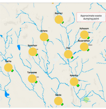
Steps to take:
- Creating a excel worksheet named location with three columns inside it, location, Xcoord and Ycoord
- Adding a background map in Tableau
- Using annotation to get the coordinate of each location on the map
- Using the prepared data table to left join the location table by the column "location"
2. measure count overall
Purpose of this worksheet: to should the tendency from the start to the end
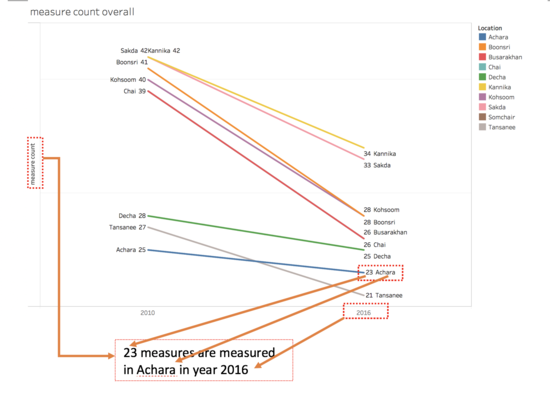
Steps to take:
- Create a calculated field measure count , using formula : COUNTD([Measure])
- Create a calculated field first or last , using formula: FIRST() == 0 OR LAST() == 0
- Drag sample date to the column shelf, and measure count to row shelf
- first or last and location as filter, and choose True only
- measure count on row shelf again, and choose dual axis
- location on color card, measure count and location on label card
3. measure count detailed
Purpose of this worksheet: showing more detailed measure count than the slope chart above
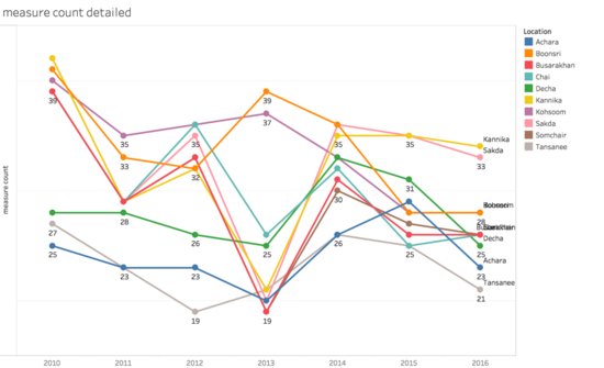
Steps to take:
- Duplicate the slope chart
- Remove first or last from filter
4. measure value per loc
Purpose of this worksheet: using with the map to perform point source
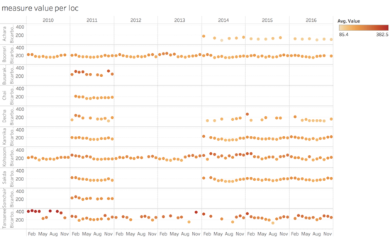
Steps to take:
- Drag sample date to column shelf and drill it down to month granularity
- Drag location and measure to row shelf in order
- Put value on row shelf and choose average as aggregation method
- Add value to color card and choose average as aggregation method
- Drag location and measure to filter
5. measure value trend by year
Purpose of this worksheet: how single measure changes in each location by year
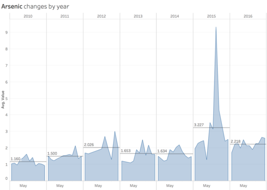
Steps to take:
- sample date on column shelf and drill down to month
- Put value on row shelf and choose average as aggregating method
- Choose area for marks
- Insert measure in title
6. measure value
Purpose of this worksheet: giving more intuitive feeling of the difference of single measure between the start year and the end year
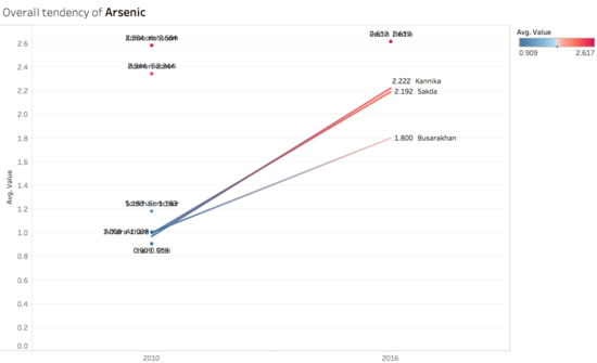
Steps to take:
- Duplicate the second slope chart
- Add measure on filter
- Double click the title and insert measure on the title
- in the tooltip card, format it a bit and insert above chart to drill down more details
7. heat map
Purpose of this worksheet: using heatmap for the convenience of comparison and obtain more detail time series analysis
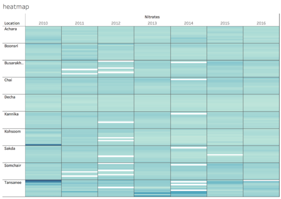
Steps to take:
- Select measure to column shelf and location to row shelf
- Drag sample date on column shelf and drill it down to month
- Drag month to row shelf
- Apply location and measure as filters
- Put average value on color card
8. seasonality trend
Purpose of this worksheet: to discovery seasonality patterns
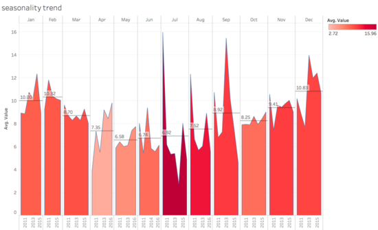
Steps to take:
- Duplicate the measure value by year trend worksheet
- Reverse the position of year and month
9. percentage diff
Purpose of this worksheet: comparing each location against all
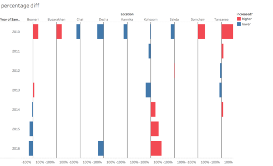
Steps to take:
- Create calculated field avg_across_all by formula : { FIXED YEAR([Sample Date]), [Measure]:AVG([Value])}
- Create calculated field pct_diff_with_all by formula: ({ FIXED YEAR([Sample Date]), [Location], [Measure]:AVG([Value])} - [avg_across_all])/[avg_across_all]
- Create calculated field increased? by formula: IF [pct_diff_with_all] > 0 THEN 'higher' ELSEIF [pct_diff_with_all] < 0 THEN 'lower' ELSE 'equal' END
- location and pct_diff_with_all on column shelf
- sample date on row shelf
- measure and location on filter
- increased? on color card
10 0.3 principle
Purpose of this worksheet: using 0.3 principle to detect the locations are polluted
0.3 principle can see data preparation section for more details
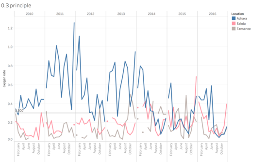
Steps to take:
- Create calculated field total chemical oxygen demand by formula: IF [Measure]='Chemical Oxygen Demand (Cr)' THEN [Value] ELSEIF [Measure]='Chemical Oxygen Demand (Mn)' THEN [Value] END
- Create calculated field total oxygen demand by formula IF [Measure]='Biochemical Oxygen' THEN [Value] END
- Create calculated field oxygen rate by formula AVG([total oxygen demand])/AVG([total chemical oxygen demand])
- Year of sample date and month of sample date on column shelf
- oxygen rate on row shelf
- Year of sample date and location on filter and location on details as well as on color
- Add a constant reference line on across table with a value 0.3
11. intuitive line graph
Purpose of this worksheet: dividing the worksheet by location to obtain insights easier
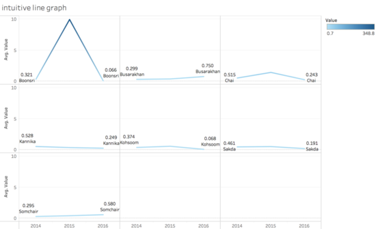
Steps to take:
- Create calculated field col divider by formula : (INDEX()-1)%(ROUND(SQRT(SIZE())))
- Create calculated field row divider by formula : INT((INDEX()-1)/ROUND(SQRT(SIZE())))
- Put location on detail and label
- Put col divider on column shelf and row divider on row shelf, make them computing using location and make them discrete value
- Drag value on row shelf as well as on color card and on label card
- Put measure as filter
User Guide for dashboard
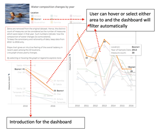
Dashboard 1: Water composition changes by year
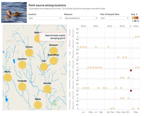
Dashboard 2: Point source among locations
To filter measures, user can choose from the dropdown menu;
Click the locations on the map the location filter can work on the scatter plot as well;
If user clicked the empty area on the map, all the locations will be selected.
