Difference between revisions of "ISSS608 2017-18 T3 Assign Vaishnavi Praveen Agarwal Visual"
| (40 intermediate revisions by the same user not shown) | |||
| Line 33: | Line 33: | ||
|} | |} | ||
| − | ==Dimensions and Measures | + | |
| + | <div style="float:center;display:block;text-align:center;font-family:'Century Gothic';font-size:30px;color:#016FEC;text-decoration:underline;"> | ||
| + | [https://public.tableau.com/profile/vaishnavi.agarwal#!/vizhome/VAST2018-MiniChallenge2/YearwiseTrend?publish=yes Click here to explore the live dashboard] | ||
| + | </div> | ||
| + | |||
| + | =Dimensions and Measures= | ||
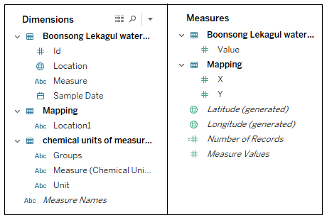
The finals dataset contains various columns and the columns are divided into Dimensions and Measures in Tableau based on their properties. Before starting with the Visualization, lets get familiar with the available Dimensions and Measures. | The finals dataset contains various columns and the columns are divided into Dimensions and Measures in Tableau based on their properties. Before starting with the Visualization, lets get familiar with the available Dimensions and Measures. | ||
<span style=text-align:center;">[[Image:Vaishnavi_8.png|700px|thumb|left]]</span> | <span style=text-align:center;">[[Image:Vaishnavi_8.png|700px|thumb|left]]</span> | ||
| − | |||
<br> | <br> | ||
<br> | <br> | ||
| Line 55: | Line 59: | ||
<br> | <br> | ||
<br> | <br> | ||
| − | + | <br> | |
| + | =Measure by Location= | ||
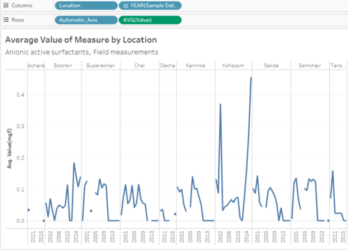
The data has a total of 106 chemicals (12 groups) and 10 places. I want to analyze the trend of each measure at all the places for years 1998 - 2016. This visualization will help to compare the average values and select the place that has the highest reading of a measure. | The data has a total of 106 chemicals (12 groups) and 10 places. I want to analyze the trend of each measure at all the places for years 1998 - 2016. This visualization will help to compare the average values and select the place that has the highest reading of a measure. | ||
| Line 97: | Line 102: | ||
*<b>Details:</b> Measure, Groups, Location, YEAR(Sample Date) | *<b>Details:</b> Measure, Groups, Location, YEAR(Sample Date) | ||
*<b>Tooltip:</b> Measure, Groups, Location, YEAR(Sample Date), AVG(Value) | *<b>Tooltip:</b> Measure, Groups, Location, YEAR(Sample Date), AVG(Value) | ||
| + | *<b>Title:</b> Measure, Groups | ||
| − | The Measure for Value is selected as Average(AVG) because there are various readings taken every year, and to compare the readings across years I have plot the value of a measure in a year as the average of all the readings in that year. | + | |
| + | <span style="color:red"><b>NOTE*</b></span> The Measure for Value is selected as Average(AVG) because there are various readings taken every year, and to compare the readings across years I have plot the value of a measure in a year as the average of all the readings in that year. | ||
|| | || | ||
| Line 105: | Line 112: | ||
|} | |} | ||
| + | </div> | ||
| + | |||
| + | |||
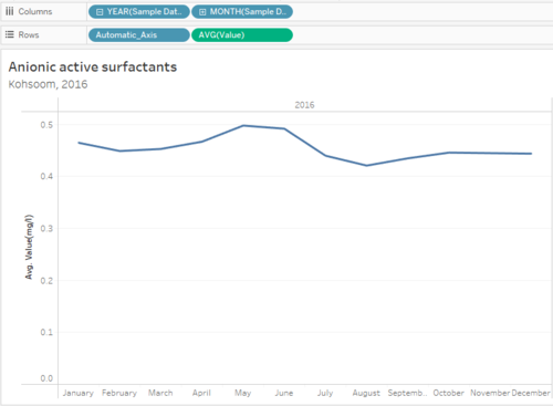
| + | =Month-wise Readings= | ||
| + | |||
| + | This graph will give the user month-wise readings of the selected measure, for the selected place and year. This can help the user get a detailed insight as for which month the readings are high, and is there any particular month where the reading are high. This graph will be a drill-dwon from <b>Measure by Value</b> graph. | ||
| + | |||
| + | <div style="margin:0px; padding: 2px; font-family: Arial; border-radius: 1px; text-align:left"> | ||
| + | {| class="wikitable" style="background-color:#FFFFFF;" width="100%" | ||
| + | |- | ||
| + | | | ||
| + | <b>Plotting the Graph</b> | ||
| + | |||
| + | *<b>Columns:</b> YEAR(Sample Date), MONTH(Sample Date) | ||
| + | *<b>Rows:</b> Automatic_Axis, AVG(Value) | ||
| + | *<b>Details:</b> Measure, Groups, Location, YEAR(Sample Date) | ||
| + | *<b>Tooltip:</b> Measure, Groups, Location, YEAR(Sample Date), MONTH(Sample Date), AVG(Value), SUM(Number of Records) | ||
| + | *<b>Title:</b> Measure, Location, YEAR(Sample Date) | ||
| + | |||
| + | |||
| + | <span style="color:red"><b>NOTE*</b></span> The Measure for Value is selected as Average(AVG) because there are various readings taken in a month, and to compare the readings across months, I plot the value of a measure in a month as the average of all the readings in that month. | ||
| + | |||
| + | || | ||
| + | |||
| + | <span style=text-align:center;">[[Image:Vaishnavi_12.png|500px|thumb|center]]</span> | ||
| + | |||
| + | |} | ||
| + | </div> | ||
| + | |||
| + | |||
| + | =No. of Records= | ||
| + | |||
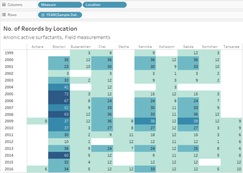
| + | This graph will show how many reading where taken for the selected measure from 1998-2016. The heat-map makes it visually easy to spot the variation in the number of readings based on the color. | ||
| + | |||
| + | <div style="margin:0px; padding: 2px; font-family: Arial; border-radius: 1px; text-align:left"> | ||
| + | {| class="wikitable" style="background-color:#FFFFFF;" width="100%" | ||
| + | |- | ||
| + | | | ||
| + | <b>Add Filters</b> | ||
| + | |||
| + | The user should be able to visualize the measure of their choice, therefore the graph should filter the data according to the selected measure. | ||
| + | |||
| + | *Create a hierarchy of Groups and Measures, this will allow the user to select a group and then select a measure of that group. | ||
| + | *Drag and drop <b>Groups</b> and <b>Measures</b> to Filters. | ||
| + | *Click on the fields in filters, select Show Filter and select the Filters to be Single Value (list). | ||
| + | |||
| + | || | ||
| + | |||
| + | <span style=text-align:center;">[[Image:Vaishnavi_10.png|400px|thumb|center]]</span> | ||
| + | |||
| + | |- | ||
| + | | | ||
| + | <b>Plotting the Graph</b> | ||
| + | |||
| + | *<b>Columns:</b> Measure, Location | ||
| + | *<b>Rows:</b> YEAR(Sample Date) | ||
| + | *<b>Details:</b> Measure, Location, YEAR(Sample Date) | ||
| + | *<b>Label:</b> SUM(Number of Records) | ||
| + | *<b>Color:</b> SUM(Number of Records) | ||
| + | *<b>Tooltip:</b> Measure, Location, YEAR(Sample Date), SUM(Number of Records) | ||
| + | *<b>Title:</b> Measure, Groups | ||
| + | |||
| + | || | ||
| + | |||
| + | <span style=text-align:center;">[[Image:Vaishnavi_13.png|500px|thumb|center]]</span> | ||
| + | |||
| + | |} | ||
| + | </div> | ||
| + | |||
| + | |||
| + | =Map= | ||
| + | |||
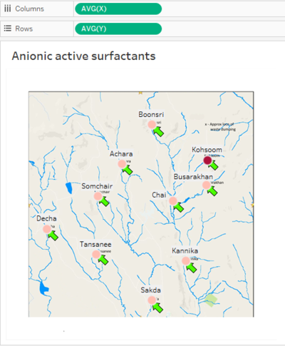
| + | Map will be used to show the location of the places where readings of the selected measures were taken and also the place that has the highest average value of the selected measure. | ||
| + | |||
| + | <div style="margin:0px; padding: 2px; font-family: Arial; border-radius: 1px; text-align:left"> | ||
| + | {| class="wikitable" style="background-color:#FFFFFF;" width="100%" | ||
| + | |- | ||
| + | | | ||
| + | <b>Plotting the Graph</b> | ||
| + | |||
| + | *<b>Columns:</b> AVG(X) | ||
| + | *<b>Rows:</b> AVG(Y) | ||
| + | *<b>Filters:</b> Groups, Measures | ||
| + | *<b>Details:</b> Measure, Location, Groups | ||
| + | *<b>Color:</b> AVG(Value) | ||
| + | *<b>Label</b> Location | ||
| + | *<b>Tooltip:</b> Location | ||
| + | *<b>Title:</b> Location | ||
| + | |||
| + | <span style="color:red"><b>NOTE*</b></span> AVG(X) and AVG(Y) is taken because there are multiple rows of data for a single location, but the X and Y coordinates will be same for a particular location, therefore using the Average measure for X and Y gives the actual coordinates of the places. | ||
| + | |||
| + | || | ||
| + | |||
| + | <span style=text-align:center;">[[Image:Vaishnavi_18.png|400px|thumb|center]]</span> | ||
| + | |||
| + | |} | ||
| + | </div> | ||
| + | |||
| + | =Interactive Dashboard= | ||
| + | |||
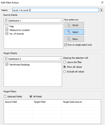
| + | The 4 graphs that I plotted are added to the dashboard, and following actions were added to the sheets to link them to each each, so that detailed analyses of the data can be done. | ||
| + | |||
| + | <div style="margin:0px; padding: 2px; font-family: Arial; border-radius: 1px; text-align:left"> | ||
| + | {| class="wikitable" style="background-color:#FFFFFF;" width="100%" | ||
| + | |- | ||
| + | | | ||
| + | <b>Level 1 to Level 2</b> | ||
| + | |||
| + | This action was added to the files: <b>Measure by Location and No. of Records</b>. | ||
| + | <br>This will help the user get detailed insights of a particular measure by just selecting the point on any of these two graphs. | ||
| + | <br>When the user select any point on the graph, it will redirect to the other two graphs: <b>Month-wise Reading and Map</b> for extra details. | ||
| + | |||
| + | || | ||
| + | |||
| + | <span style=text-align:center;">[[Image:Vaishnavi_19.png|400px|thumb|center]]</span> | ||
| + | |||
| + | |- | ||
| + | | | ||
| + | <b>Level 2 to Level 1</b> | ||
| + | |||
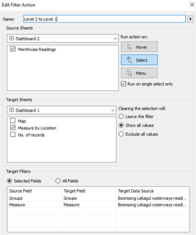
| + | This action was added to the files: <b>Month-wise Readings and Map</b>. | ||
| + | <br>This will help the user go back to the previous graph with the selection highlighted. | ||
| + | <br>The target sheet is only <b>Measure by Location</b> because the filter is added only to that sheet and applied to No. of Records and Mao sheets in the Dashboard | ||
| + | |||
| + | || | ||
| + | |||
| + | <span style=text-align:center;">[[Image:Vaishnavi_20.png|400px|thumb|center]]</span> | ||
| + | |||
| + | |} | ||
| + | </div> | ||
| + | |||
| + | <div style="float:center;display:block;text-align:center;font-family:'Century Gothic';font-size:30px;color:#016FEC;text-decoration:underline;"> | ||
| + | [https://public.tableau.com/profile/vaishnavi.agarwal#!/vizhome/VAST2018-MiniChallenge2/YearwiseTrend?publish=yes Click here to explore the live dashboard] | ||
</div> | </div> | ||
Latest revision as of 23:17, 8 July 2018
|
|
|
|
|
|
|
Contents
Dimensions and Measures
The finals dataset contains various columns and the columns are divided into Dimensions and Measures in Tableau based on their properties. Before starting with the Visualization, lets get familiar with the available Dimensions and Measures.
Measure by Location
The data has a total of 106 chemicals (12 groups) and 10 places. I want to analyze the trend of each measure at all the places for years 1998 - 2016. This visualization will help to compare the average values and select the place that has the highest reading of a measure.
|
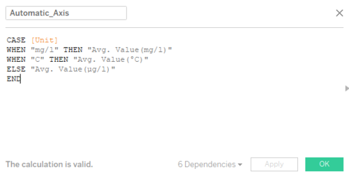
Create a Calculated Field The measures have three different units: mg/l, µg/l, and °C. The unit for average value should change according to the measure, therefore we will use this calculated field to automate the y-axis label.
|
|
|
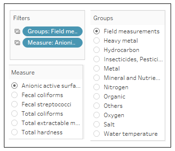
Add Filters The user should be able to visualize the measure of their choice, therefore the graph should filter the data according to the selected measure.
|
|
|
Plotting the Graph
|
Month-wise Readings
This graph will give the user month-wise readings of the selected measure, for the selected place and year. This can help the user get a detailed insight as for which month the readings are high, and is there any particular month where the reading are high. This graph will be a drill-dwon from Measure by Value graph.
|
Plotting the Graph
|
No. of Records
This graph will show how many reading where taken for the selected measure from 1998-2016. The heat-map makes it visually easy to spot the variation in the number of readings based on the color.
|
Add Filters The user should be able to visualize the measure of their choice, therefore the graph should filter the data according to the selected measure.
|
|
|
Plotting the Graph
|
Map
Map will be used to show the location of the places where readings of the selected measures were taken and also the place that has the highest average value of the selected measure.
|
Plotting the Graph
NOTE* AVG(X) and AVG(Y) is taken because there are multiple rows of data for a single location, but the X and Y coordinates will be same for a particular location, therefore using the Average measure for X and Y gives the actual coordinates of the places. |
Interactive Dashboard
The 4 graphs that I plotted are added to the dashboard, and following actions were added to the sheets to link them to each each, so that detailed analyses of the data can be done.
|
Level 1 to Level 2 This action was added to the files: Measure by Location and No. of Records.
|
|
|
Level 2 to Level 1 This action was added to the files: Month-wise Readings and Map.
|

