Difference between revisions of "ISSS608 2017-18 T3 Assign Gao Jiaoyang Visualization"
Jygao.2017 (talk | contribs) |
Jygao.2017 (talk | contribs) |
||
| Line 103: | Line 103: | ||
<tr> | <tr> | ||
| − | <td><b> | + | <td><b> 5 </b> |
</td> | </td> | ||
| − | <td>Chemicals | + | <td> '''Chemicals''' |
| + | |||
| + | |||
| + | Since the rest of chemicals are using the same units, so we can visual them together. Since we've already know '''''Methylosmoline''''' is a target chemical contaminant the investigators are looking for. I'll explore more in this one and let this as an example to show. | ||
| + | <td> '''Trend of Methylosmoline''' | ||
| + | |||
</tr> | </tr> | ||
</table> | </table> | ||
Revision as of 12:48, 8 July 2018
|
|
|
|
|
Visual Analysis
| Number | Methodology | Detail |
|---|---|---|
| 1 | Measure Count
|
Heatmap of Distinct Measure Count by Location
Seems most of the locations took records every year since 1998. However, 3 positions include Achara, Decha, Tansanee only take records start from 2009. And during 2005-2009, all the locations recorded more measures than other years, especially in 2009. |
| 2 | Measure Record
|
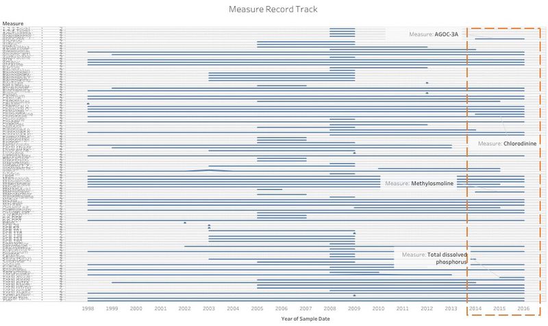
Line Chart of Measure Record
The measure record is kind messy, some measure are recorded continuously since 1998. But some measure only be recorded for one year and the average value of most of them is 0. Some measures only be tested in recent years which are AGOC-3A,Chlorodinine,Methylpsmoline from 2014 and Total dissolved phosphorus from 2015. The 4 measures need analyze carefully to understand the recent situation of the pollution. |
| 3 | Water Temperature
|
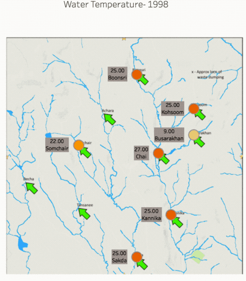
line chart by Quarter
Seasons may have a greater impact on water temperature, that's the reason why I show this graph in quarter. And as we can see, the highest water temperature appear in Q3 which are July, August and September (similar with the seasonality) except Sakda whose highest water temperature appears in Q2. Motion Graph of Water Temperature This motion graph can show the change of water temperature of each locations more directly. |
| 4 | Macrozoobenthos
|
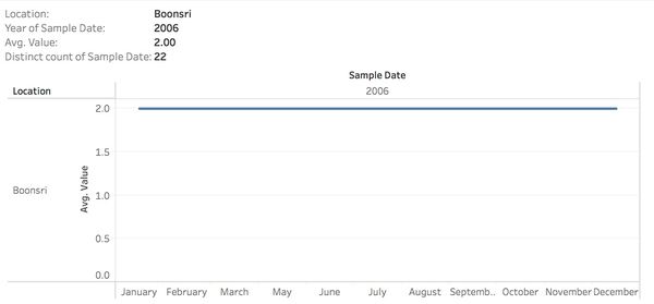
Highlight Table of Macrozoobenthos Overview
when hover mouse over, also shows the trend of each location in this year. The Macrozoobenthos was been recorded quite continuously except Decha which only took records for 2011 and 2016. And obviously that the values of Macrozoobenthos are quite steady during these years. However, it increased sharply in 2014 at Kannika and Sakda. |
| 5 | Chemicals
| Trend of Methylosmoline |


