Difference between revisions of "ISSS608 2017-18 T3 Assign Harisingh Q2"
| (2 intermediate revisions by the same user not shown) | |||
| Line 34: | Line 34: | ||
| − | With a | + | With a good background on data sampling issues, we will next focus our attention on remaining chemicals and try to understand '''anomalies''' in form of unusual patterns in actual readings. |
The below line chart clearly shows that Ammonium observed highest concentration in two locations, '''namely Decha and Tansanee''', in years 2010 and 2014 respectively. | The below line chart clearly shows that Ammonium observed highest concentration in two locations, '''namely Decha and Tansanee''', in years 2010 and 2014 respectively. | ||
| Line 47: | Line 47: | ||
===Dashboard for Analyzing Changes in Readings=== | ===Dashboard for Analyzing Changes in Readings=== | ||
| − | For remaining chemicals, investigators can use the below dashboard to '''interactively analyze''' | + | For remaining chemicals, investigators can use the below dashboard to '''interactively analyze''' changes in actual readings and/or compare their readings across locations. For example, '''Chlorides''' has high number of sample collected in '''Boonsri, Chai, Kannika, and Sakda''' (indicated by bubble size in location map), it observed very high reading in '''Tansanee''' (indicated by color shade) location. |
| Line 55: | Line 55: | ||
| − | + | If we further zoom into '''December 2013''' for Chlorides, the revised view of location map suggests that chemical contamination was actually high in '''Sakda''' location. | |
[[File:h_chart16.png|700px]] | [[File:h_chart16.png|700px]] | ||
| Line 65: | Line 65: | ||
===Dashboard for Analyzing Peaks in Readings=== | ===Dashboard for Analyzing Peaks in Readings=== | ||
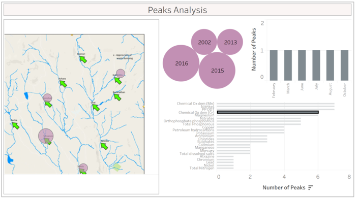
| − | For the ease of use, I have also added a separate dashboard, which can used by investigators to interactively | + | For the ease of use, I have also added a separate dashboard, which can used by investigators to interactively visualize the peaks in different chemicals. The dashboard shows that '''Chemical Oxygen Demand (Cr)''' mainly experienced peaks in 2015-16 (between February and October) in four different locations namely Kohsoom, Sakda, Tansanee, and Somchair. |
| Line 73: | Line 73: | ||
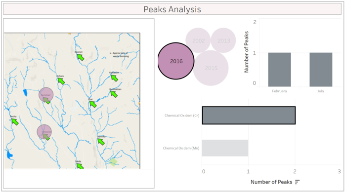
| − | It becomes clearer when we further zoom into 2016 for Chemical Oxygen Demand (Cr) that peaks were observed into February and July in Somchair and Tansanee. | + | It becomes clearer when we further zoom into '''2016''' for Chemical Oxygen Demand (Cr) that peaks were observed into '''February and July''' in Somchair and Tansanee. |
[[File:h_chart19.png|700px]] | [[File:h_chart19.png|700px]] | ||
Latest revision as of 15:47, 9 July 2018
In previous sections, we consolidated our understanding in different aspects for given problem. We started by identifying key data collection issues, followed by trend analysis of number of samples collected for different chemicals. In the process, we also filtered chemicals of interest for further analysis.
Here is a summary of key issues in data sampling, which requires special attention from Hydrology Department in the future:
- Most chemicals have missing readings for many years, leading to sparse data.
- Few chemicals have missing readings only in recent years, the potential period of dumping.
- Inconsistent number of readings of a chemical across locations, leading to location-specific sparsity in data.
- For Achara, Decha, and Tansanee, readings have only been collected in recent past (2009 onward). It would have helped to understand the overall pattern since 1998 in these locations.
With a good background on data sampling issues, we will next focus our attention on remaining chemicals and try to understand anomalies in form of unusual patterns in actual readings.
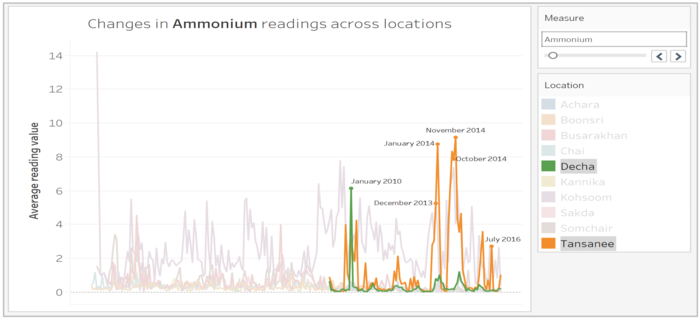
The below line chart clearly shows that Ammonium observed highest concentration in two locations, namely Decha and Tansanee, in years 2010 and 2014 respectively.
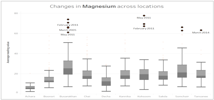
The box plot gives us more insights into concentration of individual chemicals in different locations. Magnesium seem to have experienced higher readings in Busarakhan and Somchair, with most of peaks observed around May 2011.
Dashboard for Analyzing Changes in Readings
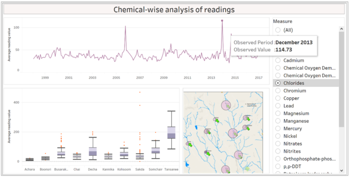
For remaining chemicals, investigators can use the below dashboard to interactively analyze changes in actual readings and/or compare their readings across locations. For example, Chlorides has high number of sample collected in Boonsri, Chai, Kannika, and Sakda (indicated by bubble size in location map), it observed very high reading in Tansanee (indicated by color shade) location.
Follow this link to access below dashboard.
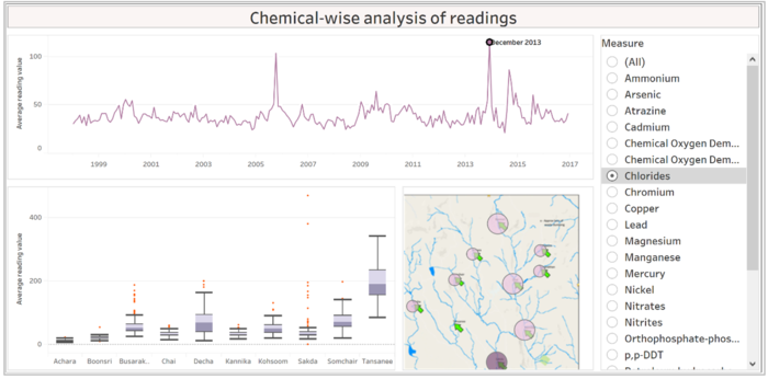
If we further zoom into December 2013 for Chlorides, the revised view of location map suggests that chemical contamination was actually high in Sakda location.
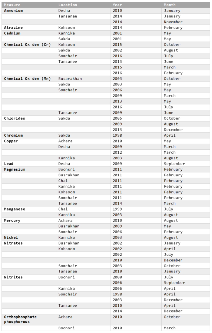
Using the above dashboard, I was able to summarize peaks in readings for other chemicals by location. This information can be used by investigators to further investigate chemical contamination during specific time periods.
Dashboard for Analyzing Peaks in Readings
For the ease of use, I have also added a separate dashboard, which can used by investigators to interactively visualize the peaks in different chemicals. The dashboard shows that Chemical Oxygen Demand (Cr) mainly experienced peaks in 2015-16 (between February and October) in four different locations namely Kohsoom, Sakda, Tansanee, and Somchair.
Follow this link to access the below dashboard.
It becomes clearer when we further zoom into 2016 for Chemical Oxygen Demand (Cr) that peaks were observed into February and July in Somchair and Tansanee.

