ISSS608 2017-18 T3 Assign Vishal Badrinarayanan Question1
|
|
|
|
|
|
|
|
|
Question 1 Analysis
|
Graph |
Description |
|
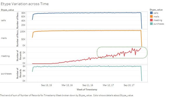
This graph shows the variation of E_Types across time. - From the graph we find that the count of Mails , Calls and Purchases increases initially for a short period of time for the month of may. After that the increase in count is less compared to the initial month and drops abruptly by the end of December. - The sudden drop might be due to missing data as the count drop is too high. So we can exclude the initial month of may and December from our analysis. - For meetings the numbers gradually increases across the months showing an upward trend.
|
|
|
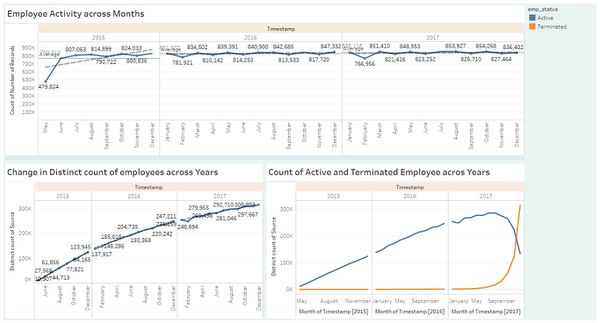
The dashboard shows us the following : - The employee activity across months tells about the no of observations per month across 2015-2017. The increasing trend every month shows us that the employee size is increasing as from may(479,824) – June (769,010) there is a big increase in activity which can be cause by increasing the no of employees. - The second graph tells about the change in distinct source count across years which has an increasing trend. If we find the difference between points it can give a rough estimate of how many employees have been added. - The third graph shows the change in the count of employees who are ‘Active’ or ‘Terminated’ from the company. We find that no of employees leaving the company is very less until 2017 after which more employees started to leave. Also the no of active employees also increased till mid -2017 after which there was a decrease. |
|
|
This graph depicts change in E-Type with respect to years which provides the information that the no of calls , emails ,purchase and meetings have increased from 2015. |
From the above graphs we can see the according to company’s communication and purchase habit there is an upward trend for all the factors which suggests that company was growing steadily without considering the data for December 2017 which might be missing.


