Group24 Report
ISSS608 Visual Analytics and Applications
IPL Analytics through Data Visualisations
|
|
|
|
|
|
Abstract
Understanding team dynamics in sports is never easy. In a game of Cricket, it’s even harder because teams show so many ups and downs on the cricket field each time they come out to play, its hard to say that there is a one-stop solution that can be implemented on all players for all formats of the game. To overcome this problem, we have conducted an exploratory data analysis to identify patterns in players (batsman and bowlers) and the teams they have been a part of through a medium of visualization to better throw light on their performances over the past 10 seasons (2008-18). Through various comparisons between batsman, bowlers, and team performances, we have highlighted various anomalies, validated certain presumptions, and created a visualization dashboard that, if used, would allow team managers to buy better players for upcoming seasons of the IPL.
Introduction
The Indian Premier League is a professional Twenty20 cricket league in India contested during April and May of every year by teams representing Indian cities and some states. It is a tournament that started in 2008 and has ever since continued to be in action for the past 10 years. In the game of Twenty20 Cricket, each team gets to bat 20 overs and while one team bats, the other team will bowl and fields. The purpose of the game is for the team batting second to score one more run than the team that batted first, within the timeline of 20 overs and without losing 10 wickets. Each over consists of 6 legitimate balls thrown down at the batsman and the batsman are expected to score runs of each ball thrown at them. When a bowler is bowling at the batsman facing him, the rest of the players in the bowler’s team are expected to stop the ball and the batsman from scoring runs.
Understanding the data
To start the analysis, we selected the data via Kaggle that consisted of two files namely, ‘deliveries’ and ‘matches’. The dataset ‘deliveries’ records each delivery bowled by the bowler at the batsman and the outcome of that delivery for all matches over 10 years. The dataset ‘matches’ explains factual data like which team played against which team on which date, where, and the outcome of the match, amongst others. After going through the data, we decided to visualize the information present here by dividing it into three categories: Batsman, Bowlers, and team performances. We believe that doing this will help us understand and visualize each of the critical parameters that go into judging the performance of players on the cricket field. We hope the following analysis will add value to your life in terms of understanding the sport better, gaging our understanding of the sport from our perspective, and help bring out certain anomalies and trends about this game that you may otherwise have not heard of.
Analysis
We have divided our visualizations into different sections as per overall team performances, batsman (individuals), and overall performances of batsman and bowlers.
Teams
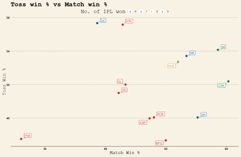
To understand the performance of each team, we asked ourselves a few questions and tried to get the answers to them through visual analysis of the data present at hand. For this, we first consolidated our data using the ‘tidyverse’ package in R. Then, with the ‘Toss win %’ of each team on the y-axis and the ‘Match wins %’ of each team on the x-axis, taken as an aggregate of all matches across all 10 seasons of IPL so far, we were able to produce the following scatterplot. Also, the color of each team’s label was an indication of the no. of times it had won the IPL trophy.
Teams CSK (Chennai Super Kings), MI (Mumbai Indians), and KKR (Kolkata Knight Riders), marked in the green circle, have won the title 3, 3, and 2 times respectively. Teams DC (Deccan Chargers), RR (Rajasthan Royals), and SH (Sunrisers Hyderabad), marked in the blue circle, have won the title one time each. As shown, there doesn’t seem to be a clear indication of the toss win % affecting the win % of the team, however, 5 out of 6 title winners so far have won the toss over 50% of the times, keeping all their matches in check. This shows that while there isn’t a high correlation between these two factors, winning the toss does help a team get an advantage going into a game at any point in time.
Next, we wanted to understand if there was an impact on the win% of teams that hit more fours and sixes vs the ones who took more one and/or two runs in a match. Thus, we aggregated all the fours, sixes, ones, and twos hit by each team into two categories – ones and twos, and fours and sixes. We then plotted the fours and sixes in the y-axis and the ones and twos in the x-axis to see a scatterplot with all the teams in the plot, having a color difference w.r.t their win%.
While there isn’t a clear difference between teams, it is quite visible that most successful teams (teams with a higher win%) tend to be the ones that have a higher ratio of one’s and two’s than others. Therefore, while Twenty20 cricket may be a format that seems to be all about hard-hitting, it is a tournament where the team that focusses on taking singles and rotating the strike that lands up winning more matches.
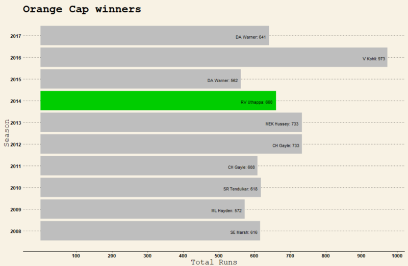
Next, we wanted to see how many teams with Orange cap and Purple cap winners went on to win the IPL that season. To visualize this, we aggregated and filtered out the runs and names of all the players who won the orange and purple cap each season from 2008 to 2018. With the seasons on the y-axis and the runs on the x-axis, I was able to plot each season’s orange cap winner on a bar chart format as shown below.
Only in 2014, did the batsman whose team scored the highest number of runs, go on to win the IPL trophy that season. In no other year did the pattern seem to exist w.r.t the batsman. This indicates the importance of Cricket as a team game and one or two great performances might not actually be enough to help any team win the cup.
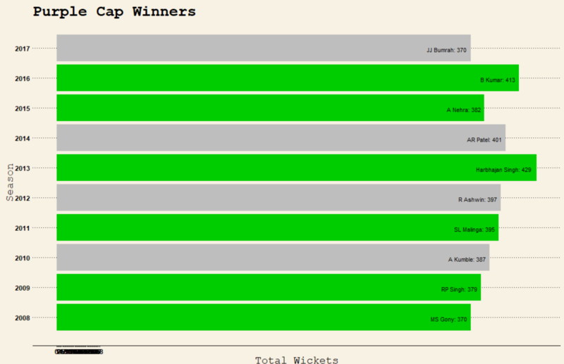
When we try to analyze the same results for bowlers, a different pattern is seen. While only one batsman was seen to have won the orange cap and the IPL trophy in any season, there were quite a few bowlers who, when they won the purple cap, ended up with their teams winning the IPL that season. This is indicated in the graph below.
This is an indication of the importance of having a good bowling attack on the team as it can be a game changer for you to go on and win the IPL. With world class batsman, your chances of winning the IPL are lesser as compared to that when you have bowlers who can become purple cap winners.
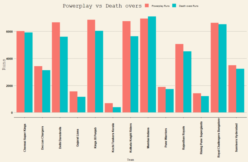
Teams in IPL tend to win or lose matches on a very small margin of runs and wickets. Almost all matches are very tight and in such cases, it is highly important to have batting lineups that go deep with power hitters at the bottom. Thus, we wanted to see the difference in the number of runs scored by teams during the first 5 and the last 5 overs, in all the seasons so far. The bar chart below indicates the same with each team being displayed separately in the x-axis.
As you can see, teams like Chennai Super Kings, Mumbai Indians, and Sunrisers Hyderabad, who have won the IPL previously, have more or less the same ratio of runs being scored in the first 5 and the last 5 overs. However, some other teams such as Delhi Daredevils or Kings XI Punjab, have a huge difference in the number of runs they score in the first 5 and the last 5 overs. This highlights the importance of depth in the batting order, the importance of buying allrounders who can come in later in the innings and hit the ball a long way, and the tactical balance of bowlers who can bat when needed and produce a lot of runs for their side.
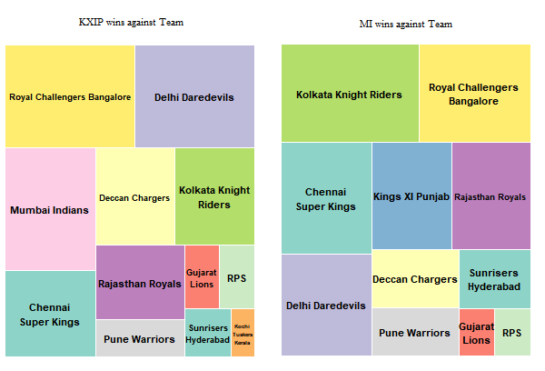
Next, it was important for us to be able to help team owners visualize which teams had they been most consistent against in all the seasons and matches of the IPL so far. Hence, using a treemap, we tried to highlight the same for each team. As a representation purpose, we have shown one treemap for Kings XI Punjab, but in our Shiny App, you, the user, can easily choose the team of your choice and see their performance against others in a similar format.
Apart from winning, a very important aspect to consider is the consistency of a team’s performance, which can also be corelated to the buying and selling of players. Therefore, looking at each team’s total scores in every season helped us understand their level of consistency. The graph below explains how Chennai Super Kings is the only team that has been very consistent in this department. Perhaps, that is the reason why it is one team which has reached the top 4 spots in every IPL season till date.
Batsman
Having had a good look at the team performances, we then wanted to dive deeper and be able to look at the batsman, both individually and all of them together.
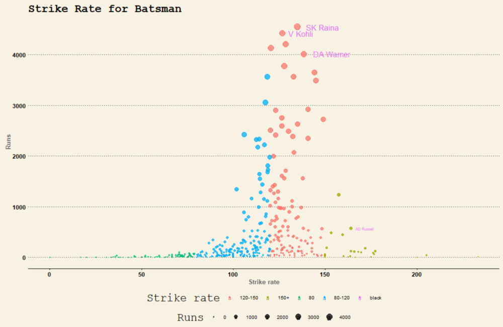
This is a very interesting graph as it shows how the batsman who has a mid-range of strike rate, that is between 100-150, are the ones who have scored more runs as compared to the batsman who has a strike rate of over 150. This is ironic as the batsman who tends to score quicker (batsman with a higher strike rate) are generally expected to have scored more.
Diving deeper, we wanted to see the innings progression for each player over all the seasons. This is a graph which can be accessed via R Shiny App through the drop-down list on the app itself. On the x-axis, we have the number of balls played by the batsman and the y-axis indicates the total number of runs. This graph clearly shows how the inning of any player progresses over the course of the match and a dropdown for any particular season will show that players performance in that season. This could be used by teams to understand the playing style, current worth, and also the ability of a player to pace his innings, amongst other things.
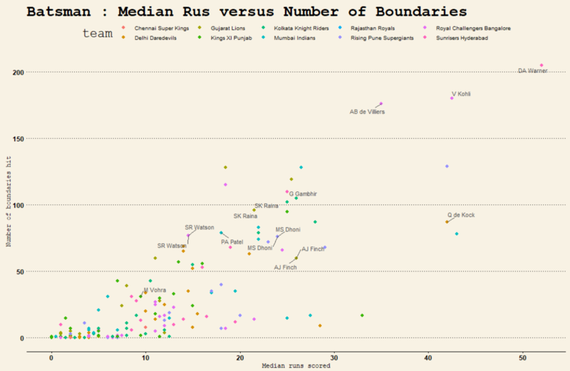
Next, we wanted to look at all the batsman playing this tournament and understand their scoring style by looking at their runs scored in the x-axis and the number of boundaries hit on the y-axis. Each player was represented by a point and his team was represented by the color.
Bowlers
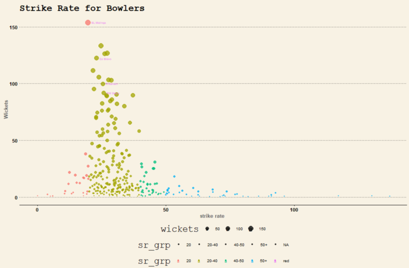
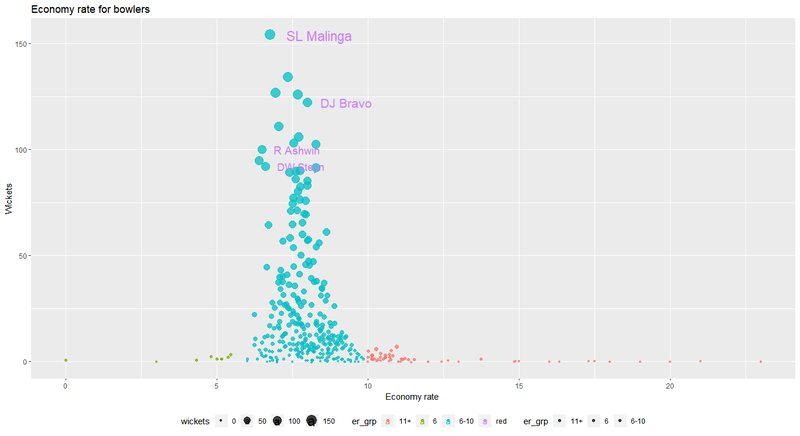
Talking about bowlers, it was important to see their strike rate since this is a department which has been known to turn the game on its head. We even saw that purple cap winners belonged to teams that had won the IPL in many of those seasons and therefore, looking at all the bowlers, their no. of wickets, strike rates, economy rates etc., was an important aspect to consider.
As shown above, bowlers with top strike rates are clearly visible with the difference in the number of wickets between each player. This could be a useful graph for team managers, owners, and coaches to analyze before buying, selling, or trading players during or after the tournament. Similarly, as mentioned earlier, the economy rate is an important criterion to consider in twenty over cricket as it helps teams prioritize their buy-in and sell out according to requirements. Some teams and players have shown that the lesser the economy rate, the more wickets a bowler tends to pick up.


