Group21 Research Paper
|
|
|
|
|
|
Contents
Data Preparation
The data for 12 months (June 2017 to March 2018) that covers the resale prices, nature and characteristics of HDBs is taken from analysis.
Checking for Missing Values: Excel is used to check for the missing value patterns in the dataset. From the results of missing value pattern in the dataset, we observe that the dataset has no missing value patterns.
Adding New Columns: The year, month and quarter field was extracted from the “Month” column of the dataset. Using the data from the Singapore government website, the Planning region for each area is added to the dataset.
Preparing the Geolocation Data:
1. The concatenate function in Excel was used to derive the Address of each block in the dataset. The block number, street name was concatenated together, and “Singapore” was added to the end of the entry to derive the full address of each block.
2. Since the postal code was not available in the dataset, the coordinates were derived using the address of each block. To do the following, the “ggmap” package was used in R. The geocode function in ggmap package was used to derive the latitude and longitude coordinates of each block based on the address. The API could only run 2500 entries at a time and hence subsets of each month of the dataset were created and the code was run.
3. After running the code, it was observed that several rows had “NA” values in the latitude and longitude columns. These “NA” values were then extracted into a separate excel sheet and the code was re run. After running the code multiple times, there were still some “NA” values. The latitude and longitude coordinates for these blocks were manually derived.
4. For a few blocks, the values generated for latitude and longitude coordinates were reversed. The values were manually swapped to get the accurate coordinates for each block.
Design Farmework
The visualizations are coded using R language and the application is created in R Shiny application using ShinyDashboard package that adds a theme to the existing R shiny making it more organized and attractive. For the users to get clear insights we divided the analysis in three segments Market Overview, Summary Statistics and Detailed Ananlysis.
For creating the visualization plots in each segment, we have viewed the dataset at three different levels:
Level 1: Planning Region
Level 2: Town
Level 3: Streets
The Market Overview is to view the resale price trends at town level, whereas the Summary Statistics and Detailed Analysis is done considering all the three levels of data.
Visualizations
1. Geofacet Plot
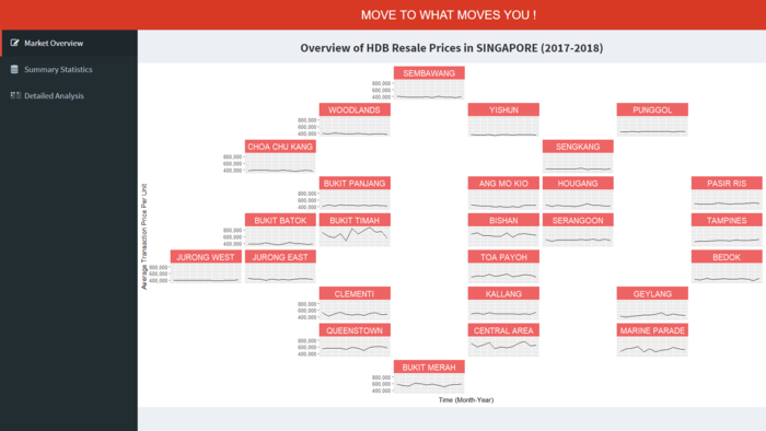
The Geofacet plot is used to show the resale prices of HDB flats based on the new town plan. The visualization shows the month wise trend of resale prices that facilitates the user to examine the fluctuations in Resale prices across a town and compare it to other neighboring towns. It also helps to the user to visually locate the town as per the region.
- The plot is made using ggplot2 and geofacet packages in R. The geofacet package allows to arrange a sequence of plots of data for different geographical entities into a grid that strives to preserve some of the original geographical topology. And, the facet_geo layer from ggplot2 package is used to treat town as a facet.
- The x-axis of each facet denotes the month and y-axis denoted the Resale Price. All the facet have same scale for both the axes.
- The lines represent the change in resale prices over the last 12 months.
2. Interactive Tree Map
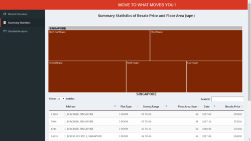
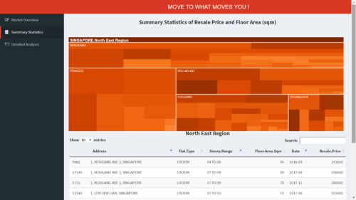
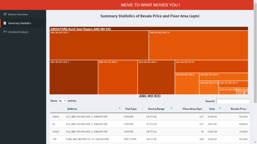
The interactive tree map is designed to give a summary of all the transactions in a geographically hierarchical manner. Once the user click on a Planning Region they can see different towns in the region and if they select a town, all the streets in that town can be seen. Along with the treemap, a data table is also rendered in the dashboard that allows the user to view the transactions based on the selection.
- The visualization is created using treemap package from CRAN and D3treeR from Github. Devtools package from R allows us to install packages from outside of CRAN. The data table is rendered using DT package in R.
- The size of the block in treemap represents the number of transaction for that place.
- The color of the block in treemap represents the mean resale price of that place.
- The data table allows the user to search and sort the transaction summary.
The main advantage of this segement is the ability to visually see the relationship between the number of transaction and the resale price at different levels.
3. Detailed Analysis of HDB Blocks
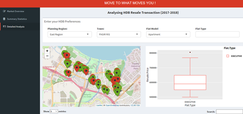
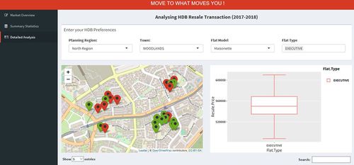
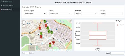
This segment of the project is user driven, the user can analyze the prices based on different criteria like Flat Model, Flat Type, Town and Planning Region. Based on the input from the user, two visualizations are plotted, Box Plot and Interactive Map. The Box Plot is used for explanatory analysis. The plot allows the user to see the distribution of prices across flat types for a selected flat model. It also gives the summary of price like the minimum, median, quarter and maximum prices for the each flat type. One major benefit of this plot is for the users to identify the outliers in the prices. The second visualization in this tab is the interactive map. The map is used to locate the HDB block on the Singapore map. The map shows multiple markers, these markers are all the HDB blocks in Bishan town of Improved Flat Model as selected by user. The user can see the HDB located nearby which will give him an ease to compare the prices in that town. The marker colors are based on the resale prices, HDB below the median resale price are colored green and the ones above median are colored red. The Leaflet map has hover to display the HDB name, the map refreshes itself based on the user selections. When the user selects a Flat Type the map shows only markers only for HDB having that Flat Type. The detailed analysis tab also renders a data table that lists the transactions based on the selection. The interactive map also allows the user to click on the marker to view the transactions for that particular HDB. The visualizations are created using the leaflet, ggplot2, DT, plotly and other packages in R. The user can also use the visualization to analyze which HDB could be a good investment decision based on the price trends.
Future Work
Given time constraints, the current application is only able to showcase the location of HDB flats based on the user input and resale prices of the flats at different levels. However, we believe that the dashboard can be enhanced further to include the following:
1. Price Estimation- Using regression models and forecasting methods, the dashboard can be enhanced further to build a price estimator which provides the users with the future price trends and estimated price of a HDB in the future based on the current market trend.
2. User Interface with more options- The data can also be prepared to include amenities and other key locations such as MRTs, Schools, shopping malls, etc so that the users are given an option to select their desired HDB based on proximity to these key locations.
Demonstration: Sample Test Cases
The purpose of this section is to provide important demonstrative examples of the usage of this application. Some important use cases for the application are as follows:
1. Detailed Analysis of HDB Resale Transaction
The first use case demonstrates the resale price trend in Woodlands region for Maisonette flat model and Executive flat type. The users can see the minimum and maximum resale price transactions and the locations of HDBs based on the transactions. The second use case demonstrates the resale price trend for Woodlands town for improved flat model and 3 room flat type.
Installation Guide
1. The user can explore GRIT application to view the application on HDB Resale Price trends.
Click here to explore the live application.
2. Installation Process - System Requirements
Due to the packages used in this application, the minimum version for RStudio is 'Version 1.0.143'. You can install R studio:
Click here Click here to download the latest version of RStudio.
3. Deployment Process
You can host the R Shiny application on your own server. A free server to host this application is provided by shinyapps.io. Steps to deploy the application on shinyapps.io are as follows:
- Visit Shiny Apps and sign up for a free account, which allows you to host up to 5 applications.
- Based on the personal token and secret number provided by Shiny Apps after signing up, the application can then be deployed to your server.
- In Rstudio, execute the following code snippet:
install.packages('devtools')
devtools::install_github('rstudio/shinyapps')
devtools::install_github('rstudio/rsconnect')
library(shinyapps)
library(rsconnect)
rsconnect::setAccountInfo(name="Your account name", token="Your Personal Token", secret="Your Secret Number")
Click on the Publish icon in RStudio to upload and deploy the application to the Shiny Apps Server.
After entering an appropriate name for your application, the GRIT application will be deployed and hosted to your Shiny Apps server.


