Group20 Report
|
|
|
|
|
|
Contents
Introduction and Motivation
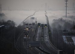
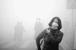
In the winter of 2014, Beijing suffered severe smog weather. The haze has lasted for half a year, and the number of heavy polluted days was more than one month. Air quality issues and environment issues were being discussed throughout the country, everyone was questioning himself about the consequences of developing economy by sacrificing environment. Our living conditions has become bad, and we are faced with the tracheitis, pneumoconiosis, asthma, to name just a few.
Chinese government has frequently proposed to abandon the outdated idea called “treatment after pollution” and to protect the environment while developing the economy. Therefore, after three years, has China’s air quality become better? In our project, we want to apply the visual analytics tools to visualize the changes of air quality of major cities of China. We will show the fluctuation of the historical AQI (Air Quality Index), and the pollution sources, like PM2.5, PM10, SO2, O3, CO2 and so on.
Review and critique on past work
As increasing people are attaching more importance to environment issues, there are a lot of researchers over the world studying how to improve our environment, including air quality problem, and they have contributed many substantial outcomes to this area. In China, researchers have studied air quality from various aspects based on the background of China. Some of them focused on impact of human factors on air quality, such as increasement of population and GDP, some of them focused on specific areas, like Beijing, Shanghai or eastern areas, to analyze that how the air quality is changing, and others are also interested in forecasting air quality in the future. As experts have already enriched this research area, we will focus on using visualization tools to help people better and more effectively understand the changing trend of air quality and its pollution sources. We hope that we can give some contribution raising awareness of protecting environment of people.
Data preparation
Data introduction
Our datasets were collected from various government departments containing AQI and its pollutants: AQI (Air Quality Index), PM2.5, PM10, SO2, NO2, CO, O3.We choose monthly data from 2014-01 to 2018-8 as our target dataset containing 6162 record rows. The columns are shown as below:
| Variable name | Variable property |
|---|---|
| Date | Monthly data from 2014-01 to 2018-08 |
| AQI | Air quality index, as it increases, air quality is getting poor |
| Range | Air quality range |
| Air quality level | Five levels based on range |
| PM2.5 | One of pollutants affecting AQI, monthly data from 2014-01 to 2018-08 |
| PM10 | One of pollutants affecting AQI, monthly data from 2014-01 to 2018-09 |
| SO2 | One of pollutants affecting AQI, monthly data from 2014-01 to 2018-10 |
| O3 | One of pollutants affecting AQI, monthly data from 2014-01 to 2018-11 |
| CO2 | One of pollutants affecting AQI, monthly data from 2014-01 to 2018-12 |
| NO2 | One of pollutants affecting AQI, monthly data from 2014-01 to 2018-13 |
| City | 110 cities from China |
| Log | Longitude of each city gotten by R coding |
| Lat | Latitude of each city gotten by R coding |
Data pre-processing
1) Use R to get 110 cities’ longitude and latitude.
2) Reformat the data structure to do better time series analysis.
3) Combine all the cities’ air quality data file into one csv file.
The part of final data structure is shown as below:
Designed framework
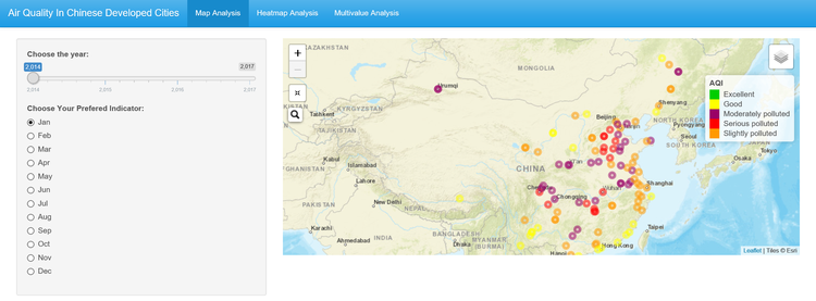
Page1 Map Analysis

Description: Users can choose year and month to discover the AQI level of 110 cities of China. It is clear to find out the polluted level distribution in specific time. For example, in Jan of 2014, users can find that lightly polluted and good air quality cities were mainly located in Pearl river delta and Yangtze river delta region.
Approach: Rshiny
Packages:'leaflet' 'tidyverse' 'leaflet.extras' 'shinydashboard' 'shinythemes'
Page2 Heatmap Analysis

Description: We use area chart to visualize the changing trend of air quality level of top30 cities in China. We can make conclusions as below:
1) After 2014, the number of polluted cities has become smaller.
2) The number of cities with good and excellent air quality is increasing.
3) In the middle of each year, the number of polluted cities reaches the peak.
Approach: Rshiny
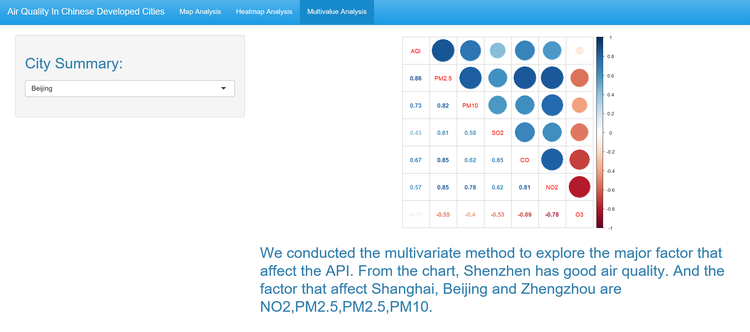
Page3 Multivalue Analysis

Description: We offer top4 cities in the left filter, users can choose the one they are interested in, and get the outcomes on the right. For example, we choose Beijing as our target city, and the figure shows that PM2.5 is the most related pollutant with its AQI.
Approach: R
Package: 'corplot'
Future work
1) Forecasting air quality index and pollutants in the future.
2) Analyze the impact of human factors on air quality to give suggestions on improvement of air quality.
3) If the health data related to air quality can be collected, we can add it on the map to explore healthy condition of each city, however, we did not find the dataset about this issue.
4) Weather condition and landform are also very important factors to influence the AQI.
User guide
![]()
On the top of the bar, we offer three parts for users to choose the one they are interested in.
In the left filter, users can select year and month, then get the outcomes on the right picture.
Same with the first page, users choose the target city in the left filter, then the outcomes will appear on the right.


