ISSS608 2017-18 T1 Assign DENG YUETONG
|
|
|
|
Contents
Background
Smartpolis is a major metropolitan area with a population of approximately two million residents. During the last few days, health professionals at local hospitals have noticed a dramatic increase in reported illnesses. Observed symptoms are largely flu-like and include fever, chills,sweats, aches and pains, fatigue, coughing, breathing difficulty, nausea and vomiting, diarrhea, and enlarged lymph nodes. More recently, there have been several deaths believed to be associated with the current outbreak. City officials fear a possible epidemic and are mobilizing emergency management resources to mitigate the impact. You have been charged with providing an assessment of the situation. As a senior visual data analyst, I'm trying my best to locate the answers to the following questions: 1. The outbreak origin; 2. Hypothesis for disease transmission; 3. Status of outbreak containment.
Outbreak Origin
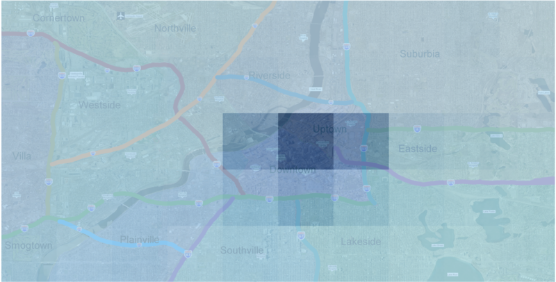
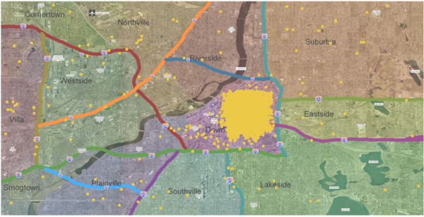
Based on the data extracted from the original dataset (by keywords: flu, fever, cough, cold, chills, pain, etc.), the real-time GPS locations of people who published microblogs contained flu-relevant keywords are plotted for our better understanding of the overall distribution of sick people. To find out the areas that have been most significantly affected, I have plotted a polygon chart to represent the density of people that have complained about the disease. From the chart below we are able to find out that the Downtown and Uptown area have been the area that suffer most from the disease based on the depth of color.
Conventions
Further more, through plotting the microblogs regarding keywords "Convention", we are able to discover that the conventions are mostly arranged in Downtown and Uptown area. Thus, we can be more sure that the outbreak might begins in Downtown and Uptown area with its location has overlapped with the affected people's location. Therefore, we can assume that it is Downtown and Uptown regions that have been the ground zero outbreak origin. Due to the dense crowd of people in the conventions, the disease are more likely to transmitted, and it will be brought back to the infected people's residential regions.
Hypothesis for disease transmission
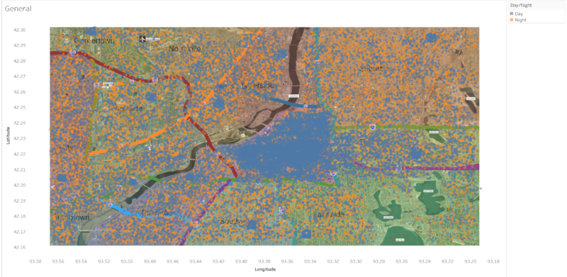
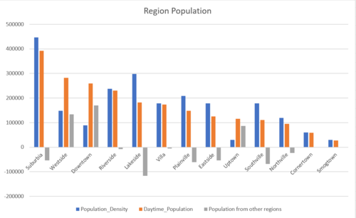
In the data tidying and transformation process, I have manually binned the time-stamp into 2 parts: day time and night time. Day time indicates microblogs published between 8:00 a.m. and 6:00 p.m. The transformation is done to fulfill the purpose of revealing people’s moving patterns. Moreover, we can dig into the affected people’s moving patterns and dig out the methods of transmissions, which I assume it’s person-to-person based on the chart below.
Additionally, the given region total and daytime population data has provided us a more straight-forward view of population movement. We can have the following conclusion based on this given dataset: Those areas with higher population in daytime compared with their total population are with more alien working labors, for instance, Uptown and Downtown area. People who live in the suburb area (areas that are not Uptown and Downtown) are more likely come to the main area for work and conventions.
During daytime, a great amount of affected people gathered around the Downtown and Uptown area, which matches with what the Region Population dataset presents. While night time people are more likely to go back to their residential area – the surrounding area. This has indicated that people are likely to get affected in the crowded Downtown & Uptown area during daytime, and brought back the disease to the surrounding residential area.
Status of disease containment
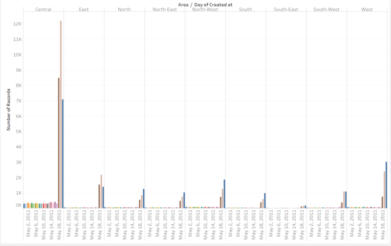
To assess whether the disease is under containment and not spreading out, we have to look into the number of last few days of microblogs from different areas. Since we have identified Downtown and Uptown areas have been the ground zero location, the status of other areas are the key indicators of the disease status of containment.
From the chart above we can see that May 18, 19, 20 are the major outbreak days with a significant amount of microblogs were published regarding the disease. While Central area (Downtown & Uptown) has been the outbreak origin area and has suffered most, in the last day, 20 of May, the number of microblogs published in Central area have a dramatic drop. Meanwhile, the other areas have shown a continuous increase of numbers of flu-relevant microblogs. Thus, we can conclude that the situation has not yet been contained, though cases of complaint have dropped in Central area, other areas have shown an increase of flu cases. In my opinion, it's necessary to deploy more treatment resources to the surrounding areas.
Visualization Software
- Tableau
- JMP
- Microsoft Excel
Acknowledgements
Special thanks to the following fellow students, who have been a great support, and have provided extraordinary suggestions:
YAU HON TAK
FAM GUO TENG
