Wyz-Visualization & Insights
|
|
|
|
|
Visualization & Insights
Origin and Epidemic Spread
Identify approximately where the outbreak started on the map (ground zero location). Outline the affected area. Explain how you arrived at your conclusion.
After a quick browse around the dataset, we can find that the content of over 1M microblog messages contains all aspects of life. So first, we start by extracting flu-related microblog messages. A list of keywords was selected to filter raw data. The list consists of keywords including flu, chill, fever, sweat, ache, pain, fatigue, cough, breath, nausea, vomit, diarrhea, and lymph, which are from observed symptoms and human judgement. After filtering, there are 71939 flu-related microblog messages left.
| Visualization | Insights |
|---|---|
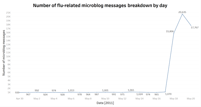
| 1. Infer the disease outbreak date
|
|
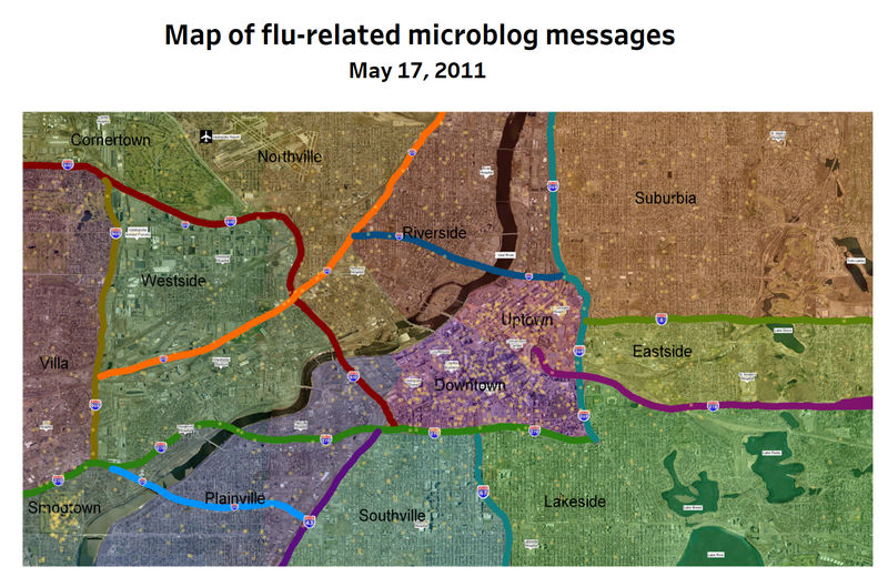
| 1. Map of flu-related microblog messages on May 17
|


