 Vast2011 MC1: Characterization of an Epidemic Spread
Visualization & Insights
Origin and Epidemic Spread
Identify approximately where the outbreak started on the map (ground zero location). Outline the affected area. Explain how you arrived at your conclusion.
After a quick browse around the dataset, we can find that the content of over 1M microblog messages contains all aspects of life. So first, we start by extracting flu-related microblog messages. A list of keywords was selected to filter raw data. The list consists of keywords including flu, chill, fever, sweat, ache, pain, fatigue, cough, breath, nausea, vomit, diarrhea, and lymph, which are from observed symptoms and human judgement. After filtering, there are 71939 flu-related microblog messages left.
| Visualization |
Insights |
|
Infer the disease outbreak date
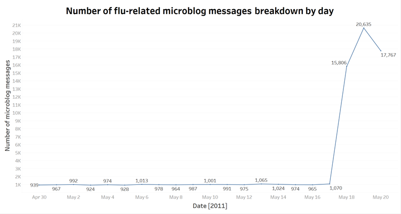
The line chart is to show daily total flu-related microblog messages trend. It can be seen from the graph that there is a significant rise on May 17th.
|
|
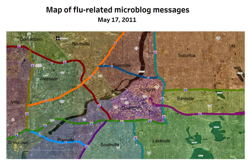
Map of flu-related microblog messages on May 17
The few reports were scattered over the map.
|
|
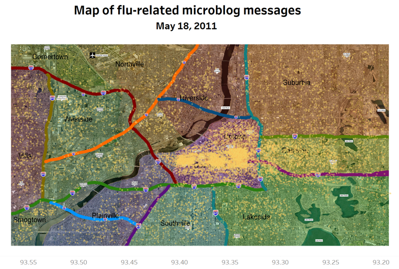
Map of flu-related microblog messages on May 18
From the geographical map, it is clear to see that the disease broke out in the Downtown and then spread to Eastside.
|
|
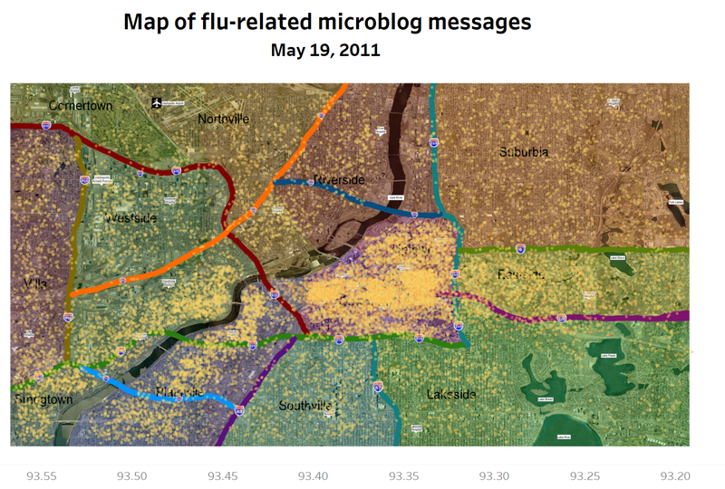
Map of flu-related microblog messages on May 17
On May 19th, the disease had spread throughout the downstream of the Vast river.
|
|
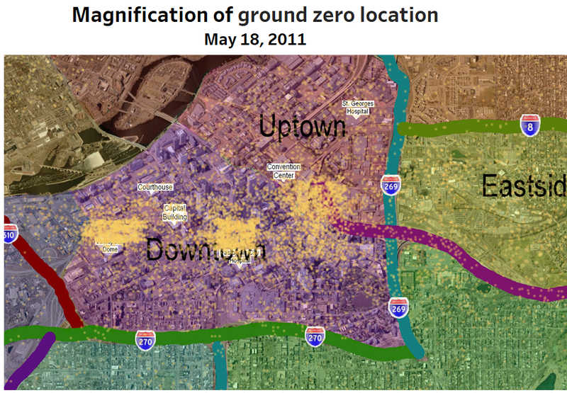
Magnification of ground zero location, May 18
If we zoom in, we can deduce from this picture that first 'ground zero' was in Downtown, around the Dome, City Hospital, and Convention Center.
|
Epidemic Spread
Mode of transmission
Present a hypothesis on how the infection is being transmitted. For example, is the method of transmission person-to-person, airborne, waterborne, or something else? Identify the trends that support your hypothesis.
Person-to-person
Considering that most of the flu is spread by person-to-person, we will focus on this route of transmission first.
| Visualization |
Insights |
|
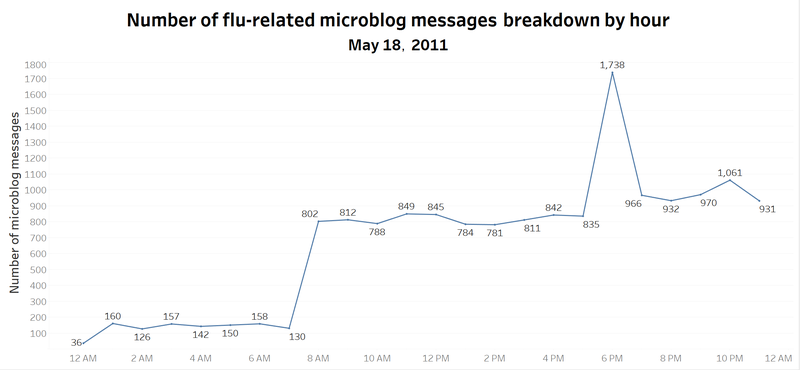
Number of flu-related microblog messages breakdown by hour, May 18 2011
As above, we assumed that the disease broke out on the May 18th. On that day, most of conversations started from 7 AM and suddenly rose at 5 PM while reaching a peak at 6 PM. The period just fit the work time.
|
|
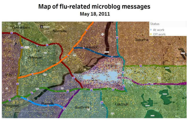
Map of flu-related microblog messages by work status
As is shown in the diagram, blue points stand for people location during work time from 7 am to 5 pm while yellow points represent the rest of the day. There is an intensive blue part in the downtown area during work time, which facilitates the spread of the disease.
|
Windborne
In this part, we investigated whether the wind might also be a factor in the spread of infectious disease.
| Visualization |
Insights |
|
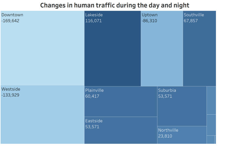
Changes in human traffic during the day and night
However, by comparing the changes in human traffic during the day and night among 13 city zones. There is no significant difference on change of human traffic between Eastside which is hard hit and other zones like Suburbia, Plainville, Southville. The weather information that it was west wind also helped diffusion of pathogen.
|
Waterborne
Through the discoveries of investigation, we deem that the reports about gastrointestinal problems should be distinguished from respiratory infections cases. We suspected that the health problems due to water contamination caused by a truck accident happened on May 17th 12 pm near the interaction between road 610 and the Vast river.
| Visualization |
Insights |
|
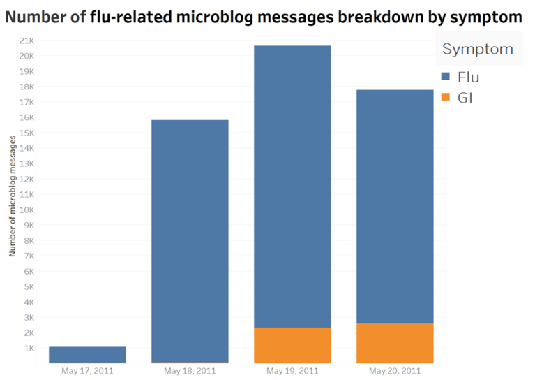
Number of flu-related microblog messages breakdown by symptom, May 17th-20th
What is also noticeable is that the areas affected spread to the downstream of Vast river on May 19th. What’s more, we discovered that the posts related to gastrointestinal problems increased gradually. The bar chart gives a breakdown of the different symptoms reported in microblog from May 17th to May 20th. It is apparently manifest from the graph that the posts related to gastrointestinal issues experienced a dramatic increase over the period from May 19th to May 20th. From the map, the reports are dense in the lower reaches of the Vast river.
|
|
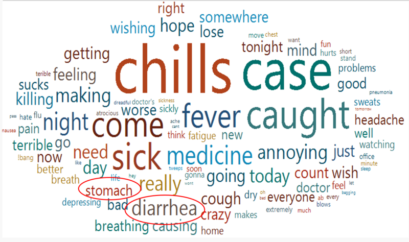
Wordcloud by term frequency
The word cloud shows the flu-related words with high frequency in microblogs of 19th and 20th. Highlighted words "stomach" and "diarrhea" which describe abdominal problems hadn't appeared until 19th.
|
|
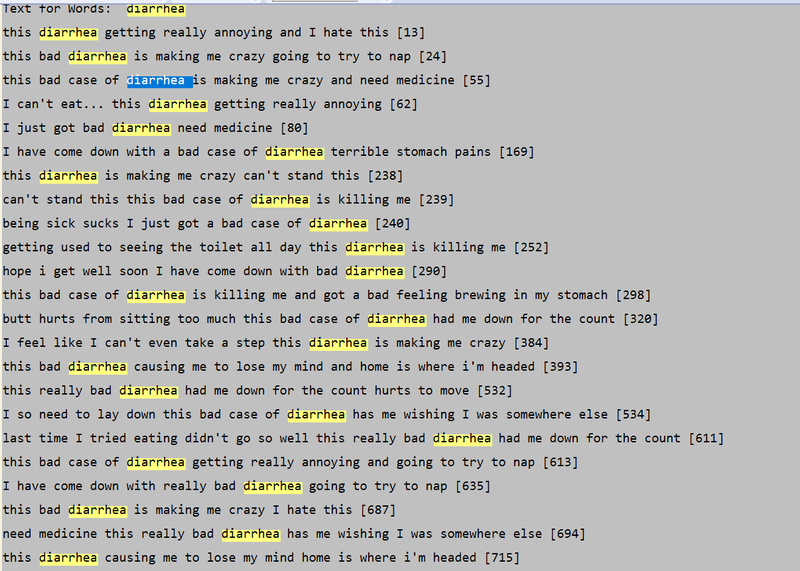
Sample messages including word "diarrhea"
To go further about this issue, the messages containing abdominal problems related words are extracted, which is shown in the screenshot to see the details.
|
|
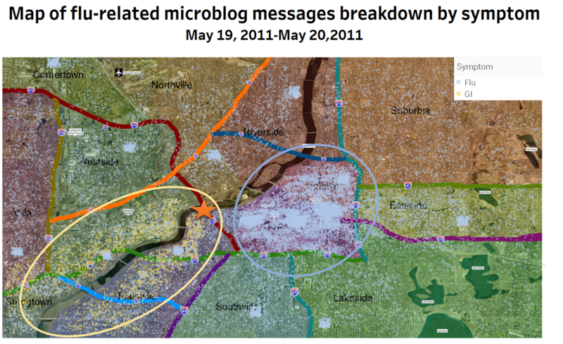
Map of flu-related microblog messages by symptom, May 19th-20th
In the map, blue points which stand for common cold are mostly distributed around the middle area, while yellow points which stand for abdominal flu like vomit, stomach, diarrhea, nausea appeared along the lower reached of Vast River and on the one side of the road 610.Tracing back to the source, attention should be drawn to the intersection between the Vast river and road 610 which marked as star.
|
|
Word Frequency table of messages containing "610"
To find what happened on intersection between road 601 and Vast River, word "610" was considered as the key word to extract the most frequent words and phrases in microblogs. And unsurprisingly, a serious truck accident happened around 12 pm which was likely to even lead to fire on road 610.
|
|
Sample messages including word "truck accident" and "610"
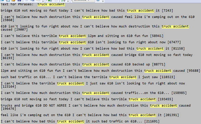
Then we continued to explore messages containing truck accident and inferred that pollutant carried by the truck was poured into the river where drinking water of residence nearby comes from.
|
Trend of outbreak
Is the outbreak contained? Is it necessary for emergency management personnel to deploy treatment resources outside the affected area? Explain your reasoning.
| Visualization |
Insights |
|
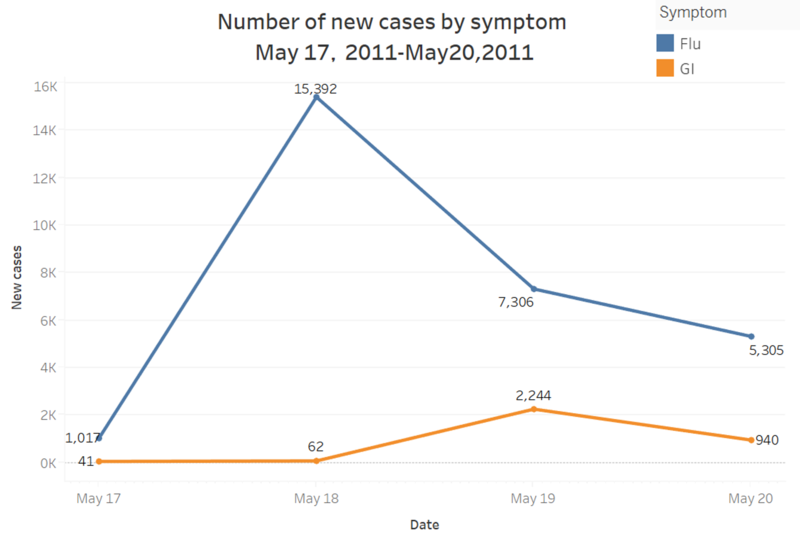
Number of new cases by symptom, May 17th-May 20th
The line chart shows that the new flu-related cases appeared on each day from 17th to 20th. The number of new cases are actually the number of ID that never showed in the previous dates. From the chart, it is obvious that the flu cases on 18th May reached the peak while GI case meets its highest number on 19th. However, after 18th and 19th, there are declining trends on both symptoms and total new cases are decreasing, which indicates a controllable trend in general. Since the date factor in dataset is limited, more data is needed to evaluate the condition accurately.
|
|
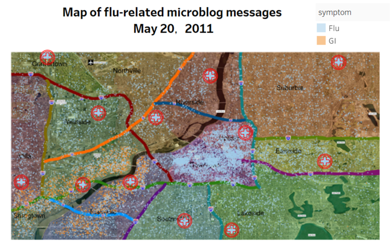
Map of flu-related microblog messages by symptom, May 20th
The points on the map show all the flu-related text messages on 20th. The red cross marks are the location of hospitals where some sick people gathered. However, most of the people with flu symptom are still at home or at work. Since the flu is infectious and the scale of it is relatively large, the government should encourage citizens to see doctors as soon as possible and arrange more medical resources.
|

