IS428 2017-18 T1 Assign Tay Wei Rong
Link to assignment: Assignments
Link to dropbox: Assignment Dropbox
Links
Overview
Mistford is a mid-size city is located to the southwest of a large nature preserve. The city has a small industrial area with four light-manufacturing endeavors. Mitch Vogel is a post-doc student studying ornithology at Mistford College and has been discovering signs that the number of nesting pairs of the Rose-Crested Blue Pipit, a popular local bird due to its attractive plumage and pleasant songs, is decreasing! The decrease is sufficiently significant that the Pangera Ornithology Conservation Society is sponsoring Mitch to undertake additional studies to identify the possible reasons. Mitch is gaining access to several datasets that may help him in his work, and he has asked you (and your colleagues) as experts in visual analytics to help him analyze these datasets.
Mitch Vogel was immediately suspicious of the noxious gases just pouring out of the smokestacks from the four manufacturing factories south of the nature preserve. He was almost certain that all of these companies are contributing to the downfall of the poor Rose-crested Blue Pipit bird. But when he talked to company representatives and workers, they all seem to be nice people and actually pretty respectful of the environment.
In fact, Mitch was surprised to learn that the factories had recently taken steps to make their processes more environmentally friendly, even though it raised their cost of production. Mitch discovered that the state government has been monitoring the gaseous effluents from the factories through a set of sensors, distributed around the factories, and set between the smokestacks, the city of Mistford and the nature preserve. The state has given Mitch access to their air sampler data, meteorological data, and locations map.
The Task
General Task
The four factories in the industrial area are subjected to higher-than-usual environmental assessment, due to their proximity to both the city and the preserve. Gaseous effluent data from several sampling stations has been collected over several months, along with meteorological data (wind speed and direction), that could help Mitch understand what impact these factories may be having on the Rose-Crested Blue Pipit. These factories are supposed to be quite compliant with recent years’ environmental regulations, but Mitch has his doubts that the actual data has been closely reviewed. Could visual analytics help him understand the real situation?
The primary job for Mitch is to determine which (if any) of the factories may be contributing to the problems of the Rose-crested Blue Pipit. Often, air sampling analysis deals with a single chemical being emitted by a single factory. In this case, though, there are four factories, potentially each emitting four chemicals, being monitored by nine different sensors. Further, some chemicals being emitted are more hazardous than others. Your task, as supported by visual analytics that you apply, is to detangle the data to help Mitch determine where problems may be. Use visual analytics to analyze the available data and develop responses to the questions below.
The Specific Tasks
Task #1
Tableau Link for task 1:https://public.tableau.com/profile/tay.wei.rong#!/vizhome/Task1_48/Story1?publish=yes
Q1: Characterize the sensors’ performance and operation. Are they all working properly at all times? Can you detect any unexpected behaviours of the sensors through analyzing the readings they capture? Limit your response to no more than 9 images and 1000 words.
Missing values across 9 sensors over three months
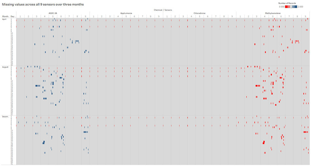
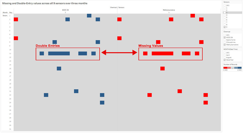
Across the 9 sensors, each measure the four chemicals (AGOC-3A, Appluimonia, Chlorodinline and Methylosmolene) they are generally working 24 hours daily across the three months sample period (April, August and December) its records the reading of the chemicals. The graph below shows the exception of some periods that have missing values in the recording of the chemicals across the three months. The red symbolizes the missing values from the dataset, the blue symbolizes double entry values which will be explained in the later part and lastly, the grey symbolizes values with one reading.
Missing midnight values
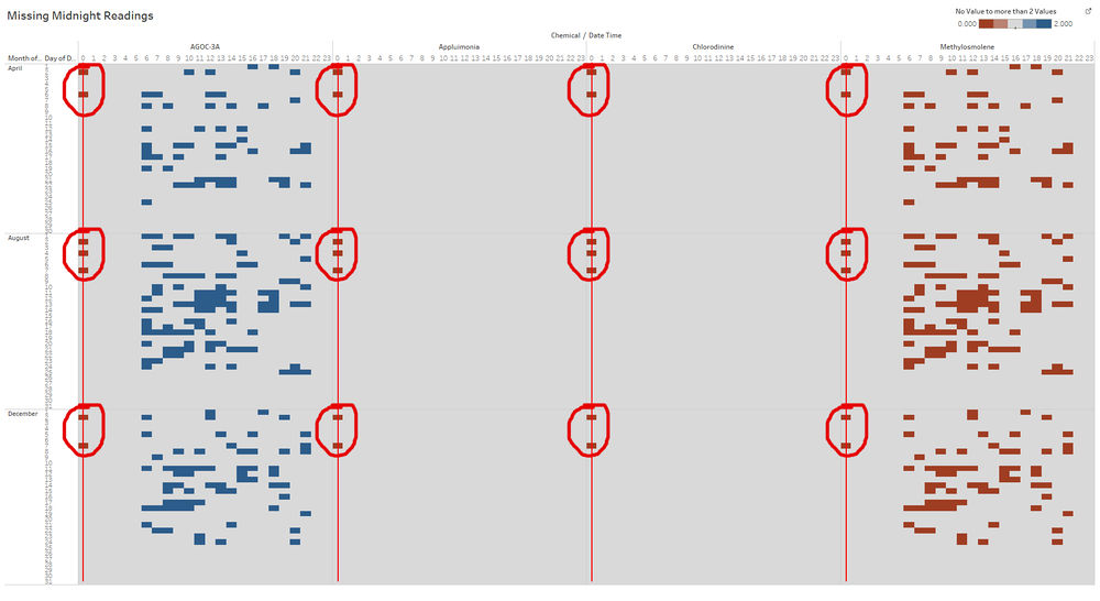
There are some values that clearly shown a clear pattern within the dataset. The graph above shows 7 missing values during midnight (0.00 hours) along the red lines except for some dates that have values in it which is explained in the table below. (Yes (Y) = Some Sensors has read, No (N) Sensors has no reading at all).
AGOC-3A
| Sensors/Date | 1 | 2 | 3 | 4 | 5 | 6 | 7 | 8 | 9 |
|---|---|---|---|---|---|---|---|---|---|
| 2nd April | N | N | N | N | N | N | N | N | N |
| 6th April | N | N | N | N | N | N | N | N | N |
| 2nd August | N | N | Y | N | N | N | N | N | N |
| 4th August | N | N | N | N | N | N | N | N | N |
| 7th August | N | N | N | N | N | N | N | N | N |
| 2nd December | N | N | N | N | N | N | N | N | N |
| 7th December | N | N | N | N | N | Y | Y | Y | N |
Appluimonia
| Sensors/Date | 1 | 2 | 3 | 4 | 5 | 6 | 7 | 8 | 9 |
|---|---|---|---|---|---|---|---|---|---|
| 2nd April | N | N | N | N | N | N | N | N | N |
| 6th April | N | N | N | N | N | N | N | N | N |
| 2nd August | N | N | N | N | N | N | N | N | N |
| 4th August | N | N | N | N | N | N | N | N | N |
| 7th August | N | N | N | N | N | N | N | N | N |
| 2nd December | N | N | N | N | N | N | N | N | N |
| 7th December | N | N | N | N | N | N | Y | N | N |
Methylosmolene
| Sensors/Date | 1 | 2 | 3 | 4 | 5 | 6 | 7 | 8 | 9 |
|---|---|---|---|---|---|---|---|---|---|
| 2nd April | N | N | N | N | N | N | N | N | N |
| 6th April | N | N | N | N | N | N | N | N | N |
| 2nd August | N | N | Y | N | N | N | N | N | N |
| 4th August | N | N | N | N | N | N | N | N | N |
| 7th August | N | N | N | N | N | N | N | N | N |
| 2nd December | N | N | N | N | N | N | N | N | N |
| 7th December | N | N | N | N | N | N | N | Y | N |
The only reading that was captured is the list below:
- 2nd August Sensor 3 (AGOC-3A and Methylosmolene),
- 7th December Sensor 6 (AGOC-3A), Sensor 7 (AGOC-3A and Appluimonia), and Sensors 8 (AGOC-3A and Methylosmolene)
Double-Entry Values on AGOC-3A vs Sensors Reading
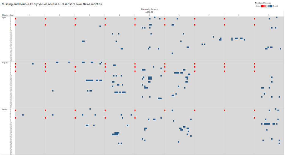
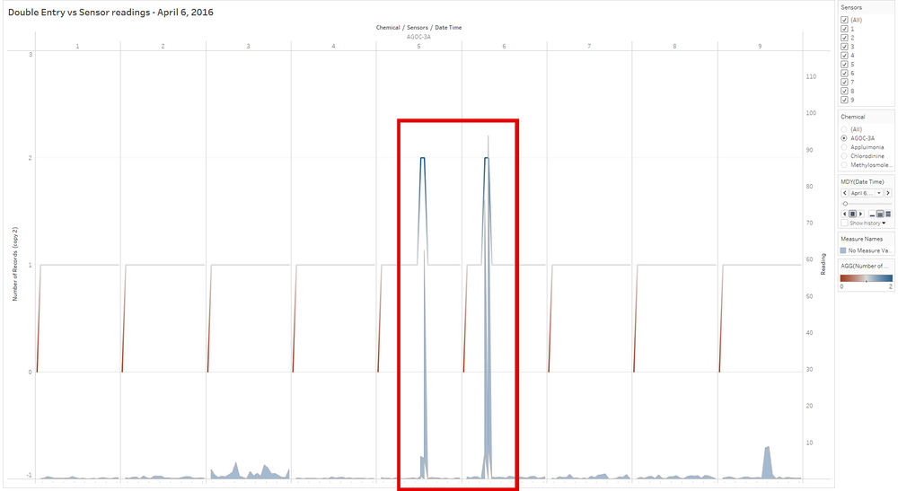
There are a huge number of double entries found especially on AGOC-3A (214 double entries) comparing to the rest of the 3 other chemicals [1]. These double entries means that the sensors might have two reading on the same date and time. Within this double entry, I also observed that that are huge spikes on the sensors readings whenever there is a double entry. The graph below will show a zoom in version of the double entry and huge spikes of one of the days (6th April 2016, AGOC-3A) between monitor 5 and 6 where the line graph shows the number of reading recorded and the area graph shows the reading.
Double-Entry Values on AGOC-3A may relates to Methylosmolene
Another pattern found within the sensors reading was numerous double-entry readings in AGOC-3A coincide with the missing values in Methylosmolene. This is most likely that the sensors are reading the wrong chemicals and recorded Methylosmolene as AGOC-3A which may be the cause the huge spikes or someone has tampered with sensors to read AGOC-3A when they are releasing Methylosmolene as AGOC-3A it's less harmful to human and environmental health and as for Methylosmolene is strictly regulated in the manufacturing sector as should be releasing the chemical at a certain timing and certain amount of it. From the graph above, clearly, shows the pattern between the blue which symbolizes double entries in AGOC-3A and the red symbolizes in Methylosmolene accurately depicting the exact timestamps where they occur. The table below, also proof evidence that the double entries values in AGOC-3A that is added in the Methylosmolene missing values which add up to a total of 2201 for each monitor. As for monitor 8, there is an exception for the extra midnight value on 7th Dec 00.00 hour.
Methylosmolene Adjustment
| Description | Monitor 1 | Monitor 2 | Monitor 3 | Monitor 4 | Monitor 5 | Monitor 6 | Monitor 7 | Monitor 8 | Monitor 9 |
|---|---|---|---|---|---|---|---|---|---|
| Original no. of records | 2199 | 2196 | 2174 | 2163 | 2154 | 2158 | 2195 | 2195 | 2163 |
| AGOC-3A Double Entries | 2 | 5 | 28 | 38 | 47 | 43 | 6 | 7 | 38 |
| Methylosmolene Adjusted no. of records | 2201 | 2201 | 2201 | 2201 | 2201 | 2201 | 2201 | 2202 | 2201 |
Task 2
Q2: Now turn your attention to the chemicals themselves. Which chemicals are being detected by the sensor group? What patterns of chemical releases do you see, as being reported in the data? Limit your response to no more than 6 images and 500 words.
Task 2: https://public.tableau.com/profile/tay.wei.rong#!/vizhome/Task-2_1/Task2?publish=yes
Before proceeding to task 2, I start clearing the data double entries values in AGOC-3A to Methylosmolene using a Python script. It was done by finding the mean and standard deviation of AGOC-3A for each sensor. After which, the z-score is calculated for the double entries and the value which shows the lower z-score is assigned to AGOC-3A while the other entry will be assigned to Methylosmolene.
Monthly Readings Trends
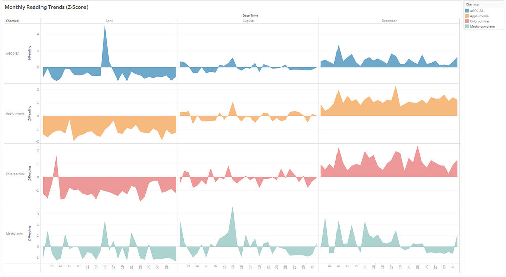
The graph above gave an overview of the chemical trends detection for each month. From this, I observe that the chemicals were higher in December than they were in April by calculating the Z-Score of the readings to show how far the readings are from the average readings across the 3 months sample period. Zooming into April the Z-Score is below the average expected for 15 April where there is a spike at its highest across all sensors at a total of 49.98 and 4 Standard Deviation away. Comparing this to December where all the Z-Scores are above the average for AGOC-3A, Appluimonia and Chlorodinine consistently. Another consistent pattern is during August where all the Z-Scores for AGOC-3A, Appluimonia and Chlorodinine are very similar in their readings this could mean they are releasing the chemicals on a routine basis during August. Not forgetting about Methylosmolene, where there are consistent spikes across all three months sample period suggest that the chemical it releases randomly throughout the three months sample.
Note: The average between the chemicals might not be the regulated average so the average readings could be dangerous for humans and environment.
Sensors Trend Detection on a Monthly Basis
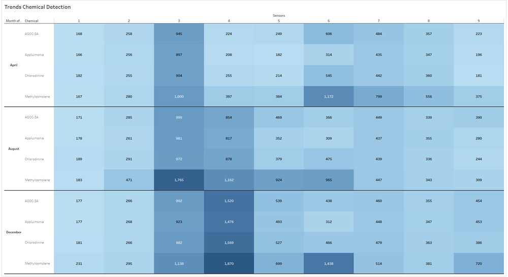
Next, we look into each sensor to see how much chemicals are release during each month. From the graph above, you can see that sensors 3 and 4 have the highest reading across 3 months sample period with the lighter blue symbolize a lower reading and the darker blue symbolize a higher reading. For sensors 3 has consistently been the highest reading and monitor 4 is slowly increasing from April to December it has the highest reading amount the 9 sensors. Another consistent pattern is sensor 6 where it is consistently spiking for Methylosmolene across the 3 months sample period.
Chemical Release per Sensors
Sensor 9
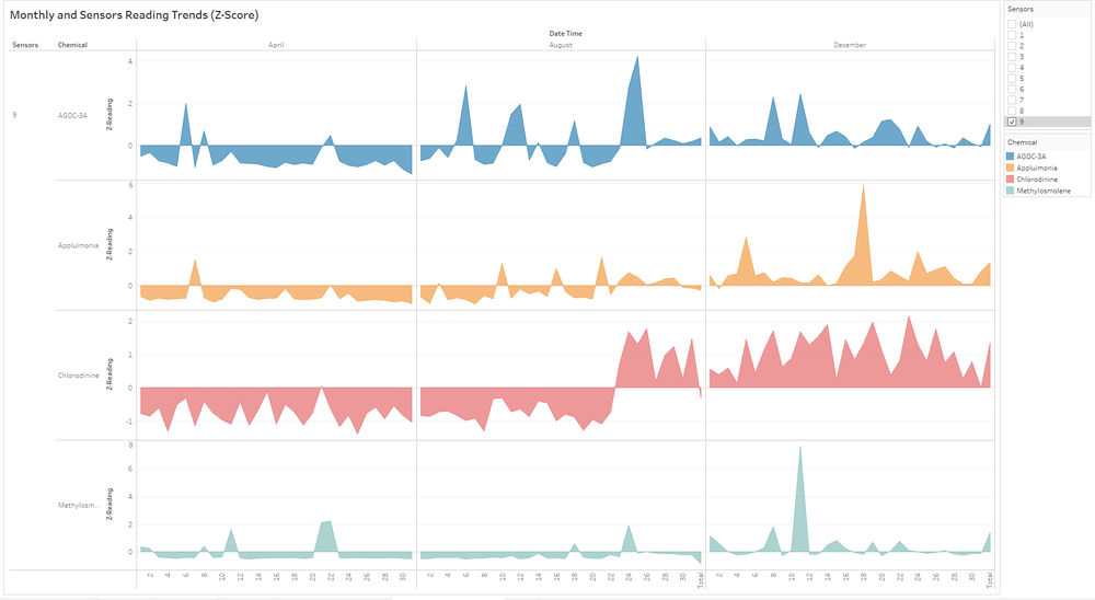
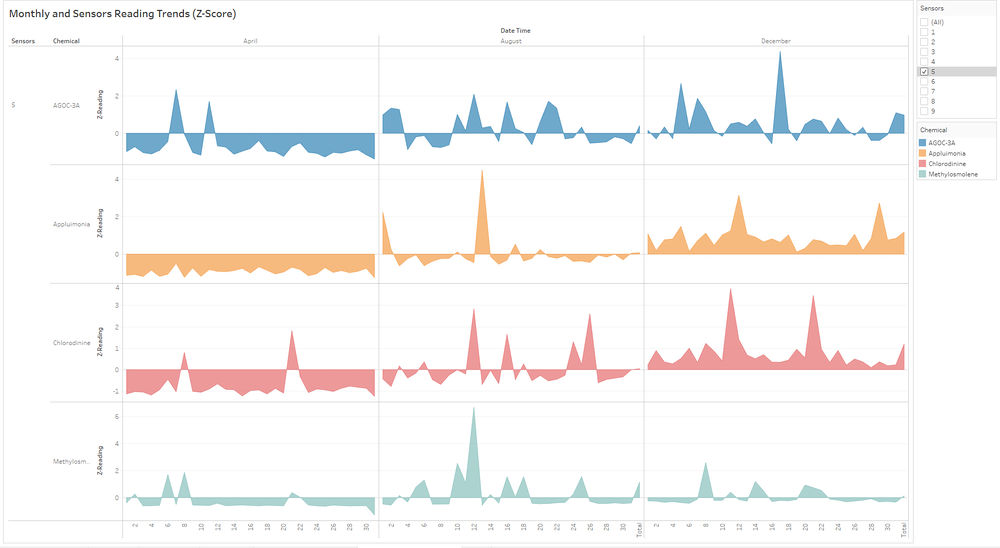
On Sensor 5 and Sensor 9 saw an increase in standard deviation of 3 to 4 for chemicals (AGOC-3A, Appluimonia and Chlorodinine) from the end of August and though December.
Sensor 4
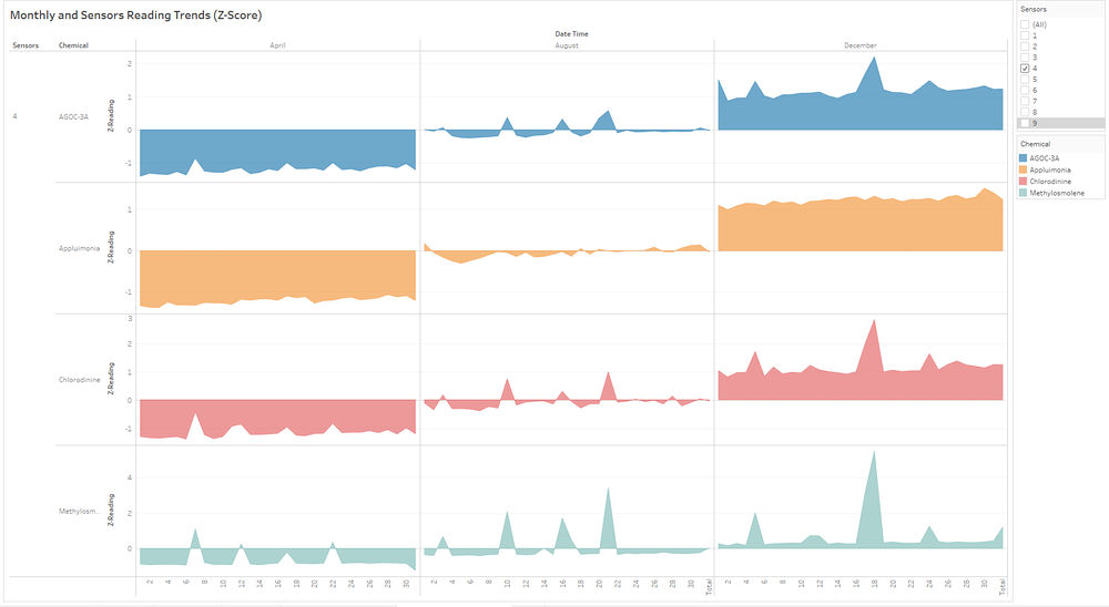
Sensor 4 saw an increase in standard deviation for all chemicals throughout December.
Task 3
Q3: Which factories are responsible for which chemical releases? Carefully describe how you determined this using all the data you have available. For the factories, you identified, describe any observed patterns of operation revealed in the data. Limit your response to no more than 8 images and 1000 words.
Tableau Link: https://public.tableau.com/profile/tay.wei.rong#!/vizhome/Task-3_0/Story1?publish=yes
Approach
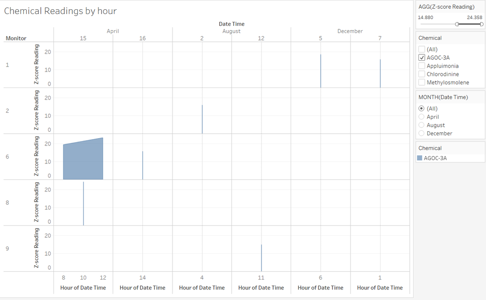
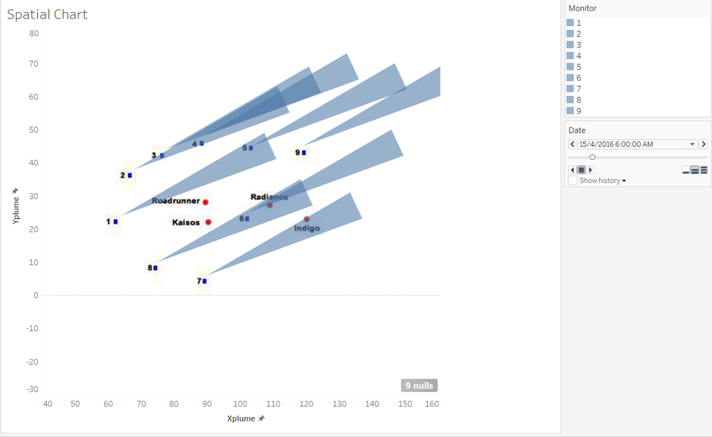
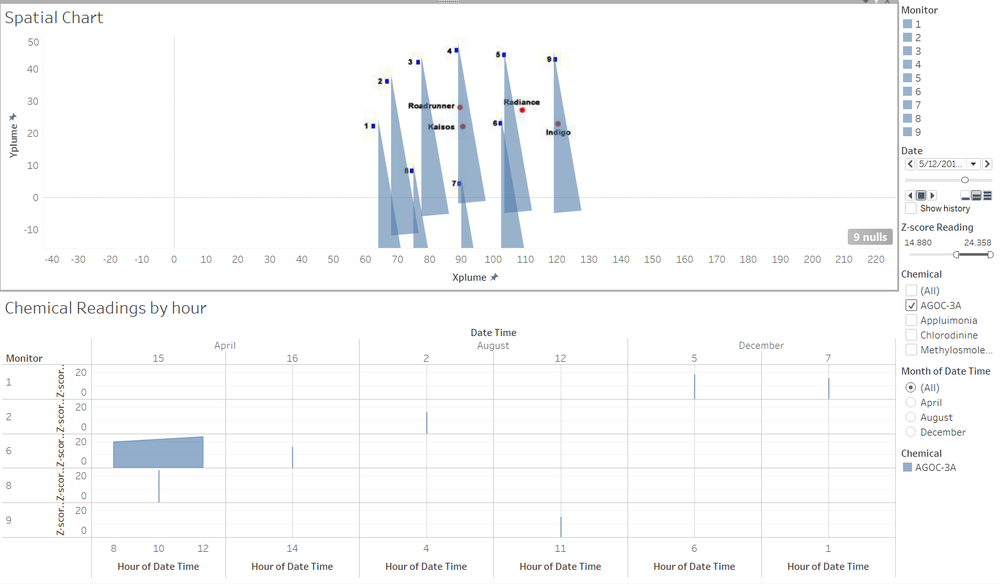
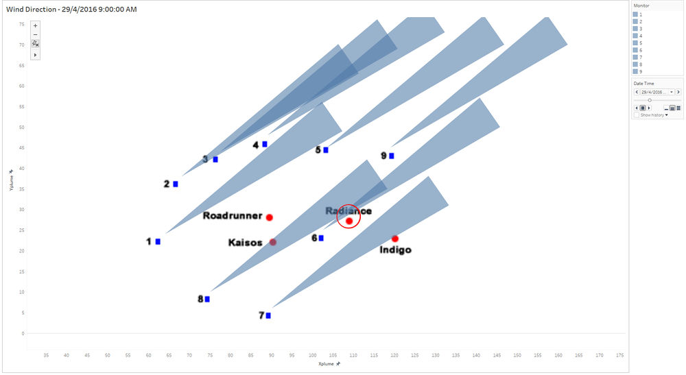
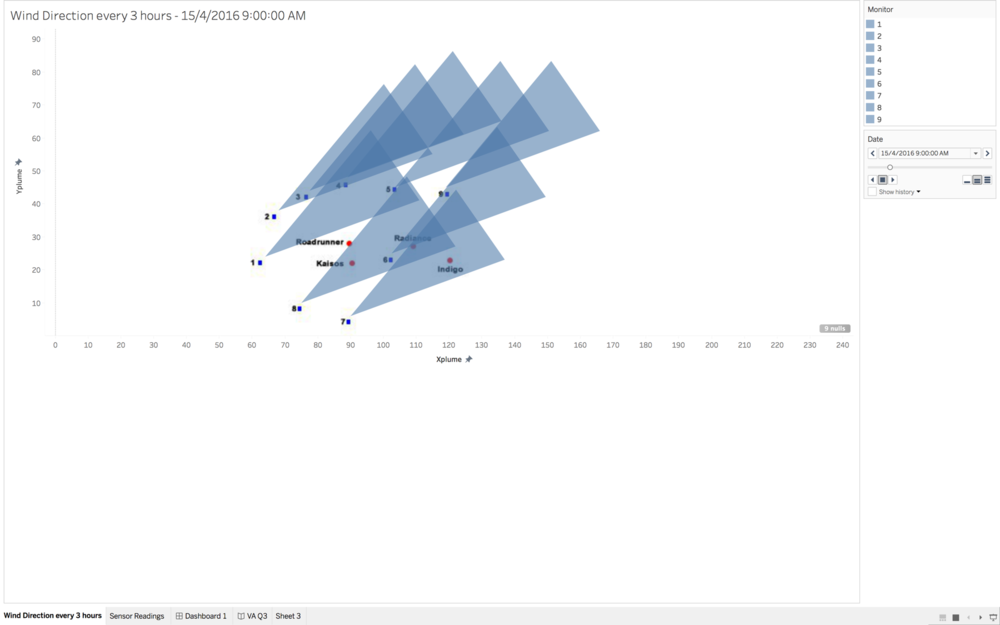
In order to pinpoint the culprit, I decided to use a wind-rose type of concept to pinpoint which companies are the producers of certain chemicals. By using the sensors as a base, we draw back a cone which aims to visually show which company is the possible culprit. By using wind-speed and the wind direction in the meteorological dataset, plot out a cone and whichever factory is covered by the cone, it is a probable producer of the chemical. To zoom in on the possible culprits, we first pick out the days in which there are spikes and proceed to look at which hours the peaks occur.
First, we plot out the readings for each monitor and chemical and filter the results by a upper bound range of the z-score over the hours. This chart will help us to find the spikes in the readings by the hour. However, we are using 3-hour data for the meteorlogical data so if a chemical readings is 10:00am, we will use the wind readings at 09:00am to match against the spatial chart.
If a overlap occurs in the spatial chart with the right sensor, we will consider it as a hit and the company that it hits is recorded as a suspected producer of the chemical. If it is a miss, it is recorded as no-hit so that we know that there was no overlap based on the wind data and there could be other factors that need to be considered in order to find out the actual situation. An example of this is
AGOC-3AReading
| AGOC Readings | |||
| Date Time | Monitor | Reading | Suspected Company |
|---|---|---|---|
| 15/4/2016 8:00:00 AM | 6 | 114.2 | Radians |
| 15/4/2016 12:00:00 AM | 6 | 136.5 | Radians |
| 15/4/2016 10:00:00 AM | 6 | 31.1 | Kasios |
| 16/4/2016 14:00:00 AM | 6 | 93.2 | Radians |
| 12/8/2016 14:00:00 AM | 6 | 93.2 | Radians |
Appluimonia Reading
From the table, we can see that Radiance and Indigo are the most probable producers of Appluimonia
| Appluimonia Reading | |||
| Date Time | Monitor | Reading | Suspected Company |
|---|---|---|---|
| 29/4/2016 09:00:00 AM | 6 | 26.85 | Roadrunner |
| 13/8/2016 11:00:00 AM | 5 | 23.33 | Radience, Indigo |
| 5/12/2016 12:00:00 PM | 9 | 23.55 | Indigo |
| 7/12/2016 01:00:00 AM | 9 | 23.77 | Radience |
Chlorodinine Reading
From the table, we can see that every single companies are culprits of different chemicals
Chlorodinine
| Chlorodinine Readings | |||
| Date Time | Monitor | Reading | Suspected Company |
|---|---|---|---|
| 16/4/2016 11:00:00 AM | 1 | 15.27 | Roadrunner |
| 20/8/2016 4:00:00 AM | 2 | 22.38 | Roadrunner, Radians |
| 16/8/2016 5:00:00 AM | 5 | 35.25 | Radians, Kasios |
| 5/12/2016 4:00:00 AM | 7 | 40.2 | Radians, Indigo |
| 19/12/2016 10:00:00 PM | 9 | 15.1 | Roadrunner |
Methylosmolene Reading
From the graph above, you could see that Kasios immediately becomes a possible culprit of releasing high levels of Methylosmolene at 303.3 but Radience could be a possible culprit if the angle is wider.
| Methylosmolene Reading | |||
| Date Time | Monitor | Reading | Suspected Company |
|---|---|---|---|
| 14/4/2016 04:00:00 AM | 7 | 143.8 | Kaios |
| 15/4/2016 10:00:00 AM | 8 | 303.3 | Kaios, Radience (If the angle is higher) |
| 12/8/2016 12:00:00 PM | 5 | 253.9 | Radience |
| 20/8/2016 12:00:00 PM | 5 | 128.1 | Roadrunner |
| 7/12/2016 1:00:00 AM | 1 | 95.4 | Roadrunner, Kaios |
Reference
This assignment is done with Amos Tan, Russell Yap, Benedict Wee and Ong Sue Cern
