IS428 2017-18 T1 Assign Tan Song Kai
Contents
Assignment Details
IS428 Main Page: (https://wiki.smu.edu.sg/1718t1is428g1/Main_Page)
Assignment Overview: (https://wiki.smu.edu.sg/1718t1is428g1/Assignments)
Assignment Dropbox: (https://wiki.smu.edu.sg/1718t1is428g1/Assignment_Dropbox)
Another link to Tableau Public: (https://public.tableau.com/profile/tan.song.kai.evan.#!/vizhome/VisualAnalyticsAssignment-EvanTanSongKai/HomeDashboard?publish=yes) - Tan Song Kai (Evan)
Problem & Motivation
Mistford is a mid-size city is located to the southwest of a large nature preserve. The city has a small industrial area with four light-manufacturing endeavors. Mitch Vogel is a post-doc student studying ornithology at Mistford College and has been discovering signs that the number of nesting pairs of the Rose-Crested Blue Pipit, a popular local bird due to its attractive plumage and pleasant songs, is decreasing! The decrease is sufficiently significant that the Pangera Ornithology Conservation Society is sponsoring Mitch to undertake additional studies to identify the possible reasons.
Mitch Vogel was immediately suspicious of the noxious gases just pouring out of the smokestacks from the four manufacturing factories south of the nature preserve. He was almost certain that all of these companies are contributing to the downfall of the poor Rose-crested Blue Pipit bird. But when he talked to company representatives and workers, they all seem to be nice people and actually pretty respectful of the environment.
In fact, Mitch was surprised to learn that the factories had recently taken steps to make their processes more environmentally friendly, even though it raised their cost of production.
Mitch is gaining access to several datasets that may help him in his work, and he has asked you (and your colleagues) as experts in visual analytics to help him analyse these datasets. These datasets includes air sampler data, meteorological data, and locations maps provided by the state government, which has been monitoring the gaseous effluents from the factories through a set of sensors distributed around the factories.
Task
General Task
The dataset provided several months of meteorological data (wind speed and direction) and chemical data emitted by four industrial factories and captured by nine sensing stations. To explore the spatio-temporal chemical readings and wind data, specifically which factories emitted what chemicals and how the nine sensors in the area were performing, the team developed a web-based analytics tool with interactive visualizations and path line analysis to reveal sensor errors and chemical reading spikes, as well as pinpoint possible sources of chemical reading spikes. The goal was to help the local ornithologist determine whether or not the factories were compliant with environmental regulations.
Specific Task
Specifically, we are to provide visualisation to identify these issues:
• Sensors: To find out if all sensors’ performance and operations are working properly at all times, by detecting unexpected behaviours of sensors from the readings captured.
Characterize the sensors’ performance and operation.
Are they all working properly at all times?
Can you detect any unexpected behaviours of the sensors through analysing the readings they capture?
Limit your response to no more than 9 images and 1000 words.
• Chemicals: To find out which chemicals are being detected by the sensor group, by identifying patterns of chemical releases.
Now turn your attention to the chemicals themselves.
Which chemicals are being detected by the sensor group?
What patterns of chemical releases do you see, as being reported in the data?
Limit your response to no more than 6 images and 500 words.
• Factories: To find out which factories are responsible for which chemical releases, to be able to pinpoint on the factories which are responsible for the Rose-Crested Blue Pipits.
Which factories are responsible for which chemical releases?
Carefully describe how you determined this using all the data you have available.
For the factories you identified, describe any observed patterns of operation revealed in the data.
Limit your response to no more than 8 images and 1000 words.
Dataset Analysis & Transformation Process
Datasets Provided (Sensor Data, Sensor Location, Meteorological Data)
The datasets provided to Mitch from the state includes:
- Sensor Data (Sensor Data.xlsx)
- Contains three months of readings in the following format:
- Chemical: Which one of the four chemicals detected by the sensors
- Monitor: Which one of the nine sensors picking up the reading
- Reading: The air sensor detected amount in parts per million
- Date Time: The date and time of day of the reading, local time with no change for Daylight Savings
- Sensor Location (Sensor Location.xlsx)
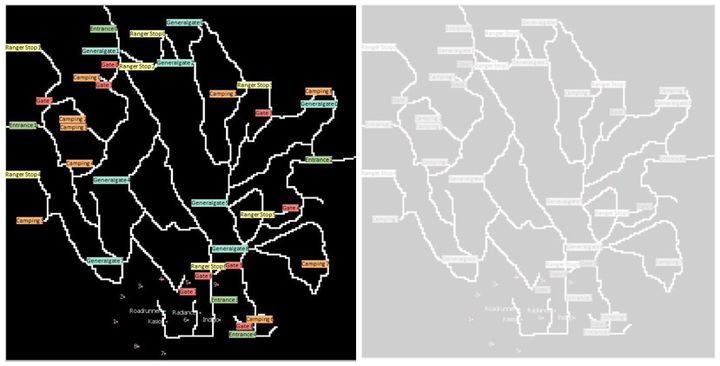
- The factories and sensor locations are provided in terms of x,y coordinates on a 200x200 grid, with (0,0) at the lower left hand corner (southwest). The sensors map shows the locations of the sensors and factories by number for the sensors and by name for the factories.
- Meteorological Data (Meteorological Data.xlsx)
- Contains three months of readings in the following format:
- Date: The date and time of the readings, local time with no change for Daylight Savings
- Wind Direction: The compass directions where wind is originating from, using a north-referenced azimuth bearing where 360/000 is true north
- Wind Speed: The speed of the wind in meters per second


Before being able to commence on our analysis, the datasets provided were analysed to better understand how we could potentially link these sets of data together, and at the same time verify the field attributes provided. This is to ensure that Tableau (the visualisation tool that will be used in this analysis), is able to interpret the data as accurately and seamlessly possible.
From briefly looking through the datasets, we can derive that no data requires any immediate attention to solve, as the Date field for both the Meteorological Dataset and Sensor Dataset are in proper DateTime format. Additionally, the other fields provided are pure strings / integers, and there are no joint fields in any one column. The only possible field that may cause a bit of confusion for Tableau would be the Elevation (m) field in the Meteorological Dataset, where it only takes up one row within the entire column. Hence, we just remove it to ensure Tableau does not misinterpret it.

Additional Information Provided
Next, the documents provided within the Assignment Data (Backgrounder on Sensors in the Lekagul Wildlife Preserve Area.doc, Companies v2.doc, MC2 Data Descriptions.doc and MapLargeLabels.jpg) were carefully gone through to better understand the entire context that is provided.
From the information provided, it can be derived that the factories and sensors locations are provided in terms of x, y coordinates on a 200x200 grid (MapLargeLabels.jpg), with (0,0) at the lower left-hand corner (southwest). The location of the four factories are also given to us:
- Roadrunner Fitness Electronics: (89, 27)
- Kasios Office Furniture: (90, 21)
- Radiance ColourTek: (109, 26)
- Indigo Sol Boards: (120, 22)
The factory location coordinates are then placed into another excel file, knowing that this information / data is necessary for further analysis later when we start analysing the wind direction and wind speed to identify the chemicals released by the factories.

Importing & Configuring the Data
Combining Sensor Data.xlsx & Sensor Location.xlsx
As the data provided for the sensor data readings and sensor location are in two different worksheets, Tableau’s table join was used to merge these two sheets together, to be able to aid us in further visualisation of the data – for the readings in each location.

An inner join is used to map each Monitor Identifier to the Monitor location.

Map Image
Proceeding on to preparing the image (MapLargeLabels.jpg) to be able to be interpreted by Tableau, this Tableau Training Video was made use of (Tableau Training Video - Background Images -http://www.tableau.com/learn/tutorials/on-demand/background-images-8) to obtain the required steps to enable the ability to plot points on the image within Tableau itself.
Issue: As it is stated that the X and Y columns are given to plot a 200x200 grid, nothing is needed to be done for the current X and Y data provided. However, Tableau is unable to use the current given data to include the image that is given to us.
Solution: In order for us to make use of the coordinates provided in the different datasets, we have to ensure a 200x200px image is imported onto Tableau, before we start plotting the X and Y coordinates for each of the sensors and factories.
- A new excel file is created, to include the coordinates for all the information that is given to us. An additional field – Entire Image is created with the coordinates X – 200, Y – 200.

- We make use of readily available image editing capabilities on Adobe Photoshop to recolour the given image – this will allow us to be able to only focus on the important details, as the current image given to us has too many distracting colours.
- As the points of the monitors and factories are on a single point and not an area, the excel file prepared above is sufficient. Tableau will be able to interpret these points and plot them on the image itself.
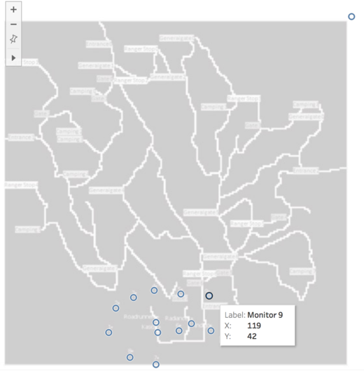
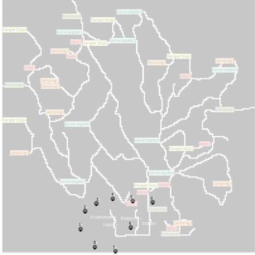
- Based on these points of the sensor locations, I made use of Adobe Photoshop to edit the photo, replacing these plots with a monitor icon and to make the monitor label number more significant. This is done as the monitors are static and they do not move throughout the entire visualisation, and hence it would be good to demarcate the monitors in a clearer manner, which will be of use when visualising the wind stick plots which will be shown further below.


Preparing Wind Vector Data for Visualisation
Guided by - https://community.tableau.com/thread/148044
Example output of wind shapes used to visualise wind direction:

As the wind direction were provided, an easy way to quickly aid the viewer to understand the wind direction for the current time would be to use visual shapes to represent it, instead of a bearing. Hence, Tableau’s calculated fields were used to aid in the preparation of this. A new calculated field called “Wind Direction Shapes” is created, with the bearings split into different 45 degrees to identify the general direction the wind is blowing.

Shapes are then made use of such that in the different cases, the arrows would point in a different direction as specified in this “Edit Shape” tool below.

Using the Meteorological Data
As the meteorological data provided only included the date-time, wind direction and wind speed, it is insufficient to be able to plot / visualise how the wind direction and speed affected the chemicals emitted in the surroundings. After digging deeper into how the wind direction and wind speed can be of use to visualise the wind path from each of the 4 factories, a new excel sheet is created to aggregate the data in the manner that Tableau will be able to interpret.
Excel’s advanced formulas and quick fill feature are made use of below to assist in the handling of the large dataset provided.
Example: Setting up Wind Stick Plot for Roadrunner Fitness Electronic Wind
The table below gives an overview of how the data was prepared to create a wind stick plot for Roadrunner Fitness Electronic:
| Steps | Description | Example Screenshot |
|---|---|---|
| 1 | A new excel file is created, to first Index each of this wind direction provided. This will allow for the grouping of wind sticks per date-time provided. | 
|
| 2 | Next, a duplicate of each line is made, and this was done by copying and pasting the entire index created (as shown above) and pasting it at the last index, and then making use of Excel’s sort feature to reorganise it. | 
|
| 3 | For each of the Index, a path order column is created to represent how the wind stick would connect. Path Order 1 represents the start point (in this case Roadrunner Fitness Electronic Wind’s axes [89, 27]), and Path Order 2’s X and Y axis are calculated with the formulas shown.
Further elaboration: It is common practice in meteorology to work with the u and v components of the wind. A vector can be broken into component vectors, where the i unit vector runs parallel to the x axis, and the j vector runs parallel to the y axis. For winds, the u wind is parallel to the x axis. A positive u wind is from the west. A negative u wind is from the east. The v wind runs parallel to the y axis. A positive v wind is from the south, and a negative v wind is from the north. (Extract from http://colaweb.gmu.edu/dev/clim301/lectures/wind/wind-uv.html) The formula’s were derived as such – because the wind speed and wind direction was provided, it was possible to obtain the component vector winds, u and v, as follows: u = wind speed * cos(wind direction) v = wind speed * sin(wind direction)
u = wind speed * cos(wind direction)*60 v = wind speed * sin(wind direction)*60
u = wind speed * cos(wind direction-180)*60 v = wind speed * sin(wind direction-180)*60
|
 
|
| 4 | Next, a new column is inserted for Tableau to be able to recognise that these fields are specific for Roadrunner Fitness Electronics. | 
|
| 5 | These steps are repeated for the other factories, and then merged into a single excel file, and then processed into Tableau. | 
|
Interactive Visualisation
This Interactive Visualisation is best viewed from a Generic Desktop (1366px x 768px).
Link to Tableau Public
Dashboard 1: Homepage
Upon entering the interactive dashboard, the viewer is greeted with a brief description of the interactive dashboard, with 4 main navigation icons: Wind Sensors, Chemical Sensors, Chemical Readings Detected and Factories Emitting Chemicals.
Charts used:
- Box-and-whiskers plot with jitters
- Tooltips are made use of to guide the user to better understand the different views available for viewing
- Additionally, this dashboard shows an overview of the readings throughout the three months, for the viewer to have a glimpse of the monitors which have the highest readings through the three months. More information on each chemical is provided as well, such that the viewer will be able to better understand the different types of chemicals and its potential harmful effects.
- Filters are made use of within the Actions feature in Tableau, to map the different icons to link to a different dashboard with the action being run upon “Select”.


Dashboard 2: Chemical Monitor Detection
The purpose of this dashboard is for the viewer to have a better understanding of the chemicals detected by the monitors. Navigation icons are deployed on the left side of the screen, which is standardised across all other dashboards (apart from home dashboard) to allow for quick navigation between the different dashboards views.

Charts used:
- Heatmap
- Specifically, the heatmap compliments the time-series line chart to allow the viewer to derive insights on the chemicals detected by each monitor throughout the three months. The heatmap would also allow for detection in any case of no readings being detected, in a much easier manner compared to the line chart.
- Time-series Line Chart
- The line chart aggregates the total readings by all 9 monitors to allow the viewer to find out if chemicals are being detected at all times of the day, and at the same time, allow the viewer to detect if there may be patterns in the time that more chemicals are detected in the air.
- Within Actions as well, a multi-filter option was created such that it links both sheets within the dashboard to change together upon selecting a different month. This would increase the usability of the dashboard and filters, as it would be inconvenient and tedious to have to change two different filters for two different charts.
- Additionally, for the time series line chart, a reference line is made use of to allow the viewer to compare the daily chemical emissions with the average of each day. This would allow the viewer to have a better gauge of what is considered as a high reading for the particular day itself.
- Apart from that, a view selector was created as well to allow the toggling of a similar heatmap within this dashboard – one to visualise the readings measured, and one to visualise the number of readings measured. This will aid us in further investigations related to monitor readings. Below show the steps taken to allow for sure interactivity, for the other sheets within the dashboard to remain static apart while this two sheet gets toggled.


Dashboard 3: Wind Monitor Detection
The purpose of this dashboard is for the viewer to have a general overview of the wind conditions throughout the three months. This includes the wind speed of each day, the direction of the wind, and how the wind conditions fared throughout the three months.
Charts used:
- Cycle Plot
- This allows the viewer to have a general overview of each day's wind speed over time, and have a comparison of the windiest hours etc.
- Wind Direction Shapes Chart
- This allows the viewer to be able to tell the wind direction at every three hours interval during the day
- Highlight Tables
- This allows the viewer to be able to tell the exact wind measurement at each hour of the day
- In this dashboard, "Apply to Filters" feature was used to enable the a single change in the date with multiple charts.

Dashboard 4: Chemical Emissions Readings
This purpose of this dashboard is to scope in specifically to visualise the different chemicals emissions over the three months. This dashboard would allow the viewer to be able to determine if the chemical emissions have been increasing or decreasing over the months, as well as identify patterns of chemical releases throughout the day.
Charts used:
- Stacked Bar Graph
- The stacked bar graph will allow the viewer to visualise the total readings of each chemical released in a single month. It will allow for the comparison of the highest chemical emitted, as well as compare the total chemical released over the three months.
- Time-series Line Chart
- The time-series line chart depicts an aggregated value throughout the different timings in the day for each month. The idea of this is to enable the viewer to detect potential patterns with regards to the timings that different chemicals are being released for each month (e.g. it is more common for Methylosmolene to be released in the early morning).
- Cycle Plot
- The cycle plot would enable the viewer to better visualise the difference in the chemical released for each hour over the three months. It will allow the viewer to determine if the chemical released in different hours of the day for the different months are on a general increase / decrease.

- Filters and reference lines are used to aid the usability of this dashboard. It allows the viewer to quickly be able to make comparisons between the different chemical emissions, to be able to identify possible trends with regards to chemical emissions over the three months.

Dashboard 5: Individual Factory Chemical Emissions
This purpose of this dashboard is to allow the viewer to visualise the factories chemical emissions, with the wind direction and speed taken into consideration over the different dates and hours. Together with the chemical emissions being detected by the different monitors at different times of the day, this dashboard seeks to aid the viewer to find out which factory is responsible for which chemical that is released in the air.
Charts used:
- Time-Series Chart
- This time series chart aims to allow the viewer to select from the 4 different chemicals, and be able to visualise extreme readings detected in the different hour, day and month. This would be used in relation to the wind-stick plot to allow the detection of factories responsible for the different chemical emissions.
- Map Image Plot
- This map image plot allows us to better visualise the area of the factories and sensors deployed. The map image plot has also been enhanced, to bring out the relevant points (such as the monitors and factories), and the irrelevant points such as the road labels and roads are masked out in a dimmer shade.
- Wind Stick Plot
- The wind stick plot aims to allow the viewer to see the general direction that the wind would blow the chemical released to, at different times during the day that the wind sensors managed to capture.

- Apart from the chart, the wind stick plot and the wind direction arrow is also linked, as shown in the image. This is done by a Filter Action, and this aids the viewer to be able to not only visualise the wind stick direction, the wind direction arrow allows the viewer to tell the general direction that the wind is blowing at different timings throughout the three months.
- Additionally, the wind stick plot has been extrapolated to better visualise which monitor the chemicals would float to from each of the factories. Radio buttons are also used to allow for the quick selection of individual chemicals, to facilitate the viewer with being able to interact better with the dashboard.


Results
Task #1
From the analysis of the Meteorological Data and Sensor Data provided, a few observations can be made:
Wind Sensors
The wind sensors could have possibly been malfunctioning / down on the night of 30th April 2016, after 21:00hrs till 4th August 2016, before 18:00hrs as no wind data was captured. This can be further verified through the Meteorological Datasheet itself, as shown below.
| S/N | Findings |
|---|---|
| 1 | The wind sensors could have possibly been malfunctioning / down on the night of 30th April 2016, after 21:00hrs till 4th August 2016, before 18:00hrs as no wind data was captured. This can be further verified through the Meteorological Datasheet itself, as shown below. |

| |
| 2 | There was another occurrence of the wind sensors / wind sensor data capturing tool malfunctioning, where despite the date being captured, no Wind Direction and Wind Speed data were captured after 30th August 2016 00:00hrs, to before 30th August 2016 06:00hrs. |

|
Sensor Readings
Duplicate Instances
| S/N | Findings |
|---|---|
| 1 | From the visualisation, I was able to derive that the sensor readings captured had constant pockets of malfunctions throughout the three months. These small pockets of malfunction would occur at different hours during the day, which would usually last for only an hour to two hours. There are however, instances where a monitor would malfunction for even more hours during a single day. |

| |
| 2 | With regards to the null results captured for Methylosmolene for these pockets of malfunction, whenever data is not captured for Methylosmolene, the data captured for AGOC-3A is noticeably more than their usual. This shows a possible duplicate recording / additional recording for AGOC-3A instead of Methylosmolene whenever these occurrences happen. By viewing it as a count of readings, it is indeed true that for these instances of null values of Methylosmolene, a duplicate record is captured for AGOC-3A. Hence, we can speculate the Methylosmolene was misinterpreted as AGOC-3A. |

|
Large Scale Malfunctions
| S/N | Findings |
|---|---|
| 1 | The largest malfunctions occurrence seems to happen on the 2nd of every month (April, August, December), at 00:00hrs, where almost every Monitor does not record any readings. Only Monitor 3 on the 2nd of August was able to record chemicals detected for AGOC-3A and Methylosmolene. |

| |
| 2 | Another large-scale malfunction occurrence similar seems to happen on the 6/7th of April, August and December, 00:00hrs as well. In this occasion, only Monitor 6, 7 and 8 was able to detect AGOC-3A, AGOC-3A and Appluimonia, AGOC-3A and Methylosmolene respectively in December. |

| |
| 3 | It can also be seen that August experienced another hour of full scale monitor malfunction, where in between 2nd and 6/7th, the monitors stopped malfunctioning at 00:00hrs once again. This additional large-scale occurrence however only occurred in August. |

|
Conclusion
From this, we are able to conclude that both the wind and chemical monitors had suffered from malfunctions. However, this was non severe, as majority of the data was still captured and not misinterpreted by the sensors. From the wind monitors malfunction, one of the possibilities could be that there was a huge storm from the 1 - 4 of August, or it could have been purely intentional, where the wind monitors were shut down to re-calibrate. Also, Mitch could probably find out more from the state government to check if the large scale chemical malfunctions were just scheduled re-calibrations, since it seems similar for each month. However, Mitch should inform them of the duplicate readings of AGOC-3A, as would result in the readings for AGOC-3A and Methylosmolene to be flawed.
Task #2
Patterns of Chemical Releases
Firstly, based off this overview of box-and-whiskers plot with jitters, it is noticeable that monitor 6 has the highest amount of readings for both AGOC-3A and Methylosmolene. Additionally, it is noticeable that Monitor 3, 4, 5 and 6 has the higher amount of readings, which could possibly also mean that these sensors have been the ones detecting the most.
It is also noticeable that Chlorodine and Appluimonia have less emissions compared to the other two chemicals.

Specifically, for the chemicals detected by the sensor group, a few observations can be made with regards to the patterns of chemical releases.
| S/N | Findings |
|---|---|
| 1 | Over the course of April, August and December, it can be seen that the total chemical released for each of the chemicals has been increasing, with AGOC-3A chemicals being released the most every month. It is followed by Methylosmolene, Chlorodinine, and Appluimonia. |

| |
| 2 | Looking closer in detail regarding the chemicals emitted in every hour through each month, it can be seen that there is indeed a pattern with the chemical emissions in the different hours:
Methylosmolene It can be seen that the amount of Methylosmolene emission starts to rise at night, above the average readings detected for the chemicals, at around 21:00-22:00hrs to 4:00-5:00hrs in the morning, where it starts to drop to similar amount emissions as the other chemicals. AGOC-3A It can be seen that the amount of AGOC-3A starts to rise above the average readings detected for the chemicals after 5:00hrs in the morning, right after Methylosmolene released in the air starts decreasing. It remains high throughout the day, where it only starts to fall back to the average readings after 20:00-21:00hrs in the night. |

| |
| 3 | Chlorodinine & Appluimonia
Chlorodinine and Appluimonia remains just below the average emissions throughout the day, with constant emissions in every hour over the month. |

| |
| 4 | This cycle plot of each of the chemical emissions further affirms the pattern identified in 2) and 3) – the chemicals emitted in every hour through each month. From the cycle plot, it can be further seen that there is a general upward increase in emissions over each hour through the three months, apart from Methylosmolene being released in the morning (1:00hrs to 5:00hrs), where there was a dip in emission but surged past April emissions readings, in December. |

|
Conclusion
From these findings, we can derive that there is actually a noticeable increase in all chemical emissions from April till December, where could possibly be causing the Rose-Crested Blue Pipit's decrease. This is of a concern not only for the Rose-Crested Blue Pipits, but also because even though the factories had recently taken steps to make their processes more environmentally friendly, we can tell that this is actually not true at all. They are definitely not respectful of the environment.
Task #3
For this task, a flow map / wind stick plot was used to determine which factories was responsible for which chemical releases. It was done by comparing especially high readings for certain days throughout the three months, with the wind stick plot that was created.
A few assumptions are made with regards to this analysis:
- As the wind speed and wind direction readings were only recorded every three hours despite the chemical sensors being recorded every hour, the meteorological data is assumed to affect the chemical sensors for the three hours readings recorded (especially since it’s a 12 x 12 miles area of the map and the wind speed is measured by miles per second).
- The elevation does not affect the wind direction and wind speed, even though it could have been possible that elevation of the area would affect wind speed
- The diffusion rate of the chemical particles are minimal, due to the close proximity of the factories and monitors
AGOC-3A
While trying to detect which factories were responsible for AGOC-3A emissions, it was fairly tricky, as the readings for AGOC-3A experienced spikes due to double readings at some times of the month as we detected earlier, and additionally due to the close proximity of factories and wind paths from the factories, it was difficult to zoom onto a single factory unlike the other three chemicals.
| S/N | Findings |
|---|---|
| 1 | From this visualisation, it is noticeable that Roadrunner Fitness Electronic (RFE), Kasios Office Furniture (KOF) and Radiance ColorTek (RC) could possibly be culprits for the AGOC-3A emission. The difficulty in determining this is due to the fact that all three factories chemicals emitted would naturally point to the same direction. Coupled with diffusion, it would be difficult to determine. One thing for sure is that Indigo Sol Boards was not involved in this chemical emission. Hence, it would be good to analyse other spike in readings to try to determine which factory might actually be responsible. |

| |
| 2 | It can be seen that RFE and KOF could potentially be the main culprits of AGOC-3A emissions, as based on this reading on 6 April, 6:00am, it can be seen that the wind was coming from the west, and since Monitor 6 detected high AGOC-3A readings, it could only be RFE or KOF's doings. KOF wind path is seen to be the most direct towards the sensors based off both this visualisation and the previous one. Hence, it would be good to analyse another occurrence to better make a sound judgement. |

| |
| 3 | Once again, on 15 April, 10:00am, there is another high reading detection, this time the highest - 111.5ppm. From the visualisation, we can tell that RFE and KOF would be the main culprit. |

|
Appluimonia
| S/N | Findings |
|---|---|
| 1 | Compared to detecting AGOC-3A, it seems to be a lot easier. This could be due to Indigo Sol Boards (ISB) being relatively far compared to the other factories. On 7 April, 12am, a high reading of 4.995ppm of Appluimonia was detected. The wind stick plot at 12am shows only one possible culprit, which is ISB. Based on this findings, another occurrence is inspected to affirm the findings. |

| |
| 2 | On 13 August, 9am, Monitor 5 had a reading of 7.74ppm, which is considered very high compared to the general averages of Applumonia released. From the wind stick plot, it is clearly visible that only ISB could be responsible for this. |

|
Chlorodinine
| S/N | Findings |
|---|---|
| 1 | From the visualisation, a high amount of Chlorodinine was detected on 8 August, 1am (a reading of 11.25ppm). Based off the wind stick plot, RFE seems like a highly susceptible culprit. Due to the readings being detected from monitor 6, it was easier to assume that only RFE is the culprit and not KOF, due to the monitor being in closer proximity compared to the other monitors. However, it would be good to affirm this findings with another inspection. |

| |
| 2 | Once again on 23 December, 5am, another high reading (a reading of 15.04ppm) of Chlorodinine was detected. This time, it is monitor 6 that detected it once more. From the wind stick plot, it seems unlikely that KOF is involved in the releasing of Chlorodinine, and RFE is indeed the most susceptible one. |

|
Methylosmolene
| S/N | Findings |
|---|---|
| 1 | On 2 April, 4am, a high reading of 88.53ppm of Methylosmolene was detected. From the wind direction and wind stick plot, it can be inferred that KOF could be the main culprit for the release of this chemical. Once again, it is easier to affirm this even though RFE and KOF are in close proximity, as monitor 6 is relatively closer to the other monitors. |

| |
| 2 | Once again, on 2 December 4am, another high reading of 85ppm of Methylosmolene was detected. KOF, once again, is seen to be the main culprit for this chemical released. |

|
Conclusion
AGOC-3A
- From the current information provided, we can also determine that based off the current readings and sensors, it would be difficult to determine which exact factory would be the main culprit, and we can only suspect that three factories - Radiance Colortek, RFE and KOF are highly likely to be releasing AGOC-3A. The main reason for this difficulty would be due to the close proximity of RFE and KOF compared to the other factories. However, it is not of too much concern, since AGOC-3A is comparatively less harmful to human and environmental health compared to the other chemicals.
Applumonia
- From the visualisations shown for Applumonia in Part 3, it was straightforward to conclude that the culprit for Applumonia is ISB. Since Applumonia is a airborne odour that can even cause death to humans / animals, ISB could be a possible culprit behind the dying Rose Crested Blue Pipits. However, it can be noted that ISB releases a minimal level of Applumonia compared to AGOC-3A and Methylosmolene, as shown in the visualisation above.
Chlorodinine
- Due to the high readings of Chlorodinine being detected from monitor 6, it was easier to conclude that RFE is the main culprit for the release of Chlorodinine. This chemical seems like the one of the more dangerous chemicals compared to AGOC-3A and Applumonia, hence RFE could also be a possible culprit behind the dying Rose Crested Blue Pipits. However, we also note that the release of Chlorodinine in the air is minimal compared to AGOC-3A and Methylosmolene as well.
Methylosmolene
- We can conclude that the main culprit behind the Mehylosmolene release is KOF. Additionally, an interesting finding would potentially be how KOF releases this chemical in the very early timing of the day (both occurring at 4am). It seems like Methylosmolene is the strictest chemical as well, and this early release could be due to how KOF does not want anyone to find out that they are involved with such harmful chemical release. This, is actually the most harmful chemical out of the four chemicals, and Mitch could potentially start looking further into this if he were to start his deeper investigations.
All in all, we can conclude that KOF may be the primary culprit to the fall of the birds, despite the factory releasing AGOC-3A as well, it may be due to the fact that it may be covering up the more harmful chemical releases (Methylosmolene).
References
These visualisations would not have been possible if not for all these reference materials:
Fusing both of these saved me - to be able to plot the wind stick lol:
- Calculating Wind Direction & Extrapolation (http://colaweb.gmu.edu/dev/clim301/lectures/wind/wind-uv.html)
- Create a Wind Stick Plot (https://community.tableau.com/thread/177425)
- Tableau Training Video - Background Images (http://www.tableau.com/learn/tutorials/on-demand/background-images-8)
- Dynamically Switch Images Using Filters (https://community.tableau.com/message/182926#182926)
- Tableau Tip Week - Dashboard Navigation Buttons (http://www.thedataschool.co.uk/niccolo-cirone/tableau-tip-week-wednesday-creating-dashboard-navigator-buttons/)
- Create Maps that Show a Path Over Time in Tableau (https://onlinehelp.tableau.com/current/pro/desktop/en-us/maps_howto_flow.html)
- Joining Tables (https://onlinehelp.tableau.com/current/pro/desktop/en-us/joining_tables.html)
- Visualising Wind Vector (https://community.tableau.com/thread/148044)
- Creating a View (Sheet) Selector for Your Dashboard (http://onlinehelp.tableau.com/current/pro/desktop/en-us/help.htm#dashboards_sheet_selector.html)
Comments
Feel free to leave any comments :)