1718t1is428T12
| Version 1 | Version 2 |
Contents
Introduction & Motivation
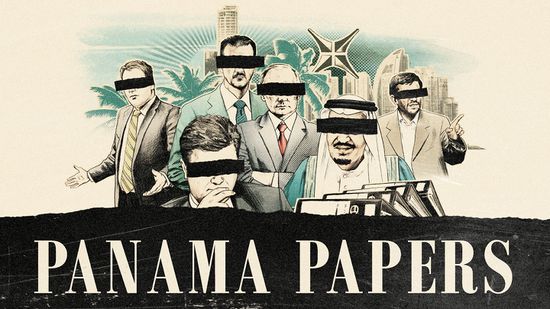
The Panama Papers (2016) are a huge leak — 11.5 million (approximately 2.6 TB) — of financial documents that reveal the financial holdings of the rich and powerful. The global investigation into the secretive industry of offshore companies expose how politicians, celebrities, sportsmen and high-net-worth individuals set up front companies in remote jurisdictions to protect their cash from higher taxes, and facilitate bribery, arms deals, financial fraud and drug trafficking. Laying within the trove of leaked files are also the names of the rich and powerful in the Asia-Pacific (APAC) region, overshadowed by the media’s interest of more prominent names of the West.
Objectives
As news coverage, even in Singapore, was focused mainly on the West, attention is diverted from what may be more important, which are details of individuals and businesses in APAC that are also found in the leaked documents. This results in a lack of information and coverage on the APAC region.
Our goal is the shed light on the individuals and business involved in the APAC region in the following ways:
- To present the complexity and structure of relationships between entities and individuals in each country in the APAC region.
- Identify key parties in the offshore investments.
Background Survey of Related Works
| Visualization | Description |
|---|---|
|
|
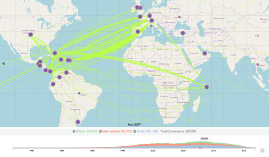
Geospatial map chartThis visualization shows the interconnectedness of countries connected and involved in the offshore industry over a forty-year period. The map view scalable and specific date and time is selectable on the timeline.
|
|
|
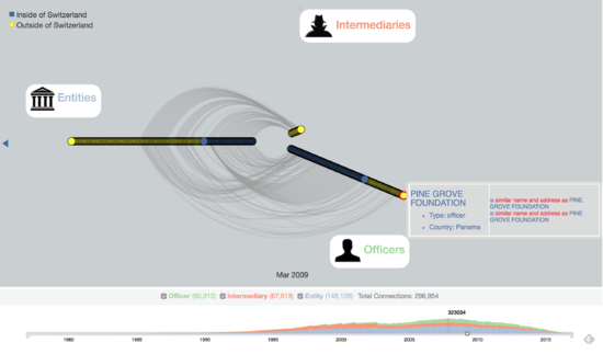
Network graphThis visualization is part of a drill-in in the previous visualization when you click on a particular country. It shows the interconnectedness of companies in that particular country to companies outside the country, across the world. The nodes show more details when they are hovered over.
|
|
|
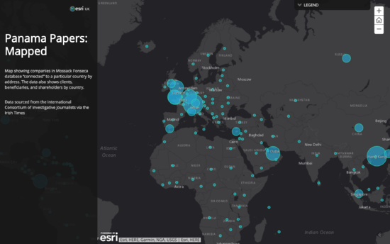
Interactive mapMap showing companies in Mossack Fonseca database “connected” to a particular country by address. The data also shows clients, beneficiaries, and shareholders by country. The visualization uses scaled circle location markers to show the number of companies in each country mentioned in the database. Each country's circle location markers are clickable, which reveal the number of clients, beneficiaries, and shareholders mentioned in the papers from the selected country.
|
Proposed Storyboard
| Page | Description |
|---|---|
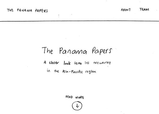
HomepageWhen the user enters our application, he is introduced to the home screen with our project topic and prompted to scroll down to read more. He can click the quick links at the top right hand corner to view details about our team or the project. | |
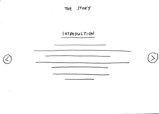
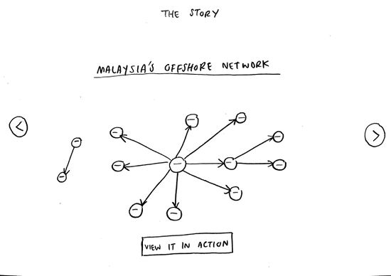
StoryAs the user scrolls down to read more, he is introduced to the story of an individual who intends to set up an offshore company for asset protection, but is unsure of which country he should set up his company in.
| |
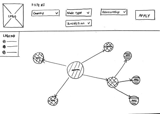
Try it out: Interactive network graphNow, the user is in our interactive network graph. He can click through the filters to select a Country, Node type, Jurisdiction, Relationship, and click Apply to execute the filters to show the offshore networks of a particular country.
|
Data Source
The following are the data sources we have gathered the Panama Papers data from for this project:
| Dataset | Description |
|---|---|
Offshore Leaks Database by The International Consortium of Investigative JournalistsData source: https://offshoreleaks.icij.org/pages/database |
Contains information on more than 520,000 offshore entities that are part of the Panama Papers, the Offshore Leaks, the Bahamas Leaks and Appleby data from the Paradise Papers as well as from some politicians featured in the Paradise Papers investigation. The data covers nearly 70 years up to early 2016 and links to people and companies in more than 200 countries and territories. |
Paradise-Panama-Papers: Data Scientists United Against Corruption datasetData source: https://www.kaggle.com/zusmani/paradisepanamapapers/version/1/data |
Compilation of data from the Paradise and Panama Papers leaks in .csv format of Addresses, Entities, Intermediaries and Officers, and also node edges, which we will be utilizing to assist the development of our network graph. |
Tools
Technical Challenges
| Key Technical Challenges | Description | Solution |
|---|---|---|
|
D3.js is a JavaScript library for producing dynamic, interactive data visualizations in web browsers. |
| |
|
The data set are in text format and many other different format. Integration are challenging as there are a lot of manual work to be done. |
| |
|
In order to enable users to understand the data sets, interactive elements needs to be suitable for this project |
|
Project Timeline & Task Assignments
References
- Databases: https://offshoreleaks.icij.org/pages/database
- Kaggle Dataset: https://www.kaggle.com/zusmani/paradisepanamapapers/version/1/data
- D3.js: https://d3js.org/
- Neo4j: https://neo4j.com/
Comments
Please leave comments here.
