IS428 2017-18 T1 Assign Sarah Jane Tong
Contents
Problem and Motivation
Background
Rose-Crested Blue Pipits are dwindling in numbers, and the cause is likely to be from one or more of the four types of chemicals emitted from the four factories. The factories are located south-west of the nature preserve where the birds reside, with the 9 sensors placed in the vicinity surrounding the 4 factories.
- The 4 factories are
- Roadrunner Fitness Electronics
- Kasios Office Furniture
- Radiance ColourTek
- Indigo Sol Boards
- A brief description of the 4 chemicals are also as follows
1. Appluimonia – An airborne odor which can possibly cause serious injury, long-term health effects, or death to humans or animals.
2. Chlorodinine – Corrosive chemical which can attack and chemically destroy exposed body tissues. It has been used as a disinfectant and sterilizing agent as well as other uses. It is harmful if inhaled or swallowed.
3. Methylosmolene – Has potent effects on vertebrates. Liquid forms of Methylosmolene are required by law to be chemically neutralized before disposal. Strictly regulated.
4. AGOC-3A – A solvent which is not extremely harmful to human and environmental health.
General Task Overview
To determine the cause of the dwindling numbers of the birds. Isolating the chemicals from the dataset and identifying if there are correlations between the emissions and the data.
Subtasks
- Characterize the sensors’ performance and operation. Are they all working properly at all times? Can you detect any unexpected behaviors of the sensors through analyzing the readings they capture?
- Which chemicals are being detected by the sensor group? What patterns of chemical releases do you see, as being reported in the data?
- Which factories are responsible for which chemical releases? Carefully describe how you determined this using all the data you have available. For the factories you identified, describe any observed patterns of operation revealed in the data.
Given the large number of variables and measures, there is a need to build an interactive data visualization tool to help to analyse the correlations between various variables. The visualisations will draw links between each factory, chemical and monitor.
Dataset Analysis & Transformation Process
There were 3 excel datasets provided in the assignment with different formats and attributes. And 1 document regarding general information about the environment in the problem question.
This section will elaborate on the dataset analysis and transformation process for each dataset in order to prepare the data for import and analysis on an interactive visualization.
| Dataset Name | Brief Description |
|---|---|
| Sensor Location.xlsx | 9 sensors and their locations in X-Y coordinates in 2 columns. |
| Sensor Data.xlsx | Approximately 80,000 rows each with a unique set of chemical, monitor, date and time and readings.
Date and time are taken in 3 months, April, August and December. One reading is taken 24 times a day, at the start of each hour for the entire month. |
| Meteorological Data.xlsx | Approximately 2,000 rows with a unique time and date stamp, and respective wind direction and wind speed. Elevation is also given as 340 m. |
| MC2 Data Descriptions.doc | Provided the X-Y coordinates of the factories and the sensors. Also provides information on the map, which is a 200 x 200 grid. |
Data Cleaning
Meteorological Data
- Problem
- Column E has data on elevation which has no context in the questoin.
- Solution
- Elevation in Col E was removed
Data Preparation for Merging/Joining Datasets
Several columns in the various datasets are likely to be merged. However, not all of them can be used for analysis as they are.
| Datasets involved | Data Transformation | |
|---|---|---|
| Sensor Data.xlsx
Meteorological Data.xlsx |
Datetime stamp for Meteorological data.
Interpolation such that both data reflect hourly data. |
|
| Meteorological Data.xlsx
MC2 Data Descriptions.doc |
The units of the wind speed | There are 3 units which can be used for wind speed:
Given that meteorological data was planned to be plotted on a x-y map later on, it makes most sense to convert from m/s to px/hr. |
| Meteorological Data | To insert factory location into dataset.
The planned visualisation was such that each of the 4 factories and the wind would be plotted on the same map as a wind stick plot for each timestamp. Using the factory as the source. |
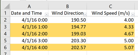
First, 4 separate sheets were created, one for each factory. Using trigonometrical transformations, the wind was plotted with an XY coordinate.
For each time stamp there would be 2 sets of XY coordinates; the factory’s coordinates and the hypotenuse coordinate created by the angle. <image> |
Question 1
Visualisation
The interactive visualisation can be seen here Q1 Visualisation
Generally, readings were taken in 3 months, April, August and December. Readings were taken at intervals of one hour, every day for each month.
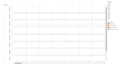
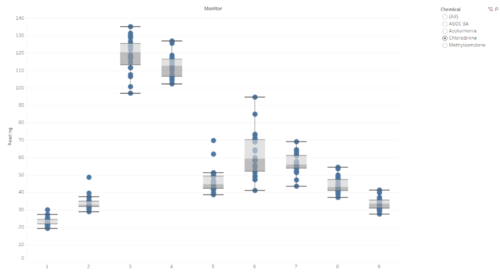
Stable readings are coming from Monitors 1, 2, 7and 8. Based on the location of these sensors, they are collated around the West. Although 7 does have a larger spread of readings collected.
Monitors 3 and 7 also indicate highly dispersed readings. This could indicate that these two sensors are much more sensitive to the chemicals than the rest of the sensors.
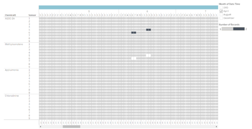
There are certain timestamps which the sensors have recurring missing chemical data and record surges in another chemical. These occur at 00:00 on 2nd and 6th April, 2nd and 7th August and 2nd and 7th December. Because the dates on the 3 months are almost identical, it is highly likely that this is not a coincidence and there is perhaps a scheduled event that occurs during these dates of the month.
Quite significantly across the 3 months is the matching of missing Methylosmolene and AGOC-3A. With the exception of Sensors 1 and 2, all the sensors have recorded a double reading for AGOC-3A (in grey) and missing Methylosmolene data for the same timestamp.
Question 2
Visualisation
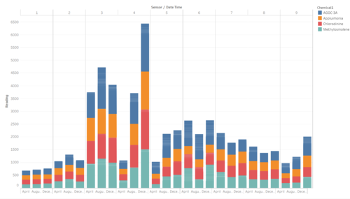
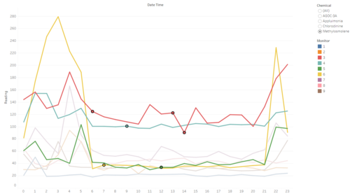
The general trend observed is an increase in the release of all 4 chemicals, particularly for Methylosmolene. Turning individually to the 4 chemicals I will discuss the results of analysing the visualisations which were analysed per day irregardless of month.
- Methylosmolene
Of the 4 chemicals, Methylosmolene was the most interesting to analyse, not only because of the missing data as was in question 1, but also in the above graph. What is noteworthy is the timings of release of Methylosmolene. During the day time, we can see that the release of Methylosmolene was almost always the lowest of the 4 chemicals. However, during the night, readings of the chemical would spike and remain so till the wee hours of the morning.
Returning to the chemical description sheets, not only is it indicated to be strictly regulated, and needs to be neutralised before being released, the high readings are found only at night, outside of regular operational hours. This the factories' usage of the chemical highly suspicious.
High readings of Methylosmolene is detected by Monitors 3, 4 and 6.
- AGOC-3A
The increasing release of AGOC-3A is less worrying compared to the others, as while it has the highest readings across all the chemicals for the 3 months, it is not as harmful to the environment.
High readings of AGOC-3A is detected by Monitors 3, 4, 5 and 6. The chemical’s readings are generally high but show a decreasing trend from 5 am to 9pm. As mentioned above, the high readings could be misleading as the AGOC-3A readings also include mistaken Methylosmolene readings by the sensors.
- Chlorodine and Appluimonia
The increase of both chemicals are a cause for concern and could possibly be the explanation for the decrease in the bird population. As mentioned in the chemical brief, both chemicals are toxic and cause lasting damage to the environment.
Both chemicals are have high readings in Monitors 3 and 4. With Chlorodine showing a higher increase over the 3 months compared to Appluimonia.
This ties in with question 1 which show that Monitors 3 and 4 have an average higher reading than the other sensors.
Question 3
Based on the data collected and analysed, the following companies and the chemical releases are shown below
| Chemical | Company |
|---|---|
| AGOC-3A | Roadrunner Fitness Electronics |
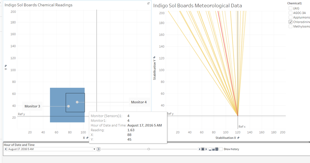
| Appluimonia | Indigo Sol Boards |
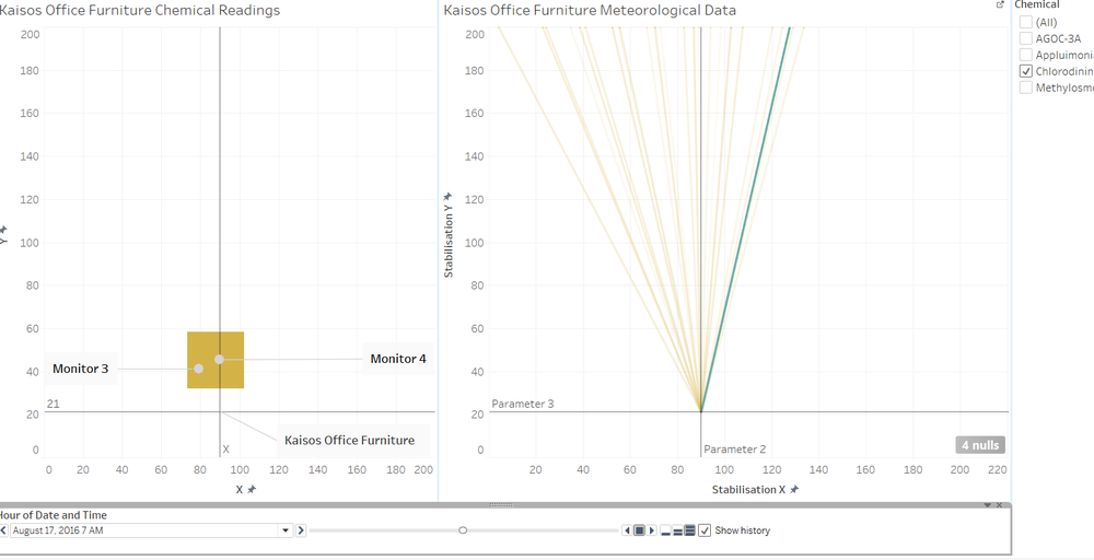
| Chlorodinine | Roadrunner Fitness Electronics
Kaisos Office Furniture |
| Methylosmolene | Roadrunner Fitness Electronics |
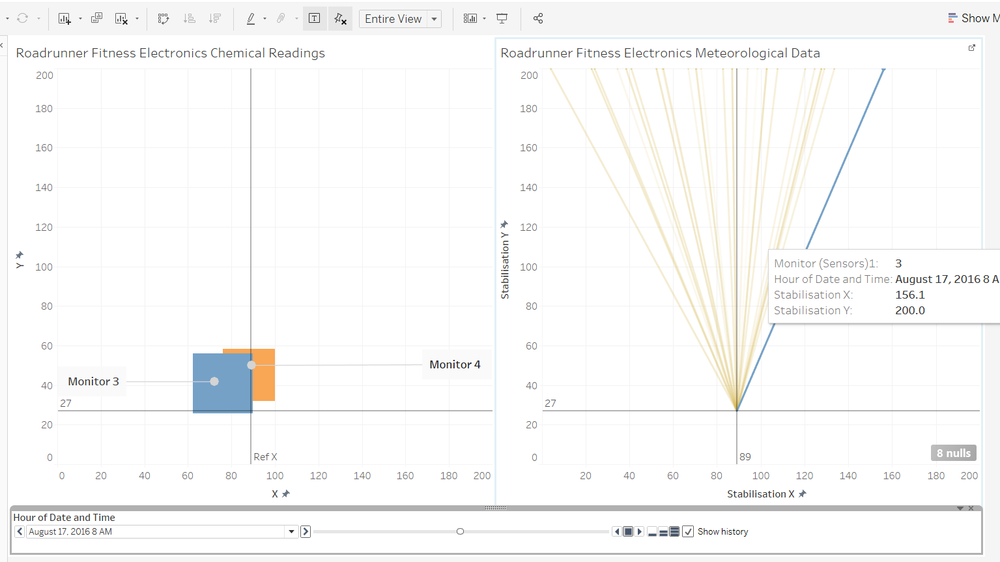
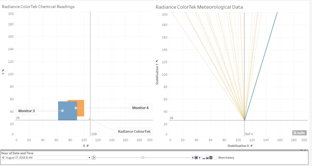
The highest readings of the chemicals were recorded and their timestamps were recorded. Then based on the date and a lag of the previous wind directions, as shown by the yellow lines, the factories which were least likely to have released were eliminated. Then the second highest readings were taken and the steps repeated. If the results were inconclusive, then more than q factory would be considered to release high amounts of that chemical.
Visualisation
Roadrunner Fitness Electronics
Conclusion
AGOC-3A is unlikely to be a contributing factor of the dwindling numbers of the Rose-crested Blue Pitpits. However, it cannot be ruled out that Roadrunner, the sole contributor of AGOC-3A is not responsible as it also releases Cholorodinine and Methylosmolene, both of which are harmful to the environment.
Based on the high readings of Sensors 3 and 4, despite possible malfunctions, the factories are releasing increasing amounts of the remaining 3 chemicals. However, most worrying is the surge in Methylosmolene which Roadrunner is a major contributor of. Hence, Mitch should look into Roadrunner Fitness Electronics for further answers.


