IS428 2017-18 T1 Assign Tan Yong Jin
Contents
Problem Overview
Link to the Assignment Information
Mistford is a mid-size city is located to the southwest of a large nature preserve. The city has a small industrial area with four light-manufacturing endeavors. Mitch Vogel is a post-doc student studying ornithology at Mistford College and has been discovering signs that the number of nesting pairs of the Rose-Crested Blue Pipit, a popular local bird due to its attractive plumage and pleasant songs, is decreasing! The decrease is sufficiently significant that the Pangera Ornithology Conservation Society is sponsoring Mitch to undertake additional studies to identify the possible reasons. Mitch is gaining access to several datasets that may help him in his work, and he has asked you (and your colleagues) as experts in visual analytics to help him analyze these datasets.
Mitch Vogel was immediately suspicious of the noxious gases just pouring out of the smokestacks from the four manufacturing factories south of the nature preserve. He was almost certain that all of these companies are contributing to the downfall of the poor Rose-crested Blue Pipit bird. But when he talked to company representatives and workers, they all seem to be nice people and actually pretty respectful of the environment.
In fact, Mitch was surprised to learn that the factories had recently taken steps to make their processes more environmentally friendly, even though it raised their cost of production. Mitch discovered that the state government has been monitoring the gaseous effluents from the factories through a set of sensors, distributed around the factories, and set between the smokestacks, the city of Mistford and the nature preserve. The state has given Mitch access to their air sampler data, meteorological data, and locations map. Mitch is very good in Excel, but he knows that there are better tools for data discovery, and he knows that you are very clever at visual analytics and would be able to help perform an analysis.
Background Information
With the passage of the Mistford Pact of 2010, the town and the Preserve have set into place certain safeguards to help ensure the safety of the people, animals, and vegetation of our area. When Mistford began growing its manufacturing industry, both the town and the companies wished to ensure an environmentally sound and economically supportive partnership. With these aims in mind, air sampling sensors have been placed near the town and in the Preserve to monitor air quality.
The Chemicals
These sensors collect information on several substances of potential concern, including:
Appluimonia – An airborne odor is caused by a substance in the air that you can smell. Odors, or smells, can be either pleasant or unpleasant. In general, most substances that cause odors in the outdoor air are not at levels that can cause serious injury, long-term health effects, or death to humans or animals. However, odors may affect your quality of life and sense of well-being. Several odor-producing substances, including Appluimonia, are monitored under this program.
Chlorodinine – Corrosives are materials that can attack and chemically destroy exposed body tissues. Corrosives can also damage or even destroy metal. They begin to cause damage as soon as they touch the skin, eyes, respiratory tract, digestive tract, or the metal. They might be hazardous in other ways too, depending on the particular corrosive material. An example is the chemical Chlorodinine. It has been used as a disinfectant and sterilizing agent as well as other uses. It is harmful if inhaled or swallowed.
Methylosmolene – This is a trade name for a family of volatile organic solvents. After the publication of several studies documenting the toxic side effects of Methylosmolene in vertebrates, the chemical was strictly regulated in the manufacturing sector. Liquid forms of Methylosmolene are required by law to be chemically neutralized before disposal.
AGOC-3A – New environmental regulations, and consumer demand, have led to the development of low-VOC and zero-VOC solvents. Most manufacturers now use one or more low-VOC substances and Mistford’s plants have wholeheartedly signed on. These new solvents, including AGOC-3A, are less harmful to human and environmental health.
The 4 Manufacturing Companies Near Mistford
Roadrunner Fitness Electronics – Roadrunner produces personal fitness trackers, heart rate monitors, headlamps, GPS watches, and other sport-related consumer electronics. Roadrunner began as one of the region’s first fitness stores in 1962, with an eye toward outfitting the entire nation with appropriate outdoor gear. After an earthquake nearly destroyed their main warehouse in 1968, Roadrunner turned a bad situation into a glowing success with the first “slightly damaged goods” sale. After which they began to focus on manufacturing; though their “Earthshaking Bargains” business still sells dented, overstocked and refurbished items over the internet and from a small retail shop attached to their front office.
Kasios Office Furniture – Kasios Office Furniture manufactures metal and composite-wood office furniture including desks, tables, and chairs. Kasios wants to do with desk chairs what Starbucks did for coffee – making office furniture what people must have, instead of what they just need. “Office equipment doesn’t need to be ugly!” says founder Ken Kasios. “We have redesigned all office products to be cool, fun, and hip—even your basic stapler.” Kasios business model is focused on in-store merchandising highlighting the beauty and functionality of their “user-centered design”. They recently celebrated the one-year anniversary of a distribution and merchandising agreement with the national office supply chain store PaperKlips.
Radiance ColourTek – Radiance produces solvent based optically variable metallic flake paints. “Metallic paints with an untarnished reputation!” quips ColourTek’s Senior Vice President Arthur Donner. “Radiance ColourTek metallic paints are worth their weight in gold.” Offering a new generation of paints in the 1970s, Radiance out marketed all competitors for three decades until manufacturing process issues began to tarnish their reputation. “We were challenged,” said Donner. “Polishing up our pearlescent pigments caused us to lose luster, but now we have the lowest VOCs (volatile organic compounds) in the industry!”
Indigo Sol Boards – Indigo Sol produces skateboards and snowboards. Founder Billy Keys started off manufacturing wooden wine barrels for northwestern US wineries, but then navigated a course from decorative fiberglass wine barrels to making his first pair of fiberglass skis in 1971. Excellent product and sales decisions rocketed Keys Skis production to unexpected levels, until they were bought out by a large Denver, Colorado-based private investment group. Keys returned to making specialized snowboards in the 1980s, with a small company in Mistford called Indigo Sol. The company has seen modest growth in recent years.
The Task
General task
The four factories in the industrial area are subjected to higher-than-usual environmental assessment, due to their proximity to both the city and the preserve. Gaseous effluent data from several sampling stations has been collected over several months, along with meteorological data (wind speed and direction), that could help Mitch understand what impact these factories may be having on the Rose-Crested Blue Pipit. These factories are supposed to be quite compliant with recent years’ environmental regulations, but Mitch has his doubts that the actual data has been closely reviewed. Could visual analytics help him understand the real situation?
The primary job for Mitch is to determine which (if any) of the factories may be contributing to the problems of the Rose-crested Blue Pipit. Often, air sampling analysis deals with a single chemical being emitted by a single factory. In this case, though, there are four factories, potentially each emitting four chemicals, being monitored by nine different sensors. Further, some chemicals being emitted are more hazardous than others. Your task, as supported by visual analytics that you apply, is to detangle the data to help Mitch determine where problems may be. Use visual analytics to analyze the available data and develop responses to the questions below.
The specific tasks
- Characterize the sensors’ performance and operation. Are they all working properly at all times? Can you detect any unexpected behaviors of the sensors through analyzing the readings they capture?
- Now turn your attention to the chemicals themselves. Which chemicals are being detected by the sensor group? What patterns of chemical releases do you see, as being reported in the data?
- Which factories are responsible for which chemical releases? Carefully describe how you determined this using all the data you have available. For the factories you identified, describe any observed patterns of operation revealed in the data.
Interactive Dashboard
Data Cleaning & Manipulation
Sensor Readings
Missing Data
As shown in Sensors Performance and Operations, there are missing data. Since the percentage of missing data within the provided data set is relatively small at 0.3% (245 missing out of 79488 records), there will be no attempts to estimate the readings for these missing data.
Meteorological Data
Elevation
Since there is only 1 entry for the column "Elevation", I believe it refers to the height of the Meteorological Station collecting the Meteorological Data. Since it has no further useful information, I have decided to remove it and not include it for further analysis.
Wind Speed
Since the wind speed is measured in meters per second and the provided map is measure in miles, the readings are also collected each hour. There is a need to convert the wind speed to a measurement unit easier to use, which is miles/hour.
From the conversion rate found from Google, the below image shows that 1 meter per second is equivalent to 2.23694 miles per hour. As such, in the Meteorological Data provided, I have created a new column (using JMP) showing the Wind Speed in Miles per Hour using the formula:
The below image shows a snippet of the output of my Meteorological dataset after the Wind Speed conversion.
Sensor Location
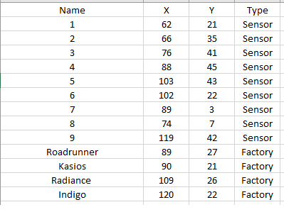
Since the original data source does not include the coordinates of the factories, the information of these factories are added in and saved as a brand new data set.
The final output is shown below:
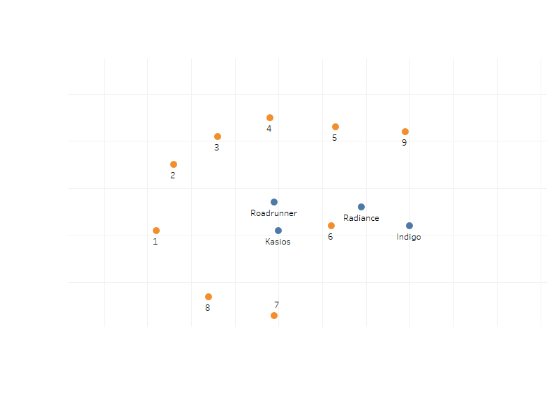
This is used, in order to plot out the location of all the sensors and factories, without relying on the provided background map. The plotted map is as shown below:
Data Joining
As there are 3 data sets provided and there are common columns that serve as a link between all the 3 different data sets, these 3 data sets can be merged together and be represented in a single data file. These 3 files are joined by JMP, using Table Join function which I had learn from this YouTube video.
The joined output is as shown below:
If you look closely, the Date Time format is different as it is in the format d/m/y h:m rather than m/d/y h:m as provided initially. This is because as the number of dimensions in the data grow larger, it takes up more time for Tableau to load this data set in xls format just like the initial provided data sets.
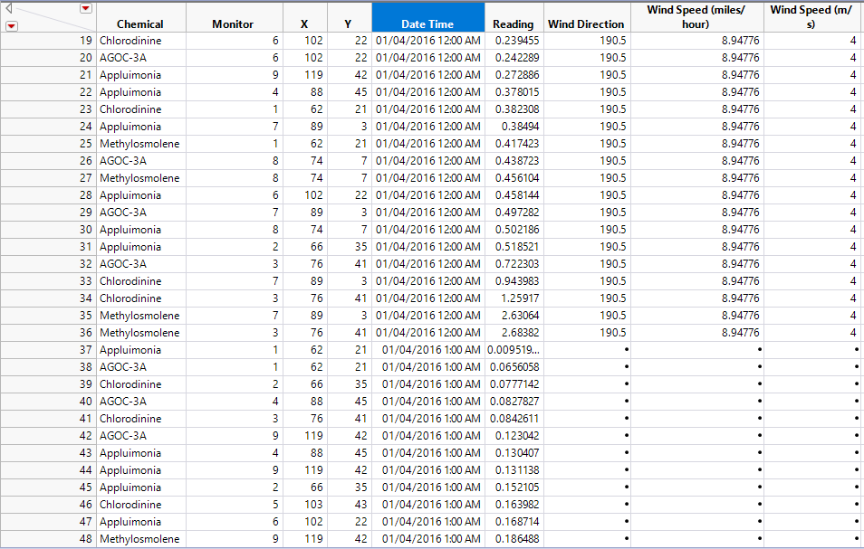
After the data sets are joined, records which timestamps do not belong to every 3 hour intervals from 12am will have its meteorological columns empty just like the image shown below:
This is to be expected because the meteorological data is not recorded hourly, but this set of data will make it difficult for analysis to be done unless these missing values are estimated and filled.
As such, since meteorological data are recorded every 3 hours, I assume that the readings for subsequent hours should not vary greatly from the last recorded reading (1pm and 2pm readings will be of the same as 12pm reading, same goes for the other hours in the day).
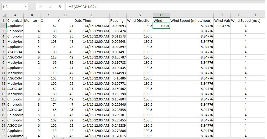
Filling my estimation for the unrecorded meteorological data will not be easy, due to the large amount of data within the data set. Using Excel, two new rows were created for me to get the actual values of the wind direction and speed at each data point.
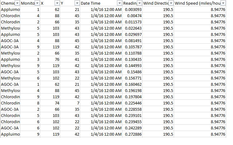
The image above shows the data manipulation I did via Excel. In the two new rows created (Wind, Wind Value), I had inserted the formula in the cell to extract actual value correctly. What the formula does is:
- The cell will check if the value of the left cell is empty
- If so, the cell will take the value of the cell above it (Previous Value)
- If not, the cell will take the value of the cell on the left
This makes it easy to fill up the actual data and estimated data of the Wind Direction and Wind Speed. The values generated and then copied and replace the Wind Direction and Wind Speed columns, then afterwards the Wind Speed in meters per second are also removed. The final output of the data set which will be used for further analysis is shown below:
Lastly, I have decided to export this data set as a csv file which does not contain formatting information as compared to xls files, this makes it faster for Tableau to load the data file. However, since the formatting information is removed also, Tableau treats the date information in the format of d/m/y by default and thus I had to convert the date format into d/m/y h:m for Tableau to interpret the date data as what I intended.
Results
Sensors’ Performance and Operation
- Are they all working properly at all times? Missing Data Each sensor records one reading for each of the 4 chemicals hourly for the months of April, August and December. In total, each sensor will have 8832 records in the data set (4 chemicals * 24 hours * 92 days). For all 9 sensors, there should be 79488 records in the provided data set. However, there are only 79243 records, this means that there are 245 records missing. From here, we can see that the sensors are not working properly as intended.
- Can you detect any unexpected behaviors of the sensors through analyzing the readings they capture?
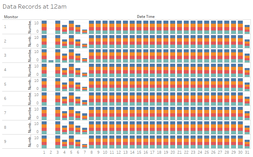
Furthermore, upon further analysis shown by the above image, all the 245 missing records are 12am records. The downtime would not be so coincidental at 12am(s) across different days, it could be due to external factors.
The above image is the breakdown of data records collected by all the sensors, filtered to shown data recorded at 0000 hours only. Each day should consist of 12 records, 1 record per month per chemical for 3 months and 4 chemicals. An exception is day 31 as April has only 30 days. We can see that there are missing data during the 2nd, 4th, 6th and 7th during the 3 months at 12am.
In summary, on these 4 days across the 3 months, only the dates where chemical readings are not fully collected on 12am are shown:
Y – No readings recorded
N – Partial readings (1 to 3 records) recorded
| Date\Sensor | 1 | 2 | 3 | 4 | 5 | 6 | 7 | 8 | 9 |
|---|---|---|---|---|---|---|---|---|---|
| 2nd Apr | N | N | N | N | N | N | N | N | N |
| 6th Apr | N | N | N | N | N | N | N | N | N |
| 2nd Aug | N | N | Y | N | N | N | N | N | N |
| 4th Aug | N | N | N | N | N | N | N | N | N |
| 7th Aug | N | N | N | N | N | N | N | N | N |
| 2nd Dec | N | N | N | N | N | N | N | N | N |
| 7th Dec | N | N | N | N | N | Y | Y | Y | N |
Duplicate Data
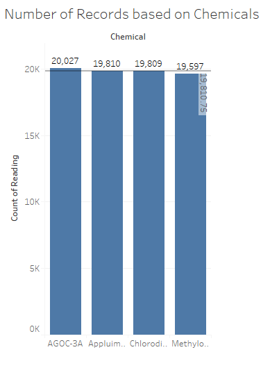
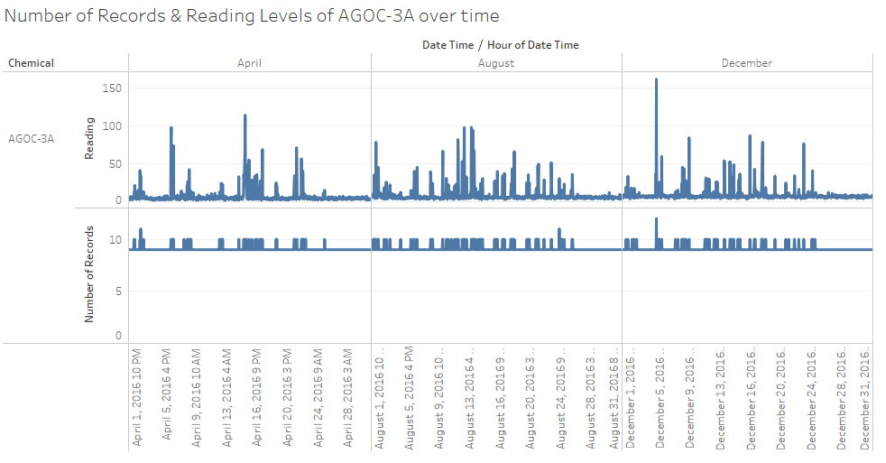
The above diagram shows the breakdown of records by each of the 4 Chemicals. We can see that the number of readings of Appluimonia and Chlorodinine are close to the average of 19180.75. However, for AGOC-3A and Methylosmolene, the number of records are far from the average value in opposite directions (AGOC-3A: +216.25, Methylosmolene: -213.75), since the difference for the 2 chemicals are quite similar, I suspect there could be Methylosmolene readings recorded wrongly as AGOC-3A by the sensors.
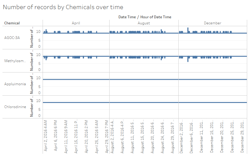
The above chart confirms my suspicions. For Appluimonia and Chlorodinine, the number of records recorded are stable. However, for AGOC-3A and Methylosmolene, the trend lines are a mirror reflection of each other, a decrease in data records for Methylosmolene will reflect an increase of data records in the same amount of AGOC-3A.
The above image shows that reading level spikes in AGOC-3A are mainly due to the wrongly recorded readings from Methylosmolene, as a pattern can be seen here between the Number of Records and the reading levels.
As of why the sensors seem to not be able to fully accurately distinguish these 2 chemicals, it could be because they are similar in nature as solvents or properties. Thus, the sensor does not have the capability to distinguish these 2 chemicals apart at high concentration levels. Potential foul play could also be involved to hide Methylosmolene emissions as AGOC-3A, since AGOC-3A is a less harmful solvent as compared to Methylosmolene.
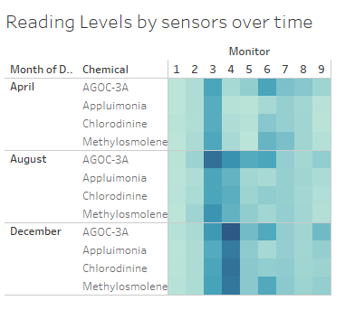
From the image above, we can see Sensor 3 has the highest level of readings among all the sensors, except against sensor 4 in December, this is despite the location of sensor 3 not being surrounded by all 4 factories just like sensor 6.
Here we can also see the level of chemical readings recorded by Sensor 4, across the 3 months, has an upward trend. This could be isolated problem with sensor 4 as if it is due to changes in emission patterns by the factories, the other sensors would have picked up the trend also.
For now, the unexpected behaviour of the readings of the sensor 3 and 4 cannot be fully explained without further analysis.
At the amount of information I have now, I would say that Sensor 3 could be faulty thus recording unusually higher readings of the chemicals despite its geographical location. For sensor 4, there must be another reason which is not associated with sensor problems or changing emission patterns of the 4 factories.
Chemicals
- Which chemicals are being detected by the sensor group?
- What patterns of chemical releases do you see, as being reported in the data?
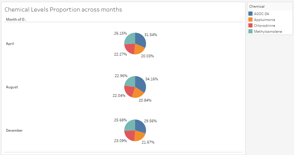
Firstly, from the above image, we can see that the sensors are capable of detecting all 4 chemicals. Although the proportion captured between the 4 chemicals could be different, this is due to the differing wind speed and direction and also the difference between factories in their emissions.
Also, the image shows that the total reading proportion across different chemicals over the 3 months are largely similar, except for August where AGOC-3A gain almost 3% from Methylosmolene. This could also show the release levels of Chlorodinine and Appluimonia are stable compared to the other 2 chemicals.
It seems that Appluimonia and Chlorodinine have a stable release rate throughout the day. For AGOC-3A is released heavily from 6am to 9pm while for Methylosmolene from 10pm to 5am, while for the remainder of the day they will release in levels like Appluimonia and Chlorodinine.
Factories identified later to be the main source of emission of AGOC-3A should be operating 6am to 9pm at the minimum and for Methylosmolene would be from 10pm to 5am. If by any chance, a single company is identified as a emitter of both chemicals, there could be possibility that that identified factory is run 24 hours by shift.
Reading levels for each of the 4 chemicals peaked on Fridays and Saturdays while falling back to low levels on Sundays before slowly picking up on Mondays. Sundays could either be an off day for the workers or a day when weekly product shipments are made from the factories.
Factories
- Which factories are responsible for which chemical releases?
- Carefully describe how you determined this using all the data you have available. For the factories you identified, describe any observed patterns of operation revealed in the data. Wind Direction is extensively used here, but as a continuous running number of 0 to 360, it could be difficult to visualize. First, I have determined there are no data entries which is wind speed is either 0 or 360 as they both mean the same direction, which is North. Next, for easier classification, I created 24 bins for Wind Direction at 15 degrees range covered by each bin. Each bin is labelled by multiples of 15 degrees, from 0 to 345 (0,15,30,45 and so on). The range covered by each bin is mentioned at 15 degrees, but the label of the bin shows the midpoint of its range (Example: the bin labelled 15, covers from degrees 7.6 to 22.5, with 15 at the center). I had previously used 36 bins at 10 degrees each, labeling each record by rounding down to the nearest 10. This poses a problem as a data point with its Wind Direction at possibly 19 degrees will be labelled under 10 where it is closer to 20 instead. The number of bins also made it harder for me to do visual analysis. Thus, in face of this problem, I have decided to use smaller number of bins covering a wider degree and changing the way I allocate data points into each specific bin. AGOC-3A
| Roadrunner Fitness Electronics | Kasios Office Furniture | Radiance ColourTek | Indigo Sol Boards | |
|---|---|---|---|---|
| AGOC-3A | Possible | Primary Responsible | Responsible | Not Responsible |
| Appluimonia | Not Responsible | Not Responsible | Not Responsible | Responsible |
| Chlorodinine | Responsible | Not Responsible | Not Responsible | Not Responsible |
| Methylosmolene | Responsible | Responsible (Possibly Primary) | Not Responsible | Not Responsible |
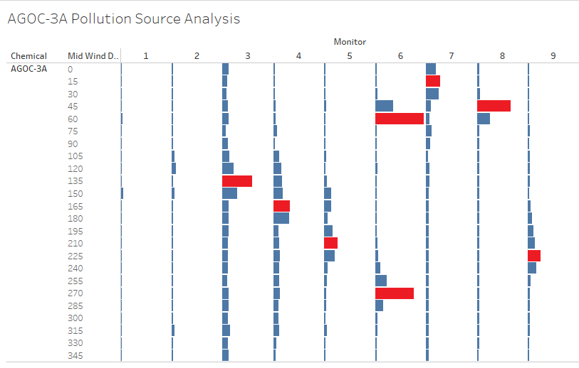
The image above shows the average reading levels of AGOC-3A according to the created bins for the direction of the wind origin. Sensor 1 and Sensor 2 have no unusually high reading levels associated with any Wind Direction, so they will be ignored for analysis.
However, for all the other 7 sensors, there are certain high reading levels of AGOC-3A associated with a certain Wind Direction. The higher reading levels (peaks) are highlighted out in red to be distinguished easily. It means when the wind is blowing from a certain direction, the average reading levels of AGOC-3A is higher, which could potentially show the source of pollution.
For these sensors, they have a single peak record, with the exception for sensor 6 which has 2 peaks. The twin peaks of reading levels of sensor 6 could instead indicate 2 possible sources of AGOC-3A pollution.
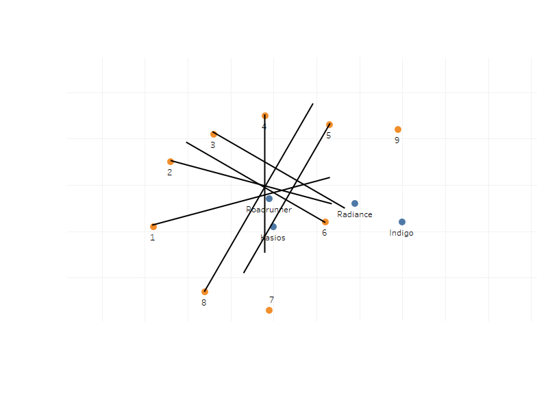
If the directions highlighted in red by each sensor are plotted on a map, it should be able to indicate more clearly the actual source of AGOC-3A pollution.
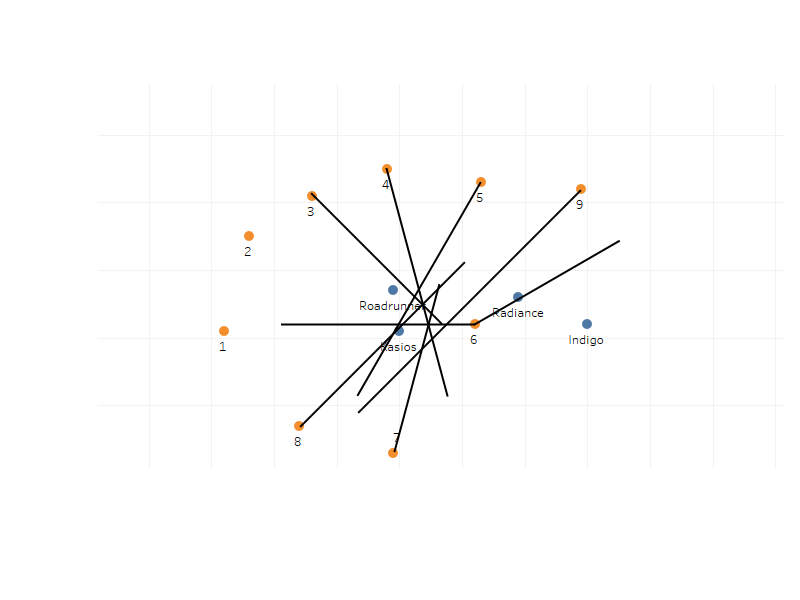
The image above is the map plotted with the wind where the average reading levels are high for each sensor. Apart from sensor 1 and 2, each sensor will have lines originated from its located towards the direction where they received the peak readings from. Since majority of the lines converged heavily around Kasios, it can be determined that Kasios is primary responsible for the emission of AGOC-3A. However, Roadrunner could also be a potential emitter of AGOC-3A due to the proximity of Roadrunner to Kasios and the loss of precision in direction due to the bin classification of Wind Direction. Radiance is an emitter of AGOC-3A, although not as heavily as Kasios, from the twin peak results we saw from Sensor 6 and the fact that the line from Sensor point towards the vicinity of Radiance. Indigo here, can be seen to be not an emitter of AGOC-3A.
Appluimonia
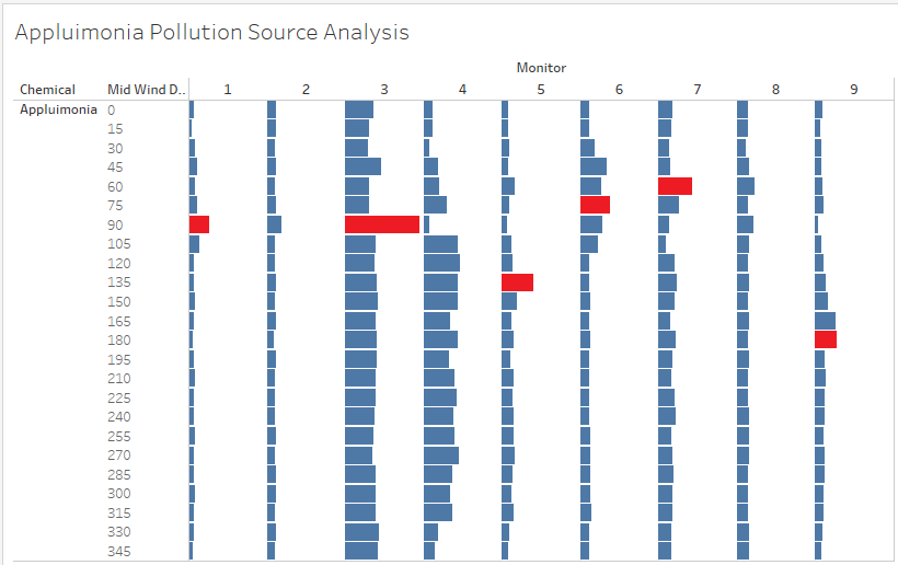
The image above shows the average reading levels of Appluimonia according to the created bins for the direction of the wind origin. Sensor 2, Sensor 4 and Sensor 8 have no unusually high reading levels associated with any Wind Direction, so they will be ignored for analysis.
However, for all the other 7 sensors, there are certain high reading levels of Appluimonia associated with a certain Wind Direction. The higher reading levels (peaks) are highlighted out in red to be distinguished easily. It means when the wind is blowing from a certain direction, the average reading levels of Appluimonia is higher, which could potentially show the source of pollution.
If the directions highlighted in red by each sensor are plotted on a map, it should be able to indicate more clearly the actual source of Appluimonia pollution.
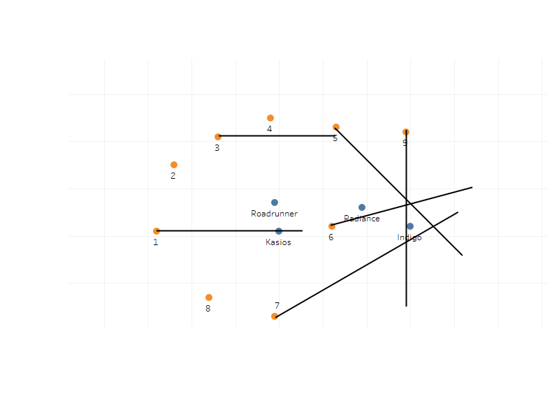
The image above is the map plotted with the wind where the average reading levels are high for each sensor. Apart from sensor 2,4 and 8, each sensor will have lines originated from its located towards the direction where they received the peak readings from.
Since majority of the lines converged heavily around Indigo, it can be determined that Indigo is primary responsible for the emission of Appluimonia.
Kasios is not responsible for the emission of Appluimonia despite having a line across it because there is no 2nd peak from Sensor 6 that shows emissions of Appluimonia from Kasios, it just happened to be on the same direction as Indigo from Sensor 1.
Chlorodinine
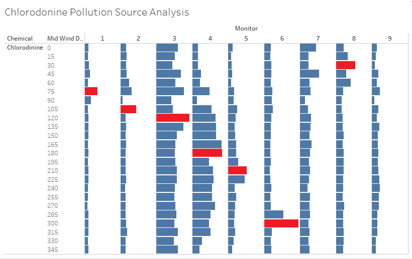
The image above shows the average reading levels of Chlorodinine according to the created bins for the direction of the wind origin. Sensor 7 and 9 have no unusually high reading levels associated with any Wind Direction, so they will be ignored for analysis.
However, for all the other 7 sensors, there are certain high reading levels of Chlorodinine associated with a certain Wind Direction. The higher reading levels (peaks) are highlighted out in red to be distinguished easily. It means when the wind is blowing from a certain direction, the average reading levels of Chlorodinine is higher, which could potentially show the source of pollution.
If the directions highlighted in red by each sensor are plotted on a map, it should be able to indicate more clearly the actual source of Chlorodinine pollution.
The image above is the map plotted with the wind where the average reading levels are high for each sensor. Apart from sensor 7 and 9, each sensor will have lines originated from its located towards the direction where they received the peak readings from.
Since majority of the lines converged heavily around Roadrunner, it can be determined that Roadrunner is primary responsible for the emission of Chlorodinine.
Methylosmolene
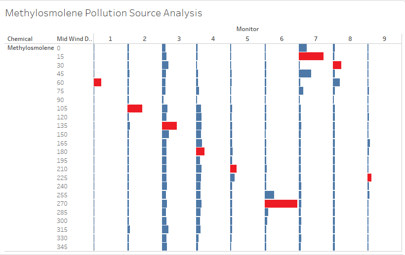
The image above shows the average reading levels of Methylosmolene according to the created bins for the direction of the wind origin.
All the sensors have shown certain high reading levels of Methylosmolene associated with a certain Wind Direction. The higher reading levels (peaks) are highlighted out in red to be distinguished easily. It means when the wind is blowing from a certain direction, the average reading levels of Methylosmolene is higher, which could potentially show the source of pollution.
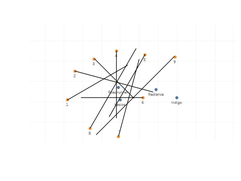
If the directions highlighted in red by each sensor are plotted on a map, it should be able to indicate more clearly the actual source of Methylosmolene pollution.
The image above is the map plotted with the wind where the average reading levels are high for each sensor. Each sensor will have lines originated from its located towards the direction where they received the peak readings from.
Since majority of the lines converged heavily around Roadrunner and Kasios, it can be determined that both companies are responsible for the emission of Methylosmolene.
However, we know that some records of Methylosmolene were recorded as AGOC-3A. Kasios, determined to be the main source of emitter of AGOC-3A, could potentially be the primary emitter of Methylosmolene out of the 2 companies
Comparison between different software
For data cleaning, JMP offers lots of features to manipulate data such as joining and column formulas. But when faced with unconventional missing data such as missing meteorological data in between rows, it is unable to do anything. JMP is good for column manipulation but not for rows, which Excel give me the flexibility to do so via cell formula.
I used JMP mainly for Data Cleaning, however I did also try to visual some charts using JMP. JMP has a range of charts made available to be used directly. However, the user interface of JMP to insert data for the charts does not seem to be that easy to use as compared to Tableau. JMP charts are not as visually appealing as Tableau but they do have more kinds of charts to be used such as a Contour Plot.
The good thing about Power BI is the ability to drill-down and roll-up by interacting with the chart, but in terms of usage it is not as straightforward as Tableau. Tableau's clean user interface is what I really enjoy when using it.
Tableau is easy and clean to use, but lacks in performance. The charts load slower in Tableau and Tableau is not able to support loading of a large data set in xlsx format which caused my machine to hang, which made me cleaned my data files and exported it in csv format.
From this Assignment I can see that although these Visualization tools are useful to have, but they do not cover every possible tool and charts that needs to be used. I have considered using a Radar Plot for visualizing pollution source, but because it cannot be done in Tableau for multiple sensors, I had no choice but to stick with the manual way of visualization using drawings.
Tableau is good to be used for the common visualization of data such as bars, lines, pies, maps. But for anything more advanced, it cannot be done using Tableau. This lack of customized charts for Tableau is the main reason why D3.js is so popular with the Data Science community due to its ability to visualize data in whole new different ways.
Areas for improvement
- For this Assignment, the data provided requires minimum cleaning. Thus I did much of the data cleaning via simple data joining and manipulation via formulas, without going deeply to the underlying data distribution to determine if possible skewness can be affecting my analysis.
- For the misreading of Methylosmolene data into AGOC-3A, I could have performed some kind of analysis to determine which record belongs to which exact Chemical in order to allocate them into correct chemicals and to obtain a much more accurate data of all the sensor readings.
- I assumed air particles carried by the wind traveled straight along with the direction of the wind. Apparently, I do not think winds work that way in real life. More possibly, I think air particles carried by the wind travels in a cone from the wind origin based on the wind direction, strength of the wind and maybe air pressure and other environmental factors.
- My lack of visualization ability caused greater inaccuracies in report finding.
- There is no other way I could visualize data in a 360 degree setting thus having forced to bin them into smaller amounts which causes direction aggregation when performing analysis on the pollution source. This is particular so in this Assignment where factories could be situated close to one another, such as Roadrunner and Kasios.
Programs used
- Tableau 10.3
- JMP Pro 13
- Microsoft Excel
- Paint.net 4.0.19
- Paint
References
- Google Search for Wind Speed Conversion Rate, https://www.google.com
- How to Join Two Data Tables into One Using Matching Columns in JMP, https://www.youtube.com/watch?v=UrW0X3XfHFA

