IS428 2017-18 T1 Assign Wang Maioqing
Contents
Links
Overview
Background
Mistford is a mid-size city is located to the southwest of a large nature preserve. The city has a small industrial area with four light-manufacturing endeavors. Mitch Vogel is a post-doc student studying ornithology at Mistford College and has been discovering signs that the number of nesting pairs of the Rose-Crested Blue Pipit, a popular local bird due to its attractive plumage and pleasant songs, is decreasing! The decrease is sufficiently significant that the Pangera Ornithology Conservation Society is sponsoring Mitch to undertake additional studies to identify the possible reasons. Mitch is gaining access to several datasets that may help him in his work, and he has asked you (and your colleagues) as experts in visual analytics to help him analyze these datasets.
Mitch Vogel was immediately suspicious of the noxious gases just pouring out of the smokestacks from the four manufacturing factories south of the nature preserve. He was almost certain that all of these companies are contributing to the downfall of the poor Rose-crested Blue Pipit bird. But when he talked to company representatives and workers, they all seem to be nice people and actually pretty respectful of the environment.
In fact, Mitch was surprised to learn that the factories had recently taken steps to make their processes more environmentally friendly, even though it raised their cost of production. Mitch discovered that the state government has been monitoring the gaseous effluents from the factories through a set of sensors, distributed around the factories, and set between the smokestacks, the city of Mistford and the nature preserve. The state has given Mitch access to their air sampler data, meteorological data, and locations map. Mitch is very good in Excel, but he knows that there are better tools for data discovery, and he knows that you are very clever at visual analytics and would be able to help perform an analysis.
General Task
The four factories in the industrial area are subjected to higher-than-usual environmental assessment, due to their proximity to both the city and the preserve. Gaseous effluent data from several sampling stations has been collected over several months, along with meteorological data (wind speed and direction), that could help Mitch understand what impact these factories may be having on the Rose-Crested Blue Pipit. These factories are supposed to be quite compliant with recent years’ environmental regulations, but Mitch has his doubts that the actual data has been closely reviewed. Could visual analytics help him understand the real situation?
The primary job for Mitch is to determine which (if any) of the factories may be contributing to the problems of the Rose-crested Blue Pipit. Often, air sampling analysis deals with a single chemical being emitted by a single factory. In this case, though, there are four factories, potentially each emitting four chemicals, being monitored by nine different sensors. Further, some chemicals being emitted are more hazardous than others. Your task, as supported by visual analytics that you apply, is to detangle the data to help Mitch determine where problems may be. Use visual analytics to analyze the available data and develop responses to the questions below.
Data Analysis and Preparation
Factory Location
| Issue:
Data Format of Factory locations |
|---|
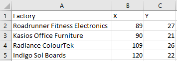
| Factory locations are provided in the word document as shown below, thus we need to convert it into proper format for later use. The following are the factory locations: |
| As the screen shot below, the factory data now is organized in the x/y-coordinate format. |
Meteorological Data
| Issue:
Extra column of - Elevation(m) |
|---|
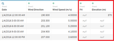
| By examining the dataset- Meteorological Data.xlsx, I found that there is an extra column Elevation(m)
|
| when import data into tableau (e.g. Fig. Meteorological Data), it will read the empty column after Wind Speed (m/s) as F4, and recognize Elevation(m) as a column label that has many null values, which may affect our analysis. Thus, we have to remove it. |
Sensor Data and Sensor Location
| Issue:
Sensor Data and Sensor Location are in the separate files. We have to combine them together so that we can link the reading records to corresponding sensors. |
|---|
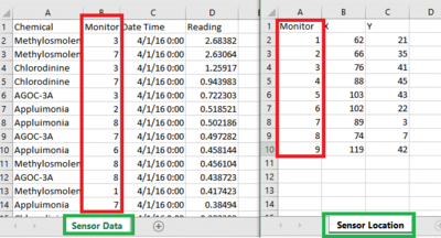
| As the screen shot below, Sensor Data is shown on the left side, Sensor Location is on the right side. We can observed that both files have common column- Monitor (highlighted in red box) |
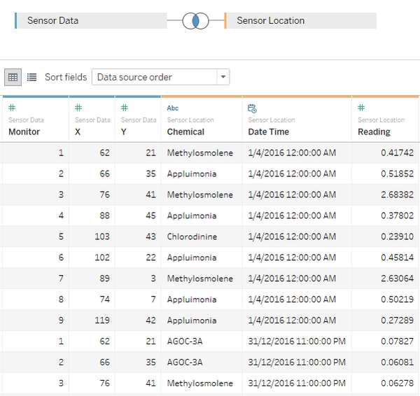
| Thus, we can use inner join function in Tableau to combine them together |
The specific tasks
Task 1
Characterize the sensors’ performance and operation. Are they all working properly at all times? Can you detect any unexpected behaviors of the sensors through analyzing the readings they capture?Limit your response to no more than 9 images and 1000 words.
Calendar Heat Map
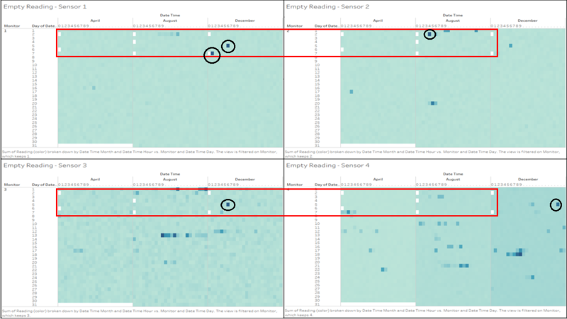
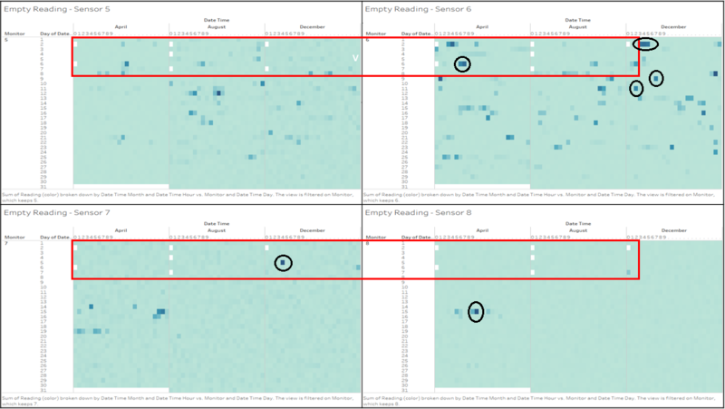
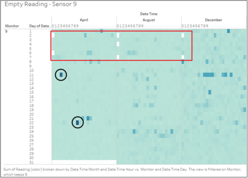
The graphs below (Fig. 1.1 to 1.3) summarize the overview of sensor readings. The cell represents the reading captured by the sensor, different colour hue represents different level of readings, for example, light blue represents low level of readings (i.e. chemical releases level is low), dark blue shows high level of readings. White colour indicates there is an absence of sensor readings.
1. Empty Reading
As can be seen from the above graphs, Fig. 1-1 to 1-3 shows the existence of empty readings (which are highlighted in red box) at midnight (0:00am) on 2nd Apr, 6th Apr, 2nd Aug, 4th Aug, 7th Aug, 2nd Dec and 7th Dec. For the ease of reference, I have summarized all missing data into table format as below, No indicates empty reading, Yes indicates non-empty reading.
| Sensor 1 | Sensor 2 | Sensor 3 | Sensor 4 | Sensor 5 | Sensor 6 | Sensor 7 | Sensor 8 | Sensor 9 | |
|---|---|---|---|---|---|---|---|---|---|
| 2nd-Apr | No | No | No | No | No | No | No | No | No |
| 6th-Apr | No | No | No | No | No | No | No | No | No |
| 2nd-Aug | No | No | Yes | No | No | No | No | No | No |
| 4th-Aug | No | No | No | No | No | No | No | No | No |
| 7th-Aug | No | No | No | No | No | No | No | No | No |
| 2nd-Dec | No | No | No | No | No | No | No | No | No |
| 7th-Dec | No | No | No | No | No | Yes | Yes | Yes | No |
2. Abnormal Reading
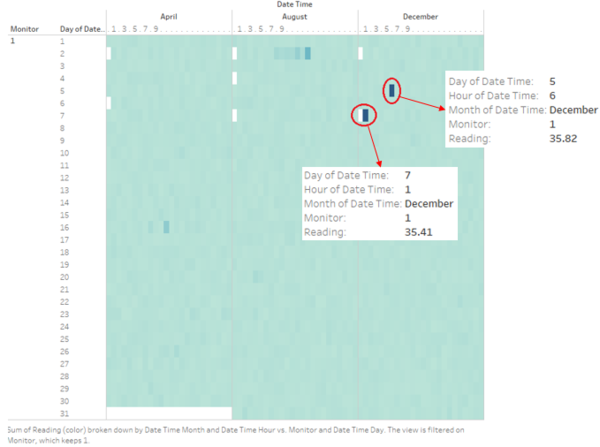
As highlighted in the black cycle, from calendar heat maps, we can also observe abnormal readings(i.e. cell colour turned into dark blue suddenly) captured by the sensors. Take the heat map of sensor 1 as an example- which shows the chemical concentration readings of Monitor 1 in Apr, Aug and December breakdown by day and hour. By Zooming in, we can see the some readings spikes sharply at some specific hours. As shown, Sensor 1 gets a reading of 35.82 at 6am on 5th-Dec and gets a reading of 35.41 at 1am on 7th-Dec.
By examining each sensor heat maps (Fig. 1-1 to Fig. 1-3 above), we can find other abnormal readings for other sensors. For the ease of reference, the table below listed down some prominent abnormal readings for sensors 2-9.
| Sensor | Date/Time | Reading |
|---|---|---|
| 2 | 2 August 4:00 | 64.98 |
| 3 | 13 August 9:00 | 104.6 |
| 3 | 5 December 6:00 | 99.2 |
| 4 | 5 December 21:00 | 67.03 |
| 5 | 6 April 13:00 | 63.31 |
| 6 | 9 April 1:00 | 104.7 |
| 7 | 5 December 4:00 | 83.24 |
| 8 | 15 April 10:00 | 111.7 |
| 9 | 22 April 9:00 | 53.30 |
Dot Plot
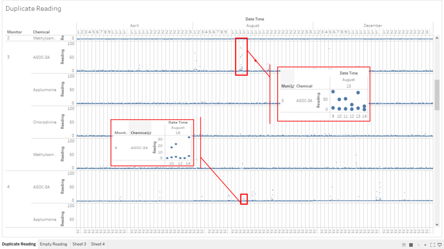
From Dot Plot, I also observed an existence of data redundancy at some specific hours on some days for monitors readings. Take for an example, the graphs below (Fig. 1-5) lists down the readings of different chemical releases for different Monitors over the time (breakdown by month, day and hour).
1. Data Redundancy
By drilling down further, we can see clearly that (as highlighted in the red box) on 13th Aug and 16th Aug, the Monitor 3 and 4 capture multiple readings of AGOC-3A at the specific hour.
Area Chart
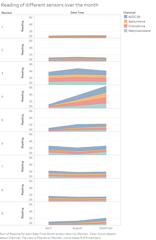
The graphs below (Fig. 1-6) presents the reading of different sensors in April, August and December. From the graph, we can observe that sensor 1 and sensor 2 has relative stable reading over the time. Sensor 4 shows a consistent sharp increase of reading over the months. Sensor 9 shows a slight increase over time. Sensor 6 shows there is a drop of reading in August
Task 2
Now turn your attention to the chemicals themselves. Which chemicals are being detected by the sensor group? What patterns of chemical releases do you see, as being reported in the data? Limit your response to no more than 6 images and 500 words.
Line Graph - 1
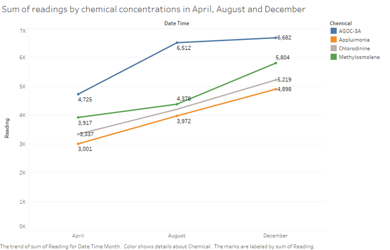
The graphs below (Fig. 2-1) presents sum of readings for each chemical concentration in April, August and December. Different colors represent different chemical releases. Overall, all these chemical concentrations present an upward trend from April to December. Both Appluimonia and Chlorodine display a linear growth over the time. Chemical AGOC-3A has highest reading among all chemical releases. From April to August, AGOC-3A displays a sharp increase, after that, the increase speed slows down. Chemical Methylosmoiene shows a different increasing trend, from April to August, there has been a steady increase, from August to December, it presents a sharp increase.
Line Graph - 2
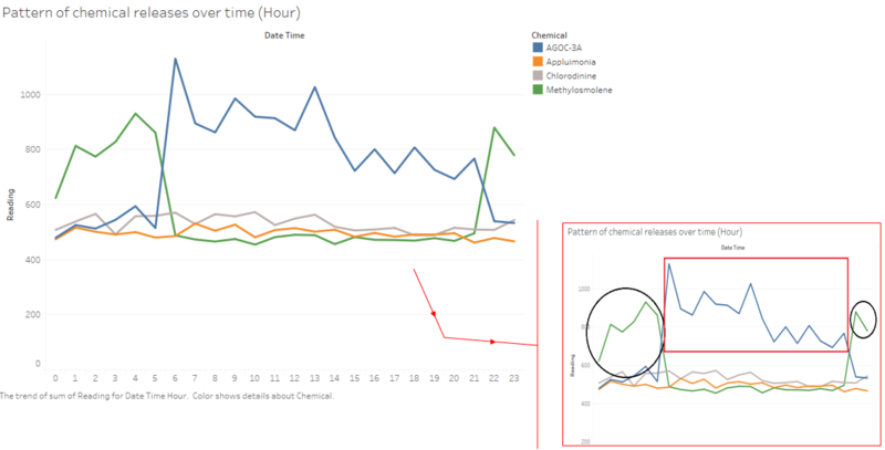
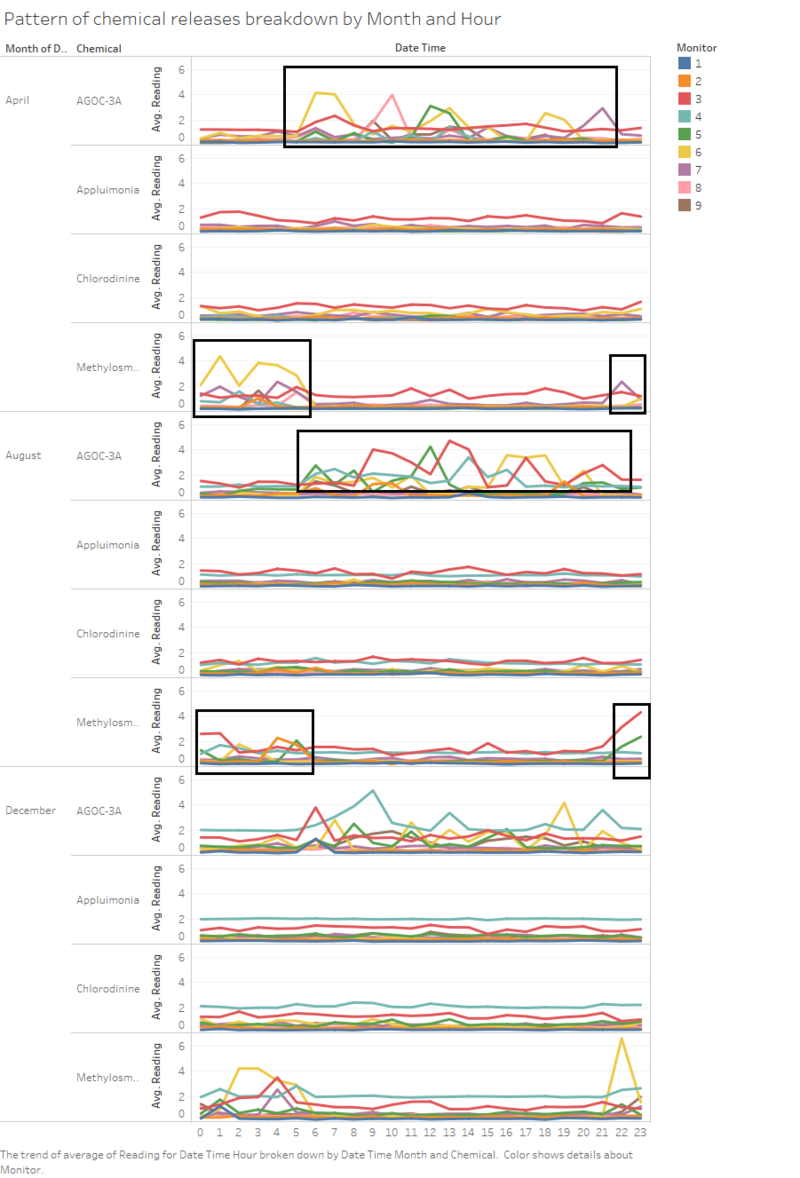
By drilling down the Date time to hour, we can see a more detailed pattern of chemical releases over time. The graph below (Fig. 2-2), shows the average reading of chemical releases over time (on hours). As can be seen from the graph, the pattern Appluimonia releases and Chlorodinine releases was relatively stable. AGOC-3A and Methylosmolene shows a significant release. AGOC-3A has relatively high releases from 6am to 21pm (highlighted in red box). Methylosmolene has significant releases from 22pm to 5 am (highlighted in black cycle).
Some Considerations: from the task1, I found there are some duplicate readings of chemical concentrations at the specific time (Fig. 1-5 ). Therefore, I used the average of readings to reduce the gap of readings at different hour.
Line Graph - 3
In addition, I further break down the above graph (Fig. 2-2) to focus on hourly readings of different chemical concentrations for different sensors in April, August and December. As can be seen from the graph (Fig. 2-3), the reading of Appluimonia and Chlorodine in these month remains relatively consistent in contrast to AGOC-3A and Methylosolene, which fluctuates sharply. In addition, we can also observe that the period of peak readings (highlighted in black box) of each month is very closed to above graph.
Pie Chart
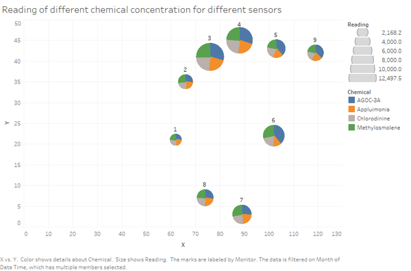
However, the above graph (Fig. 2-1 to Fig. 2-3) doesn't reveal any sensor information. To find out more, I create a pie chart (Fig. 2-4), which shows readings of different chemical concentrations for sensor 1 to sensor 9. Different colors represent different chemical releases, the size of pie charts indicates sum of readings captured by individual sensor. From the below graph, we can find that sensor 3 and sensor 4 have relative large readings among all the sensors.
Bar Graph
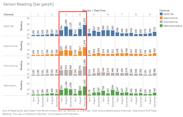
To further breakdown, we can observe detailed distributions of different chemical concentrations in April, August and December (breakdown by sensors) from the bar chart below (Fig. 2-5). The colour represents different chemical concentrations.
As highlighted in the red box, overall, sensor 3 has relative higher readings of each chemical concentrations in these month. Sensor 4 shows a steady growth of readings of each chemical concentrations from April to December.
Task 3
Which factories are responsible for which chemical releases? Carefully describe how you determined this using all the data you have available. For the factories you identified, describe any observed patterns of operation revealed in the data. Limit your response to no more than 8 images and 1000 words.
WindRose
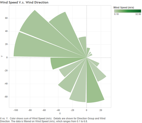
The graph (Fig. 3-1) below shows an overview of Meteorological Data.xlsx. It shows speed of wind blowing from each direction. The colour gives the speed category (e.g. blustery or breezy), From the wind rose below, we can observe how wind patterns change throughout the time. As presented, winds from the NW (North West) direction is most common, followed by SW (south west), whereas the winds from NE (North East) direction is least common.
Factory Radiance ColourTek - responsible for AGOC-3A
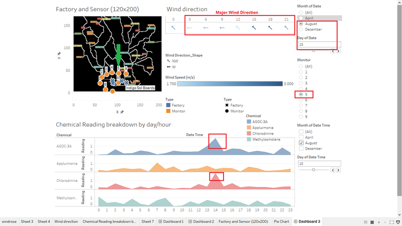
By changing the date/time in the dashboard, we can observe that over the time, this factor contributed to large amount of AGOC-3A release.Take for the example, from the graph (Fig. 3-2) below, we can find that on the 15-Aug, the major wind direction is NW (North West) and W (west), sensor 5 captures relative high reading of all chemical releases. From highlighted (red box), we can observe that chemical AGOC-3A, and Chlorodinine at 14:00pm
References
windrose
1. https://community.tableau.com/thread/122640
2. https://sustainabilityworkshop.autodesk.com/buildings/wind-rose-diagrams
wind direction
1. https://community.tableau.com/thread/148044
