IS428 2017-18 T1 Assign Lee Ting Kon Jeremy
Contents
Links
Problem & Motivation
Mistford is a mid-size city is located to the southwest of a large nature preserve. The city has a small industrial area with four light-manufacturing endeavors. Mitch Vogel is a post-doc student studying ornithology at Mistford College and has been discovering signs that the number of nesting pairs of the Rose-Crested Blue Pipit, a popular local bird due to its attractive plumage and pleasant songs, is decreasing! The decrease is sufficiently significant that the Pangera Ornithology Conservation Society is sponsoring Mitch to undertake additional studies to identify the possible reasons. Mitch is gaining access to several datasets that may help him in his work, and he has asked you (and your colleagues) as experts in visual analytics to help him analyze these datasets.
Mitch Vogel was immediately suspicious of the noxious gases just pouring out of the smokestacks from the four manufacturing factories south of the nature preserve. He was almost certain that all of these companies are contributing to the downfall of the poor Rose-crested Blue Pipit bird. But when he talked to company representatives and workers, they all seem to be nice people and actually pretty respectful of the environment.
In fact, Mitch was surprised to learn that the factories had recently taken steps to make their processes more environmentally friendly, even though it raised their cost of production. Mitch discovered that the state government has been monitoring the gaseous effluents from the factories through a set of sensors, distributed around the factories, and set between the smokestacks, the city of Mistford and the nature preserve. The state has given Mitch access to their air sampler data, meteorological data, and locations map. Mitch is very good in Excel, but he knows that there are better tools for data discovery, and he knows that you are very clever at visual analytics and would be able to help perform an analysis.
Background Information
| Companies | Description | Location |
|---|---|---|
| Roadrunner Fitness Electronics | Produces personal fitness trackers, heart rate monitors, headlamps, GPS watches, and other sport-related consumer electronics. | 89,27 |
| Kasios Office Furtniture | Manufactures metal and composite-wood office furniture including desks, tables, and chairs. | 90,21 |
| Radiance ColourTek | Produces solvent based optically variable metallic flake paints with the lowest volatile organic compounds in industry. | 109,26 |
| Indigo Sol Boards | Produces skateboards and snowboards and has seen modest growth in recent years. | 120,22 |
| Chemicals | Description |
|---|---|
| Appluimonia | It is an airborne odor is caused by a substance in the air that you can smell. While it does not cause serious injury, long-term health effect, or death to humans or animals, it may affect the quality of life and sense of well-being. |
| Chlorodinine | It is a corrosive that can attack and chemically destroy exposed body tissues as soon as it touches the skin, eyes, respiratory tract or digestive tract. It is thus harmful if inhaled or swallowed. Chlorodinine is used as a disinfectant and sterilizing agent as well as other uses. |
| Methylosmolene | It is a trade name for a family of volatile organic solvents. Several studies have documented the toxic side effects of Methylosmolene in vertebrates, and the use of it in manufacturing is strictly regulated. Liquid forms of Methylosmolene are required by law to be chemically neutralized before disposal. |
| AGOC-3A | It has been developed under new environmental regulations and consumer demand for low-VOC and zero-VOC solvents. It is less harmful to human and environmental health. |
The Data
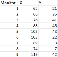
The factories and sensors locations are provided in terms of x,y coordinates on a 200x200 grid, with (0,0) at the lower left hand corner (southwest).
Sensor Location
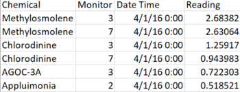
Sensor Data
Chemical: Which one of the four chemicals detected by the sensors
Monitor: Which one of the nine sensors picking up the reading
Reading: The air sensor detected amount in parts per million
Date Time: The date and time of day of the reading, local time with no change for Daylight Savings.
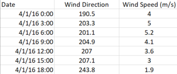
Meteorological Data
Each of these reading is taken at the date and time provided.
Date: The date and time of the readings, local time with no change for Daylight Savings.
Wind Direction: The compass directions where the wind is originating from, using a north-referenced azimuth bearing where 360/000 is true north.
Wind Speed: The speed of the wind in meters per second.
Dataset Cleaning & Transformation Process
| S/N | Dataset | Changes | Description |
|---|---|---|---|
| 1 | Meteorological Data.xlsx | Remove redundant column | |
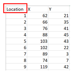
| 2 | Sensor Location.xlsx | Rename column name to "Location" so we can append the factory names to the column | |
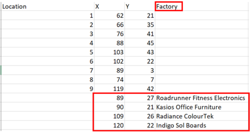
| 3 | Sensor Location.xlsx | Added an additional header "Factory" to allow for factory coordinates to be input as location data. Append factory location coordinates to date file. |
Dataset import structure/ Process
| S/N | Name | Screenshot | Description |
|---|---|---|---|
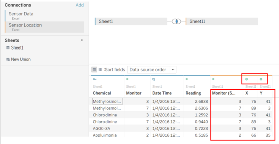
| 1 | Joining data | In order to utilise the sensor location coordinates, we have to join the 2 datasets Sensor Data.xlsx and Sensor Location.xlsx. We will join the dataset with a inner join with primary ID as monitor. In addition, after successfully joining the dataset, we will configure variable "X" to a geographical role - Longtitude and "Y" to a geographical role - Latitude.
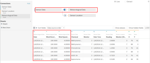
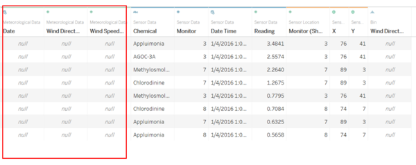
Furthermore, to effectively locate the factory responsible for the chemicals produced we have to utilise all 3 dataset and join the Meteorological Data.xlsx with a left join to utilize the wind direction and speed. With the meteorological data being collected 3 hours apart while the Sensor data being collected 1 hour apart. This difference in timestamp collected will result in null values when a left join is performed thus reflecting all the sensor data. | |
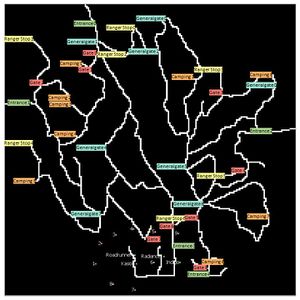
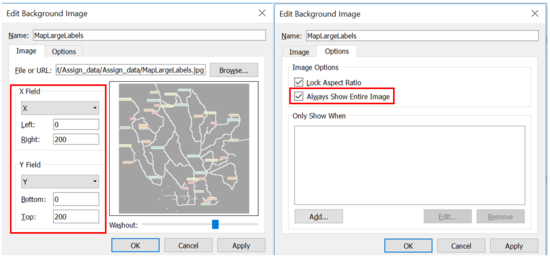
| 2 | Importing Background Map as image | To get a clearer visualisation of the positions of the sensors we will utilise the map image provided to get a better understanding of the data. We will map the "X-Field" to X and "Y-Field" to Y and set the values as shown in the screenshot. We will also customise the image to always show entire image. | |
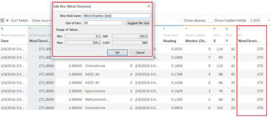
| 3 | Setting bins for wind direction | In order to determine the wind direction, we create bins of size 45. This will generate 8 bins that will indicate the wind direction in terms of North, North-East, East, South-East, South, South-West, West, North-West.
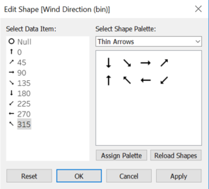
Thereafter, we will map the binned values to "arrow" shapes reflecting the direction of wind. The value of bins 0, 45, 90, 135, 180, 225, 270, 315 will be assigned to the North, North-East, East, South-East, South, South-West, West, North-West directions respectively. This will help to visualise the wind direction data more effectively on the map.Which will be used to infer and deduce the factory that is responsible for the chemicals.
|
The Task
General task
The four factories in the industrial area are subjected to higher-than-usual environmental assessment, due to their proximity to both the city and the preserve. Gaseous effluent data from several sampling stations has been collected over several months, along with meteorological data (wind speed and direction), that could help Mitch understand what impact these factories may be having on the Rose-Crested Blue Pipit. These factories are supposed to be quite compliant with recent years’ environmental regulations, but Mitch has his doubts that the actual data has been closely reviewed. Could visual analytics help him understand the real situation?
The primary job for Mitch is to determine which (if any) of the factories may be contributing to the problems of the Rose-crested Blue Pipit. Often, air sampling analysis deals with a single chemical being emitted by a single factory. In this case, though, there are four factories, potentially each emitting four chemicals, being monitored by nine different sensors. Further, some chemicals being emitted are more hazardous than others. Your task, as supported by visual analytics that you apply, is to detangle the data to help Mitch determine where problems may be. Use visual analytics to analyze the available data and develop responses to the questions below.
The specific tasks
Task 1
Characterize the sensors’ performance and operation. Are they all working properly at all times? Can you detect any unexpected behaviors of the sensors through analyzing the readings they capture?Limit your response to no more than 9 images and 1000 words.
Dataset utilised: Sensor Data.xlsx
| Chart | Visualisation | Analysis |
|---|---|---|
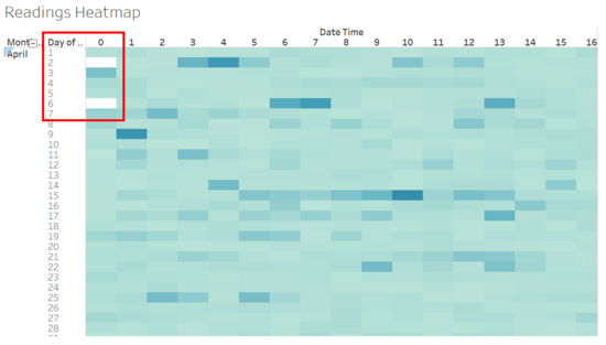
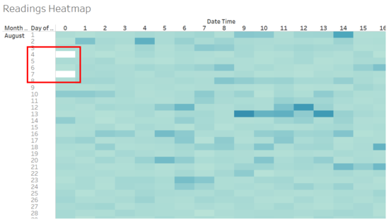
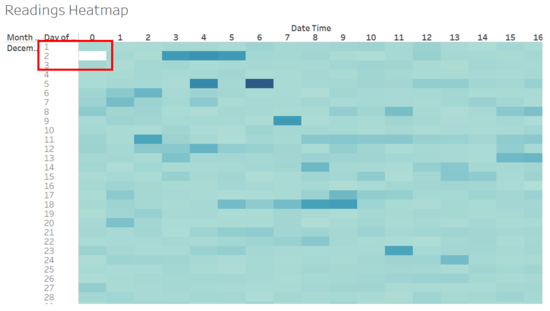
| Calendar Heatmap | After plotting a calendar heatmap of sum of readings based on a hourly breakdown across 3 months, we will be able to detect the operational stability of the sensors hourly. As seen from the heatmap, there is no reading on the 2nd April, 6th April, 4th August, 7th August and 2nd December at 00:00 hrs. However, a reading is detected at 01:00hrs on the same days. This indicates a 1 hour breakdown in ALL the sensors during the above mentioned dates. From the similar pattern and timing in breakdown dates and time it suggest that a regular monthly maintenance/ data collection of sensor is scheduled at the start of the month causing a disruption in data collection from 0:00hrs - 01:00hrs for all sensors.
| |
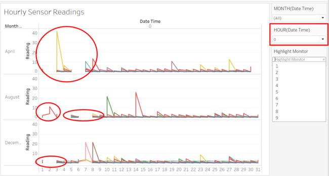
| Cyclic Plot | After analysing the heatmap, we were able to detect the breakdown timings specifically as mentioned above. Hence from that information, we will be able to zoom in and focus our investigation on the 0:00hrs period. Utilising a cyclic plot to show hourly readings across the 3 months for the different sensors, we are able to understand the breakdown situation better. In addition, we have added a filter to focus our investigation on the 0:00hrs. Firstly, the visualisation results coincides with the initial insight from the calendar heatmap showing no reading on the 2nd April, 6th April, 4th August, 7th August and 2nd December at 00:00 hrs. This confirms our conjecture above.
Upon further investigation, we realise that on the 2nd August only monitor number 3 is working as shown by the only red lines in the chart. In addition, there is an abnormal high spike in reading by monitor 6 as indicated by the yellow line on the 3rd April. This might reflect an unexpected behaviour of the sensor as this is the only instance that such a behaviour was recorded across the 3months during the 0:00hrs period.
|
Task 2
Now turn your attention to the chemicals themselves. Which chemicals are being detected by the sensor group? What patterns of chemical releases do you see, as being reported in the data? Limit your response to no more than 6 images and 500 words.
| Chart | Visualisation | Analysis |
|---|---|---|
| Location Map | To get a better understanding of the data we can clearly map out the sensors with “star” icons to realise it’s position to each factory. This will provide context of the type of chemical produced by each factory. | |
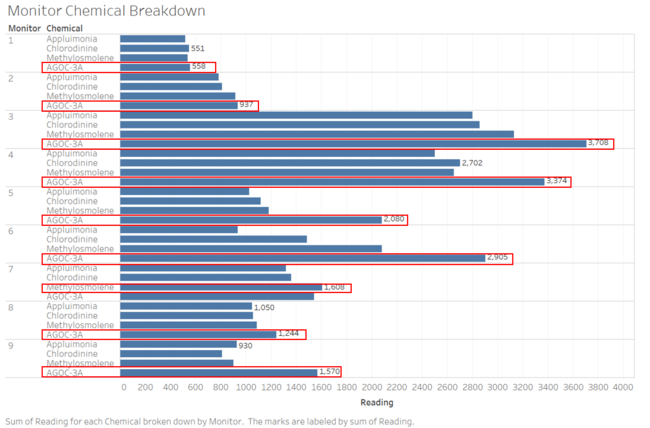
| Bar Chat | To understand which chemicals are being detected by the sensor group we will utilise a bar chart to analyse the chemical composition and sum of readings over the 3 months duration. As seen from the chart, all 9 sensors picked up all the 4 different chemical composition. Having sorted the chart in ascending order for each panel we can easily highlight that the chemical “AGOC-3A” is the highest produced chemical picked up by monitors 1,2,3,4,5,6,8,9. While the chemical “Methylosmolene” was picked up most by monitor 7.
| |
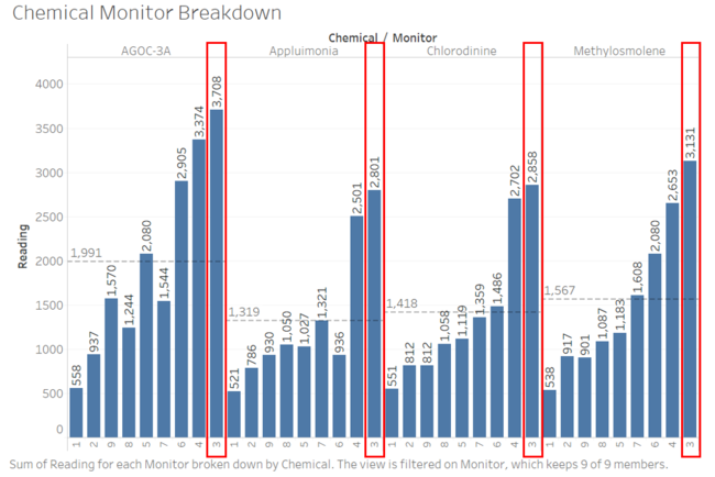
| Bar Chart | By utilising a vertical barchart, we realise that monitor 3 has consistently picked up the highest readings for all the 4 different chemical composition “AGOC-3A” , “Appluimonia”, “Chlorodinine”, “Methylosmolene”. The next highest readings picked up for all 4 different chemical is monitor 4 , with monitor 1 having the lowest amount of reading of the chemicals. This suggest that the area at monitor 1 is the least “toxic” and most chemical free. The opposite is true for areas near monitor 3 and 4 as seen in the map above.
| |
| HeatMap | With a simple heatmap broken down by monthly chemical reading, we notice that the sum of readings for each chemical increases as the months progress. Hence in December there is the highest amount of chemical readings detected and this is consistent across all 4 different chemicals. This suggest that the production of the factories nearby might have increased causing an increase in chemicals released in the vicinity. Hence we can conclude that more chemicals are progressively being released into the environment as it draws closer towards the end of the year. This analysis applies to all 4 different chemical types measured.
| |
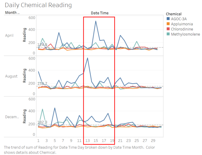
| Cyclic Plot | In order to analyse the chemical patterns further, we can plot a cyclic plot by days. With the reference line showing the average of the readings across the 3 different months, it confirms our previous analysis that the sum of readings has been increasing as the months progress. In addition, we also notice that during the mid of every month specifically from day13- 19 , there will be a spike/ increase in “AGOC-3A” chemical released and this behavior is consistent across the 3 different months. From the graph we also can tell that the chemical “Appluimonia” and “Chlorodinine” as shown by orange and red lines are pretty consistent in levels across the 3 months.
|
Task 3
Which factories are responsible for which chemical releases? Carefully describe how you determined this using all the data you have available. For the factories you identified, describe any observed patterns of operation revealed in the data. Limit your response to no more than 8 images and 1000 words.
Method used to determine factory responsible for chemical released:
| Chart | Visualisation | Analysis |
|---|---|---|
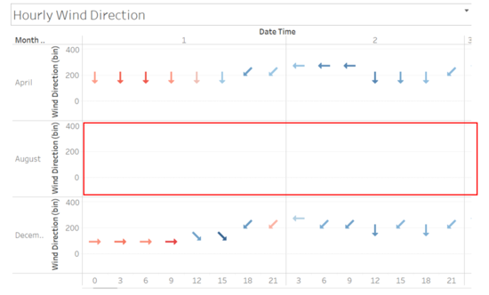
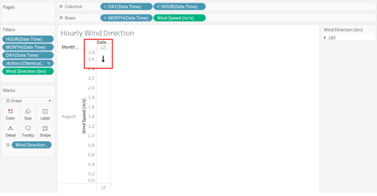
| Hourly Wind Direction | In order to determine the origin of the chemicals, we have to breakdown and identify the wind direction at a chosen time for analysis. In order to do that we have constructed a hourly wind direction chart. From the chart we will be able to tell the direction of the wind based on the available timestamp. Interestingly we have found that the Meteorological Data.xlsx provided is incomplete. We uncovered that the wind sensor data is missing from the 1st – 3rd Aug and on the 4th Aug from 0:00hrs-15:00 hrs. This might suggest a breakdown in sensor during the stipulated duration. | |
| Heatmap | |
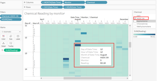
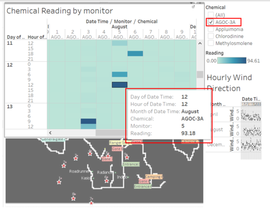
We will begin by focusing on each chemical. With the heatmap build we will filter to show only the “AGOC-3A “chemical then we will look for highest reading day with available wind data with the help of the color gradient, thus we will drill down to focus on the 12 Aug, 12:00 hrs monitor 5.
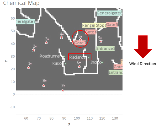
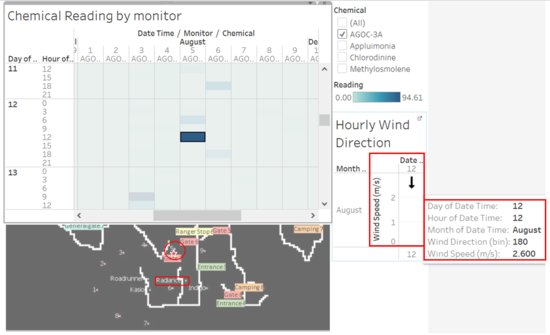
We will then utilise the worksheet we build earlier to identify the hourly wind direction on 12Aug, 12:00 hrs. After realising that there are strong winds of 2.6m/s blowing southwards, we will apply this knowledge to the map to determine the location of monitor 5. Interestingly monitor 5 is located above all the factories, with strong winds blowing south, it can be inferred that the factory closest to monitor 5 will be the factory that is producing the “AGOC-3A” chemical. Thus suggesting that factory Radiance is responsible for producing the “AGOC-3A” chemical. |
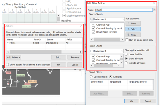
In order to streamline the process and make it more effective for visusalisation, we can combine the above worksheets into a dashboard to show all the information in 1 page more effectively. Together with the highlight action we will be able too more clearly replicate this process to identify the factories responsible for the different chemicals.
| Chemical | Visualisation | Analysis |
|---|---|---|
| AGOC-3A | As described above. | |
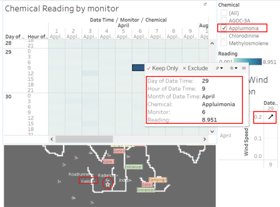
| Appluimonia | Next we will filter to show only the "Appluimonia" chemical then we will look for highest reading day with available wind data with the help of the color gradient, thus we will drill down to focus on the 29 April, 09:00 hrs monitor 6 with the highest reading 8.951. From the dashboard we realise that there are strong winds of 2.0m/s blowing North-East, we will apply this knowledge to the map to determine the location of monitor 6. From the direction of the wind and position of monitor 6 it suggest that the “Appluimonia” chemical is brought from either the Roadrunner / Kasio factory. The Roadrunner factory is located above the Kasio factory and monitor 6 location. Thus highly suggesting that the Kasio factory is responsible for producing the “Appluimonia” chemical, however this does not eliminate the possibility that the Roadrunner factory might be responsible for it’s production as well. | |
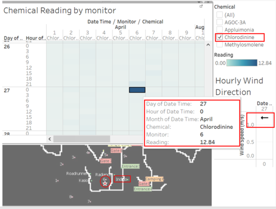
| Chlorodinine | Next we will filter to show only the "Chlorodinine" chemical then we will look for highest reading day with available wind data with the help of the color gradient, thus we will drill down to focus on the 27 April, 00:00 hrs monitor 6 with the highest reading 12.84. From the dashboard we realise that there are winds of 1.2m/s blowing West, we will apply this knowledge to the map to determine the location of monitor 6. From the direction of the wind and position of monitor 6 it suggest that the “Chlorodinine” chemical is brought from either the Radiance / Indigo factory. The Radiance factory is located above the Indigo factory and monitor 6 location, while the Indigo Factory is directly eastward of monitor 6. Thus highly suggesting that factory Indigo factory is responsible for producing the “Chlorodinine” chemical, however this does not eliminates the possibility that Radiance factory might be responsible for it’s production as well. | |
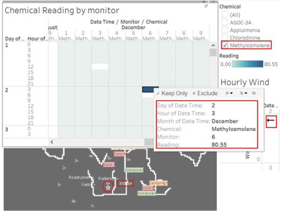
| Methylosmolene | Next we will filter to show only the "Methylosmolene" chemical then we will look for highest reading day with available wind data with the help of the color gradient, thus we will drill down to focus on the 02 December, 03:00 hrs monitor 6 with the highest reading 80.55. From the dashboard we realise that there are winds of 3.2m/s blowing West, we will apply this knowledge to the map to determine the location of monitor 6. From the direction of the wind and position of monitor 6 it suggest that the “Methylosmolene” chemical is brought from either the Radiance / Indigo factory. The Radiance factory is located above the Indigo factory and monitor 6 location, while the Indigo Factory is directly eastward of monitor 6. Thus highly suggesting that factory Indigo factory is responsible for producing the “Methylosmolene” chemical, however this does not eliminates the possibility that Radiance factory might be responsible for it’s production as well. |
