IS428 2017-18 T1 Assign Lawrence Mark Andrew
Background
Mistford is a mid-size city is located to the southwest of a large nature preserve. The city has a small industrial area with four light-manufacturing endeavors. Mitch Vogel is a post-doc student studying ornithology at Mistford College and has been discovering signs that the number of nesting pairs of the Rose-Crested Blue Pipit, a popular local bird due to its attractive plumage and pleasant songs, is decreasing! The decrease is sufficiently significant that the Pangera Ornithology Conservation Society is sponsoring Mitch to undertake additional studies to identify the possible reasons. Mitch is gaining access to several datasets that may help him in his work, and he has asked you (and your colleagues) as experts in visual analytics to help him analyze these datasets.
Mitch Vogel was immediately suspicious of the noxious gases just pouring out of the smokestacks from the four manufacturing factories south of the nature preserve. He was almost certain that all of these companies are contributing to the downfall of the poor Rose-crested Blue Pipit bird. But when he talked to company representatives and workers, they all seem to be nice people and actually pretty respectful of the environment.
In fact, Mitch was surprised to learn that the factories had recently taken steps to make their processes more environmentally friendly, even though it raised their cost of production. Mitch discovered that the state government has been monitoring the gaseous effluents from the factories through a set of sensors, distributed around the factories, and set between the smokestacks, the city of Mistford and the nature preserve. The state has given Mitch access to their air sampler data, meteorological data, and locations map. Mitch is very good in Excel, but he knows that there are better tools for data discovery, and he knows that you are very clever at visual analytics and would be able to help perform an analysis.
The Task
General task
The four factories in the industrial area are subjected to higher-than-usual environmental assessment, due to their proximity to both the city and the preserve. Gaseous effluent data from several sampling stations has been collected over several months, along with meteorological data (wind speed and direction), that could help Mitch understand what impact these factories may be having on the Rose-Crested Blue Pipit. These factories are supposed to be quite compliant with recent years’ environmental regulations, but Mitch has his doubts that the actual data has been closely reviewed. Could visual analytics help him understand the real situation?
The primary job for Mitch is to determine which (if any) of the factories may be contributing to the problems of the Rose-crested Blue Pipit. Often, air sampling analysis deals with a single chemical being emitted by a single factory. In this case, though, there are four factories, potentially each emitting four chemicals, being monitored by nine different sensors. Further, some chemicals being emitted are more hazardous than others. Your task, as supported by visual analytics that you apply, is to detangle the data to help Mitch determine where problems may be. Use visual analytics to analyze the available data and develop responses to the questions below.
The specific tasks
- Characterize the sensors’ performance and operation. Are they all working properly at all times? Can you detect any unexpected behaviors of the sensors through analyzing the readings they capture?Limit your response to no more than 9 images and 1000 words.
- Now turn your attention to the chemicals themselves. Which chemicals are being detected by the sensor group? What patterns of chemical releases do you see, as being reported in the data? Limit your response to no more than 6 images and 500 words.
- Which factories are responsible for which chemical releases? Carefully describe how you determined this using all the data you have available. For the factories you identified, describe any observed patterns of operation revealed in the data. Limit your response to no more than 8 images and 1000 words.
The Data
Quantitative
- Meteorological data - Wind speed and direction taken at 3 hours intervals
- Sensor Data - Chemical readings from 9 different sensors taken at hourly intervals
- Factory and sensor locations - Cartesian coordinates for the locations of the 4 factories and 9 sensors.
Qualitative
- The background of the sensors and a description of each of the chemicals measured by the sensors.
- An overview of each of the factories and what they are manufacturing.
Preparing the data for analysis
1. The first step was to combine the three data sets. The readings taken by each sensor can be joined with the cartesian coordinates of the sensors. The readings can also be joined with the wind speed and direction at that time, with date and time as the linking column. Index, match in excel was used to join the data.
2. As chemical monitor readings are taken more frequently than wind speed, we attribute the most recent measurement of wind speed and direction to monitors readings during hours where there is no wind measurement. This is done on excel by selecting all the blanks, typing "=", clicking on the previous data point and pressing ctrl + enter.
3. Finally, we wish to bin the wind direction data to make analysis easier. This was done on excel using the IF function:
=IF(F11<45,45,IF(F11<90,90,IF(F11<135,135,IF(F11<180,180,IF(F11<225,225,IF(F11<270,270,IF(F11<315,315,360)))))))
It can also be done on tableau using the create bins function
Now the data is ready for use, we import it into Tableau.
Building the Visualisation
The visualisation can be viewed on Tableau Public at: https://public.tableau.com/profile/mark.lawrence#!/vizhome/Assignment1_465/SensorStatus?publish=yes
The Charts
Two dashboards will be used to visualise the sensor readings with respect to the other variables.
Sensor Readings over time
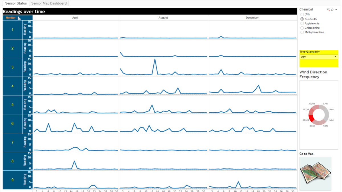
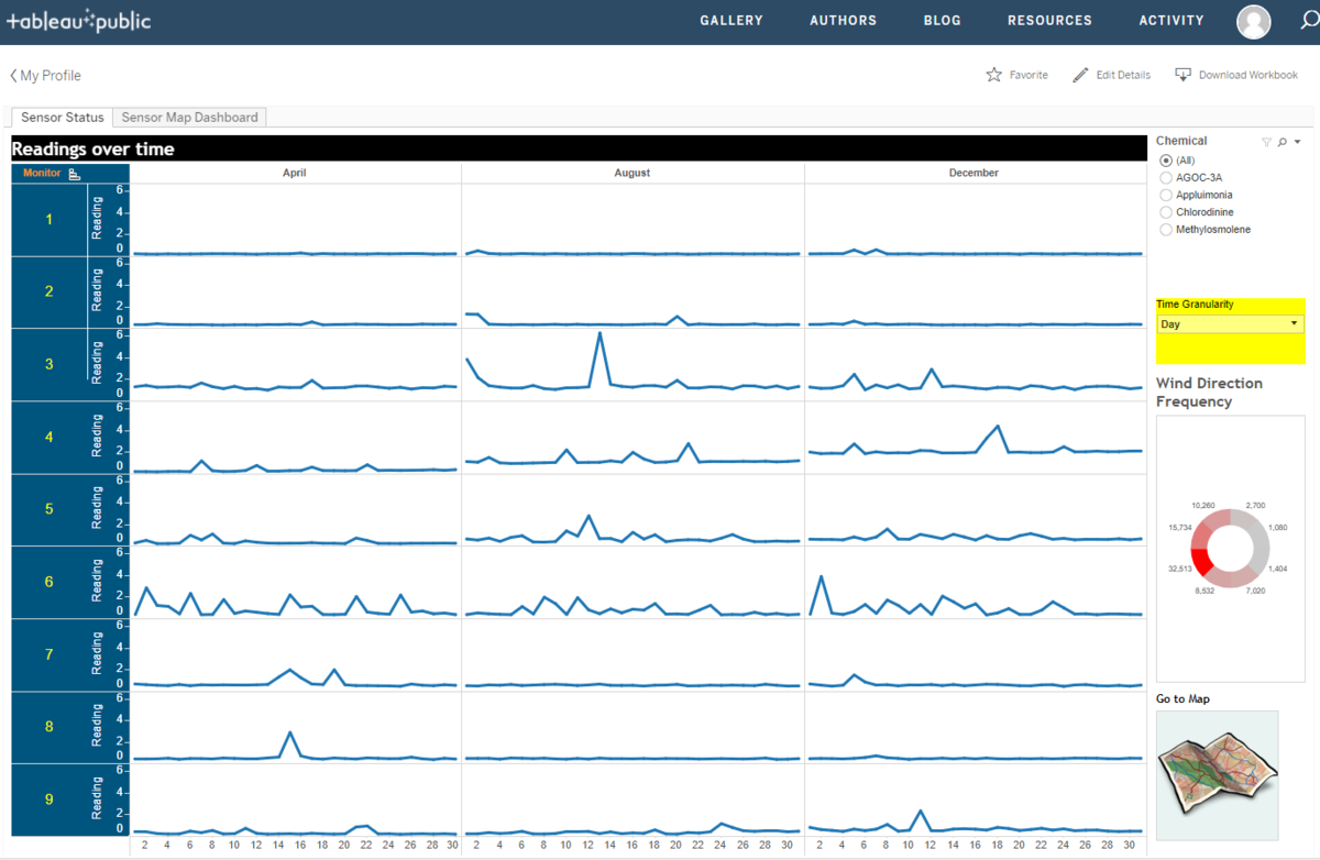
This line graph is used to view the sensor readings for each time period, with all monitors side-by-side for easy comparison. This will allow us to quickly spot erroneous measurements, such as when one sensor records a significant increase in readings for that day, but the others do not report any change.
As will be explained later in the interactivity section, the time granularity and aggregation in this chart can also be toggled to different views. This will allow the reader to investigate the readings from various angles, such as reading patterns for the 24 hours of each day, daily levels, weekly levels and days of the week.
Finally, this graph also allows us to monitor sensor performance, for example if a sensor is malfunctioning and not reading and data, it will be evident from this graph.
Frequency of wind direction, which is the number of observations when the wind is in a particular direction, is displayed at the right side. This allows us to validate our observations, for example if one set of monitors is constantly reading large amounts of chemicals while the others have low readings. We can then verify if this is due to the wind blowing towards the first set of monitors more often.
Sensor Map
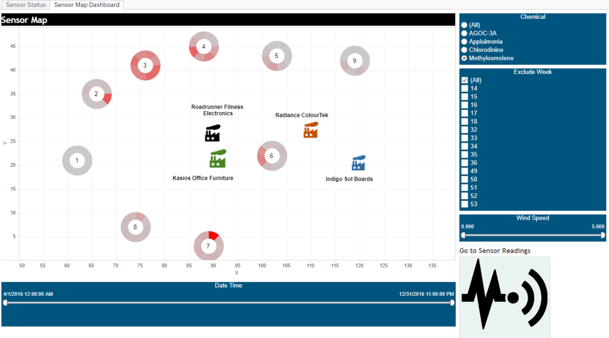
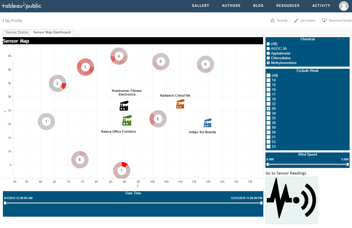
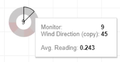
This map firstly allows us to see the positions of the various sensors and factories in relation to each other. Secondly, overlaid on each of the sensors is a doughnut chart displaying the average intensity of readings when the wind is coming from each direction. The more intense the average reading, the redder the segment will be, and each segment is grouped according to that corresponding angle: e.g. Measurements taken when the wind is coming from the North North-East will fall under the 45 Degree angle bin.
Interactivity
| Navigation Buttons |
|---|
| Purpose / Description As the visualisations are meant to be used with constant reference to each other, navigation buttons have been added to the bottom right corner for easy switching between the two dashboards. This allows the reader to explore the sensor data from both the perspective time as well as relative locations and wind direction
|
| Adjusting Time Granularity |
|---|
| Purpose / Description This function allows the reader to change the time granularity of the sensor readings over time, facilitating investigation of reading patterns and fluctuations from different angles. Also, it effectively provides four different graphs for the user to view upon demand.
The following options are available:
|
| Filters, Sliders and Exclusions |
|---|
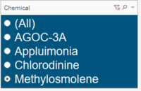
| Purpose / Description Filtering is critical for the use of this dashboard as the data will not make sense when viewed as a whole. For example, the safe ppm amount of AGOC-3A will not be the same as Appluimonia and the readings for each chemical should be viewed individually. Hence, filters to view the data by chemical are included in both the dashboards:
|
| Tooltips |
|---|
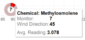
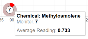
| Purpose / Description The tooltips allow the reader to quickly view the relevant figures for their particular selection of data. In the example below, we can see from the dark red colour that the wind from the North North-East has been carrying more intense amounts of Methylosmolene than the wind from the other directions. The tooltip that pops up when hovering over this segment of the doughnut allows us to quantify this statement:
|
Findings
Task 1: Sensor Performance & Operation
In investigating the integrity of the sensor readings, we look out for two strange behaviours:
1. Consistently low readings
2. Unusual spikes in readings
Taking a look at the average readings for all chemicals for each day, we can see that monitors 1,2,7 and 8 appear not to be reading much chemicals at all.
However, looking at the frequency of wind direction readings, we can easily see that the wind is usually blowing from the South-West and thus this could be the reason why these sensors are not picking up much readings, as they require wind from the North-east to carry chemicals from the factories to them.
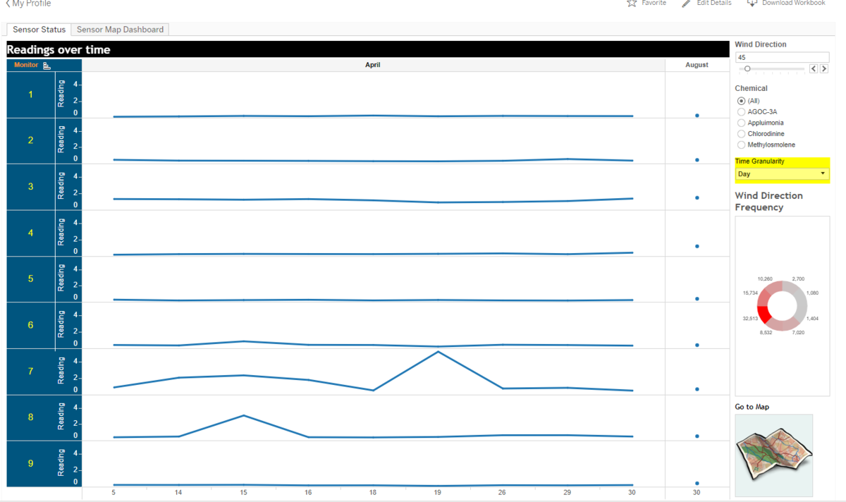
To further investigate, we can filter the readings to only include data when the wind is blowing in a certain direction. If these sensors were working correctly, we would expect to see the readings increase once we filter for North-easterly wind.
In this case, we can see the readings pick up for Sensors 7 and 8, but not for sensors 1 and 2. Even after including 90 deg (wind coming from the east), the readings for 1 and 2 still remain low. Thus, it is likely that sensors 1 and 2 require a maintenance visit.
Referring to the overview again, we can see a spike in readings for Monitor 3 during August 13. However, the readings for all the other monitors remain stagnant during this day. This is probably due to a sensor fault on that day and data for this period should not be used.
Task 2: Hazardous chemicals and Release Pattern
It appears that AGOC-3A readings tend to increase every day from 5am till 8pm, which could correspond to one of the factory's operating hours.
Methylosmolene levels also appear to increase from 9pm-5am, the most drastic being at monitor 6 due to to its proximity to the factories. However, this increase can be seen in other monitors as well. This could be due to illegal dumping being done at night to avoid detection by the authorities.
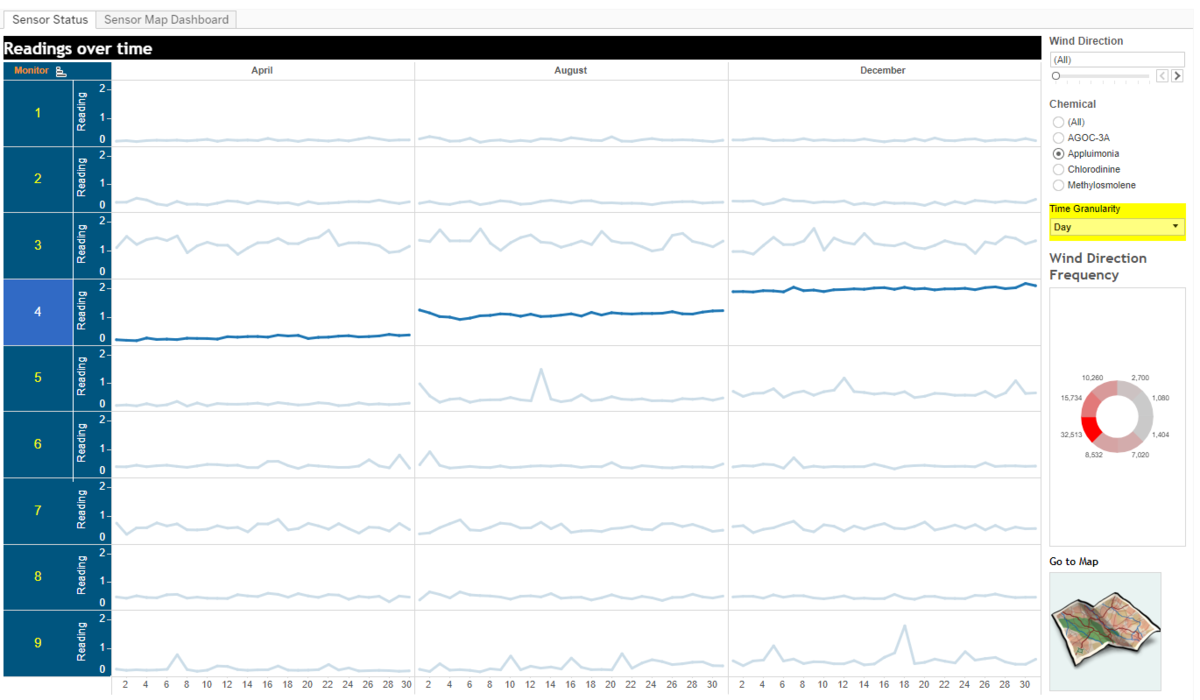
For sensor 4, we can see that levels of Appluimonia have been increasing from April to December. This could either be a sensor fault getting more and more serious, or a localised issue of appluimonia levels getting worse in the particular location of sensor 4.
Task 3: Identifying the factory responsible for the pollution
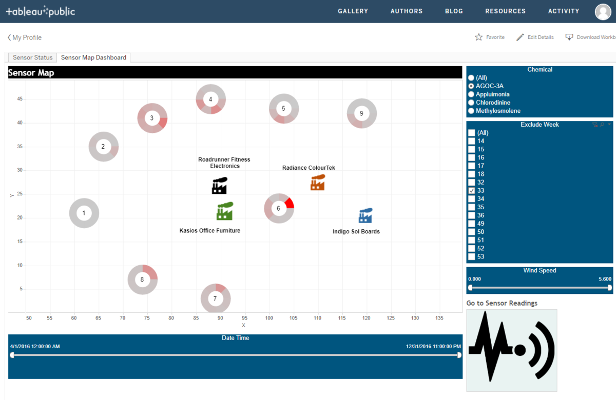
In the information given, we know that AGOC-3A has been introduced as a lower impact VOC solvent as a substitute for Methylosmolene. Comparing the reading intensities for both these chemicals, it appears as though Radiance ColourTek has made the switch to AGOC-3A, which is in-line with their marketing strategy of advertising themselves as having the lowest VOCs in the market.
From the sensor readings, we can see either Roadrunner Fitness Electronics or Kasios Office furniture is still polluting with Methylosmolene and not chemically neutralizing the waste before disposal.
Methylosmolene Readings
AGOC-3A Readings
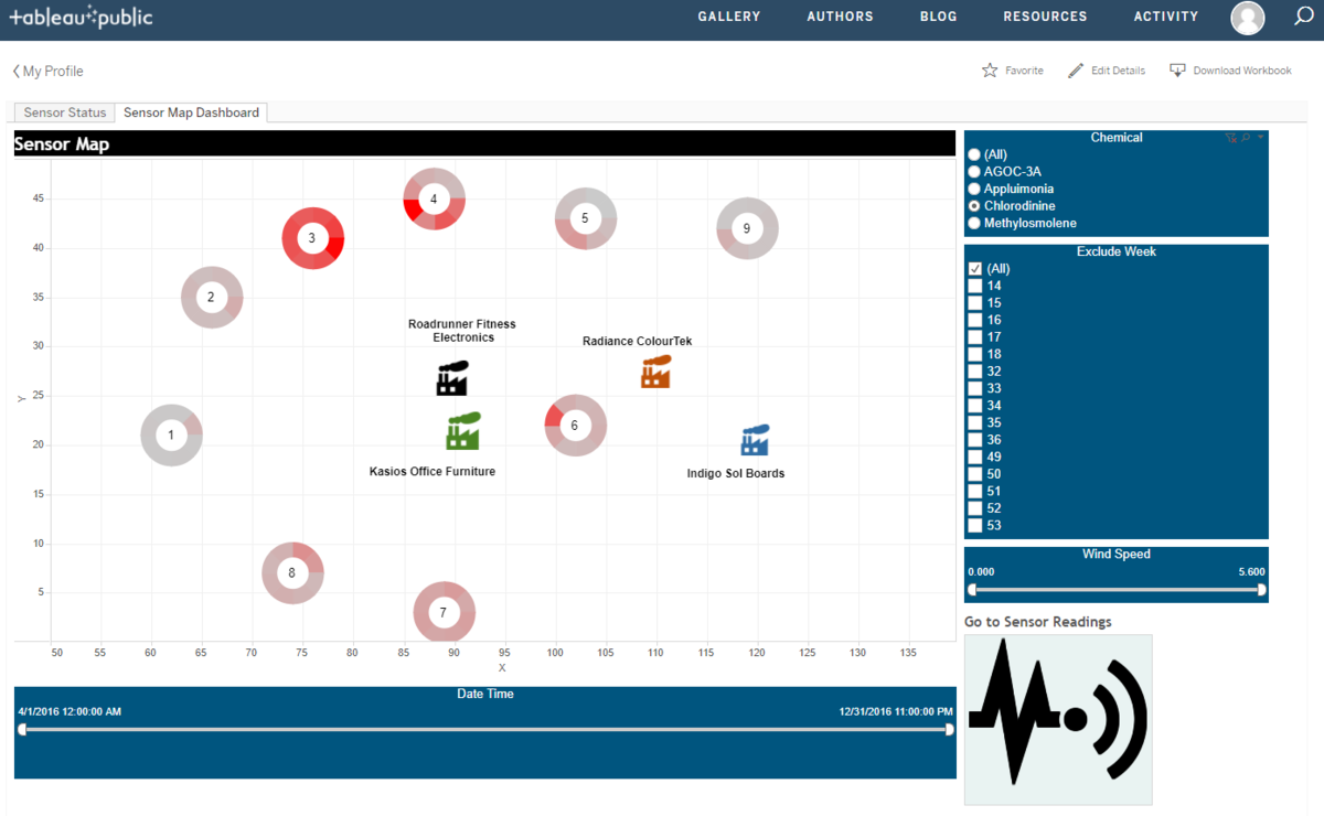
It also appears that high levels of Chlorodinine are originating from the area of Kasios Office Furniture and Roadrunner Fitness Electronics:
Chlorodinine Readings
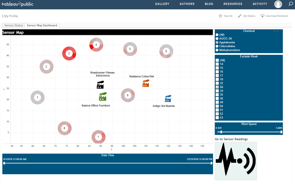
The readings for Appluimonia are inconclusive. The readings will need to be compared with the acceptable level of Appluimonia - If it's under, then there is no issue, if it's above then further investigation has to be done on other potential sources of Appluimonia apart from these 4 factories.
Appluimonia Readings
Conclusion
The evidence clearly points to either Roadrunner Fitness Electronics or Kasios Office Furniture as the culprit of Methylosmolene and Chlorodinine pollution. However, due to their close proximity, it is difficult to conclusively state from sensor readings alone, which factory is the true culprit.
From our analysis, we have observed the dumping pattern of Methylosmolene as nocturnal from 9pm-5am, and with this information it is a simple matter of observing both factories during these hours, to catch them red-handed.

